


TL;DR: In this article, we're going to use the Aurelia JavaScript framework to build a TypeScript application that lets you search for movies or pick from a list of current popular movies, and add them to a 'watch later' list. We're also going to use Auth0 to require authentication for movie list management.
If you would like to follow along, the source code for this article is available on GitHub.
"Learn how to use Aurelia to build a movie listing application with ease."
Tweet This

If, like me, you're always picking up on new movies that you need to watch, but never have the time for — or forget what they were — then this app is for you! Today we're going to build a movie—tracker app that lets you keep a record of those movies that you want to watch without having to remember what they were. Here's a breakdown of the things we'll achieve in this article:
- We'll use the Aurelia JavaScript framework and its CLI to generate a new Aurelia application that uses TypeScript and Webpack
- Our app will have three screens — the list of movies we've added (our "watch list"), a list of currently trending movies, and a search results page
- We'll connect to the The Movie DB to get our movie information
- We'll place the feature to add a movie to your watch list behind an Auth0 login, and also add the ability to log in and out of your application
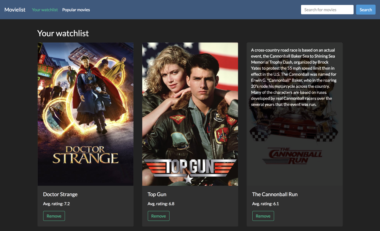
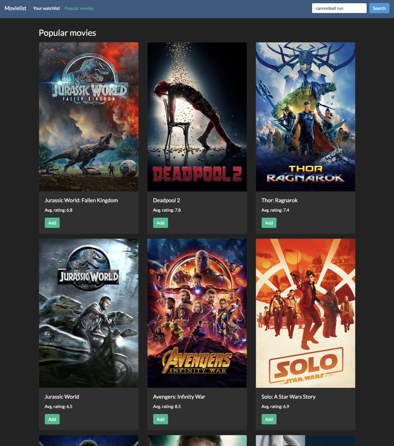
To illustrate, here's what this will look like once it's done:
A brief intro to Aurelia
Aurelia is a modular JavaScript framework designed to remove the pain of building and configuring your application, allowing you to focus on your important application features and business logic. It includes everything you need out—of—the—box to build modern JavaScript applications in the browser, on the desktop or mobile, with support for many popular JavaScript variants including ES5, ES2016, and TypeScript.
Prerequisites
The only thing you need to follow along with this article is Node 4.x or above, which is the minimum requirement for the Aurelia CLI.
Setting up the application
Let's begin by creating our application using the Aurelia CLI. This tool will help us to set up a boilerplate application using sensible defaults (chosen by us), giving us a large head start in getting our application up and running. We won't have to worry about the detail of how it is configured — we'll be able to just start writing our app.
To start, we need to install the CLI tool. Assuming at this point you have installed Node version 4.x or above, you can install it by opening up your terminal window and using NPM to install the tool locally:
npm install -g aurelia-cliNext, still inside the terminal, navigate to a place on your computer where you want the project to live. You can then invoke the Aurelia CLI to generate the beginnings of your app:
au newThe CLI tool will then guide you through the creation of your application. The first question asks you for the name of your application. I called mine 'movielist', but you can call it whatever you want.
The next question, however, asks you for a choice of default setup — choose '2. Default TypeScript' here, as that's what we'll be using in this article. This will provide you with a sensible configuration for a TypeScript application that is built using Webpack.
Next, you'll just be asked to confirm your choices, so go ahead and choose "1. Yes" to create the project.
For brevity, the project configuration that has been generated for me looks like this:
Project Configuration

    Name: movielist
    Platform: Web
    Bundler: Webpack
    Loader: None
    Transpiler: TypeScript
    Markup Processor: Minimal Minification
    CSS Processor: None
    Unit Test Runner: Jest
    Unit Test Runner: Karma
    Integration Test Runner: None
    Editor: Visual Studio Code
Finally, you'll be asked if you want to install the project dependencies. This simply performs an npm install operation on the project directory and installs all the packages it needs, so select 'yes' for this option.
Once Aurelia has finished installing all of your dependencies, you should be left with a fully working application. Just to check that it's working, move into your project directory from the terminal (cd movielist) and then run the project using au run --watch. After a few seconds, Webpack should report that it has compiled successfully and you will able to view your newly created project by visiting http://localhost:8080 in a browser window.
Hopefully, you will see the words 'Hello world!' printed out in a heading tag. If not, go back over the steps in this section and ensure that nothing has been missed out.
Note: I would like to point out at this point that while you can run your project by simply using
au run(without the--watchflag) there is an open Webpack bug at the time of writing which prevents this from working properly. So for the purposes of this article, always run your project usingau run --watchto make sure that it compiles and starts properly!
A quick tour around the project
At this point, you can open the project in your favorite editor. I'm using Visual Studio Code; while it's generally pretty awesome as an editor, it's particularly great at working with TypeScript and is a perfect fit for this project.
Looking at the file system, we're mainly going to be concerned with the src folder, as it's where all of our components, service classes, and templates are going to live and will contain the bulk of our code. We will, however, dip our toes into a couple of other places along the way, primarily:
- We're going to add a custom TypeScript definition file for The Movie DB library we'll be using, which will help us out a lot with using certain types. These live in the
custom_typingsfolder - We're going to add a Bootstrap 4 skin into the
index.ejsfile, which is essentially the wrapping HTML for our entire application - We'll be adding some environment variables into the files in the
aurelia_project/environmentsdirectory, allowing us to customize values for the different environments you might want to deploy to
At its core though, it has all the files you'd expect for a Node/Webpack project; there is a package.json file to manage dependencies, and a webpack.config.js file to configure your build. The build configuration is one of the more advanced ones you'll come across — we only need to make a very minor change to it as part of this tutorial — but it can be changed if you so wish.
One thing I would like you to do is remove the test folder. While I'm an avid fan of unit testing, it's not something we'll cover as part of this tutorial. Therefore, if you don't remove this folder, you'll find that as you progress through the article, you will hit more and more issues with your unit tests failing as they run automatically whenever Webpack is invoked.
The Movie Database API
Before we get started on the meat of the application build, let's have a quick look at the API that is going to drive the whole project.
The Movie DB is a huge database of information about movies and TV shows where you can retrieve names, overviews, ratings, cast and poster images. You can also get collections of popular movies and TV shows, some of which we'll be using here.
To get started, you will need to create a free account and apply for an API key. The application is instant, but you do need to give them some basic information about why you want the key and what you're going to use it for. You can do this by going to your account settings page once you've created your account, and going to the 'API' tab. There, you can click on the request a Developer API key option and accept the terms of use. You will find out that the form is quite extensive but don't worry, the validation process occurs instantly.
We won't quite need it yet, but keep a mental note of where to get this key from later when we start putting in the classes we need in order to communicate with the API.
Start building the demo app
Let's get writing our app. The first thing we're going to do is configure the main application window with some default styles and get the header into place.
From this point, make sure you've got the project running using au run --watch and that you are able to view the application in the browser at http://localhost:8080.
Looking in the src folder, you'll see the app.ts and app.html files. This is essentially the entry point to our application and is where the rest of our application will grow from. To start with, let's create our first component — the header.
To create components, we can make use of the Aurelia CLI tool again by asking it to create the component for us. To invoke the component generator, run this from the command line:
au generate component HeaderYou will be asked which subfolder you want the component to be created in. You can just press 'enter' if you want the component to be created inside the src folder, but I'm going to create components such as this inside a subfolder called 'components', just to keep them nice and organized.
Now if you look inside the src/components folder, you'll find header.html and header.ts. These are the files that make up our header component. Every component is created with some default 'Hello world' content, but we're going to strip that out and replace it with our own markup.
In this case, we're going to replace it with some basic navigation markup and come back to it later as we implement all the other features. Replace the contents of header.html with the following to create a basic Bootstrap navigation bar:
<!-- src/components/header.html -->
<template>
  <nav class="navbar navbar-expand navbar-dark bg-primary justify-content-between">
    <span class="navbar-brand mb-0 h1" href="#">${appTitle}</span>
    <button class="navbar-toggler" type="button" data-toggle="collapse" data-target="#navbarSupportedContent" aria-controls="navbarSupportedContent"
      aria-expanded="false" aria-label="Toggle navigation">
      <span class="navbar-toggler-icon"></span>
    </button>
    <div class="collapse navbar-collapse" id="navbarSupportedContent">
    </div>
  </nav>
</template>
So far, this is mostly just Bootstrap's standard markup for a responsive navigation bar. Notice the ${appTitle} directive in there? We're going to bind that from the 'controller' of this template, which can be found in the header.ts file. Replace its contents with the following:
// src/components/header.ts

export class Header {
  appTitle = "Movielist";

  constructor() {
  }
}
You can see from this example how easy the binding can be between variables that exist on the component class and the template. Not only that, but changes to that variable will also be picked up and surfaced to the template in real time.
Continuing on, open app.html in the root of the src folder and replace its contents with the following, which will display the Header component on the page:
<!-- src/app.html -->
<template>
  <require from="./app.css"></require>
  <require from="./components/header"></require>
  <header></header>
</template>
Notice that it brings in app.css, which just has some minor styling in it to put some distance in between the header and the content. Create the file app.css in the same directory as your app template and give it the following content:
/* src/app.css */

.container {
  margin-top: 2rem;
}
Next, let's bring in those Bootswatch styles we were talking about. Open index.ejs in the root of the project and add in the stylesheet inside the head tag so that it looks like this:
<!-- index.ejs -->
<!DOCTYPE html>
<html>
  <head>
    <meta charset="utf-8">
    <title><%- htmlWebpackPlugin.options.metadata.title %></title>
    <meta name="viewport" content="width=device-width, initial-scale=1">
    <base href="<%- htmlWebpackPlugin.options.metadata.baseUrl %>">
    <!-- Add styles for Bootswatch here -->
    <link rel="stylesheet" href="https://bootswatch.com/4/darkly/bootstrap.min.css">
    <!-- end Bootswatch -->
    <!-- imported CSS are concatenated and added automatically -->
  </head>
  <body aurelia-app="main">
    <% if (htmlWebpackPlugin.options.metadata.server) { %>
    <!-- Webpack Dev Server reload -->
    <script src="/webpack-dev-server.js"></script>
    <% } %>
    <script src="https://code.jquery.com/jquery-3.3.1.slim.min.js" integrity="sha384-q8i/X+965DzO0rT7abK41JStQIAqVgRVzpbzo5smXKp4YfRvH+8abtTE1Pi6jizo" crossorigin="anonymous"></script>
    <script src="https://cdnjs.cloudflare.com/ajax/libs/popper.js/1.14.3/umd/popper.min.js" integrity="sha384-ZMP7rVo3mIykV+2+9J3UJ46jBk0WLaUAdn689aCwoqbBJiSnjAK/l8WvCWPIPm49" crossorigin="anonymous"></script>
    <script src="https://stackpath.bootstrapcdn.com/bootstrap/4.1.1/js/bootstrap.min.js" integrity="sha384-smHYKdLADwkXOn1EmN1qk/HfnUcbVRZyYmZ4qpPea6sjB/pTJ0euyQp0Mk8ck+5T" crossorigin="anonymous"></script>
  </body>
</html>
Notice that we've also included script tags for Bootstrap and jQuery so that the responsive navigation bar works correctly across smaller devices.
By the way, for my application, I've chosen to use the Darkly theme, but you can use any of the themes that you like, as all of the markup should be compatible.
At this point, you should be able to see your application with a very basic header showing the application title and some basic coloring coming from your chosen Bootswatch styles. Notice, however, that the HTML title of your application is not quite right — by default, it's set to 'Aurelia Navigation Skeleton'. We can change that to something a little more appropriate by opening webpack.config.js and altering line 16 to whatever title we like. I've simply called mine 'Movielist':
// webpack.config.js

//...
const when = (condition, config, negativeConfig) =>
  condition ? ensureArray(config) : ensureArray(negativeConfig);

// primary config:
const title = 'Movielist';
const outDir = path.resolve(__dirname, project.platform.output);
const srcDir = path.resolve(__dirname, 'src');
const nodeModulesDir = p
// ...
Showing some movies
One of the first things we can do is show some of the current movies that are trending from the API. This will involve a few different pieces:
- Creating a class that we can use to access the API
- Creating a component to show a single movie
- Creating a component to show a list of our movie components
Let's begin with the API class. This will simply be a class that will allow us easy access to The Movie DB API and will wrap a node library called moviedb-promise. Create a new folder called api inside the src folder, and create a new file in there called index.ts.
We also need a couple of supporting elements before we go ahead and create the API class itself.
First up, we need to modify the environment configuration with our MovieDB API key that we created earlier. Open aurelia_project/environments/dev.ts and add in your API key, like so:
// aurelia_project/environments/dev.ts

export default {
  debug: true,
  testing: true,
  apiKey: '<your API key here>'
};
Note: After requesting an API key, The Movie DB team will generate two keys: one called API Key (v3 auth) and one called API Read Access Token (v4 auth). Use the
v3one to replace<your API key here>in the code snippet above.
We also need to install the moviedb-promise package. You can do this using npm on the command-line:
npm install moviedb-promiseNext, we need to add some TypeScript typings for the moviedb-promise library that we're about to interact with. We don't have to do this, but it will make working with the library much nicer, seeing as we're using TypeScript anyway.
Create a new file called moviedb-promise.d.ts inside the custom_typings folder and populate it with the following:
// custom_typings/moviedb-promise.d.ts

declare module 'moviedb-promise' {
  type SearchOptions = {
    query: string;
  }

  type Configuration = {
    images: {
      base_url?: string;
      secure_base_url?: string;
      poster_sizes?: string[];
    }
  }

  type Movie = {
    id?: number;
    overview?: string;
    popularity?: number;
    title?: string;
    vote_average?: number;
    vote_count?: number;
    release_date?: string;
    poster_path?: string;
  }

  type SearchResults = {
    page?: number;
    total_pages?: number;
    total_results?: number;
    results?: Array<Movie>;
  }

  export default class MovieDB {
    constructor(apiKey: string)

    searchMovie(options: SearchOptions): Promise<SearchResults>;
    miscPopularMovies(): Promise<SearchResults>;
    configuration(): Promise<Configuration>;
  }
}
This isn't an exhaustive set of operations that the library supports, but it does contain all the types and functions that we're going to need to build this app.
Turning our attention back to the API class we're creating, open src/api/index.ts and start by importing the types that we'll need.
// src/api/index.ts

import MovieDB, { Configuration, Movie } from "moviedb-promise";
import env from "../environment";
Next, we can create the MovieDB client and load its configuration. The configuration is another API call to the MovieDB API that returns some useful settings to us, the main one being the secure (HTTPS) base URL to movie poster images!
// src/api/index.ts

const client = new MovieDB(env.apiKey);

let config: Configuration;

client.configuration().then(c => (config = c));
Now we can create our API class. The two operations we're going to make use of in our application are the abilities to search for a movie by title and to retrieve the current popular movies:
// src/api/index.ts

export class MovieApi {
  search(query: string) {
    return client
      .searchMovie({ query })
      .then(result => Object.assign(result, {
        results: fixProfilePaths(result.results)
      }));
  }

  popularMovies() {
    return client
      .miscPopularMovies()
      .then(result => fixProfilePaths(result.results));
  }
}
The last thing we need to do is provide the implementation of the fixProfilePaths function. The movie data that we get from the API normally only includes a short path to the image (e.g. /8763abc43c1/image.png) — what we'd like to do is prepend the base path to that so that it becomes a fully qualified URL. fixProfilePaths will take a list of movies, and modify them to include the full image URL instead of just the path:
// src/api/index.ts

const fixProfilePaths = (movies: Movie[]) => {
  return movies.filter(movie => movie.poster_path).map(movie => {
    return Object.assign(movie, {
      poster_path: `${config.images.secure_base_url}/w500${movie.poster_path}`
    });
  });
};
You'll notice that it also filters out movies that don't have a value for poster_path, so there's no point in prepending the full URL if we can't show the image anyway.
That completes the API class — let's move on to showing some movies!
Getting movies on the screen
We'll begin by showing the most popular movies on the home page. Later, once we've got the 'watch list' implemented, we'll shuffle things around a bit to be more like the final version of the application.
For this, we'll need two components: one to show a single movie, and another to show a collection of movies together.
Starting with the single movie component, use the Aurelia CLI to generate a new component inside the components folder:
au generate component MovieNote: If the command above ends up with an error saying
TypeError [ERR_INVALID_ARG_TYPE]: The "path" argument must be of type string, you might need to remove the currentjest-clidependency and installing the latest version available (for the time being,v23.1.0).
Again, you'll notice that two more files have appeared inside src/components: movie.html and movie.ts. Open movie.ts and replace its contents with the following:
// src/components/movie.ts

import { bindable } from 'aurelia-framework';
import { Movie as MovieModel } from 'moviedb-promise';

export class Movie {
  @bindable model: MovieModel;
  isHovering = false;

  mouseOver() {
    this.isHovering = true;
  }

  mouseOut() {
    this.isHovering = false;
  }
}
Here we bring in a couple of types that we need: bindable allows us to create properties on our exported class that can be bound by components higher up the order, effectively allowing them to set which movie this component should display.
We've also added a couple of methods that allow us to tell whether or not the mouse is hovering over the component or not. This is so that we can include some nifty CSS which will show the movie description on hover.
Turning our attention to the view for this component, let's add the markup we need to support displaying a single movie on the screen. Open movie.html and replace the default content with the following:
<!-- src/components/movie.html -->
<template>
  <require from="./movie.css"></require>
  <div class="card">
    <div class="movie-card ${isHovering ? 'active' : ''}" mouseover.delegate="mouseOver()" mouseout.delegate="mouseOut()">
      <img src="${model.poster_path}" alt="" class="card-img-top"/>
      <div class="movie-info">
        <p>${model.overview}</p>
      </div>
    </div>
    <div class="card-body">
      <h5 class="card-title">${model.title}</h5>
      <p>Avg. rating: ${model.vote_average}</p>
    </div>
  </div>
</template>
This is pretty standard markup for Bootstrap's Card component. For now, it mostly uses Aurelia's binding syntax for outputting properties of the movie into the HTML template.
Notice the events which handle the mouseover and mouseout are used here to set an active class on the element that contains the movie poster and overview text. The idea is that, as you mouse over the poster, the overview text will come into view.
Also, notice the reference to movie.css. Create that file now alongside the HTML file, and populate it with the following:
/* src/components/movie.css */

.movie-card {
  position: relative;
}

.movie-card .movie-info {
  position: absolute;
  top: 0;
  left: 0;
  background: black;
  opacity: 0;
  height: 100%;
  padding: 1rem;
  transition: all 0.25s;
}

.movie-card.active .movie-info {
  opacity: 0.8;
}
This sets up an overlay over the movie poster image with a black background, with its opacity set to 0 (fully transparent). When the active class is applied, then the overlay becomes partially opaque. The idea is that the mouse events we applied in the previous step will apply this active class to the element, giving us the reveal effect allowing the user to read the overview text. Notice that there's also a transition setting, giving the overlay a nice fade—in fade—out effect whenever the class is applied.
Moving on, the second component we need to create is the 'movie list' — a component that displays a list of movie components. We can do that by using the Aurelia CLI tool, again creating it inside the components directory alongside the others:
au generate component MovieListOpen movielist.ts and replace the default content with the following:
// src/component/movielist.ts

import { Movie } from "moviedb-promise";
import { bindable } from "aurelia-framework";

export class MovieList {
  @bindable movies: Movie[];
  @bindable title: string;
}
At this stage, it's a pretty simple component that provides bindings for some movies (the ones we want to show in the list) as well as a title. We're providing the movies binding because we're going to be using this component to display a list of movies from a bunch of different sources — the search result, the popular movies and the watch list. All of these things are essentially just different lists of the same Movie type, so it makes sense to reuse this component as much as possible.
Open movielist.html and replace the default markup with this:
<!-- src/components/movielist.html -->
<template>
  <require from="./movie"></require>
  <require from="./movielist.css"></require>
  <h2>${title}</h2>
  <div class="movie-list row">
    <div class="col-sm-4 movie" repeat.for="movie of movies">
        <movie model.bind="movie"></movie>
    </div>
  </div>
</template>
Thanks to the repeat.for directive, this template will loop through the list of movies that have been bound to this component. From here we simply show the movie component that we created in the previous step, binding the model property to the movie instance that we currently have in the loop. Around that is just some Bootstrap markup to display all the movies in a nice column format.
We also bring in movielist.css for the list of movies, which has some minor styling to pad out each movie component a little bit:
/* src/components/movielist.css */

.movie {
  padding-bottom: 1rem;
}

h2 {
  margin-bottom: 1rem;
}
All that's left to do now is show this on a page! We're going to wrap a movie list component inside another component called PopularMovies, which will be in charge of loading the movies from the API and displaying them using the MovieList component. Use the CLI tool to generate a new component. This time though, we're going to put it in the pages folder:
au generate component PopularMoviesNext, open popularmovies.ts and add in the code to load the movies from the API:
// src/pages/popularmovies.ts

import { Movie } from "moviedb-promise";
import { MovieApi } from '../api/index';
import { autoinject } from "aurelia-framework";

@autoinject
export class PopularMovies {
  movies: Movie[];

  constructor(private api: MovieApi) {
  }

  async attached() {
    this.movies = await this.api.popularMovies()
  }
}
There are a few things to note here. First of all, we're bringing in the MovieApi type that we created a while back, and it's being injected into the component by Aurelia's dependency injection framework. The @autoinject decorator allows Aurelia to automatically resolve the type and give us the right thing when the component is created.
Next, we're handling the attached method, which is part of Aurelia's component life—cycle. attached is called once the component has been attached to the DOM. At this point, we call into the API to retrieve the popular movies. this.api.popularMovies() is a promise—based asynchronous method, which means we can take advantage of the async/await pattern and improve the readability of the code.
Now we can open popularmovies.html and create the template for this component:
<!-- src/pages/popularmovies.html -->
<template>
  <require from="../components/movielist"></require>
  <movie-list movies.bind="movies" title="Popular movies"></movie-list>
</template>
This is a simple template that delegates most of its work to the MovieList component. Notice though that Aurelia has determined that the tag name for the component is movie-list — it has split the name based on the camel—case convention, making it a bit easier to read in the HTML.
Finally, to get this all working and showing some movies on the screen, head to app.html and modify the template so that it includes the PopularMovies component and displays it under the header:
<!-- src/app.html -->
<template>
  <require from="./components/header"></require>
  <require from="./pages/popularmovies"></require>
  <header></header>
  <div class="container">
    <popular-movies></popular-movies>
  </div>
</template>
With any luck, you should now have the list of movies displayed inside your browser! Hover over the poster image and make sure you can see the movie overview text too, as that will show you that the mouse binding is working.
Configuring the Aurelia router
In the next section we're going to be creating the user interface to allow the user to search for movies, so let's take this opportunity now to set up the Aurelia router to allow us to do that.
Open app.ts. The first thing we need to do is import some types that'll need for the routing to work:
// src/app.ts

import { PLATFORM } from 'aurelia-pal';
import { RouterConfiguration, Router } from "aurelia-router";
Next, add the configureRouter method inside the App class that will be invoked by Aurelia when it is time to configure the router for the application:
// src/app.ts

configureRouter(config: RouterConfiguration, router: Router) {
  config.options.pushState = true;

  config.map([
    { route: ['', 'popular'], name: 'popular', title: 'Popular movies', moduleId: PLATFORM.moduleName('pages/popularmovies'), nav: true },
  ]);
}
The first task is to configure the router to enable pushState, which allows us to use proper URLs like /search instead of the usual /#/search type, which will be required later once we start receiving callbacks from Auth0.
The other thing this function does is to set up a single route that points to our Popular Movies page by default. We'll come back and modify this later once we start adding the rest of the pages in.
The final thing we need to do is adjust the view so that the router can display its content on the page. Open app.html and remove the <popular-movies> element as well as the require element for it. Then, add in a router-view element to act as the viewport for the router content. You should end up with this:
<!-- src/app.html -->
<template>
  <require from="./app.css"></require>
  <require from="./components/header"></require>
  <header></header>
  <div class="container">
    <router-view></router-view>
  </div>
</template>
If you run the app now, you should still see the Popular Movies page, and you should be able to see that if you either browse to / or /popular you will see the same data. You will change this later in the tutorial.
Creating the search interface
Now that we have the facility to browse between pages, let's go ahead and tackle 'search'. This page is going to be very similar to Popular Movies, in that it simply uses the MovieList component to display the results that have been retrieved from a call to the API. We'll also put a search box in the header, allowing the user to type in some search criteria.
Let's start with the page. Create a new component in the pages directory called 'SearchResults':
au generate component SearchResultsNext, open searchresults.html and populate it with the following markup:
<!-- src/pages/searchresults.html -->
<template>
  <require from="../components/spinner.html"></require>
  <require from="../components/movielist"></require>
  <movie-list movies.bind="results.results" title.bind="header"></movie-list>
  <spinner if.bind="isLoading"></spinner>
</template>
There are a couple of things to notice here. First is that we're just using the usual MovieList component to display the results and to bind the movies property to a list of results. We'll tackle where those results come from in a moment.
The other thing to notice is that we've got a reference to a spinner component. This is just an animated graphic which will show while the results are being loaded. To create this, create a new component in the components directory called 'Spinner':
au generate component SpinnerThen, open spinner.html and replace its contents with the following:
<!-- src/components/spinner.html -->
<template>
  <require from="./spinner.css"></require>
  <div class="spinner">
    <img src="spinner.svg" alt="Loading.."/>
  </div>
</template>
There's a couple of other files we need to create in this folder. First, spinner.css:
/* src/components/spinner.css */

.spinner {
  margin-bottom: 1rem;
  text-align: center;
}
And spinner.svg. This SVG file came from Sam Herbert's excellent collection of SVG loaders, and I used rings.svg in my implementation of the app. Pick which one you like from his SVG loader repository and save it alongside the spinner component as spinner.svg.
To finish off the search component, open searchresults.ts and start by importing some types:
// src/components/searchresults.ts

import { autoinject } from "aurelia-dependency-injection";
import { MovieApi } from "../api/index";
import { Movie, SearchResults as Results } from "moviedb-promise";
Then, update the SearchResults class so that it looks like the following:
// src/components/searchresults.ts

@autoinject
export class Search {
  searchTerm: string;
  header: string = 'Your search results';
  results: Results;
  isLoading = false;

  constructor(private api: MovieApi) {}

  async activate(args: { term: string }) {
    this.searchTerm = args.term;
    this.isLoading = true;
    this.results = null;

    this.results = await this.api.search(this.searchTerm);

    this.header = this.results.total_results > 0
      ? `Found ${this.results.total_results} movies that matched "${this.searchTerm}"`
      : `Didn't find any results for "${this.searchTerm}"`;

    this.isLoading = false;
  }
}
Again we're using the autoinject decorator which allows the MovieApi type to be automatically injected into the constructor when this component is created. Then, we implement one method activate which is called by the Aurelia router when this component has been activated through a route. This function is given the search term as an argument, meaning that we can use that to query the API.
Notice that this function uses the async/await pattern as well, meaning that we can write the call to the API in a way that appears to be synchronous, but actually it's using a Promise in the background.
Finally, the content for the header is devised based on the number of search results that have been returned. If we get some results, the header tells us how many results there are for the given term. Otherwise, we simply display a message telling the user that there were no results.
The next part we need to tackle is updating the router so that the search page can be accessed by the browser. Reopen app.ts and update the router config to include this new search route:
// src/app.ts

config.map([
  { route: ['', 'popular'], name: 'popular', title: 'Popular movies', moduleId: PLATFORM.moduleName('pages/popularmovies'), nav: true },
  { route: 'search/:term', name: 'search', moduleId: PLATFORM.moduleName('pages/searchresults')}
]);
Here the route is configured so that the page can be accessed via the URL, including the search term. For example, we should now be able to find all the Godzilla movies by browsing to the search page at /search/godzilla!
The final thing to do is create the little search box that the user can use to find movies through the UI. Create a new component in the components directory called 'SearchBox':
au generate component SearchBoxPopulate the searchbox.html file with the markup to display a form with a textbox:
<!-- src/components/searchbox.html -->
<template>
  <form class="form-inline my-2 my-lg-0" submit.trigger="doSearch()">
    <input type="search"
      value.bind="searchTerm"
      type="text"
      placeholder="Search for movies"
      class="form-control mr-sm-2">
      <button type="submit" class="btn btn-info">Search</button>
  </form>
</template>
Notice that the form has submit.trigger="doSearch()" applied to it, which means that when the form is submitted (either the user hits the enter key after entering a search term, or presses the 'search' button) then it will execute the doSearch() function inside the component. Another thing of importance is that the textbox's value is bound to the searchTerm property so that we can retrieve the value that the user typed in when the form has been submitted. We'll see how this is created in the next piece of code.
Inside searchbox.ts, the component code should look like the following. Again the autoinject decorator is used to bring in the Router type through the constructor:
// src/components/searchbox.ts

import { autoinject, bindable } from "aurelia-framework";
import { EventAggregator } from "aurelia-event-aggregator";
import { Router } from "aurelia-router";

@autoinject
export class SearchBox {

  @bindable searchTerm: string;

  constructor(private router: Router, private events: EventAggregator) {
    this.events.subscribe('router:navigation:success', r => {
      if (r.instruction.config.name === 'search') {
        this.searchTerm = r.instruction.params.term;
      }
    });
  }

  doSearch() {
    if (this.searchTerm && this.searchTerm! + "") {
      this.router.navigate(`search/${this.searchTerm}`);
    }
  }
}
There are a few pieces to this code, but let's go through the main areas:
- We have the bindable
searchTermproperty, which is bound to the search box'svalueproperty in the template - In the constructor, we're bringing in the router and also the
EventAggregator, and we subscribe to therouter:navigate:successevent. We do this so that, if the user is performing a search and browses to/search/arthurthen we retrieve the search term from the router data and pre-fill the search term with it - Finally, the
doSearch()function is defined, and it basically takes the search term (if the user typed one in) and uses the router to navigate to the search results page
The last thing to do is place this new search control into the header so that the user can interact with it. Reopen header.html and modify the template so that it includes the search control:
<!-- src/components/header.html -->
<template>
  <require from="./searchbox"></require>
  <nav class="navbar navbar-expand navbar-dark bg-primary justify-content-between">
    <span class="navbar-brand mb-0 h1" href="#">${appTitle}</span>
    <button class="navbar-toggler" type="button" data-toggle="collapse" data-target="#navbarSupportedContent" aria-controls="navbarSupportedContent"
      aria-expanded="false" aria-label="Toggle navigation">
      <span class="navbar-toggler-icon"></span>
    </button>
    <div class="collapse navbar-collapse" id="navbarSupportedContent">
      <!-- new! -->
      <search-box></search-box>
      <!-- /new -->
    </div>
  </nav>
</template>
Now the search box should appear inside the navigation panel, and the user should be able to type in a search term and have the results displayed on the page. Neat!
While we're inside the header template, let's modify the navigation container to include the available routes from the Router. If you look back at the router configuration we're building up inside app.ts, you'll notice that some of the routes have a nav: true property. This facilitates the ability to enumerate over the available routes and generate a set of navigation links. While we've got header.html open, let's do that now. Put this just inside the div with the 'collapse' class on it, to write out the available links:
<!-- src/components/header.html -->
<ul class="navbar-nav mr-auto">
  <li class="nav-item ${item.isActive ? 'active' : ''}"
      repeat.for="item of router.navigation">
    <a class="nav-link" href.bind="item.href">${item.title}</a>
  </li>
</ul>
Now open header.ts and bring in the router using dependency injection:
// src/components/header.ts

import { autoinject } from 'aurelia-framework';
import { Router } from 'aurelia-router';

@autoinject
export class Header {
  appTitle = "Movielist";

  constructor(private router: Router) {}
}
This will give the template access to the router and the available navigation elements, enabling it to write out the navigation links. If you look at the page now in the browser, you should find that the 'Popular movies' navigation link is available.


