


At Auth0, we want our customers to be successful using our authentication solutions. The Customer Success Infrastructure Team builds customer-facing and internal tools that help us achieve that goal. One of the technologies that have enabled them to have rapid iterations in user interface development is React.

This team builds a variety of different projects such as the software that runs our Auth0 Support Center and other internal tools that power internal support workflows. In addition to React, they develop their projects using Node.js, hapi.js, and Redux. It is a JavaScript-heavy team and that is driven by building quality features quickly.

Would you like to be part of a Team like this? We are currently hiring engineers to join the Customer Success Infrastructure team!
Guillermo Rodas is one of the Engineers of the Customer Success Infrastructure Team. He recently led a project initiative known as Support Center Components that solved a problem centered around having duplicate React components in our customer-facing and internal tools site.
In this blog post, through Guillermo's insight, we are going to explore how the Account Center Team is using React and Storybook to optimize UI development and promote consistent branding by creating a component library that can be shared across different projects.
Don't Repeat Yourself (DRY)
Auth0 Support Center, a customer-facing site, and Customer Success Tools, an internal site, have similar elements on their interfaces. For example, despite having a different business context in each interface, the Quota Utilization feature in both interfaces uses the same structure to report data to the user.
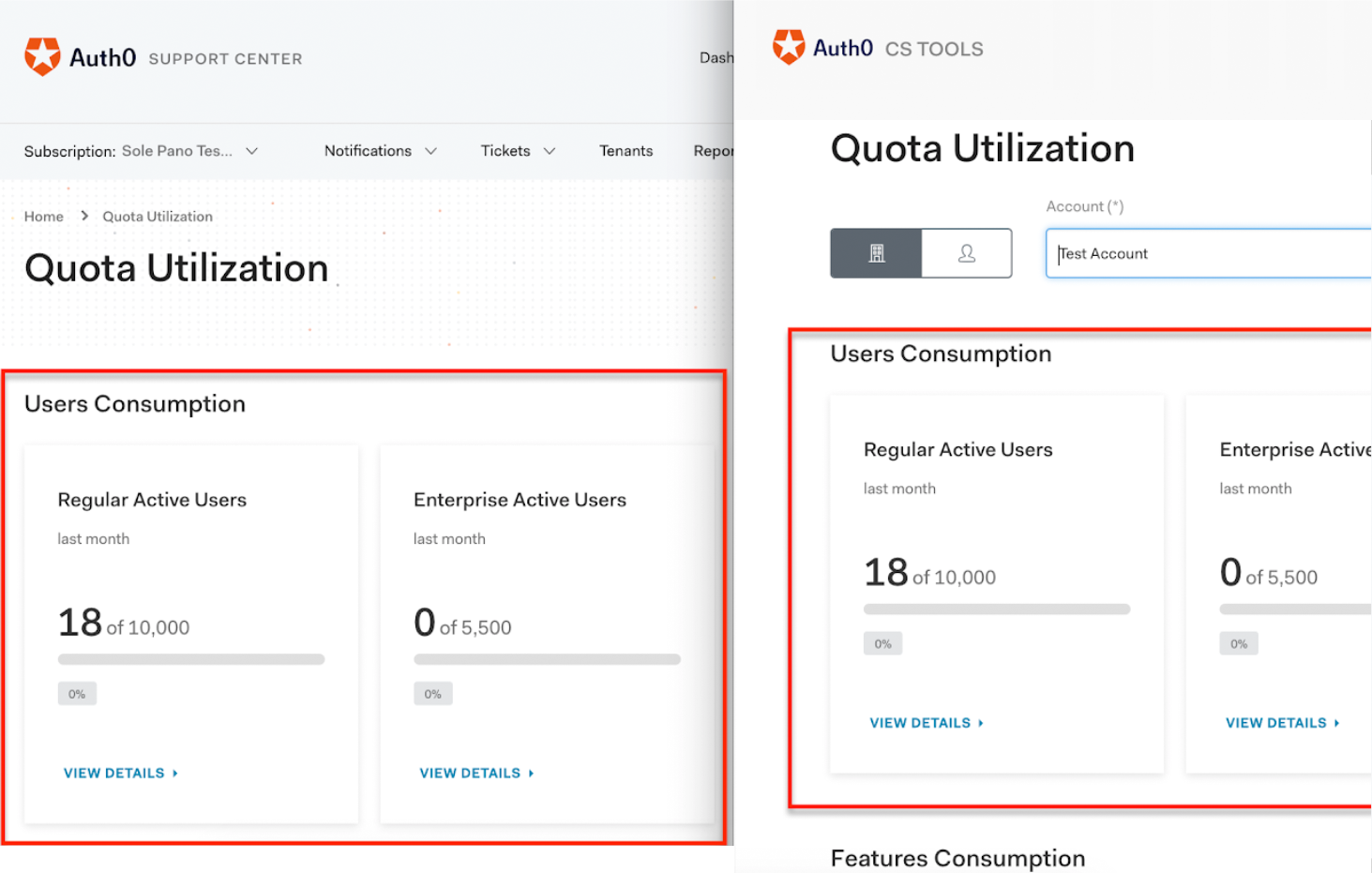
The problem that we had was that this structure was being implemented as a React component separately for each interface instead of sharing the implementation. The development team was duplicating components to solve the same problem. This approach inherently created pain points for developers as Quota Utilization was just one of a few other features that had overlapping front-end architectures within our sites.
Having duplicate code is not ideal. One version of the code may be more up-to-date than another version, creating something similar to a race condition around code versioning. If a bug is found, it would need to be fixed in every place that shares the code while hoping that the developer can remember them all. An inconsistent bug fixing process could multiply bugs and create havoc in a codebase.
"If you see patterns in your code, that is an indication it is prime for DRYing. Sometimes this means standing back from the screen until you can’t read the text and literally looking for patterns." (Donavon West, American Express Developer Relations)
The solution for this code duplication problem was to make the code DRY (Don't Repeat Yourself). We needed to write the presentational component once and then have each feature/interface implement it from a single source of truth: a component library.
As explained by Mark Perkins from Clearleft on their insightful post On Building Component Libraries, a component library is an effective and robust format for delivering documented code and design patterns to developers and clients. React lends itself to the architecting of a component library since it involves the process of thinking and building in a "componentised manner", as coined by Mark.
"react lends itself to the architecting of a component library since it involves the process of thinking and building in a "componentised manner", as coined by @allmarkedup from @clearleft"
Tweet This

Integrating a Component Library
Implementing the concept of a component library within our workflow was an architectural decision that required us to further strategize our component and feature development process.
For example, when creating a component, we started asking the following questions:
- How to categorize the component within a library? Should we have categories at all?
- How should a prototype of the component be presented? Should a blank page with mock data be used?
- Should different states of the component be presented on its prototype?
It was critical to be able to answer these questions visually and in an organized manner to help us iterate cleanly through our feature development process. This process typically consists of:
- Creating an MVP (Minimum Viable Product) or POC (Proof of Concept).
- Getting feedback on the MVP/POC.
- Integrating feedback through development iterations.
Through that process, we are constantly showing how the user interface presents data through its components and defining the states of a component based on the data that it can present. We needed a tool that could let us:
- Create our components independent from any specific feature integration.
- Preview our components and their different states.
- Let us categorize each component into families for easier lookup.
- Host our components in a central location to create the concept of a library.
With React, we could already define components. We needed something to preview, categorize, and host them. Fortunately, we were able to fulfill all those requirements using one single tool: Storybook.
"Don't reinvent the <Wheel />. To create modular and reusable components that can be shared across projects, build a component library with React and Storybook."
Tweet This

Storybook: Let Your Components Tell a Story
Storybook is a UI development environment for UI components. It acts as a board where we can stage our components and visualize them in different states and interact with them as if they were on a live application. This is all done in isolation since Storybook runs outside of our app. Storybook has its own Webpack setup that is very similar to the one from create-react-app but can be configured to meet our needs. The platform also comes with a built-in dev server to help us preview our components locally.
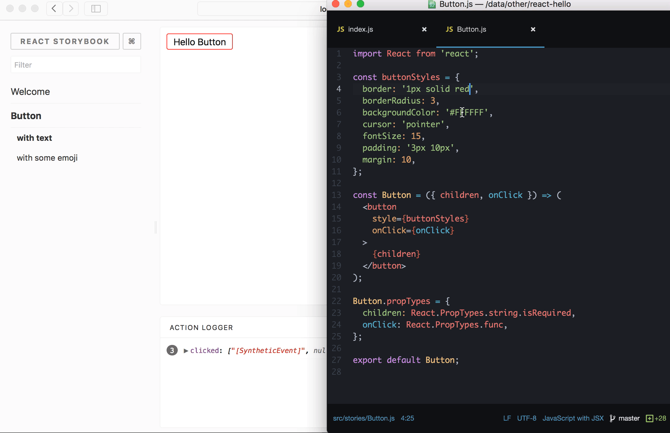
As we have described, we already had a working project when we decided to use Storybook to create a component library. However, because of its independent architecture, adding Storybook to our existing project did not create any burden or changes to our existing codebase.
We added it like any other npm package and then imported our existing components into its platform. However, it did require us to think differently about the creation, maintenance, and sustainment of our components moving forward — an integrative process we call "storybook-driven development."
With Storybook, we have been able to build our React components gradually in isolation without having to worry about having the final component version or environment ready from the start. It has doubled as a staging and planning tool for us.
"Storybook and React let us plan, stage, and build components gradually. It's a living style guide."
Tweet This
Documenting and Testing Pain Points
Our Customer Success Infrastructure team had a second problem: documenting and testing all the different scenarios of each project feature. In our projects, we have tests with high coverage that are run through a continuous integration pipeline configured in Heroku.
In Guillermo's words:
"We have strong tests along with continuous integration because we want to have nice weekends without worrying about our production builds failing. The most common phrase in a Pull Request (PR) is: Please add the tests."
Aside from testing, we place high value in documenting code. It's our legacy for anyone who will be working with our codebase in the future. Fortunately, having a component library like Storybook allows us to document components visually and declaratively. Storybook provides a developer with all the information needed to understand the structure and state of a component.
Testing is hard. For most developers, testing is a sad story. Well, not anymore! With modern and powerful tools, our testing story is a happy one.
In React, there are different aspects of UI Testing. We categorize them as follows along with their tooling:
- Structural Testing:
- Interaction Testing:
- Enzyme
- CSS/Styles Testing:
- Image comparison to do regression testing
- Jest Snapshot using inline styles
- Other tools like BackstopJS, PhantomCSS, Gemini, and Happo
- Manual Testing
Storybook integrates with Jest Snapshot through an add-on called StoryShots. StoryShots adds automatic Jest Snapshot Testing to our codebase by using our existing Storybook stories as the input for Jest Snapshot Testing.
With our Heroku CI pipeline configured, each time someone makes a PR with a new component against our Storybook, this automated testing is triggered and a visual preview of our app is created. This lets us perform structural and style testing much faster.
Sharing our Engineering Knowledge
We are happy to share what our engineering process looks like in detail and how it has positively impacted our developer experience in creating, testing, and documenting user interfaces.
You may stay in touch with us by following @auth0 on Twitter, subscribing to our newsletter, or checking this blog back from time to time. We hope that you'll love the content that we are creating.
About Auth0
Auth0 by Okta takes a modern approach to customer identity and enables organizations to provide secure access to any application, for any user. Auth0 is a highly customizable platform that is as simple as development teams want, and as flexible as they need. Safeguarding billions of login transactions each month, Auth0 delivers convenience, privacy, and security so customers can focus on innovation. For more information, visit https://auth0.com.


