> ## Documentation Index
> Fetch the complete documentation index at: https://auth0.com/llms.txt
> Use this file to discover all available pages before exploring further.
> Learn how to create a theme using tailwind CSS with ACUL
# Create a theme with Tailwind
You need:
* An Auth0 development tenant configured with [Universal Login](/docs/authenticate/login/auth0-universal-login) and a [custom domain](/docs/customize/custom-domains).
* An Auth0 [First Party Application](/docs/get-started/auth0-overview/create-applications#create-applications).
* Enable [Identifier First Authentication](/docs/authenticate/login/auth0-universal-login/identifier-first) in your Auth0 tenant.
* [Node.js](http://Node.js) V22+
* The [Auth0 CLI Tool](https://github.com/auth0/auth0-cli) [authenticated to your existing tenant](https://github.com/auth0/auth0-cli?tab=readme-ov-file#authenticating-to-your-tenant).
* To review the [ACUL Quickstart guide](/docs/customize/login-pages/advanced-customizations/quickstart)
Universal Login provides a number of [prompts](/docs/customize/login-pages/universal-login/customize-signup-and-login-prompts#terminology), or steps in the authentication process, each step includes at least one screen. You can use ACUL to apply a theme to all your custom screens.
For example:
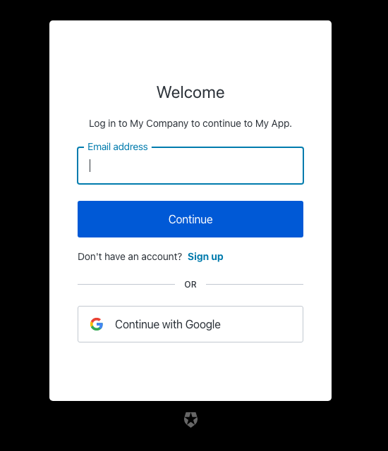
You can apply a theme to this Login screen using [Tailwind CSS v4](https://tailwindcss.com/docs/installation/using-vite).
All theme and branding customizations are located in ACUL project `src/index.css` directory.
1. Use the Auth0 CLI tool to create an ACUL project with the screens to apply a new theme.
```bash theme={null}
auth0 acul init
```
2. Edit the CSS file `src/index.css`.
```css theme={null}
/* In src/index.css */
:root {
/* Change these CSS variables to match your brand's primary color */
--primary: oklch(0.205 0 0);
--primary-foreground: oklch(0.985 0 0);
/* Override the theme variables to reference your custom color*/
--color-primary-button: var(--ul-theme-color-primary-button);
/* You can also override specific component colors directly */
--color-header: var(--primary-foreground);
--color-body-text: #000000;
--color-widget-bg: white;
--color-widget-border: transparent;
/* ... and many more */
}
```
CSS variables in the `@theme inline` block are used by the base components.
CSS variables prefixed with `--ul-theme-` are set to the default Universal Login styling and are automatically overridden by the Branding theme set in your tenant at runtime. To learn more, read the `src/utils/theme/themeEngine.ts` file in your project's directory.