Lock Configuration Options
Lock can be configured through the options parameter sent to the constructor. These options can alter the way that the Lock widget behaves, how it deals with connections, additional signup fields that you require for your project, the language and text values, colors, and images on the widget, and many more. Take a look at the index below if you know what you are looking for, or browse the options for more details.
UI
| Option | Description |
|---|---|
| allowAutocomplete | Enable or disable autocompletion on the email or username inputs |
| allowPasswordAutocomplete | Enable or disable autocompletion on password input |
| allowShowPassword | Specifies if the user can choose to show password while typing it |
| allowedConnections | List of connections that will be available to perform authentication |
| autoclose | Specifies if Lock closes after a login |
| autofocus | Specifies if focus is set on the first input field |
| avatar | Specifies if an avatar and a username should be displayed on the Lock's header once an email or username has been entered and how to obtain it |
| closable | Determines whether or not Lock can be closed |
| container | The HTML element where Lock will be rendered. This causes Lock to appear inline instead of in a modal window |
| flashMessage | Shows an error or success flash message when Lock is shown |
| language | Specifies the language of the widget |
| languageDictionary | Customize text used for widget elements (such as labels and placeholders) |
| popupOptions | Customize the location of the popup in the screen |
| rememberLastLogin | Whether or not to show a screen that allows you to quickly log in with the account you used the last time |
| scrollGlobalMessagesIntoView | Specify if a globalMessage should be scrolled into the user's viewport |
Theme
Theme options are grouped in the theme property of the options object.
| Option | Description |
|---|---|
| authButtons | Customize the appearance of specific connection buttons |
| labeledSubmitButton | whether or not the submit button has text |
| logo | What logo should be used |
| primaryColor | Color of the primary button on the widget |
Authentication
Authentication options are grouped in the auth property of the options object.
| Option | Description |
|---|---|
| audience | The API which will be consuming your Access Token |
| autoParseHash | Whether or not to automatically parse hash and continue |
| connectionScopes | Specify connection scopes |
| params | Option to send parameters at login |
| redirect | Whether or not to use redirect mode |
| redirectUrl | The URL to redirect to after auth |
| responseMode | Option to send response as POST |
| responseType | Response as a code or token |
| sso | Determines whether Single Sign-On is enabled or not in Lock |
Database
| Option | Description |
|---|---|
| additionalSignUpFields | Additional fields collected at signup |
| allowLogin | Whether or not to allow login on widget |
| allowForgotPassword | Whether or not to allow forgot password on widget |
| allowSignUp | Whether or not to allow signup on widget |
| defaultDatabaseConnection | Default shown DB connection |
| initialScreen | Which screen to show when the widget is opened |
| loginAfterSignUp | After signup, whether or not to auto login |
| forgotPasswordLink | Link to a custom forgot password page |
| showTerms | Specify if signup terms should be display |
| mustAcceptTerms | Whether or not terms must be accepted (checkbox) |
| prefill | Prefill values for email/username fields |
| signUpLink | Set a custom url to fire when clicking "sign up" |
| usernameStyle | Limit username field to accept only "username" values or only "email" values |
Enterprise
| Option | Description |
|---|---|
| defaultEnterpriseConnection | Specifies a connection if more than one present |
Passwordless
| Option | Description |
|---|---|
| passwordlessMethod | When using Auth0LockPasswordless with an email connection, you can use this option to pick between sending a code or a magic link to authenticate the user |
Other
| Option | Description |
|---|---|
| configurationBaseUrl | Override your application's base URL |
| languageBaseUrl | Override your language file base URL |
| hashCleanup | Override the default removal of the hash from the URL |
| connectionResolver | Optional callback function for choosing a connection based on the username information |
UI Options
allowAutocomplete {Boolean}
Determines whether or not the email or username fields will allow autocomplete (<input autocomplete />). Defaults to false.
allowAutocomplete: true
allowPasswordAutocomplete {Boolean}
Determines whether or not the password field will allow autocomplete (<input autocomplete />). Defaults to false.
Set allowPasswordAutocomplete to true for password manager support and to avoid other cases of adverse behavior.
allowPasswordAutocomplete: true
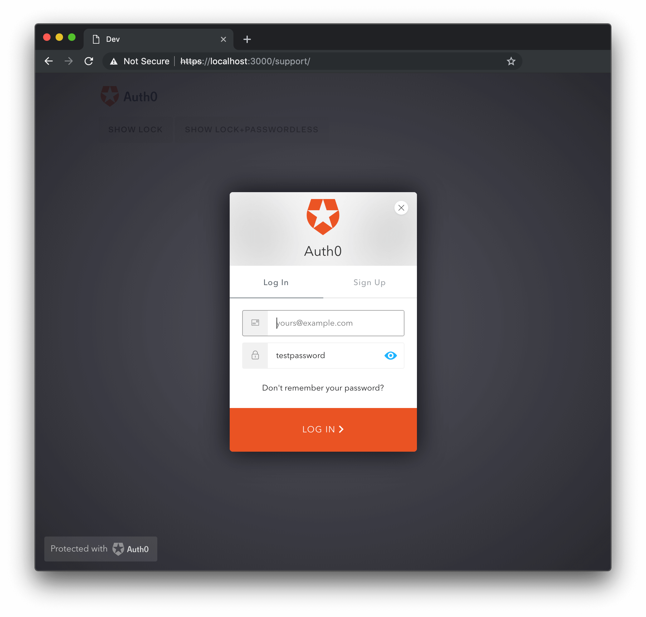
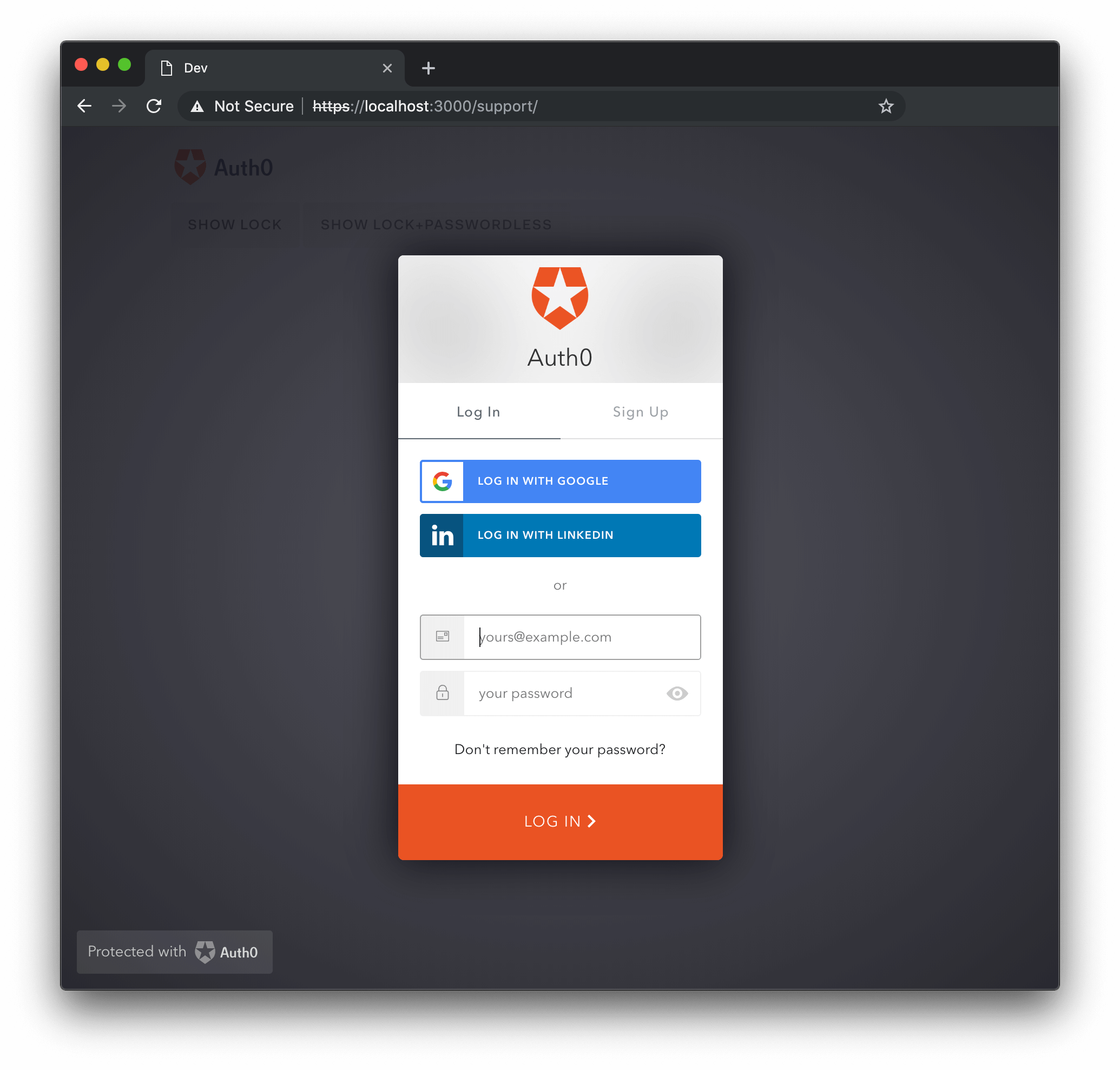
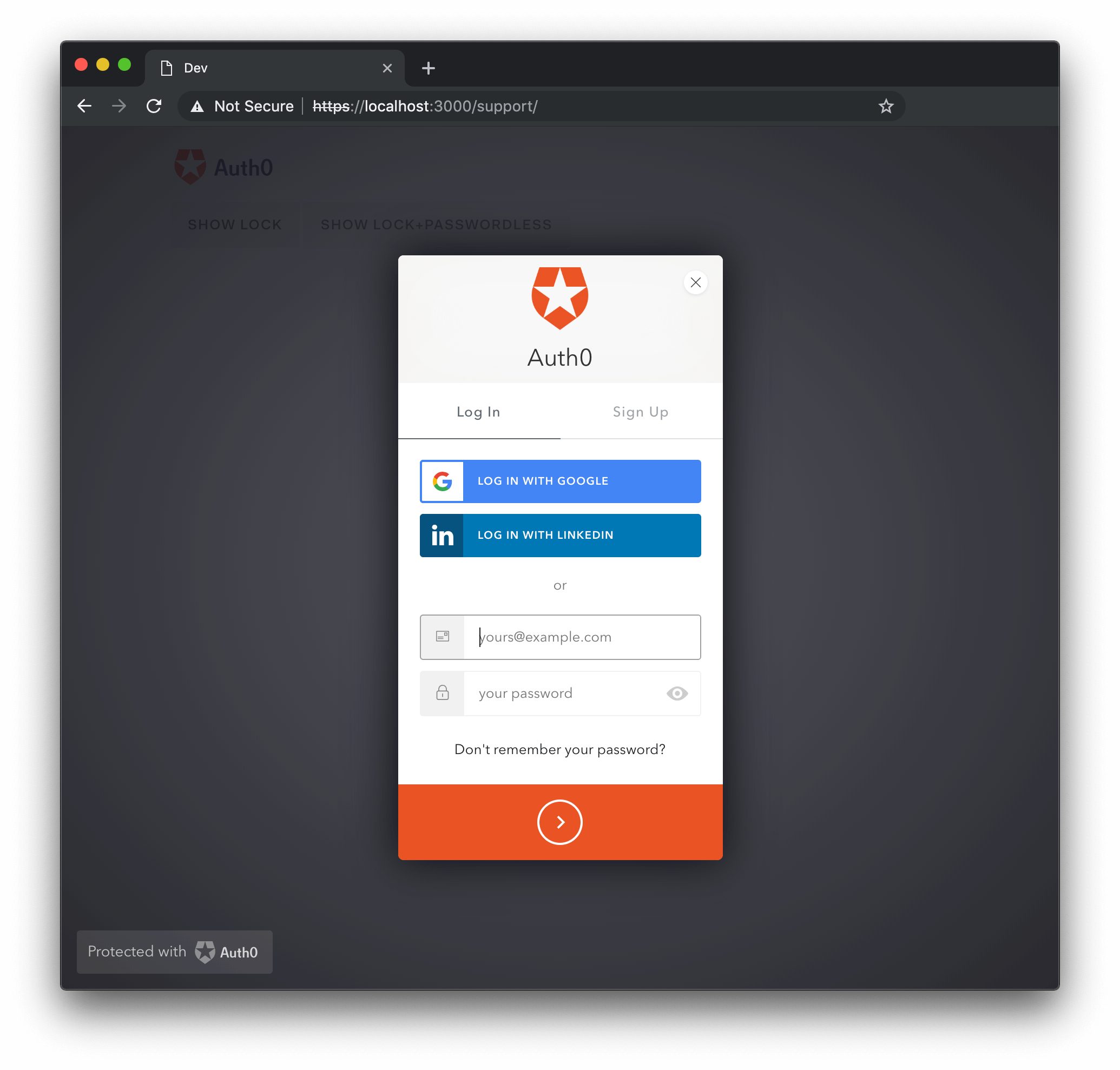
allowShowPassword {Boolean}
This option determines whether or not to add a checkbox to the UI which, when selected, will allow the user to show their password when typing it. The option defaults to false.
allowShowPassword: true
Lock with allowShowPassword set to true and toggled to show the password:
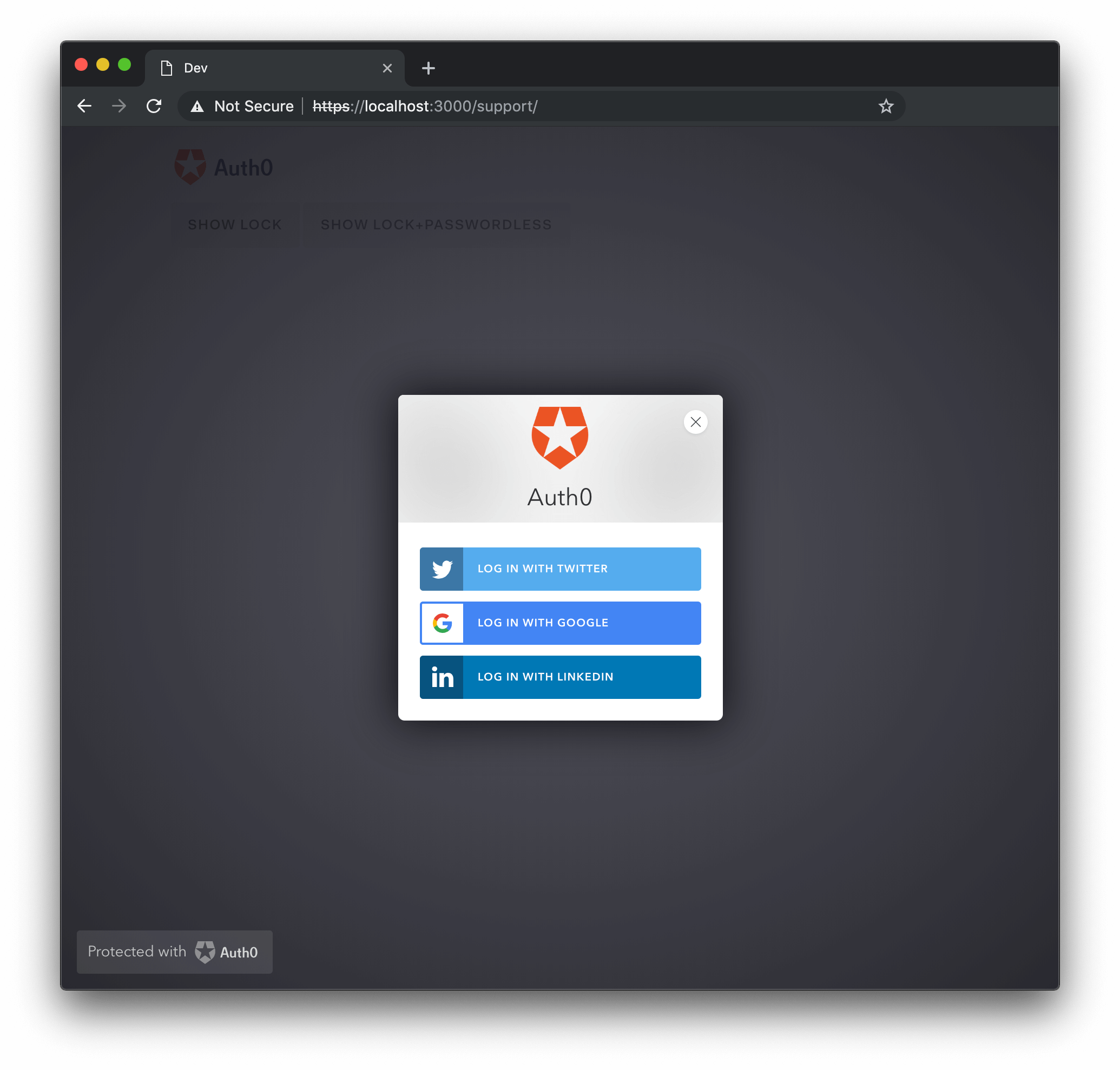
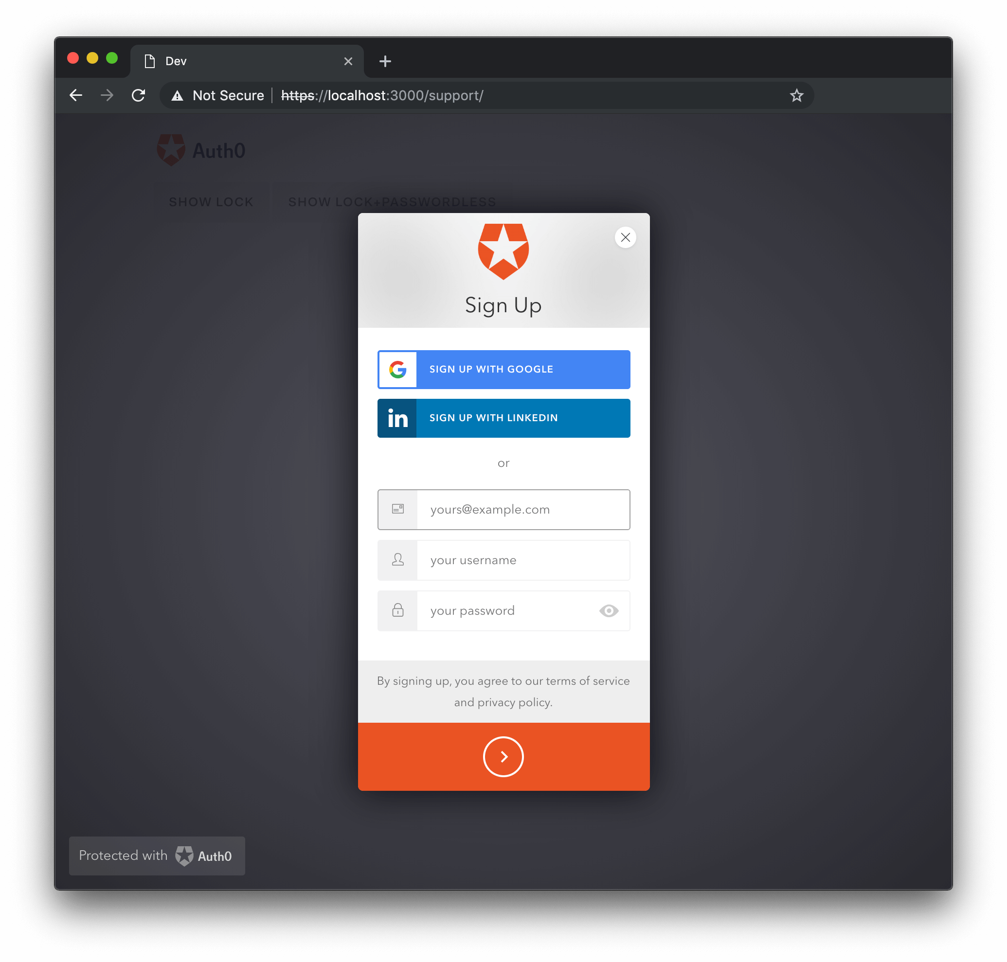
allowedConnections {Array}
Array of connections that will be used for the signin|signup|reset actions. Defaults to all enabled connections.
allowedConnections: ['Username-Password-Authentication']
allowedConnections: ['twitter', 'facebook', 'linkedin']
allowedConnections: ['qraftlabs.com']
Examples of allowedConnections:
autoclose {Boolean}
Determines whether or not the Lock will be closed automatically after a successful sign in. Defaults to false. If the Lock is not closable it won't be closed, even if this option is set to true.
autoclose: true
autofocus {Boolean}
If true, the focus is set to the first field on the widget. Defaults to false when being rendered on a mobile device, or if a container option is provided; defaults to true in all other cases.
autofocus: false
avatar {Object}
By default, Gravatar is used to fetch the user avatar and display name, but you can obtain them from anywhere with the avatar option.
var options = {
avatar: {
url: function(email, cb) {
// Obtain the avatar url for the email input by the user, Lock
// will preload the image before displaying it.
// Note that in case of an error you call cb with the error in
// the first arg instead of `null`.
var url = obtainAvatarUrl(email);
cb(null, url);
},
displayName: function(email, cb) {
// Obtain the display name for the email input by the user.
// Note that in case of an error you call cb with the error in
// the first arg instead of `null`.
var displayName = obtainDisplayName(email);
cb(null, displayName);
}
}
};Was this helpful?
Or, if you want to display no avatar at all, simply pass in null.
avatar: null
Default behavior with Gravatar:
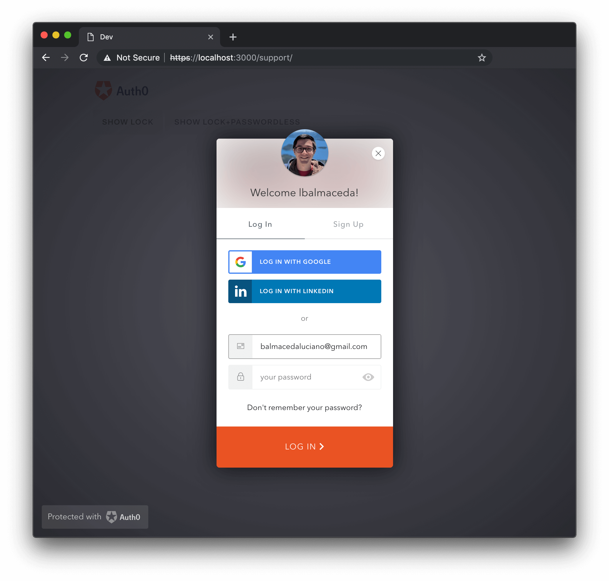
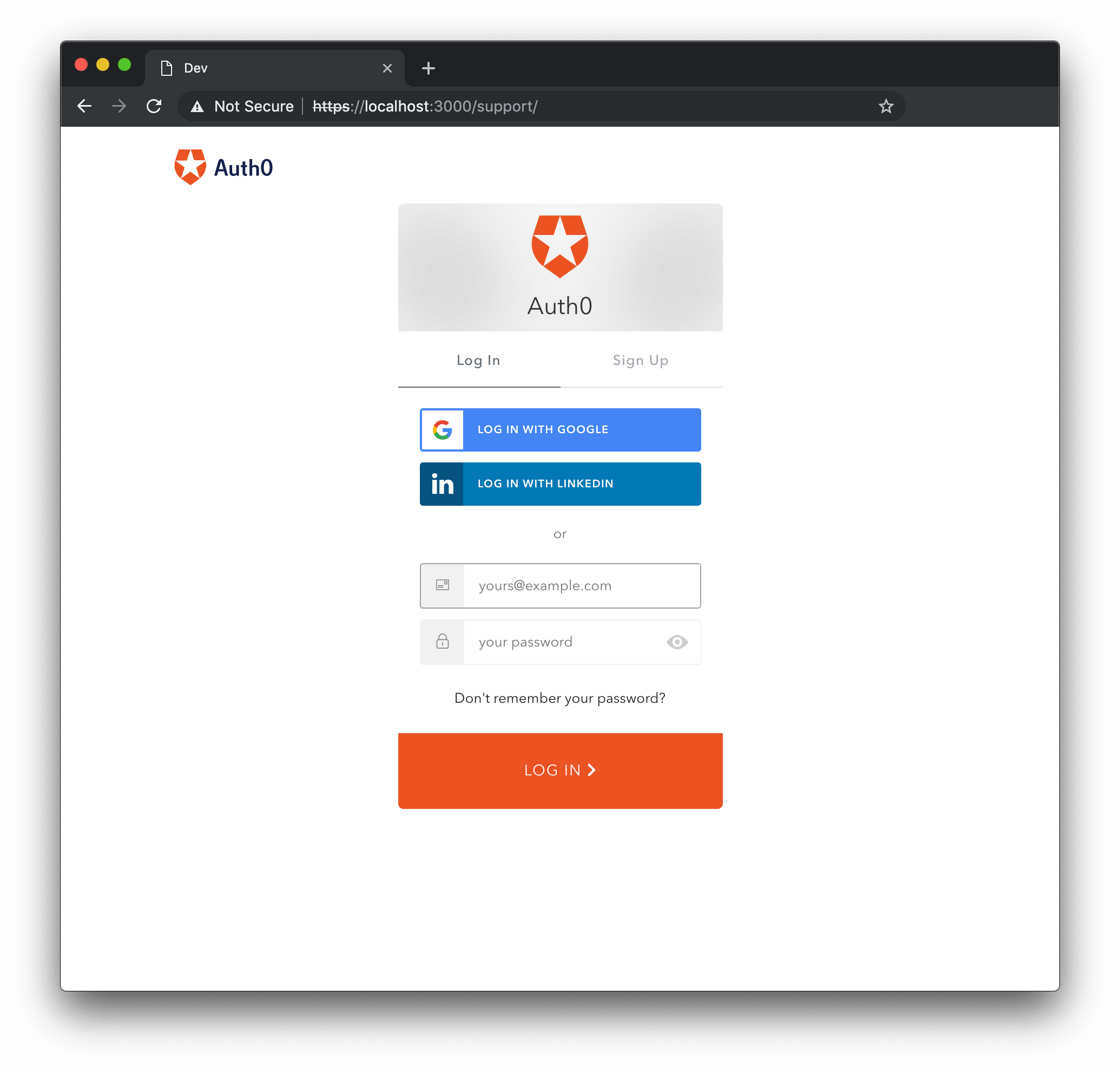
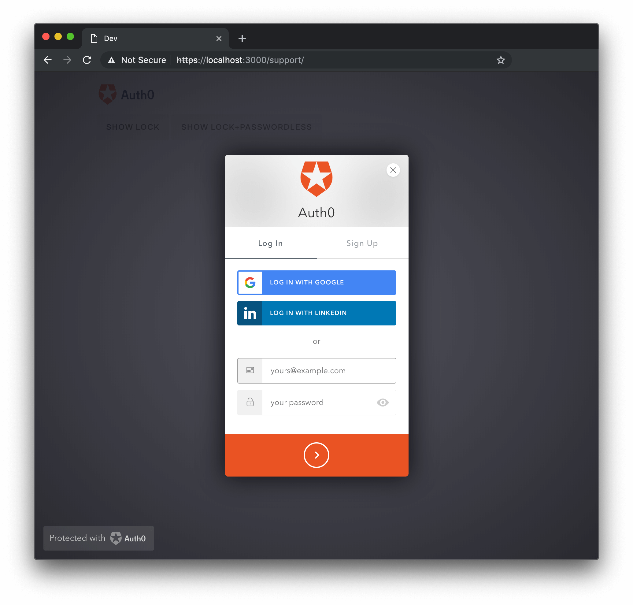
closable {Boolean}
Determines whether or not the Lock can be closed. When a container option is provided its value is always false, otherwise it defaults to true.
closable: false
container {String}
The id of the html element where the widget will be shown.
This makes the widget appear inline within your div instead of in a modal pop-out window.
<div id="hiw-login-container"></div>
<script>
var options = {
container: 'hiw-login-container'
};
// initialize
var lock = new Auth0Lock('xxxxxx', '<account>.auth0.com', options);
// render
lock.show();
</script>Was this helpful?
flashMessage {Object}
Shows an error or success flash message when Lock is shown. This object has the following properties:
type {String}: The message type, supported types are
error,info, andsuccesstext {String}: The text to show.
var options = {
flashMessage: {
type: 'success',
text: 'Welcome!'
}
};Was this helpful?
language {String}
Specifies the language of the widget. Defaults to "en". See the internationalization directory for a current list of provided languages.
language: 'es'
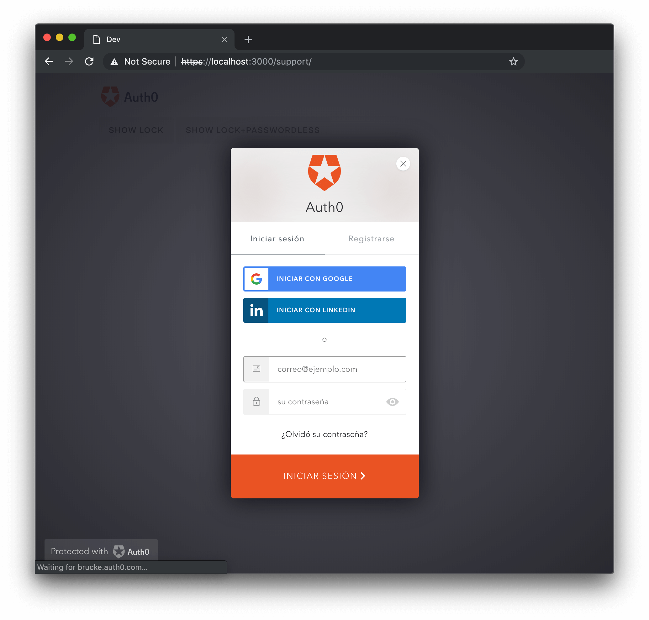
languageDictionary {Object}
Allows customization of every piece of text displayed in the Lock. Defaults to {}. See English language Language Dictionary Specification for the full list of languageDictionary values able to be altered with this object.
var options = {
languageDictionary: {
emailInputPlaceholder: "something@youremail.com",
title: "Log me in"
},
};Was this helpful?
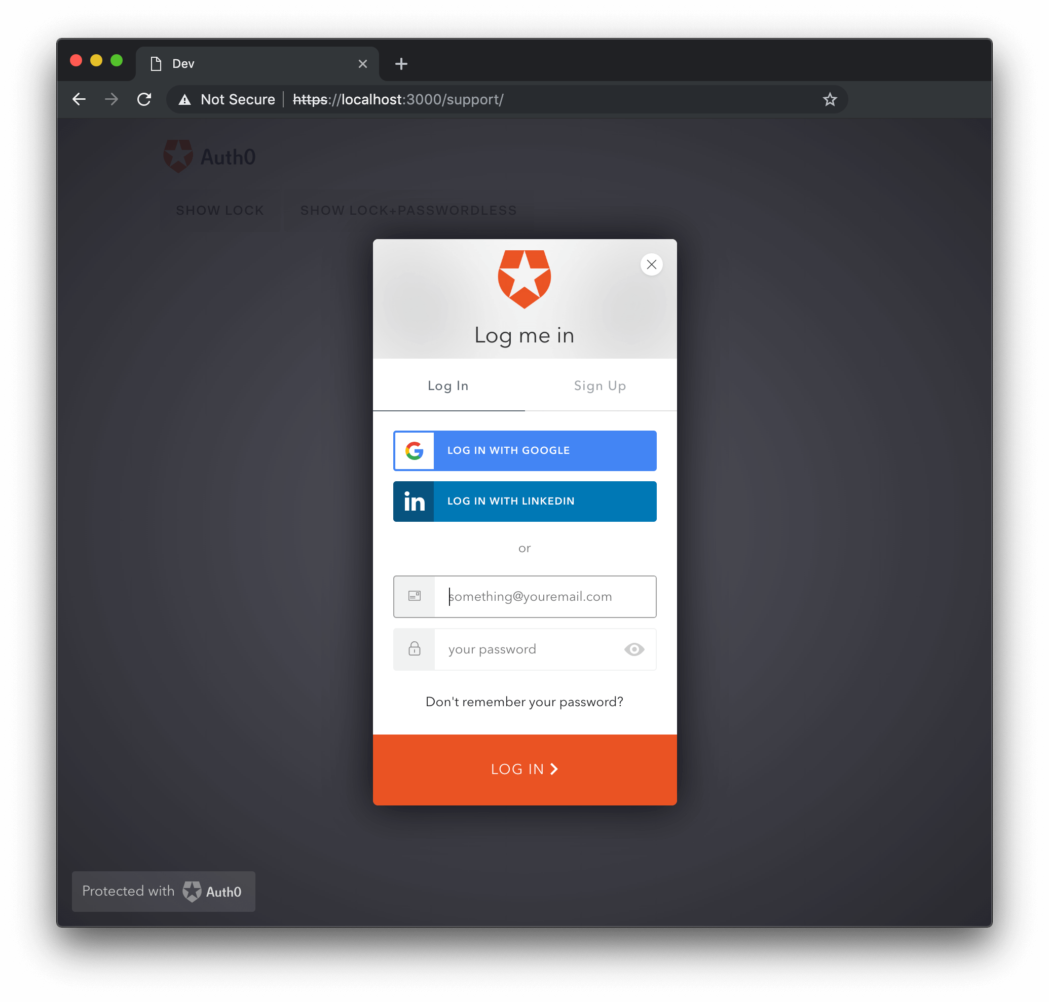
Additionally, check out the Customizing Error Messages page or the Internationalization page for more information about the use of the languageDictionary option.
popupOptions {Object}
Allows the customization the location of the popup in the screen. Any position and size feature allowed by window.open is accepted. Defaults to {}.
Options for the window.open features. This only applies if redirect is set to false.
var options = {
auth: {
redirect: false
},
popupOptions: { width: 300, height: 400, left: 200, top: 300 }
};Was this helpful?
rememberLastLogin {Boolean}
Determines whether or not to show a screen that allows you to quickly log in with the account you used the last time.
Requests Single Sign-on (SSO) data and enables a Last time you signed in with message. Defaults to true. This information comes from the user's Auth0 session, so this ability will last as long as their Auth0 session would (which is configurable).
rememberLastLogin: false
New tenants automatically have Seamless SSO enabled. With this enabled, the rememberLastLogin option will not be relevant because if there is a session in place then the Universal Login page will not be displayed at all. Using Seamless SSO is highly recommended because it provides a seamless authentication experience: users log in once and won’t have to enter credentials again when they navigate either through the applications you have built, or third party apps. If the user is not logged in they will be redirected to the login screen, as expected. Additionally, the Last time you signed in with message will not be available under the following circumstances:
You used Lock in a Hosted Login Page with the session established using Passwordless authentication.
You used Lock in an embedded login scenario where
responseType: code(indicating the Authorization Code Flow, which is used for Regular Web Apps).
scrollGlobalMessagesIntoView {Boolean}
Determines whether or not a globalMessage should be scrolled into the user's viewport. Defaults to true.
scrollGlobalMessagesIntoView: false
Theme Options
Theme options are grouped in the theme property of the options object.
var options = {
theme: {
labeledSubmitButton: false,
logo: "https://example.com/assets/logo.png",
primaryColor: "green",
authButtons: {
connectionName: {
displayName: "...",
primaryColor: "...",
foregroundColor: "...",
icon: "https://.../logo.png"
}
}
}
};Was this helpful?
authButtons {Object}
Allows the customization of buttons in Lock with custom OAuth2 connections. Each custom connection whose button you desire to customize should be listed by name, each with their own set of parameters. The customizable parameters are listed below:
displayName {String}: The name to show instead of the connection name when building the button title, such as
LOGIN WITH MYCONNECTIONfor login).primaryColor {String}: The button's background color. Defaults to
#eb5424.foregroundColor {String}: The button's text color. Defaults to
#FFFFFF.icon {String}: The URL of the icon for this connection. For example:
http://site.com/logo.png.
var options = {
theme: {
authButtons: {
"testConnection": {
displayName: "Test Conn",
primaryColor: "#b7b7b7",
foregroundColor: "#000000",
icon: "http://example.com/icon.png"
},
"testConnection2": {
primaryColor: "#000000",
foregroundColor: "#ffffff",
}
}
}
};Was this helpful?
labeledSubmitButton {Boolean}
This option indicates whether or not the submit button should have a label, and defaults to true. When set to false, an icon will be shown instead.
var options = {
theme: {
labeledSubmitButton: false
}
};Was this helpful?
If the label is set to true, which is the default, the label's text can be customized through the languageDictionary option.
logo {String}
The value for logo is a URL for an image that will be placed in the Lock's header, and defaults to Auth0's logo. It has a recommended max height of 58px for a better user experience.
var options = {
theme: {
logo: 'https://example.com/logo.png'
}
};Was this helpful?
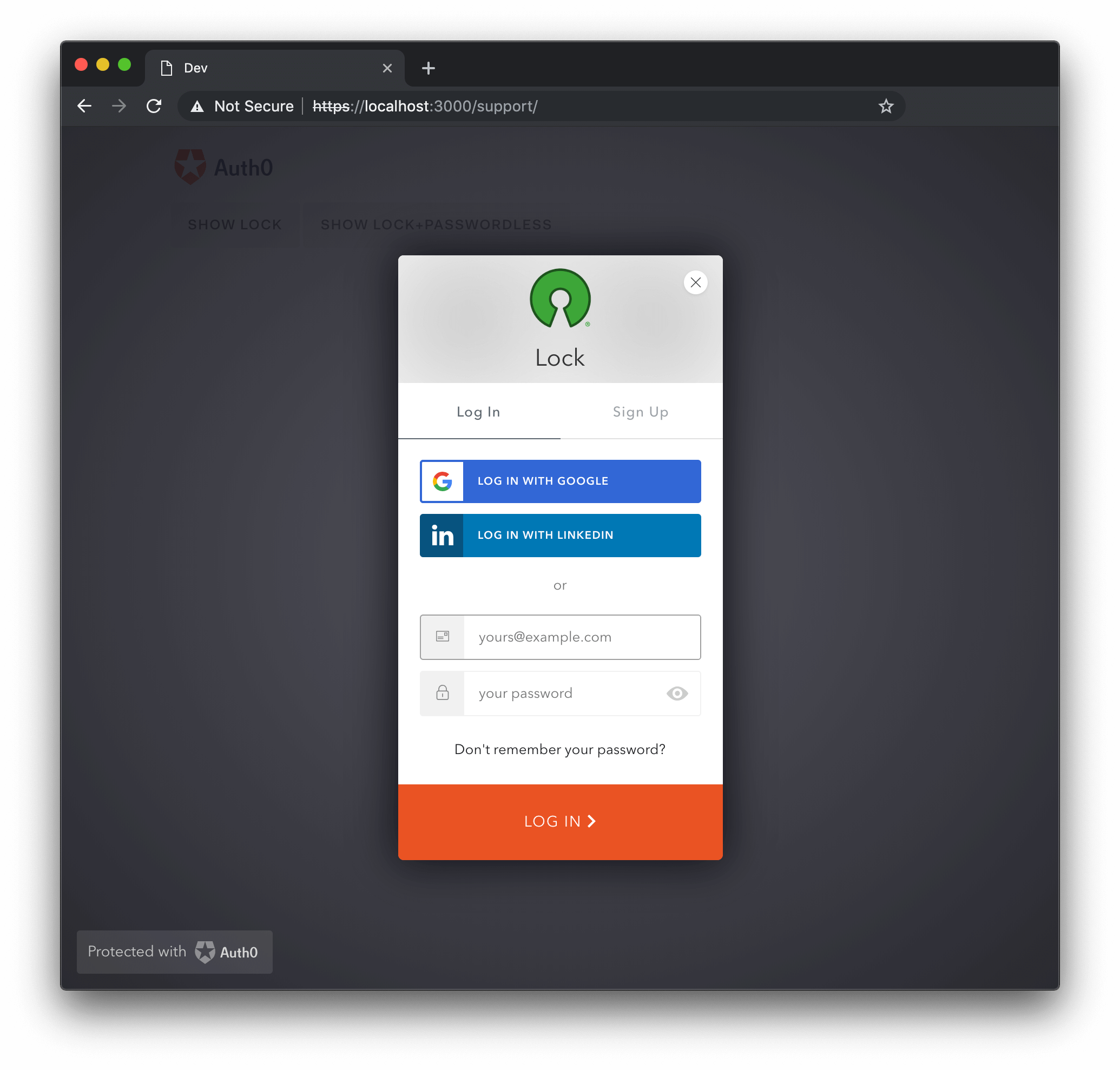
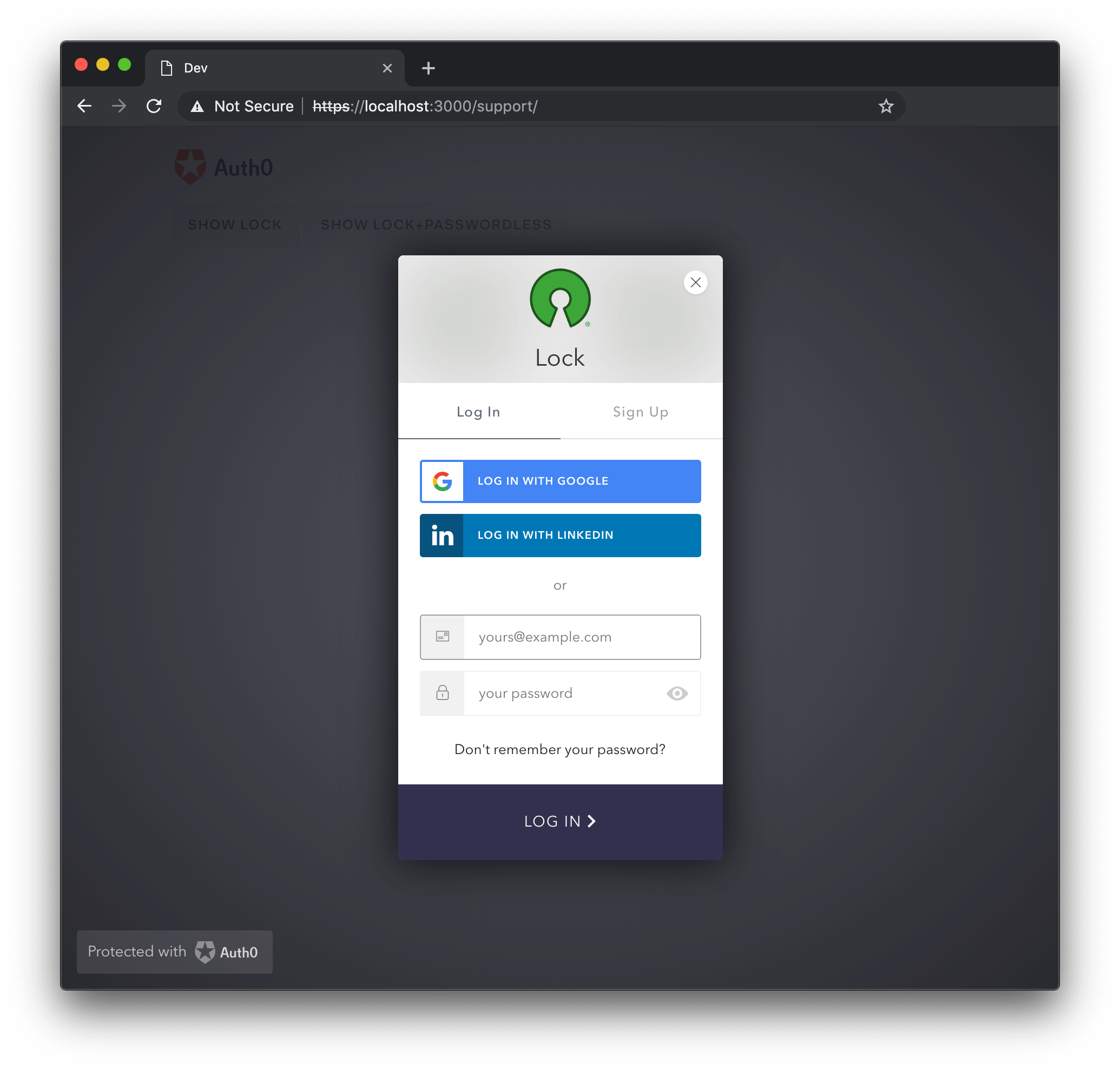
primaryColor {String}
The primaryColor property defines the primary color of the Lock; all colors used in the widget will be calculated from it. This option is useful when providing a custom logo, to ensure all colors go well together with the logo's color palette. Defaults to #ea5323.
var options = {
theme: {
logo: 'https://example.com/logo.png',
primaryColor: '#31324F'
}
};Was this helpful?
Authentication Options
Authentication options are grouped in the auth property of the options object.
The default scope used by Lock is openid profile email.
var options = {
auth: {
params: {
param1: "value1",
scope: "openid profile email"
},
autoParseHash: true,
redirect: true,
redirectUrl: "some url",
responseMode: "form_post",
responseType: "token",
sso: true,
connectionScopes: {
connectionName: [ 'scope1', 'scope2' ]
}
}
};Was this helpful?
audience {String}
The audience option indicates the API which will be consuming the Access Token that is received after authentication.
var options = {
auth: {
audience: 'https://{yourDomain}/userinfo',
}
}Was this helpful?
autoParseHash {Boolean}
When autoParseHash is set to true, Lock will parse the window.location.hash string when instantiated. If set to false, you'll have to manually resume authentication using the resumeAuth method.
var options = {
auth: {
autoParseHash: false
}
};Was this helpful?
connectionScopes {Object}
This option allows you to set scopes to be sent to the oauth2/social connection for authentication.
var options = {
auth: {
connectionScopes: {
'facebook': ['scope1', 'scope2']
}
}
};Was this helpful?
A listing of particular scopes for your social connections can be acquired from the provider in question. For example, Facebook for Developers reference has a listing of separate permissions that can be requested for your connection.
params {Object}
You can send parameters when starting a login by adding them to the options object. The example below adds a state parameter with a value equal to foo and also adds a scope parameter (which includes the scope, and then the requested attributes).
var options = {
auth: {
params: {
state: 'foo',
scope: 'openid email user_metadata app_metadata picture'
}
}
};Was this helpful?
For more details about supported parameters, see Lock Authentication Parameters.
redirect {Boolean}
Defaults to true. When set to true, redirect mode will be used. If set to false, popup mode is chosen.
var options = {
auth: {
redirect: false
}
};Was this helpful?
redirectUrl {String}
The URL Auth0 will redirect back to after authentication. Defaults to the empty string "" (no redirect URL).
var options = {
auth: {
redirectUrl: 'http://testurl.com'
}
};Was this helpful?
When the redirectUrl is provided (set to non blank value) the responseType option will be defaulted to code if not manually set.
responseMode {String}
Should be set to "form_post" if you want the code or the token to be transmitted via an HTTP POST request to the redirectUrl, instead of being included in its query or fragment parts.
Otherwise, this option should be omitted, and is omitted by default.
var options = {
auth: {
responseMode: 'form_post'
}
};Was this helpful?
responseType {String}
The value of responseType should be set to "token" for Single-Page Applications, and "code" otherwise. Defaults to "code" when redirectUrl is provided, and to "token" otherwise.
var options = {
auth: {
responseType: 'token'
}
};Was this helpful?
When the responseType is set to code, Lock will never show the Last time you logged in with message, and will always prompt the user for credentials.
sso {Boolean}
Defaults to true. When set to true, enables Single Sign-On in Lock.
var options = {
auth: {
sso: false
}
};Was this helpful?
Database Options
additionalSignUpFields {Array}
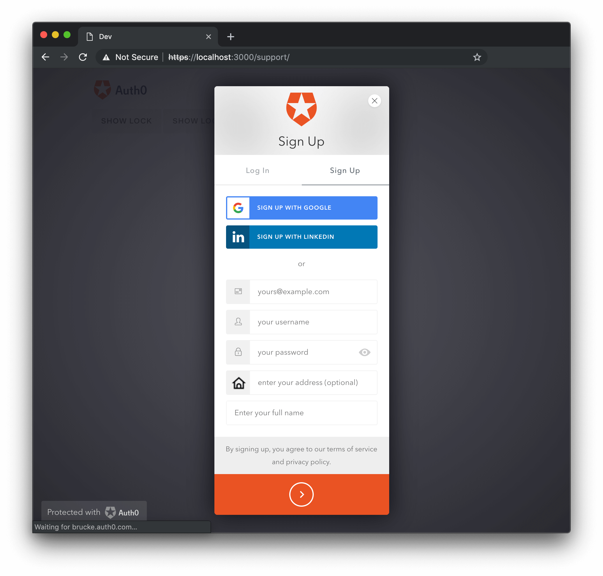
Extra input fields can be added to the sign up screen with the additionalSignUpFields option. Each option added in this manner will then be added to that user's user_metadata. To learn more, read Understand How Metadata Works in User Profiles. Every input must have a name and a placeholder, and an icon URL can also be provided. Also, the initial value can be provided with the prefill option, which can be a string with the value or a function that obtains it. Other options depend on the type of the field, which is defined via the type option and defaults to "text".
Option additionalSignUpFields Intended for use with database signup only
The additionalSignUpFields are intended for use with database signups only. If you have social sign ups too, you can ask for the additional information after the users sign up (see this page about custom signup for more details). You can use the databaseAlternativeSignupInstructions i18n key to display these instructions.
The new fields are rendered below the regular sign up input fields in the order they are provided.
Text Fields
Text fields are the default type of additional signup field. Note that a validator function can also be provided.
var options = {
additionalSignUpFields: [{
name: "address",
placeholder: "enter your address",
// The following properties are optional
icon: "https://example.com/assests/address_icon.png",
prefill: "street 123",
validator: function(address) {
return {
valid: address.length >= 10,
hint: "Must have 10 or more chars" // optional
};
}
},
{
name: "full_name",
placeholder: "Enter your full name"
}]
}Was this helpful?
If you don't specify a validator the text field will be required. If you want to make the text field optional, use a validator that always returns true like this:
var options = {
additionalSignUpFields: [{
name: "favorite_color",
placeholder: "Enter your favorite color (optional)",
validator: function() {
return true;
}
}]
}Was this helpful?
If you want to save the value of the attribute in the root of your profile, use storage: 'root'. Only a subset of values can be stored this way. The list of attributes that can be added to your root profile is here. By default, every additional sign up field is stored inside the user_metadata object.
var options = {
additionalSignUpFields: [{
name: "name",
storage: "root"
}]
};Was this helpful?
Select Field
The signup field type: "select" will allow you to use select elements for the user to choose a value from.
var options = {
additionalSignUpFields: [{
type: "select",
name: "location",
placeholder: "choose your location",
options: [
{value: "us", label: "United States"},
{value: "fr", label: "France"},
{value: "ar", label: "Argentina"}
],
// The following properties are optional
icon: "https://example.com/assests/location_icon.png",
prefill: "us"
}]
}Was this helpful?
The options array items for select fields must adhere to the following format:
{label: “non empty string”, value: “non empty string”}, and at least one option must be defined.
The options and prefill values can be provided through a function:
var options = {
additionalSignUpFields: [{
type: "select",
name: "location",
placeholder: "choose your location",
options: function(cb) {
// obtain options, in case of error you call cb with the error in the
// first arg instead of null
cb(null, options);
},
icon: "https://example.com/assests/location_icon.png",
prefill: function(cb) {
// obtain prefill, in case of error you call cb with the error in the
// first arg instead of null
cb(null, prefill);
}
}]
}Was this helpful?
Checkbox Field
The third type of custom signup field is the type: "checkbox". The prefill value can determine the default state of the checkbox (true or false), and it is required.
var options = {
additionalSignUpFields: [{
type: "checkbox",
name: "newsletter",
prefill: "true",
placeholder: "I hereby agree that I want to receive marketing emails from your company"
}]
}Was this helpful?
Hidden field
The signup field type: "hidden" will allow you to use a hidden input with a fixed value.
var options = {
additionalSignUpFields: [{
type: "hidden",
name: "signup_code",
value: "abc123"
}]
}Was this helpful?
Some use cases may be able to use additionalSignUpFields data for email templates, such as an option for language preferences, the value of which could then be used to set the language of templated email communications.
allowLogin {Boolean}
When set to false the widget won't display the login screen. This is useful if you want to use the widget just for signups (the login and signup tabs in the signup screen will be hidden) or to reset passwords (the back button in the forgot password screen will be hidden). In such cases you may also need to specify the initialScreen, allowForgotPassword and allowSignUp options. It defaults to true.
allowLogin: false
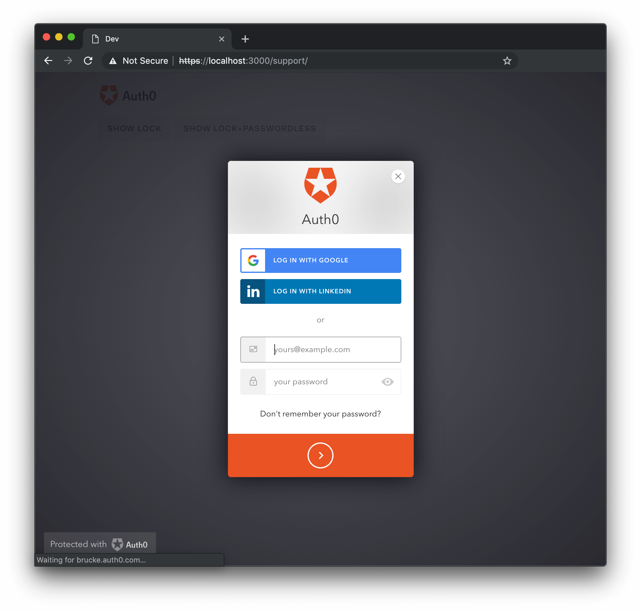
allowForgotPassword {Boolean}
When set to false, allowForgotPassword hides the "Don't remember your password?" link in the Login screen, making the Forgot Password screen unreachable. Defaults to true. If you are using a database connection with a custom database which doesn't have a change password script the Forgot Password screen won't be available.
allowForgotPassword: false
allowSignUp {Boolean}
When set to false, hides the login and sign up tabs in the login screen, making the sign up screen unreachable. Defaults to true. Keep in mind that if the database connection has sign ups disabled or you are using a custom database which doesn't have a create script, then the sign up screen won't be available.
Also bear in mind that this option only controls client-side appearance, and does not completely stop new sign ups from determined anonymous visitors. If you are looking to fully prevent new users from signing up, you must use the Disable Sign Ups option in the dashboard, in the connection settings.
allowSignUp: false
defaultDatabaseConnection {String}
Specifies the database connection that will be used when there is more than one available.
defaultDatabaseConnection: 'test-database'
initialScreen {String}
The name of the screen that will be shown when the widget is opened. Valid values are login, signUp, and forgotPassword. If this option is left unspecified, the widget will default to the first screen that is available from that list.
initialScreen: 'forgotPassword'
loginAfterSignUp {Boolean}
Determines whether or not the user will be automatically signed in after a successful sign up. Defaults to true.
loginAfterSignUp: false
forgotPasswordLink {String}
Set the URL for a page that allows the user to reset their password. When set to a non-empty string, the user will be sent to the provided URL when clicking the "Don't remember your password?" link in the login screen.
forgotPasswordLink: 'https://yoursite.com/reset-password'
showTerms {Boolean}
When set to true displays the languageDictionary.signUpTerms string. Defaults to true.
showTerms: false
mustAcceptTerms {Boolean}
When set to true displays a checkbox input alongside the terms and conditions that must be checked before signing up. The terms and conditions can be specified via the languageDictionary option. This option will only take effect for users signing up with database connections. Defaults to false.
mustAcceptTerms: true
prefill {Object}
Allows to set the initial value for the email and/or username inputs. When omitted, no initial value will be provided.
var options = {
prefill: {
email: "someone@auth0.com",
username: "someone",
phoneNumber: "+1234567890"
}
};Was this helpful?
signUpLink {String}
Set the URL to be requested when clicking on the Signup button. When set to a non empty string, this option forces allowSignUp to true.
signUpLink: 'https://yoursite.com/signup'
usernameStyle {String}
Determines what will be used to identify the user for a Database connection that has the requires_username flag set (if it is not set, usernameStyle option will be ignored). Possible values are "username" and "email". By default both username and email are allowed; setting this option will limit logins to use one or the other.
usernameStyle: 'username'
Enterprise Options
defaultEnterpriseConnection {String}
Specifies the enterprise connection which allows to login using a username and a password that will be used when there is more than one available or there is a database connection. If a defaultDatabaseConnection is provided the database connection will be used and this option will be ignored.
defaultEnterpriseConnection: 'test-database'
defaultADUsernameFromEmailPrefix {Boolean}
Resolve the AD placeholder username from the email's prefix. Defaults to true.
defaultADUsernameFromEmailPrefix: false
Passwordless Options
passwordlessMethod {String}
When using Auth0LockPasswordless with an email connection, you can use this option to pick between sending a code or a magic link to authenticate the user. Available values for email connections are code and link. Defaults to code. SMS passwordless connections will always use code.
passwordlessMethod: code
Other Options
configurationBaseUrl {String}
Overrides the application settings base URL. By default, it uses the provided domain. This option is only necessary if your specific use case dictates that your application does not use the default behavior.
configurationBaseUrl: "https://www.example.com"
languageBaseUrl {String}
Overrides the language source url for Auth0's provided translations. By default, this option uses Auth0's CDN URL https://cdn.auth0.com since this is where all of the provided translations are stored. By providing another value, you can use another source for the language translations if needed.
languageBaseUrl: "https://www.example.com"
hashCleanup {Boolean}
When the hashCleanup option is enabled, it will remove the hash part of the callback URL after the user authentication. It defaults to true.
hashCleanup: false
connectionResolver {Function}
When in use, provides an extensibility point to make it possible to choose which connection to use based on the username information.
Has username, context, and callback as parameters. The callback expects an object like: {type: 'database', name: 'connection name'}. This only works for database connections. Keep in mind that this resolver will run in the form's onSubmit event, so keep it simple and fast.
This is a beta feature. If you find a bug, please open a GitHub issue.
leeway {Integer}
The leeway option can be set to an integer - a value in seconds - which can be used to account for clock skew in ID Token expirations. Typically the value is no more than a minute or two at maximum.
leeway: 30