
In this tutorial series, you'll be provided with a practical introduction to how Next.js can help you build web applications.
Created by ZEIT, a cloud company for hosting frontends and serverless functions, Next.js is a React framework capable of creating applications that run both on the client and the server, otherwise known as Universal JavaScript applications. This framework helps you build universal apps faster by streamlining basic features like client-side routing and page layout while simplifying advance features like server-side rendering and code splitting.
Part one of this Nextjs series shows developers how to create pages and layouts. In the second part of the series, you learned how to add styling and create themes. In this third part of the series, you'll learn how to navigate to pages and implement routing using using Next.js 9, the most recent framework version at the time of writing. Familiarity with the React library is recommended.
Setting Up the Project
If you are starting from this part, you can get the app that was built in the previous, second part by cloning the repo and checking out the part-2 branch:
git clone git@github.com:auth0-blog/whatabyte-next-intro.git whatabyte
cd whatabyte
git checkout part-2
If you haven't connected to GitHub using SSH, please clone the repo with the HTTPS URL:
git clone https://github.com/auth0-blog/whatabyte-next-intro.git whatabyte
cd whatabyte
git checkout part-2
The repository is cloned into the directory called whatabyte on your local machine. If the directory doesn't exist, it is created.
With the branch checked out, proceed to install the project dependencies:
npm install
Finally, execute the following command in your terminal to run the app:
npm run dev
To see the app in action and start following the tutorial, visit http://localhost:3000 on your browser.
Understanding Next.js Routing
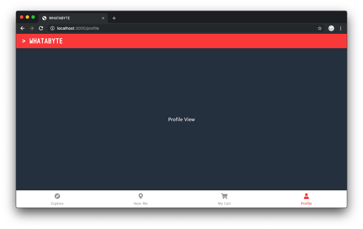
The WHATABYTE app has four core routes:
/explore: To show trending restaurants and dishes/nearme: To show restaurants near the user/mycart: To show the orders of the user/profile: To show the user information such as name, address, and billing data
From these four core routes, the /explore route will be the main route. Thus, the root path, /, should redirect to /explore.
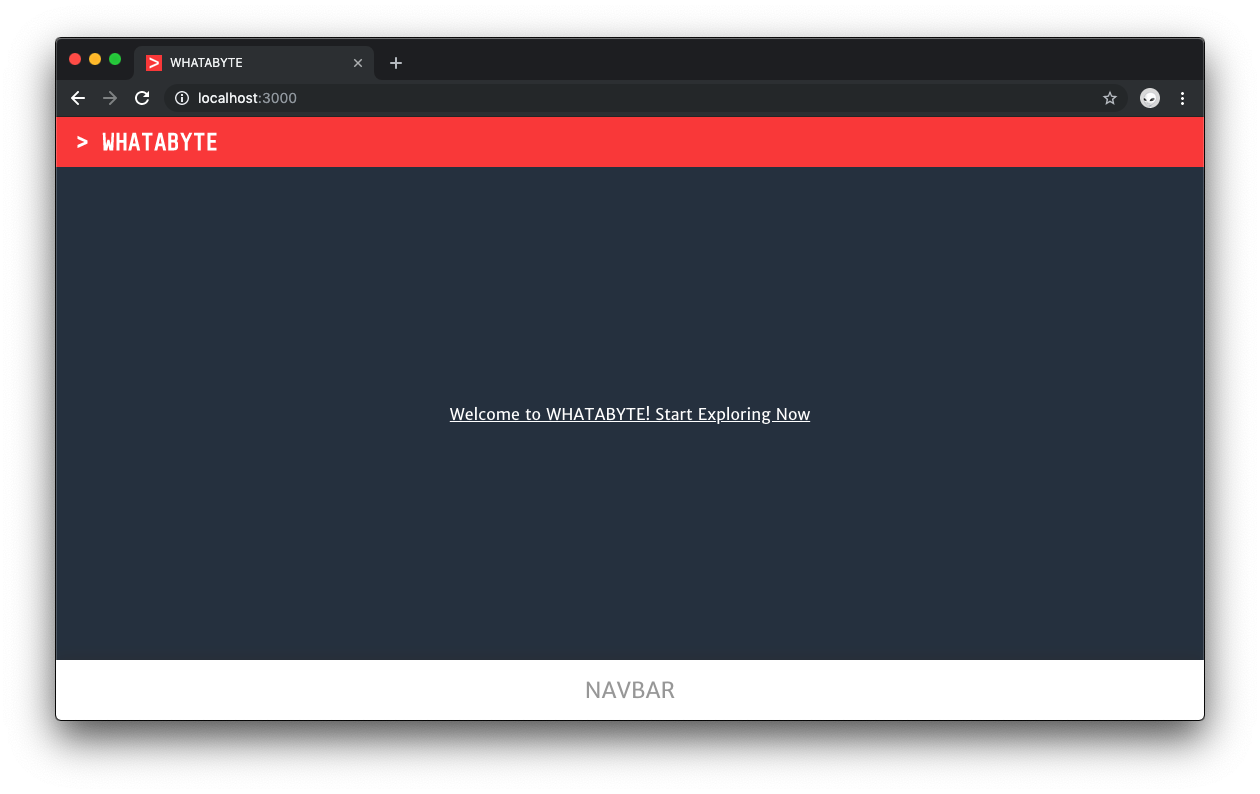
First, to get familiar with navigation in Next.js, you'll navigate to the Explore page from the Index page by adding a hyperlink inside the content container of the Index page. You can do this easily by using the Next.js Link component inside index.js as follows:
// pages/index.js
import Link from "next/link";

import Layout from "../components/Layout";

const Index = () => (
  <Layout>
    <br />
    <Link href="/explore">
      <a> Welcome to WHATABYTE! Start Exploring Now</a>
    </Link>
  </Layout>
);

export default Index;
The Next.js Link component takes a route or navigation path as the value of its href property. You can embed any other component within Link as long as that component can take an href prop.
After the view updates in the browser, visit http://localhost:3000/ and click on the link. It will take you to the Explore page.
Using this link to navigate to another page is good for testing but what the app needs is navigation through the NavBar component. To do so, you'd need a NavButton component to make the creation of four navigation buttons standard and easy to maintain.
To make the buttons look nice, you'll use the FontAwesome icons. Using another console window or tab, install the following packages:
npm i @fortawesome/fontawesome-svg-core \
  @fortawesome/free-solid-svg-icons \
  @fortawesome/react-fontawesome
- Windows PowerShell:
npm i @fortawesome/fontawesome-svg-core `
  @fortawesome/free-solid-svg-icons `
  @fortawesome/react-fontawesome
Creating the navigation bar dynamically would be much easier if you can encapsulate all of its configuration in a file. Under the whatabyte directory, create a config subdirectory:
mkdir config
Within that new subdirectory, create a buttons.js file within it:
touch config/buttons.js
- Windows PowerShell:
ni config/buttons.js
Then, populate buttons.js as follows:
// config/buttons.js

import React from "react";
import { FontAwesomeIcon } from "@fortawesome/react-fontawesome";
import {
  faCompass,
  faMapMarkerAlt,
  faUser,
  faShoppingCart
} from "@fortawesome/free-solid-svg-icons";

const navButtons = [
  {
    label: "Explore",
    path: "/explore",
    icon: <FontAwesomeIcon icon={faCompass} />
  },
  {
    label: "Near Me",
    path: "/nearme",
    icon: <FontAwesomeIcon icon={faMapMarkerAlt} />
  },
  {
    label: "My Cart",
    path: "/mycart",
    icon: <FontAwesomeIcon icon={faShoppingCart} />
  },
  {
    label: "Profile",
    path: "/profile",
    icon: <FontAwesomeIcon icon={faUser} />
  }
];

export default navButtons;
Then, under the components directory, create a NavButton.js file that exports the NavButton component:
touch components/NavButton.js
- Windows PowerShell:
ni components/NavButton.js
Then, populate NavButton.js with the following:
// components/NavButton.js

import Link from "next/link";

import "./NavButton.scss";

const NavButton = props => (
  <Link href={props.path}>
    <div className="NavButton">
      <div className="Icon">{props.icon}</div>
      <span className="Label">{props.label}</span>
    </div>
  </Link>
);

export default NavButton;
The NavButton needs its proper styling. Create NavButton.scss as a sibling file:
touch components/NavButton.scss
- Windows PowerShell:
ni components/NavButton.scss
Then, populate NavButton.scss with the following style rules:
// components/NavButton.scss

.NavButton {
  display: flex;
  flex-direction: column;
  justify-content: space-around;
  align-items: center;

  height: 100%;

  cursor: pointer;

  .Icon {
    font-size: 20px;
  }

  .Label {
    font-size: 12px;
    text-transform: capitalize;
  }
}
Import the button configuration file in the Layout component and pass its data as the navButtons props to the NavBar component:
// components/Layout.js
import Head from "next/head";

import Header from "./Header";
import NavBar from "./NavBar";

import "./Layout.scss";
import "./index.scss";

import navButtons from "../config/buttons";

const Layout = props => {
  const appTitle = `> WHATABYTE`;

  return (
    <div className="Layout">
      <Head>
        <title>WHATABYTE</title>
        <meta name="viewport" content="width=device-width, initial-scale=1" />
        <meta charSet="utf-8" />
      </Head>

      <Header appTitle={appTitle} />
      <div className="Content">{props.children}</div>
      <NavBar navButtons={navButtons} />
    </div>
  );
};

export default Layout;
It's better for the Layout component to be the one responsible for passing the button configuration to the NavBar component as it is in charge of enforcing a consistent structure for each page of the application. If you wanted to keep Layout as a presentational component, then you could wrap it into a container component that passes it the button configuration data.
To render the buttons within the NavBar component, update the content of the NavBar.js file as follows:
// components/NavBar.js

import "./NavBar.scss";
import NavButton from "./NavButton";

const NavBar = props => (
  <div className="NavBar">
    {props.navButtons.map(button => (
      <NavButton
        key={button.path}
        path={button.path}
        label={button.label}
        icon={button.icon}
      />
    ))}
  </div>
);

export default NavBar;
If your app is not running, execute npm run dev in the terminal. Otherwise, visit http://localhost:3000/ directly and then click on the Profile button. You'll be taken to the Profile page. Try using the other navigation buttons.
If the labels and icons of the buttons look too big, refresh the page.
Did you notice a bit of delay when you navigated from page to page? If you look at the terminal window or tab where the server is running, you may see a message from Next.js explaining that the pages need to be compiled when you first load them, causing a small delay:
Note that pages will be compiled when you first load them.
The navigation bar becomes much more functional and expressive by having those buttons with icons and labels on them. However, adding a visual indicator of what view is active by looking at the navbar would further improve the user experience. You'll learn how to do that in the next section by applying the .active CSS class to NavButton components dynamically.
“Learn how to add navigation and routing to Next.js apps.”
Tweet This
Using High-Order Components with Next.js
The Next.js Link component has two main props:
hrefspecifies a path inside thepagesdirectory to use as a route.asis used to customize the path rendered in the browser URL bar.There's no "active" class prop that we can pass to it. To style it, you need to do so within its underlying components.
The Next.js router keeps track of the active page through a router.pathname property. To inject the pathname prop in your component, you can use the withRouter higher-order component. Using this prop with conditional styling will let you have a distinctive style for the active page button.
Open components/NavButton.js and update its content to this:
// components/NavButton.js

import Link from "next/link";
import { withRouter } from "next/router";

import "./NavButton.scss";

const NavButton = props => (
  <Link href={props.path}>
    <div
      className={`NavButton ${
        props.router.pathname === props.path ? "active" : ""
      }`}
    >
      <div className="Icon">{props.icon}</div>
      <span className="Label">{props.label}</span>
    </div>
  </Link>
);

export default withRouter(NavButton);
If the path prop matches the router.pathname prop, the active class is added to the NavButton class name. Save your changes and test the navigation buttons in the browser. Once you click on a button, its icon lights up into an orange-red-like color.
Recap
In this part of the tutorial, you have learned how to use Next.js built-in components to navigate to pages within your app and to represent the state of the router through navigation UI elements.
You've done a lot so far throughout this tutorial and there is a lot more than could be done using Next.js! The last part of this practical introduction to Next.js will teach you how to create a login page and add user authentication to your app using Passport.js and Auth0.
Again, you can reference Part 2 for adding styling and creating themes, here and Part 1 for creating pages and a page layout
Can't wait to learn about Next.js authentication? Feel free to read Bruno's Next.js Authentication Tutorial.
About Auth0
Auth0 by Okta takes a modern approach to customer identity and enables organizations to provide secure access to any application, for any user. Auth0 is a highly customizable platform that is as simple as development teams want, and as flexible as they need. Safeguarding billions of login transactions each month, Auth0 delivers convenience, privacy, and security so customers can focus on innovation. For more information, visit https://auth0.com.
About the author

Dan Arias
Software Engineer (Auth0 Alumni)