


Storybook lets us interactively develop and test user interface components without having to run an application. Because Storybook acts as a component library with its own Webpack configuration, we can develop in isolation without worrying about project dependencies and requirements.
In this post, you are going to learn how to integrate Storybook with an existing Vue.js project by using the popular Kanban Board Progressive Web App (PWA), available on GitHub, created by my teammate Steve Hobbs. This process can be followed for a new Vue project as well.
Running the Kanban Board Project
Execute these commands to get the Kanban Board project up and running locally:
git clone git@github.com:elkdanger/kanban-board-pwa.git
cd kanban-board-pwa/
npm install
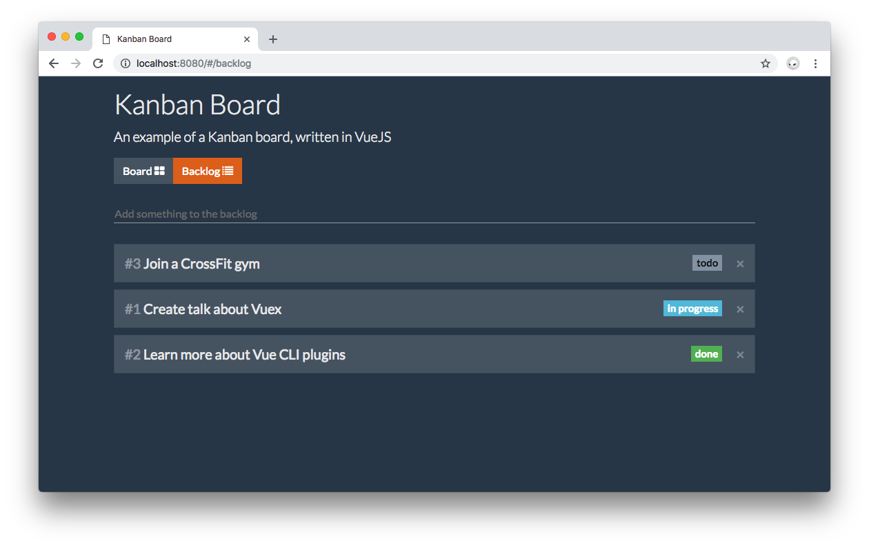
npm run devTo see the application running, open http://localhost:8080 in your browser:
You don't have to run the app to use Storybook. If you prefer, you can stop it and close the browser tab.
Finally, open the kanban-board-pwa project in your preferred IDE or code editor.
Setting Up Storybook with Vue
With kanban-board-pwa as your current working directory, run the following command to install Storybook using npm:
npm i --save-dev @storybook/vueStorybook also requires that you have vue and babel-core installed. Since the kanban-board-pwa was created using the Vue CLI, these two dependencies are already installed.
Finally, create an npm script that lets you start and run Storybook easily. Under the scripts section of your package.json file, add the following:
{
  // ...
  "scripts": {
    // ...
    "storybook": "start-storybook -p 9001 -c .storybook"
  }
  // ...
}
The -p command argument specifies the port where Storybook is going to run locally: in this case 9001. The -c command argument tells Storybook to look for a .storybook directory for configuration settings. You'll do that next.
Configuring Storybook with Vue
Storybook can be configured in many different ways. As a best practice, its configuration should be stored in a directory called .storybook. Create that directory under your root folder:
.
├── .babelrc
├── .dockerignore
├── .editorconfig
├── .eslintignore
├── .eslintrc.js
├── .git
├── .gitignore
├── .idea
├── .postcssrc.js
├── .storybook // Storybook config directory
├── Dockerfile
├── LICENSE
├── README.md
├── build
├── config
├── index.html
├── node_modules
├── package-lock.json
├── package.json
├── screenshots
├── src
└── static
Within .storybook, create a config.js file to hold all the configuration settings. Here, you have to define critical elements that would make Storybook aware of your Vue application.
Defining Vue
Similar to the src/main.js file, you we need to import vue. Update config.js as follows:
// .storybook/config.js

import Vue from 'vue';
Defining Vue Components
Just like it's done for Vue projects, you need to import and globally register with Vue.component any of your global custom components. Update the config.js to import and register the TaskLaneItem component:
// .storybook/config.js

import Vue from 'vue';

// Import your custom components.
import TaskLaneItem from '../src/components/TaskLaneItem';

// Register custom components.
Vue.component('item', TaskLaneItem);
This has to be done because Storybook runs in isolation from the Vue application. Take note that components registered locally are brought in automatically. These are components that are registered using the components property of a Vue component object. For example:
new Vue({
  el: '#app',
  components: {
    'component-a': ComponentA,
    'component-b': ComponentB
  }
});
ComponentA and ComponentB are registered locally under #app.
TaskLaneItem is a global custom component so you have to import it and register it with Vue in order to instantiate it independently within Storybook.
Configuring and Loading Stories
You need to import the configure method from @storybook/vue to run Storybook and implement it to load stories (you'll learn what stories are soon):
// .storybook/config.js

import { configure } from '@storybook/vue';

import Vue from 'vue';

// Import your custom components.
import TaskLaneItem from '../src/components/TaskLaneItem';

// Register custom components.
Vue.component('item', TaskLaneItem);

function loadStories() {
  // You can require as many stories as you need.
}

configure(loadStories, module);
Storybook works in a similar way to testing tools. The config.js file executes the configure method, which takes as argument a function called loadStories and a module. loadStories will have stories defined on its body.
A story describes a component in a specified state. You'd want to write a story for each state a component can have, such as active, inactive, loading, etc. Storybook will then let you preview the component in its specified state in an interactive component library. You'll soon be setting that up.
For better project management, it's ideal to store the stories next to the components. Within src, create a stories.js file to host all the stories you'll use. Then, you can use the stories.js file to quickly load the stories in the config.js file like so:
// .storybook/config.js

// ...

function loadStories() {
  // You can require as many stories as you need.
  require('../src/stories');
}

configure(loadStories, module);
When loadStories is run, Storybook will import all the stories present in src/stories.js and execute them. This makes the maintenance of the config.js file much easier by keeping it highly focused on the configuration of Storybook rather than its implementation. All the action, for now, happens within the src/stories.js file.
All custom components and Vue plugins should be registered before calling
configure().
"Storybook lets us interactively develop and test user interface components without having to run an application. Learn more about how to integrate it with VueJS."
Tweet This

Writing Storybook Stories for Vue
It's time to start writing Storybook stories and bring the component library to life. Head to src/stories.js and start it like so:
// src/stories.js

import { storiesOf } from '@storybook/vue';

storiesOf('TaskLaneItem', module);
So far, the storiesOf method is imported. This method will help you create stories for a component, in this case, you are using the TaskLaneItem component to fulfill that role. You don't need to import it into src/stories.js because TaskLaneItem has already been registered globally with Vue.component. Using, Storybook's declarative language, you tell it that you want stories of TaskLaneItem:
storiesOf('TaskLaneItem', module);If you think about this process in terms of an actual book, this is the book's binding and cover. Now, you need to fill it with pages full of stories. You can do that declaratively too using the add method:
// src/stories.js

import { storiesOf } from '@storybook/vue';

storiesOf('TaskLaneItem', module).add('Default TaskLaneItem', () => ({
  template: '<item :item="{id: 10, text: \'This is a test\'}"></item>'
}));
add acts like adding a chapter in a book that has a story. You'd want to give each chapter a title. In this case, you are creating a story titled Default TaskLaneItem. add takes as argument the story title and a function that renders the component being staged. In this case, the component is just a Vue component definition object with the template option specified.
Very important note: The tag name used in the template to represent the component is the name you used when you registered the component in .storybook/config.js with Vue.component:
// Register custom components.
Vue.component('item', TaskLaneItem);
This Vue component definition object can be refactored to make it more modular by making id and text discreet props:
// src/stories.js

import { storiesOf } from '@storybook/vue';

storiesOf('TaskLaneItem', module).add('Default TaskLaneItem', () => ({
  data() {
    return {
      item: { id: 10, text: 'This is a test' }
    };
  },
  template: '<item :item="item"></item>'
}));
You now have the foundation of writing a story. It's time to see if everything is working by running Storybook.
"Storybook lets you describe the presentation and state of a component in isolation through stories that are compiled in a component library. Learn how to write Storybook stories for VueJS."
Tweet This
Running Storybook
In your terminal, run the following command:
npm run storybookIf everything runs successfully, we will see this message in the console:
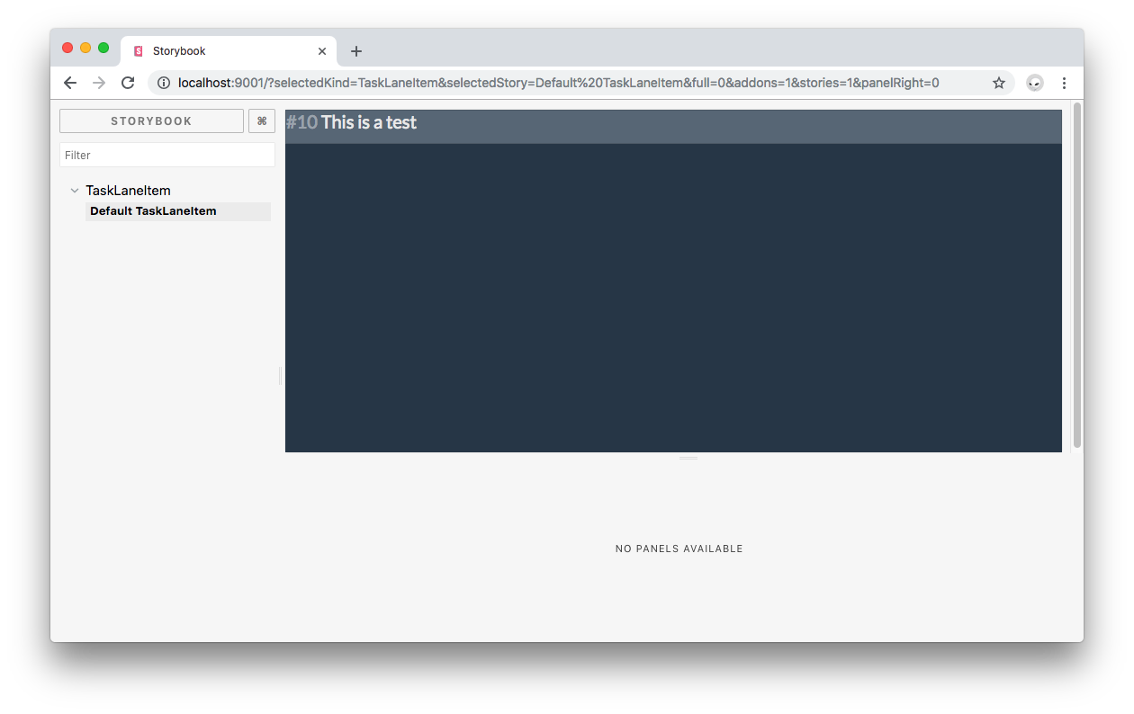
info Storybook started on => http://localhost:9001/Open that URL, http://localhost:9001/ in the browser. Let it load and you'll see your own Storybook in full glory:

Right now, the TaskLaneItem component doesn't look too good and the text is hard to read in comparison to how it looks on the live application:
Open the src/components/TaskLaneItem.vue file that holds the definition of the TaskLaneItem component. Notice that it doesn't have much styling other than a background color being defined. The complete styling for this component is coming from Bootstrap. Thus, the next step is for you to allow Storybook to use Bootstrap.
Adding Custom Head Tags to Storybook
Open index.html and notice that the kanban-board-pwa app uses different tags within the <head> element. The two relevant tags for previewing components correctly in Storybook are the <link> tags that introduce Bootstrap and FontAwesome into the project.
Since Storybook runs in isolation from the app, it is not able to see or use these tags defined within index.html. As a solution, you can create a preview-head.html file under the .storybook configuration directory and add the needed <link> tags like so:
<link rel="stylesheet" href="https://maxcdn.bootstrapcdn.com/bootswatch/4.0.0-beta.2/superhero/bootstrap.min.css">
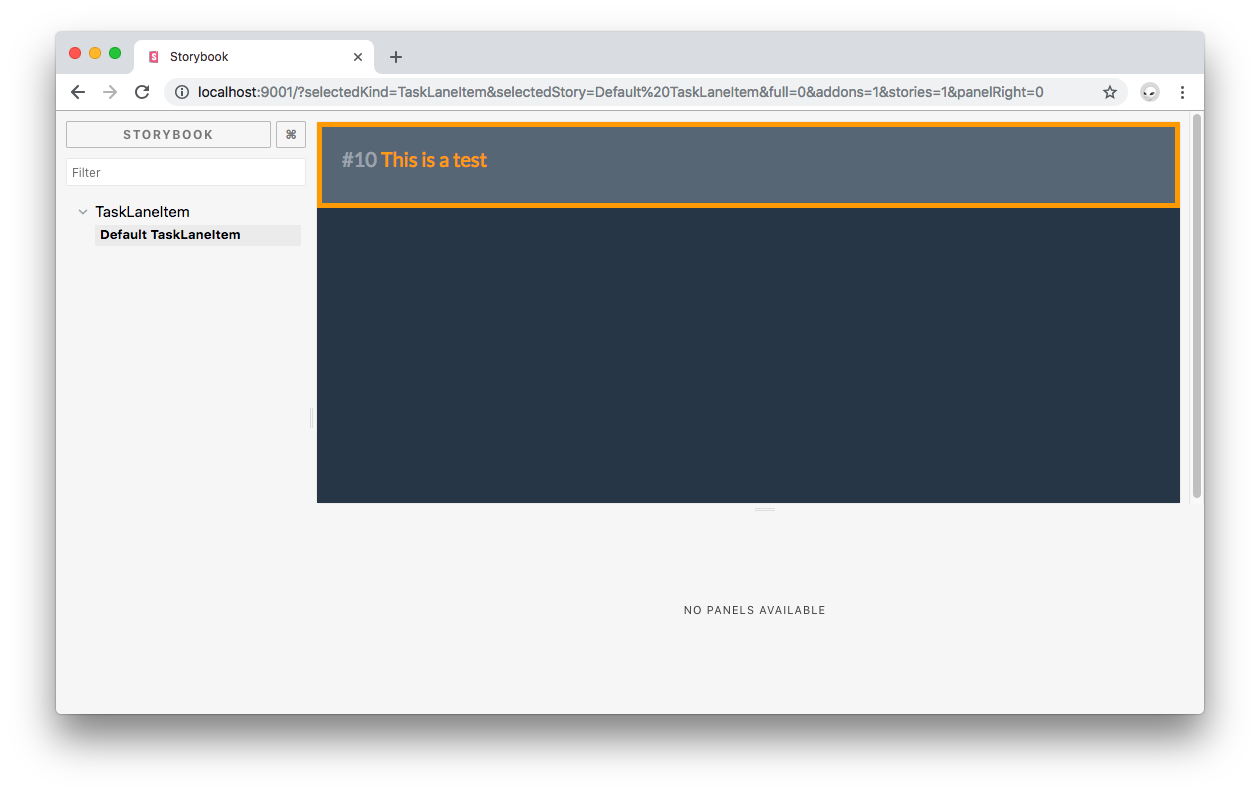
<link href="https://maxcdn.bootstrapcdn.com/font-awesome/4.7.0/css/font-awesome.min.css" rel="stylesheet" integrity="sha384-wvfXpqpZZVQGK6TAh5PVlGOfQNHSoD2xbE+QkPxCAFlNEevoEH3Sl0sibVcOQVnN" crossorigin="anonymous">Restart Storybook by stopping it and then executing npm run storybook again. This lets Storybook use your updated configuration. Open http://localhost:9001/ in the browser again and now you should see a much better-looking preview of TaskLaneItem that includes the same styling present in the full app:
Previewing Component Changes in Storybook
So far, you've staged a component with its existing definitions and configuration. The most powerful feature of Storybook is being able to see changes live without having to run the application. Let's say that you want to make the color of the text within TaskLaneItem orange, increase its padding, and add an orange border. Will this look good? Find out by making these changes within the <style> tag present in TaskLaneItem.vue:
// src/components/TaskLaneItem.vue
<template>
  // ... Template definition
</template>
<script>
  // ... Script definition
</script>
<style>
.card.task-lane-item {
  background: #627180;
  border: solid orange 5px;
}
.card-title {
  color: orange;
}
.card-block {
  padding: 20px;
}
</style>
Save the file and you'll see Storybook update the preview of the component right away!
Think about the time you can save by experimenting with a component's look and feel in isolation. Instead of assembling the whole UI puzzle, you can just preview how one piece looks. However, Storybook does let you run components in composition.
Before moving on, reverse the style changes made to TaskLaneItem, it already looks pretty good.
Using Vuex with Storybook
You have learned how to preview a simple presentational component. Now, you are going to create a story for the TaskLane component which has a more complex structure and uses a Vuex store to hydrate itself with data. First update .storybook/config.js to import and register TaskLane:
// .storybook/config.js

// ...

// Import your custom components.
import TaskLaneItem from '../src/components/TaskLaneItem';
import TaskLane from '../src/components/TaskLane';

// ...

// Register custom components.
Vue.component('item', TaskLaneItem);
Vue.component('lane', TaskLane);

// ...
Next, head back to src/stories.js and create a story of TaskLane:
// src/stories.js

// ... TaskLaneItem stories

storiesOf('TaskLane', module).add('Default TaskLane', () => ({
  data() {
    return {
      doneItems: [
        { id: 10, text: 'This is a test' },
        { id: 12, text: 'This is another test' },
        { id: 14, text: 'This is yet another a test' },
        { id: 16, text: 'This is one more test' }
      ]
    };
  },
  template: `
      <div class="col-md">
        <lane id="done" title="Done" :items="doneItems"></lane>
       </div>
    `
}));
This is similar to what you did before for TaskLaneItem, the main difference is that you are wrapping lane within a div with the col-md class and you are passing an array of doneItems to TaskLane through the items prop.
Recall that you are using
laneas the component tag name within the template because that is the name that you used to register the component withVue.component.
Since TaskLane registers TaskLaneItem locally as seen in the src/components/TaskLane.vue file, Storybook automatically brings TaskLaneItem into the scope of TaskLane for this story. There's no need to create a components property within the component definition object of the Default TaskLane story.
Save the file. The changes may not show correctly in Storybook until you refresh the page, so go ahead and do so. Click on the TaskLane menu item to expand it and then click on Default TaskLane, you should now see a preview of the TaskLane component:
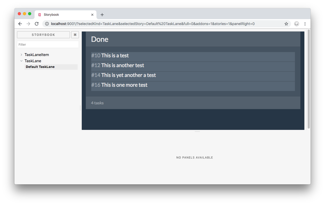
TaskLane uses TaskLaneItem to list tasks in the Kanban Board. These TaskLaneItem components can be dragged and dropped between TaskLane components as configured for this app. Notice how the Storybook TaskLane preview is completely interactive. You can drag and move around any of the visible items within the lane.
However, as you drag components within the lane, their position is not persistent. If you open the developer console, you will also see a lot of errors such as the following:
vue.esm.js:591 [Vue warn]: Property or method "$store" is not defined on the instance but referenced during render.What's happening? Head to the definition of TaskLane present in the src/components/TaskLane.vue file. Notice that this component uses the vuex store created for this project to update items:
// src/components/TaskLane.vue
// ... Template tag
<script>
// ... Script imports
export default {
// ... Other properties computed: {
itemCount() {
if (!this.items) return '';
if (this.items.length === 1) return '1 task';
return `${this.items.length} tasks`;
},
draggables: {
get() {
return this.items;
},
set(items) {
this.$store.commit('updateItems', {
items,
id: this.id
});
}
}
}
};
</script>
// ... Style tagThe instance of the vuex store is present through $store. It is used to commit an updateItems mutation that updates the lane to which a task lane item belongs. However, the instance of TaskLane within the story is unaware of the existence of this store. More importantly, you are manually passing an array of items to TaskLane for it to render. Why is this a problem?
The kanban-board-pwa application architecture uses a Vuex store as the single source of truth for the state of the application. Any component that needs to render data has to get it from the store. Vuex stores are reactive; thus, when there are changes in the structure of the store, the components that are subscribed to the affected data get updated.
The problem is that within the Storybook sandbox, the store has not been initialized with any data. Also, TaskLane gets its items data from its parent component, KanbanBoard. As seen in the KanbanBoard component definition in src/components/KanbanBoard.vue. This parent component queries the store to create computed properties that it passes down to TaskLane components:
// src/components/KanbanBoard.vue
<template>
  <div class="board">
    <div class="row">
        <div class="col-md">
          <task-lane id="todo" title="Todo" :items="todoItems"></task-lane>
        </div>
        <div class="col-md">
          <task-lane id="inProgress" title="In progress" :items="inProgressItems"></task-lane>
        </div>
        <div class="col-md">
          <task-lane id="done" title="Done" :items="doneItems"></task-lane>
        </div>
    </div>
  </div>
</template>
<script>
import { mapState } from 'vuex';
import TaskLane from './TaskLane';
export default {
  name: 'KanbanBoard',
  components: {
    'task-lane': TaskLane
  },
  computed: mapState({
    todoItems: s => s.items.todo,
    inProgressItems: s => s.items.inProgress,
    doneItems: s => s.items.done
  })
};
</script>
You'd want to instantiate Tasklane in isolation — that's the purpose of using Storybook. Instantiating the whole KanbanBoard to be able to pass items props from the store to Tasklane is not a solution either because the store would still be empty. The first step to solve this problem is to add items to the store when the Storybook project is created.
Head to .storybook/config.js and update the file as follows:
// ... Other imports
import store from '../src/store';

// .. Import your custom components.

store.commit('addItem', { text: 'This is a test' });
store.commit('addItem', { text: 'This is another test' });
store.commit('addItem', { text: 'This is one more test' });
store.commit('addItem', { text: 'This is one more test' });

// ... Register custom components.

// ...
Now, when the Storybook project is built, the store will be populated with those four items. However, if you make changes to the Storybook project files since the items are being stored in Local Storage in the browser, you will see duplicate items. This is solved by reloading the browser window where Storybook is hosted.
The id for each item is created by the store automatically. Next, update the Default TaskLane story within src/stories.js to pass store items as props to the TaskLane component:
// src/stories.js

import { mapState } from 'vuex';
import { storiesOf } from '@storybook/vue';
import store from '../src/store';

// ... TaskLaneItem stories

storiesOf('TaskLane', module).add('Default TaskLane', () => ({
  computed: mapState({
    items: s => [...s.items.todo, ...s.items.inProgress, ...s.items.done]
  }),
  store,
  template: `
      <div class="col-md">
        <lane id="todo" title="Todo" :items="items"></lane>
       </div>
    `
}));
Similar to the logic present in src/components/KanbanBoard.vue, you use mapState to generate computed getter functions for you from the store.
It's important to understand how the kanban-board-pwa app works when adding items: If you look back at the KanbanBoard template, you'll see that each lane is given an id value:
// src/components/KanbanBoard.vue
<template>
  <div class="board">
    <div class="row">
        <div class="col-md">
          <task-lane id="todo" title="Todo" :items="todoItems"></task-lane>
        </div>
        <div class="col-md">
          <task-lane id="inProgress" title="In progress" :items="inProgressItems"></task-lane>
        </div>
        <div class="col-md">
          <task-lane id="done" title="Done" :items="doneItems"></task-lane>
        </div>
    </div>
  </div>
</template>
That id matches up (intentionally) with the array symbol in the store so that it becomes trivial to update the list dynamically without too much data overhead — a fine solution for the scope of this demonstration.
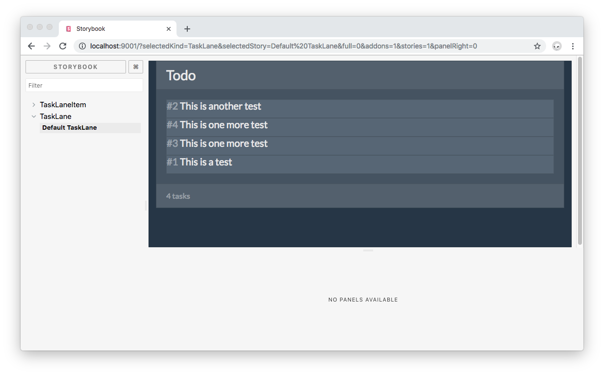
Save your work and refresh Storybook. You should see the following:

Rearrange items within the lane and observe how they remember their new position:
You didn't have to use vuex directly. But, in the case that you'd have wanted to create stores from scratch within a story, you'd have to import vuex and install it like so:
// .storybook/config.js

import Vuex from 'vuex'; // Vue plugins

// Install Vue plugins.
Vue.use(Vuex);
You would then instantiate a new store within the story like this:
import Vuex from 'vuex';

storiesOf('Component', module)
  .add('Default Component', () => ({
    store: new Vuex.Store({...}),
    template: `...`
  }));
Any required Vue plugins, such as vuex, need to be installed using with Vue.use.
Assembling Complex Components in Storybook
It was cool seeing how to drag and drop items within a lane to rearrange them, but what would be even cooler would be to drag and drop items between lanes. You'll now create a story that presents the three lanes that exist in the full app: Todo, In Progress, and Done. This will be done without having to instantiate the KanbanBoard component. Head to src/stories.js and create the Three TaskLanes story:
// src/stories.js
// ... imports
// ... TaskLaneItem stories
storiesOf('TaskLane', module)
.add('Default TaskLane', () => ({
computed: mapState({
items: s => [...s.items.todo, ...s.items.inProgress, ...s.items.done]
}),
store,
template: `
<div class="col-md">
<lane id="todo" title="Todo" :items="items"></lane>
</div>
`
}))
.add('Three TaskLanes', () => ({
computed: mapState({
todoItems: s => s.items.todo,
inProgressItems: s => s.items.inProgress,
doneItems: s => s.items.done
}),
store,
template: `
<div class="row">
<div class="col-md">
<lane id="todo" title="Todo" :items="todoItems"></lane>
</div>
<div class="col-md">
<lane id="inProgress" title="In progress" :items="inProgressItems"></lane>
</div>
<div class="col-md">
<lane id="done" title="Done" :items="doneItems"></lane>
</div>
</div>
`
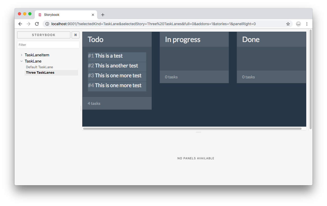
}));Here, you use the same computed property present in KanbanBoard that uses mapState to generate a computed getter function for each category of lane items. Three lanes are created with todo, inProgress, and done as id values to match the array symbols in the store. Save your work and head back to Storybook. Click on the TaskLane menu tab and then on Three Tasklanes. You should see something like this:
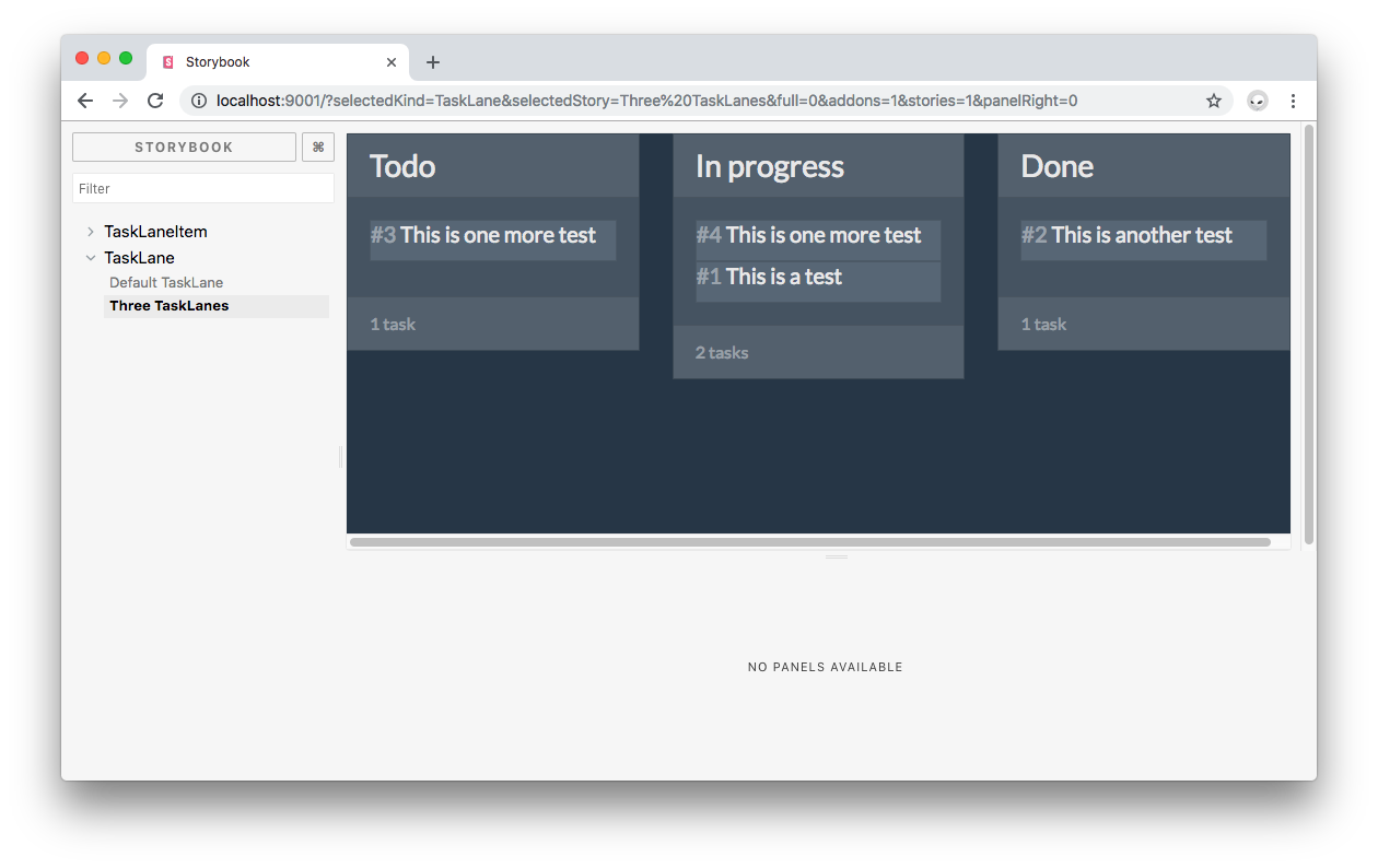
If you see duplicate items, refresh the Storybook window.
Now, drag and drop items between lanes. Each item should remember its new lane and its new position in the lane. Cool, isn't it?
In practice, you can create components from the bottom to the top: start with the small presentational components, tweak their style and content, then move to the larger components that rely on component composition for their presentation. Storybook lets you focus on treating each component like a truly modular independent piece of the UI puzzle.
As an additional benefit for large teams, creating a component library allows you to reuse components not only within a project but across organization projects that require to have a consistent look and feel for effective branding.
Recap
You have learned how to preview the presentation of basic and complex components in an interactive way through Storybook's component library while being able to access and use Vue plugins such as vuex. Storybook can be also used to preview actions triggered through components such as firing up a function upon clicking a button as well as for UI testing. These are more advanced use cases. Let me know in the comments below if you'd like to read a blog post about extending Storybook for Vue to cover event handling and testing.
At Auth0, we have been using Storybook extensively. To learn more about our experience creating component libraries with Storybook and the benefits we have found, please read our "Setting Up a Component Library with React and Storybook" post.
Auth0: Never Compromise on Identity
So you want to build an application? You're going to need to set up user authentication. Implementing it from scratch can be complicated and time-consuming, but with Auth0 it can be done in minutes. For more information, visit https://auth0.com, follow @auth0 on Twitter, or watch the video below:


