TL;DR: In this article, we're going to use Vue.js (the progressive JavaScript framework) to build an interactive Kanban board in the browser. The complete source code for this project is available on GitHub.
In my last article, I showed you how to build a working dashboard for Docker. This dashboard would show you which containers are currently running, allow you to start and stop them, and to create new ones. The application was pretty basic but its purpose was to exercise your skills with React, TypeScript, and Socket.IO. It wasn't just another React tutorial; it demonstrated how to build something useful using the technologies you're trying to learn.
I'd like to continue that theme here by building another useful tool: a Kanban board! This time, we're going to use Vue.js, another JavaScript library similar to React that enables you to build interactive applications in the browser.
So, in this article — the first of a two-part series — we build the application, which won't be as complex as the Docker Dashboard, but it will be more or less complete. In part two, we employ some modern techniques to progressively enhance the application and really bring it into its own.
Without further ado, let's get started!
“Look how easy it is to create a Kanban board with drag and drop support.”
Tweet This
Prerequisites
The only prerequisite you need to follow along with this article is the latest version of NodeJS. I'm using version 10.9.0. The main driver regarding the version of Node is vue-cli; it says you can use anything from Node 4.0 and above, but 6.0 and above is preferred.
Setting Up the Vue.js Application
To get started with the application, we're going to use Vue CLI 2. This will generate our base application for us, including setting up Webpack with everything that we need. For this tutorial, we won't really need to go into the Webpack configuration, or really interact with Webpack at all—the default configuration is all fine for us.
To start, let's install vue-cli globally from the command line:
$ npm install -g vue-cli
Then, let's browse to a folder on our disk to create the project. Find a suitable location on your hard drive and create a new folder for the project:
# Create the folder
mkdir kanban-board

# Move into it
cd kanban-board
I called mine kanban-board, but you can call it anything you want. Next, invoke the Vue.js command line interface. This tool will walk us through a series of questions to set up our project. We can leave most of them as the default, but let's opt not to create unit or E2E tests for this demo. Also, let's chose the AirBnb ESLint preset, but we will be modifying some of the rules.
Invoke the command as follows:
$ vue init webpack
Note that we're using the Webpack template, which sets up Webpack, hot reloading (allowing us to immediately see changes in the browser without refreshing the page), vue-loader, and a few other bits and pieces. This is what the output will look like:
$ vue init webpack

? Project name auth0-kanban
? Project description A Vue.js project
? Author Steve Hobbs <elkdanger@gmail.com>
? Vue build standalone
? Install vue-router? Yes
? Use ESLint to lint your code? Yes
? Pick an ESLint preset Airbnb
? Set up unit tests No
? Setup e2e tests with Nightwatch? No

   vue-cli · Generated "auth0-kanban".

   To get started:

     npm install
     npm run dev
Next, run $ npm install to install the required Node packages. Then $ npm run dev to get the project running and to ensure that we've got a good baseline. Now, browse to http://localhost:8080 - all things being well, you should see a boilerplate 'Welcome to your Vue.js App' page.
As any changes we make will automatically be recompiled and sent to the browser, you can leave the application running at this point.
Shelling Out the Default Vue.js Application
Now that we've got a template application up and running, the first thing we're going to do is get rid of the stuff that we don't need.
Most of the time, we're going to be changing the component files that live in the src folder, with maybe a couple of changes to the index.html file in the root.
First of all, delete the src/components/HelloWorld.vue file, as we won't be using that at all.
Next, since we've deleted that component file, we'll need to modify the Vue Router to tell it to stop looking for this component. So, let's open src/router/index.js and remove the reference to the component. In the end, our file will look like this (we will also rename the route to 'Default' for the time being):
import Vue from 'vue';
import Router from 'vue-router';

Vue.use(Router);

export default new Router({
  routes: [
    {
      path: '/',
      name: 'Default',
    },
  ],
});
Finally, in src/App.vue, let's modify the file to look like the following (we will just take out the reference to the logo and the default styles):
<template>
  <div id="app">
    <router-view/>
  </div>
</template>
<script>
export default {
  name: 'app',
};
</script>
We're going to come back here later and fill in some chrome to make it look a bit nicer. Right now, if we look at our application in the browser, we should just see a blank page. This is fine—we're going to start filling in some UI in just a moment.
For now, we have a nice base to start creating our Kanban board.
Styling the Vue.js Kanban Board
Let's get our header and base styles in place. For this app, we will use Bootstrap v4 through one of the smart Bootswatch themes. From there, we will choose the Superhero theme, but there are some other nice options available as well.
To insert it into our app, let's include the link from BootstrapCDN to the chosen theme and put that into the index.html file.
Later, we will also want to grab a couple of fancy icons from FontAwesome. Fortunately, MaxCDN also provides access to this icon library, so let's get that link too.
In the end, our index.html file will look like the following code snippet. Notice the two stylesheet links at the top of the markup and also the extra container div around the app element:
<!-- /index.html -->
<!DOCTYPE html>
<html>
  <head>
    <meta charset="utf-8">
    <meta name="viewport" content="width=device-width,initial-scale=1.0">
    <title>auth0-kanban</title>
    <link rel="stylesheet" href="https://maxcdn.bootstrapcdn.com/bootswatch/4.0.0-beta.2/superhero/bootstrap.min.css">
    <link href="https://maxcdn.bootstrapcdn.com/font-awesome/4.7.0/css/font-awesome.min.css" rel="stylesheet" integrity="sha384-wvfXpqpZZVQGK6TAh5PVlGOfQNHSoD2xbE+QkPxCAFlNEevoEH3Sl0sibVcOQVnN" crossorigin="anonymous">
  </head>
  <body>
    <div class="container">
      <div id="app"></div>
    </div>
    <!-- built files will be auto injected -->
  </body>
</html>
Note: you will need to refresh the page in the browser to see these changes, as they will not be picked up automatically by Webpack.
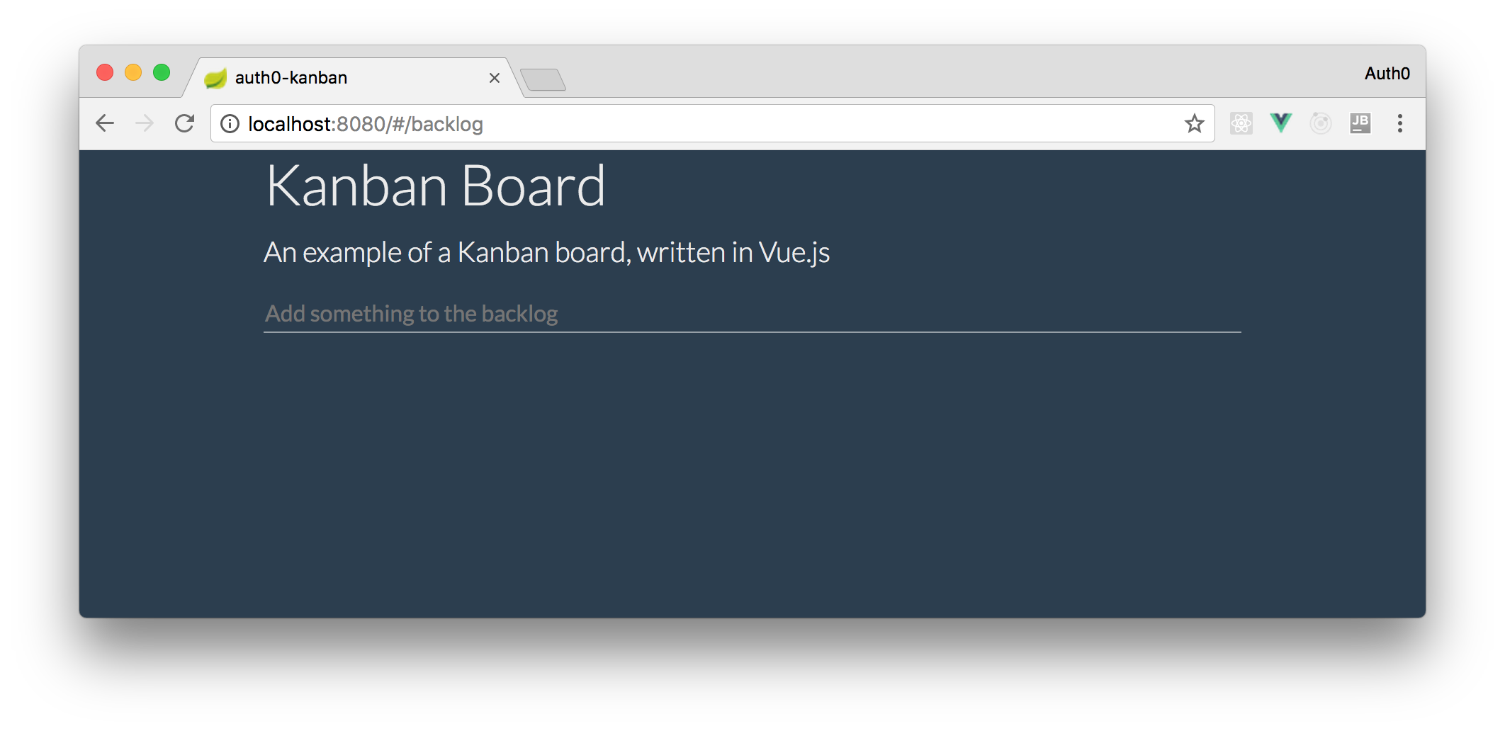
To finish off the header, let's dive into App.vue and add in some text so that we can get something on the screen. Let's add some content at the top, so our users know what the app is, and a bit of styling just to neaten it up a bit. After that, the App.vue content will look like this:
<template>
  <div id="app">
    <div class="page-header">
      <h1>Kanban Board</h1>
      <p class="lead">An example of a Kanban board, written in Vue.js</p>
    </div>
    <router-view/>
  </div>
</template>
<script>
export default {
  name: 'app',
};
</script>
<style>
  .page-header h1 {
    font-weight: 300;
  }
  .card {
    margin-bottom: 10px;
  }
  .card:last-child {
    margin-bottom: 25px;
  }
  .card-block {
    padding: 15px;
  }
</style>
Vue.js and Vuex
Now, we can begin the to develop the backlog component. This component will allow us to see the list of items and to add new items to the backlog. We'll have a couple of elements to it:
- a form with a textbox for creating our new items;
- and a list of backlog items.
As we're starting to talk about adding and listing pieces of data, it's time to talk about how we're going to store and retrieve this data. For this app, we will use Vuex. From their intro page, "Vuex is a state management pattern + library for Vue.js applications". Sounds ideal! It essentially allows us to store and mutate data in a central place and make the data available to all of our components. When the data changes (mutates) our components will be re-rendered.
We're going to use a Vuex Store to hold information about the backlog items we've added, plus a couple of other pieces of data such as the next available item ID.
To start, let's install Vuex with the following command:
npm install vuex
Next, let's create a new file on ./src/store.js:
import Vue from 'vue';
import Vuex from 'vuex';

Vue.use(Vuex);

export default new Vuex.Store({
  state: {
    items: {
      todo: [],
    },
    nextId: 1,
  },
});
Here, we import the main Vue object and the Vuex plugin which is then added to Vue via the Vue.use(Vuex) call. This allows each component to get access to the store to interact with the data. The store itself becomes initialised with some state which stores the list of to-do items and the nextId to be used when a new item is created.
We'll come back and fill this in a bit more later. For now, let's head over to main.js and add this store into our Vue app. First, let's import the store from the module we just created:
import store from './store';
Then, modify the Vue options to add the store:
new Vue({
  el: '#app',
  router,
  store,     // <-- add the store here
  template: '<App/>',
  components: { App },
});
Right now, we have a basic, working store that we can use to orchestrate the data for our application. It's not much use at the moment as we can't mutate the data yet. So, let's fix that now and turn our attention to the form that allows us to create new backlog items.
First of all, let's create the backlog view. Our finished application is effectively going to have two pages: Board and Backlog. We're going to use the Vue Router to switch between these two pages and give users a nice Single Page App (SPA) experience with navigable history.
After that, we can start by creating the board view which will house the other components, such as the form to create new items and the list of items itself. Then, we can wire up this component to the Router.
Create a new file src/components/Backlog.vue and give it the following content:
<template>
  <div class="backlog-view">
    <p>Backlog</p>
  </div>
</template>
<script>
export default {
  name: 'Backlog',
};
</script>
We'll replace the text content a bit later, but it'll be useful for the moment just to check that our component is working ok. So, open src/router/index.js and import our new component:
import Backlog from '@/components/Backlog';
Finally, configure the router with a path to our backlog page, and to use it by default when the user hits the root path '/':
export default new Router({
  routes: [
    {
      path: '/backlog',
      component: Backlog,
    },
    {
      path: '*',
      redirect: '/backlog',
    },
  ],
});
Now, when users access our Vue.js application in a browser, they should automatically be redirected to /#/backlog and they should see the text 'Backlog' underneath the main heading content. Neat!
Let's continue and get our form on the screen. Create a new file on src/components/NewItemForm.vue, and add some markup that shows an input box on the page:
<!-- src/components/NewItemForm.vue -->
<template>
    <div class="add-item">
        <form action="#" method="post" v-on:submit.prevent="submitForm">
            <input type="text" v-model="itemText" placeholder="Add something to the backlog">
        </form>
    </div>
</template>
This is a pretty bog-standard HTML form, but note a couple of things:
- The form has a
v-onbinding so that we can handle the form'ssubmitevent. This event is also suffixed with.preventto prevent the event from firing its default action. This is a handy idiom for callingpreventDefault()on the event object we would otherwise be working with if we were doing things manually. - The textbox is bound to the
itemTextproperty via thev-modelbinding. This allows us to retrieve the text that the user types in.
Underneath, add the script for our component:
  <script>
  export default {
    name: 'NewItemForm',
    data() {
      return {
        itemText: '',
      };
    },
    methods: {
      submitForm() {
        if (this.itemText) {
          this.$store.commit('addItem', {
            text: this.itemText,
          });

          this.itemText = '';
        }
      },
    },
  };
  </script>
There's a bit going on here, so let's break it down:
- We give the component a name of
NewItemForm. - We specify the data for this component as a function
data()and, for this component, the only piece of data we have isitemText. If you look back at the markup, you'll notice that thev-modelattribute on the textbox is bound toitemText, meaning that when the user changes the textbox value,itemTextwill contain whatever they typed in. - We then have a method called
submitForm()to handle the user submitting the form. This is where we can send new data to the store via mutations. Here, we want to invoke a mutation calledaddItemand we set thetextproperty to the value ofitemText. Finally, we clear the value ofitemTextso that the user can enter another item.
Before we move on, let's add a bit of styling to the form to make it look a little nicer. Underneath the script tag in our component, let's add the following:
<style>
.add-item input {
  outline: none;
  border: 0;
  border-bottom: 1px solid rgba(255, 255, 255, 0.5);
  width: 100%;
  transition: all 0.25s;
  background: inherit;
  color: white;
}
.add-item input:focus {
  border-bottom-color: rgba(255, 255, 255, 1);
}
</style>
Now, we have to update the src/components/Backlog.vue to show the NewItemForm component. So, let's open this file and update it as follows:
  <template>
    <div class="backlog-view">
      <new-item></new-item>
    </div>
  </template>

  <script>
  import NewItemForm from './NewItemForm';

  export default {
    name: 'Backlog',
    components: {
      'new-item': NewItemForm,
    },
  };
  </script>
After all these style changes, our app will look like this:
Right now, we will find that we can type something into the box, hit 'enter' on our keyboard to submit the form, and the value in the textbox disappears. At this point, the value that we entered should have been submitted to the store, but keen eyes will notice an error in the console: [vuex] unknown mutation type: addItem. We get that because the store has no idea what to do with that mutation, which isn't surprising as we haven't written it yet!
Let's fix that now.
Creating Our First Vuex Mutation
Back to store.js, we can add the mutation to the store using the mutations options key. In our mutation, we're going to:
- push a new item into our
todoItemsarray, giving it the next ID value; - and increment
nextIdso that the next item to be added gets a different value;
To fulfil these requirements, modify your store to the following:
  /* eslint-disable no-param-reassign */
  export default new Vuex.Store({
    state: {
      items: {
        todo: [],
      },
      nextId: 1,
    },
    mutations: {
      addItem(state, item) {
        state.items.todo.push(Object.assign(item, { id: state.nextId }));
        state.nextId += 1;
      },
    },
  });
Here we have a mutation called addItem which is a simple function that takes the current state and an item as an argument. Then, we push it to state.items.todo, using Object.assign to augment the item with an id value, and we increment nextId so that the next time we add an item, it gets a new id value.
Also, notice the directive at the top of the example to disable the ESLint rule no-param-reassign; the call to increment the id value causes an issue with the ruleset, but it's ok just turning that rule off in this case. The benefits of just being able to call state.nextId += 1 outweigh the rule.
So, right now, we can put new items into the backlog but, unfortunately, we can't actually see them yet. We will address that in the next part - the Backlog component.
The Vue.js Backlog Component
Essentially the backlog component is just a styled list of to-do items. Later, we're going to attribute each item to a status ("To-do", "In progress", or "Done") but, for now, let's just get the list on the screen.
Re-open the Backlog.vue. The first thing we're going to do is connect to the store to retrieve our data. Vuex provides a simple way to do this using its mapState function. Then, we can provide an additional function to retrieve what we want from the store.
To start, let's modify the script inside Backlog.vue to import mapState from Vue:
  <!-- src/components/Backlog.vue -->
  <script>
  import { mapState } from 'vuex';      // new import

  import NewItemForm from './NewItemForm';

  //...
  </script>
We're going to retrieve the data inside a Computed Property. Computed properties are properties that are usually composed together from other properties, by listening for changes to those properties. Whenever one of those dependent properties change, the computed property will recompute its own value and notify its own subscribers that the value has changed.
Let's modify the backlog component script to create this computed property and read the items from the store:
  // src/components/Backlog.vue
  export default {
    name: 'Backlog',
    components: {
      'new-item': NewItemForm,
    },
    computed: mapState({
      items: s => s.items.todo,
    }),
  };
Finally, let's add in the markup to show the items on the page. Here, we are using a Bootstrap card class to render the items:
  <template>
    <div class="backlog-view">
      <new-item></new-item>
      <div class="card" v-for="item in items" :key="item.id">
          <div class="card-block">
            <h5 class="card-title"><span class="text-muted">#{{item.id}}</span>
            {{item.text}}</h5>
          </div>
      </div>
    </div>
  </template>
At this point, we should be able to type something into your form textbox, hit the 'enter' key and see a list of backlog items appearing underneath.
The Kanban Board Vue.js Component
Let's start having a look at the board view of our items. In a more feature-rich project tracking products (such as Jira), the user is able to customise the 'lanes'—columns that work items can be dropped into—but for our simple application, we're going to hard-code three lanes to begin with: 'To-Do', 'In progress', and 'Done'. Allowing the user to customise these lanes is left as an exercise for you, the reader!
We can start by adding the board page which will eventually contain the UI for our kanban board UI. We'll leave it empty for now, but let's get the navigation and routing sorted first.
Create a new file src/components/KanbanBoard.vue and populate it with the following:
  <template>
    <p>This is where the kanban board will go</p>
  </template>

  <script>
  export default {
    name: 'KanbanBoard',
  };
  </script>
Next, modify the router so that we can navigate to this new view:
  // src/router/index.js
  // ... other import statements ...
  import KanbanBoard from '@/components/KanbanBoard';

  export default new Router({
    routes: [
      {
        path: '/backlog',
        component: Backlog,
      },
      // Add in a route to our new KanbanBoard component here
      {
        path: '/board',
        component: KanbanBoard,
      },
      {
        path: '*',
        redirect: '/backlog',
      },
    ],
  });
Now, we should be able to test the route out by changing the url in the browser to /#/board and get to our new kanban board view. Obviously, we don't want the user to have to change the url manually when they want to switch pages. As such, let's add some buttons to make it easier for them.
Create another new component in src/components/MenuBar.vue with the following content:
  <template>
    <div class="menubar">
      <div class="btn-group" role="group" aria-label="Menu bar">
        <router-link to="/board">Board</router-link>
        <router-link to="/backlog">Backlog</router-link>
      </div>
    </div>
  </template>
  <script>
  export default {
    name: 'MenuBar',
  };
  </script>
  <style>
    .menubar {
      margin-bottom: 16px;
    }
  </style>
Next, find App.vue and add the MenuBar component before the router content:
<div id="app">
  <div class="page-header">...</div>
  <menu-bar></menu-bar>
  <router-view/>
</div>
And add the component into the App's script section:
  import MenuBar from '@/components/MenuBar';

  export default {
    name: 'app',
    components: {
      'menu-bar': MenuBar
    }
  };
Now, we should have a couple of links we can click to navigate between the pages. Neat!
They don't look great though. So, let's make them actual buttons. We're going to add the standard Bootstrap button classes. However, we're going to do it in such a way that will highlight the current page that the user is on. We can dynamically change the style depending on the current route.
Let's start by adding a helper function into our MenuBar component that will return the right classes depending on the route:
  export default {
    name: 'MenuBar',
    methods: {
      buttonClass(path) {
        return {
          btn: true,
          'btn-primary': this.$route.path === path,
          'btn-secondary': this.$route.path !== path
        };
      }
    }
  };
Here, buttonClass takes a router path and if the given path matches the current route, the primary button classes is returned. Otherwise, the secondary button class is returned. Additionally, the base btn class is always returned. To put this into effect, modify the router links as follows to call this method and obtain the correct button styles:
  <router-link to="/board" :class="buttonClass('/board')">Board ...</router-link>
  <router-link to="/backlog" :class="buttonClass('/backlog')">Backlog ...</router-link>
If we reload the app now, we'll find that our menubar will not only have some nice button styles, but it will be easy to tell which page we're on!
Creating the Task Lanes with Vue.js
We can now begin to think about how we're going to show the tasks in columns on the Kanban board. As mentioned previously, for our demo app we're going to have three lanes: To-do, In progress and Done. From a code perspective, each lane is going to look and behave exactly the same way, which makes it a good candidate for a component. Each lane component is simply going to be given a list of tasks to show, and some text to show in the header. The component itself will take care of the rest. This way we can easily duplicate that behaviour across our three task lanes.
Furthermore, each item in the lane has its own markup and can be split down into another component: TaskLaneItem. This helps keep the markup clean and allows for adding more complex functionality later.
So, let's start by creating a new component in src/components/TaskLane.vue, and start by populating the template:
  <!-- src/components/TaskLane.vue -->
  <template>
    <div class="card">
        <h3 class="card-header">{{title}}</h3>
        <div class="card-body">
            <div v-for="item in items" :key="item.id">
                <item :item="item"></item>
            </div>
        </div>
        <div class="card-footer text-muted">
            {{itemCount}}
        </div>
    </div>
  </template>
Here we've used the markup for Bootstrap's Card component, which suits this application rather well. Also, we've specified a header, which is populated by reading the title prop, loops through the items prop inside the body of the card, and then writes out the number of tasks in the footer by reading itemCount. This last props, as we'll see in a minute, is a computed property of the component.
We've also made use of an <item> component; we'll get to that in a minute. Before that, let's create some of the code for this component. So, let's put this into the component's script tag inside TaskLane.vue:
  // src/components/TaskLane.vue
  import TaskLaneItem from './TaskLaneItem';

  export default {
    name: 'TaskLane',
    props: ['items', 'title', 'id'],
    components: {
      item: TaskLaneItem,
    },
    computed: {
      itemCount() {
        if (!this.items) return '';
        if (this.items.length === 1) return '1 task';
        return `${this.items.length} tasks`;
      },
    },
  };
Here, three props are being registered: a designated identifier for the lane in id, the list of tasks in items and the title of the lane. The id prop will become important later when we write the code that allows items to be moved between different lanes.
Besides that, we are also importing the TaskLaneItem component (coming next). At the bottom, we can also see a computed property which decides what the footer text should be. It simply works out a friendly way to display the number of tasks based on how many tasks there are. Simple enough, but it does demonstrate how we can 'compute' what a bound value should be based on other dependent properties.
Next, let's turn our attention to the TaskLaneItem component, which is responsible for drawing out individual items on the kanban board. Create a new file on src/components/TaskLaneItem.vue with the following content:
<!-- src/components/TaskLaneItem.vue -->
<template>
  <div class="card task-lane-item">
    <div class="card-block">
      <h5 class="card-title">
        <span class="text-muted">#{{item.id}}</span>
        {{item.text}}
      </h5>
    </div>
  </div>
</template>
<script>
export default {
  name: 'TaskLaneItem',
  props: ['item'],
};
</script>
<style>
  .card.task-lane-item {
    background: #627180;
  }
</style>
This is a very simple component that gets given the item that it should display and simply renders out the item id and the item text - again using Bootstrap's Card component. There's no computed magic here or any other functionality, but it allows us to separate out the markup from the task lane, keeping it cleaner.
Finally, let's wire this up to the KanbanBoard component and get our items on the screen. We'll just deal with the to-do items at the moment; we'll add in the other lanes in a moment. Head back to KanbanBoard.vue and modify the template to look like this:
  <template>
    <div class="board">
      <div class="row">
          <div class="col-md">
            <task-lane id="todo" title="To-Do" :items="todoItems"></task-lane>
          </div>
      </div>
    </div>
  </template>
Here we have an instance of our task lane called 'To-Do', and we bind its items prop to todoItems, which we'll deal with now. Modify the script for the kanban board component to look like the following:
  import { mapState } from 'vuex';
  import TaskLane from './TaskLane';

  export default {
    name: 'KanbanBoard',
    components: {
      'task-lane': TaskLane,
    },
    computed: mapState({
      todoItems: s => s.items.todo,
    }),
  };
This shouldn't look too unfamiliar compared to the other components we've just made. We first import mapState and the TaskLane component, then we defined our KanbanBoard component, register our TaskLane component, and then define a computed property todoItems which reads the items.todo property from the Vuex state. We'll have another couple of computed properties in here later when we start defining our lanes for our 'in progress' and 'done' items. More on that in a bit.
Right now, we should be able to add a new item into the backlog using the Backlog view, switch over to the Kanban board and see the same item inside the 'To-Do' column. Nice one!
Creating the Other Lanes
From this point, creating the 'In progress' and 'Done' lanes is a simple extension of what we've already done. In the Vuex store, we have a todo array that stores the items in the To-do lane, so we can follow a similar pattern for the other two lanes we're going to implement.
To start, head to store.js and add another two arrays into the items property, as follows:
  // ...
  state: {
    items: {
      todo: [],
      inProgress: [],
      done: [],
    },
    nextId: 1,
  },
  //...
Next, re-open KanbanBoard.vue and add the components to display the two new lanes we just added right underneath the markup we have for the todo lane:
  <div class="col-md">
    <task-lane id="inProgress" title="In progress" :items="inProgressItems"></task-lane>
  </div>
  <div class="col-md">
    <task-lane id="done" title="Done" :items="doneItems"></task-lane>
  </div>
Finally, modify the script in the same component to map the state for these two new lanes to the data in the Vuex store:
  //...
  computed: mapState({
    todoItems: s => s.items.todo,
    inProgressItems: s => s.items.inProgress,
    doneItems: s => s.items.done,
  }),
  //...
We're now at a stage where we have our three task lanes on screen! The final step is to enable the user to change the lane that a task is assigned to; let's look at how we can do that now.
Vue.js, Lanes, and Drag & Drop Support
For our app, we're going to enable users to simply drag tasks between the different lanes. Doing this will update the collection inside the Vuex store that the task belongs to. As an additional nicety, we're also going to show a coloured label beside the task on the backlog screen so that it's easy to identify the 'status' of the task when we're not on the Kanban board itself.
To get the dragging working, we're going to make use of the vue-draggable component, which is based on the popular SortableJS library. The way that this works is that we wrap the containers that contain the things we want to drag inside the Vue Draggable component, telling it which array from the Vuex store that it should manipulate. When we drag an item from one container to another, the component will send us an updated list of items that we can then commit to our Vuex store.
To start, install the vuedraggable component using the following command line:
$ npm install vuedraggable
Next, let's open our TaskLane component. The first thing we'll do is import the Draggable component inside the <script> tag:
  // ...
  import Draggable from 'vuedraggable';
  // ...
Then, we will register the draggable component with our TaskLane component:
  // ..
  components: {
    item: TaskLaneItem,
    draggable: Draggable,
  }
  // ..
Now, we can wrap our task lane inside a Draggable component to enable the items to be dragged between the different arrays. To do this, find the <div v-for="item in items"..> markup inside the <template> section and wrap it in a <draggable>, like so:
  <div class="card-body">
    <draggable v-model="draggables" :options="{ group: 'default' }">
      <div v-for="item in items" :key="item.id">
          <item :item="item"></item>
      </div>
    </draggable>
  </div>
Here, the existing <div v-for...> element is wrapped in this new draggable component. We've set the model for this to be this thing called draggables and we've also set an option for the group to be the value default. These options are simply passed straight through to the underlying SortableJS instance (with the exception of some event handlers). Setting the group name is what allows items to be dragged from one list to another (from the SortableJS documentation). Since we've got multiple task lanes all with their own Draggable component but with the same group name, we're able to drag task items between them! If we wanted to prevent tasks from being dragged into specific lanes, it follows that we would give them different group names to facilitate that feature.
One last thing we need to do is fix a small styling issue. If you were to play around with the drag-drop feature now, you'll find that you won't be able to drag anything into any columns that are empty, because the empty columns have no height. We can fix that now by adding some styling to the bottom of the file that contains the TaskLane component, like so:
  <style>
    .card-body > * {
      min-height: 50px;
    }
  </style>
If we load up the app now, we'll find that we'll be able to drag items from one lane to another - neat! However, notice that when you switch back to the Backlog view then return to the Kanban board, it hasn't remembered the positions of the tasks and you'll see them all sitting back in the To-Do lane, as they were originally. Let's fix that now by using a computed property to fetch the items.
We've already used a computed property in a previous component, but this one is slightly different as we're going to tightly control what happens when you get and set that property. When the items are retrieved (get), we'll simply return the items prop that was given to the TaskLane component to render. When the items are put back (set), we'll commit those items back to the Vuex store.
Here's what that looks like. Still in the TaskLane component then, modify the script for the component to include our new computed property:
  draggables: {
    get() {
      return this.items;
    },
    set(items) {
      this.$store.commit('updateItems', {
        items,
        id: this.id,
      });
    },
  },
This is where the draggables symbol comes in from our markup - it refers to our new computed property.
If we run the app again now and move items around, we'll see that some JavaScript errors are being generated in the console, because the Vuex store doesn't know what the updateItems mutation type is - we can fix that now.
So, open store.js and add a new mutation in that takes our update list and overwrites the given task list with the new one:
  updateItems(state, { items, id }) {
    state.items[id] = items;
  },
Pretty simple. If we look back at the Kanban board template, we'll see that each lane is given an id value. That id matches up (intentionally) with the array symbol in the store so that it becomes trivial to update the list dynamically without too much data overhead. This solution is not scalable nor the best idea in the world, but it's fine for our pet project.
Also, we have used some ES6 destructuring magic here to refer to the items and id properties, even though we sent those as an object to the store. If wanted, we could expand this out to the following equivalent code:
  updateItems(state, payload) {
    state.items[payload.id] = payload.items;
  },
Now, when we play about with your application you'll find that you'll be able to drag task items around into different lanes, and now that we're updating the Vuex store whenever we change something, their new positions will be saved when you move between the different pages. I neat side effect if this is that you can change the order of tasks within a single lane, and that detail is remembered too!
However, if we move some items from the 'To-Do' lane into one of the other two lanes and then switch back to the Backlog view, the final problem will become obvious; the items that we moved out of the 'To-Do' lane are missing. Let's fix that up now.
Fixing up the Backlog View
To finish up, we're going to do a couple of things:
- fix it so that all the items are shown in the list regardless of which lane they're in;
- and put some badges on the tasks in the list so that we can easily see at a glance which lane they're in.
Let's tackle the first one. Open Backlog.vue and find the items computed variable. Right now, this just reads from the items.todo state from the Vuex store. We can use some ES6 spread magic to combine the items for the three lanes together into one array, like so:
// ...
computed: mapState({
  items: s => [...s.items.todo, ...s.items.inProgress, ...s.items.done]
}),
// ...
This will effectively concatenate the three arrays together into one, making use of the nice new ES6 syntax. If we refresh the Backlog view now, create some new backlog items and then switch to the board view and move the items into different lanes, we'll find that all of the items will now continue to appear in the backlog view.
On the final step, we're going to put some badges on the items in the backlog view to highlight which lane they're currently in. To achieve this, we'll add in new methods to our component that return the text and badge classes for the correct lane, given an item.
To start with, let's modify the markup to include the markup for the badge component. Still inside Backlog.vue, modify the markup for the h5 tag to include a span for the badge:
<h5 class="card-title"><span class="text-muted">#{{item.id}}</span>
{{item.text}} <span :class="badgeClass(item)">{{badgeText(item)}}</span></h5>
We can see the span itself has a couple of dynamic elements in there which find out the class and the text for the badge. If we try and refresh the page now, we'll find that things start to break, primarily because we haven't defined what badgeClass and badgeText are yet.
Before we do that, let's sort out a couple of utilities that will help us complete the implementation of those methods. First up, we're going to define a map of text and classes based on the lane, which we can use later to figure out what the text and class should be for an item. Here's what that looks like:
const badgeDetail = {
  todo: {
    text: 'to-do',
    class: 'badge badge-light',
  },
  inProgress: {
    text: 'in progress',
    class: 'badge badge-info',
  },
  done: {
    text: 'done',
    class: 'badge badge-success',
  },
};
It's simply a map which says "Given this lane id, return the text and the class". We can define this inside the script tag for the Backlog component, but outside of the component definition itself.
The next thing to do is define a method which will return the lane id given an item. It's a very crude implementation which simply finds out which item array the item is in and returns the id. This will not scale to a large set of items, but it's perfectly fine for our toy application.
Let's define it inside a methods key inside the component:
methods: {
  itemLane(item) {
    if (this.$store.state.items.todo.includes(item)) {
      return 'todo';
    } else if (this.$store.state.items.inProgress.includes(item)) {
      return 'inProgress';
    }

    return 'done';
  },
},
It first checks to see if the given item is in this.$store.state.items.todo and, if so, returns an id of 'todo'. This should map directly into the badgeDetail map that we defined earlier. Then it tries the inProgress list, and then simply returns 'done' as a default if the item wasn't found in the other two lists.
Now, we have all the tools to implement our badge methods. First up, let's defined badgeText. This also goes under the methods key in our component:
// ...
badgeText(item) {
  const lane = this.itemLane(item);
  return badgeDetail[lane].text;
},
// ...
Pretty simple! It gets the lane id from this.itemLane and then uses that to look up the badgeDetail map, returning the text property.
You can probably guess the implementation for the CSS class; but here it is:
// ...
badgeClass(item) {
  const lane = this.itemLane(item);
  return badgeDetail[lane].class;
},
// ...
Pretty much exactly the same, except we're looking at the class property instead of the text property.
If we look at our Kanban board now, we should have nicely-coloured badges on all of our items to indicate which lane they're in at a glance. Neat!
“I just built a Kanban board with Vue.js!”
Tweet This
Aside: Authenticate a Vue App
Using Auth0, you can protect your applications so that only authenticated users can access them. Let's explore how to authenticate a Vue application.
If you would like to have a more in-depth explanation of protecting a Vue application, you can follow this fantastic article: Beginner Vue.js Tutorial with User Login.
Setting up Auth0
To begin, you will need an Auth0 account. You can sign up for a free Auth0 account here. Once you are logged in, follow these steps to set up an Auth0 application.
- Go to your Auth0 Dashboard and click the "+ CREATE APPLICATION" button.
- Name your new app and select "Single Page Web Applications". Hit "Create".
- In the Settings for your new Auth0 application, add
http://localhost:8080to the Allowed Callback URLs, Allowed Logout URLs, Allowed Web Origins. Hit "Save Changes" at the bottom of the page.
Vue application
You will need to install the Auth0 auth0-spa-js SDK. To do so, run the following command:
npm install @auth0/auth0-spa-js
Next, within your src/ folder, create an auth folder. Within the auth folder, create a file named index.js. You should now have a path that is src/auth/index.js.
Within that newly created file, paste in the following code:
// src/auth/index.js

import Vue from 'vue';
import createAuth0Client from '@auth0/auth0-spa-js';

/** Define a default action to perform after authentication */
const DEFAULT_REDIRECT_CALLBACK = () =>
  window.history.replaceState({}, document.title, window.location.pathname);

let instance;

/** Returns the current instance of the SDK */
export const getInstance = () => instance;

/** Creates an instance of the Auth0 SDK. If one has already been created, it returns that instance */
export const useAuth0 = ({
  onRedirectCallback = DEFAULT_REDIRECT_CALLBACK,
  redirectUri = window.location.origin,
  ...options
}) => {
  if (instance) return instance;

  // The 'instance' is simply a Vue object
  instance = new Vue({
    data() {
      return {
        loading: true,
        isAuthenticated: false,
        user: {},
        auth0Client: null,
        popupOpen: false,
        error: null,
      };
    },
    methods: {
      /** Authenticates the user using a popup window */
      async loginWithPopup(o) {
        this.popupOpen = true;

        try {
          await this.auth0Client.loginWithPopup(o);
        } catch (e) {
          // eslint-disable-next-line
          console.error(e);
        } finally {
          this.popupOpen = false;
        }

        this.user = await this.auth0Client.getUser();
        this.isAuthenticated = true;
      },
      /** Handles the callback when logging in using a redirect */
      async handleRedirectCallback() {
        this.loading = true;
        try {
          await this.auth0Client.handleRedirectCallback();
          this.user = await this.auth0Client.getUser();
          this.isAuthenticated = true;
        } catch (e) {
          this.error = e;
        } finally {
          this.loading = false;
        }
      },
      /** Authenticates the user using the redirect method */
      loginWithRedirect(o) {
        return this.auth0Client.loginWithRedirect(o);
      },
      /** Returns all the claims present in the ID token */
      getIdTokenClaims(o) {
        return this.auth0Client.getIdTokenClaims(o);
      },
      /** Returns the access token. If the token is invalid or missing, a new one is retrieved */
      getTokenSilently(o) {
        return this.auth0Client.getTokenSilently(o);
      },
      /** Gets the access token using a popup window */

      getTokenWithPopup(o) {
        return this.auth0Client.getTokenWithPopup(o);
      },
      /** Logs the user out and removes their session on the authorization server */
      logout(o) {
        return this.auth0Client.logout(o);
      },
    },
    /** Use this lifecycle method to instantiate the SDK client */
    async created() {
      // Create a new instance of the SDK client using members of the given options object
      this.auth0Client = await createAuth0Client({
        domain: options.domain,
        client_id: options.clientId,
        audience: options.audience,
        redirect_uri: redirectUri,
      });

      try {
        // If the user is returning to the app after authentication...
        if (
          window.location.search.includes('code=') &&
          window.location.search.includes('state=')
        ) {
          // handle the redirect and retrieve tokens
          const { appState } = await this.auth0Client.handleRedirectCallback();

          // Notify subscribers that the redirect callback has happened, passing the appState
          // (useful for retrieving any pre-authentication state)
          onRedirectCallback(appState);
        }
      } catch (e) {
        this.error = e;
      } finally {
        // Initialize our internal authentication state
        this.isAuthenticated = await this.auth0Client.isAuthenticated();
        this.user = await this.auth0Client.getUser();
        this.loading = false;
      }
    },
  });

  return instance;
};

// Create a simple Vue plugin to expose the wrapper object throughout the application
export const Auth0Plugin = {
  install(Vue, options) {
    Vue.prototype.$auth = useAuth0(options);
  },
};
The comments in this file go over what each section does. To find more details about this file, please visit this blog post section.
Connecting Auth0 and the Vue application
To connect your Auth0 app and your Vue app, you will need to bring over some data from your Auth0 app that you set up earlier. You will want those values protected. To do so, create a file named auth_config.json in the root of your Vue application. Then in the .gitignore, you will want to put that newly created file in there.
In that file, put the following values:
// auth_config.json

{
  "domain": "your-domain.auth0.com",
  "clientId": "yourclientid"
}
Back in your Auth0 dashboard, click on the Settings tab of your Auth0 application. You will find the values "Domain" and "Client ID". Copy and paste those values into this file.
Using authentication globally in Vue
To use this authentication globally within the Vue app, you need to update the src/main.js file. Delete everything in the file and replace with the following code:
// src/main.js

import Vue from 'vue';
import App from './App.vue';
import router from './router';

// Import the Auth0 configuration
import { domain, clientId } from '../auth_config.json';

// Import the plugin here
import { Auth0Plugin } from './auth';

// Install the authentication plugin here
Vue.use(Auth0Plugin, {
  domain,
  clientId,
  onRedirectCallback: (appState) => {
    router.push(
      appState && appState.targetUrl
        ? appState.targetUrl
        : window.location.pathname,
    );
  },
});

Vue.config.productionTip = false;

new Vue({
  router,
  render: (h) => h(App),
}).$mount('#app');
Log in and log out buttons
In order to use all this, you will want to add "Log In" and "Log Out" buttons. To do that, wherever you would like your buttons to be in your application, add this code within the <template> section of that file:
<div v-if="!$auth.loading">
  <!-- show login when not authenticated -->
  <a v-if="!$auth.isAuthenticated" @click="login">Log in</a>
  <!-- show logout when authenticated -->
  <a v-if="$auth.isAuthenticated" @click="logout">Log out</a>
</div>
In that same file within the <script> tag, add in these methods:
<script>
  export default {
    name: 'App',
    methods: {
      // Log the user in
      login() {
        this.$auth.loginWithRedirect();
      },
      // Log the user out
      logout() {
        this.$auth.logout({
          returnTo: window.location.origin,
        });
      },
    },
  };
</script>
You now have the necessary code to authenticate your Vue.js application!
More resources
Wrapping up
That brings this tutorial to a close, giving us our very own Kanban board with which to plan our next project! Ok, so it's pretty basic but it gets the job done.
From here you can progress to part two where we progressively enhance this application with offline capabilities, home screen icons, and some data storage!
About the author

Steve Hobbs
Developer Experience Engineer