
With nearly 3 billion users, almost 70% of the mobile OS market share, and the majority share of all user-facing operating systems worldwide, Android is the number one operating system in use today. As an Android developer, you have access to the world’s largest customer base, and sooner or later, you’ll write an app that requires the user to log in and out. One of the goals of this tutorial is to show you how to use Auth0 to add authentication to an Android app. You’ll also become familiar with the Auth0 dashboard and learn how to use it to register applications and manage users.
Platforms evolve, and Android is no exception. However, when a platform the size of Android fundamentally changes how you do things, developers who embrace the change early gain a significant advantage. This change is happening now with Jetpack Compose. This tutorial’s secondary goal is to give you an “early adopter” advantage by building a simple login/logout user interface with Jetpack Compose.
Look for the 🛠 emoji if you’d like to skim through the content while focusing on the build and execution steps.
Jetpack Compose
Released in July 2021, Jetpack Compose (often shortened to Compose) is a UI toolkit that thoroughly updates the process of building Android apps. Instead of XML, you use declarative Kotlin code to specify how the UI should look and behave under different states. You don’t have to worry about how the UI moves between those states — Compose takes care of that for you. You'll find Compose familiar if you’re acquainted with declarative web frameworks like React, Angular, or Vue.
The Jetpack Compose approach is a significant departure from Android’s original XML UI toolkit, modeled after old desktop UI frameworks and dates back to 2008. You use a mechanism such as findViewById() or view binding to connect UI elements to code. This imperative approach is simple but requires you to define how the program moves between states and how the UI should look and behave in those states.
Jetpack Compose is built with Kotlin, takes advantage of the features and design philosophy of Kotlin language, and is designed for use in applications written in Kotlin. With Compose, you no longer have to context-switch to XML when designing your app’s UI; you now do everything in Kotlin.
What You’ll Build
You’ll use Auth0 and Jetpack Compose to build a single-screen Android app that allows users to log in and out. I’ve purposely kept it as simple as possible to keep the focus on authentication.
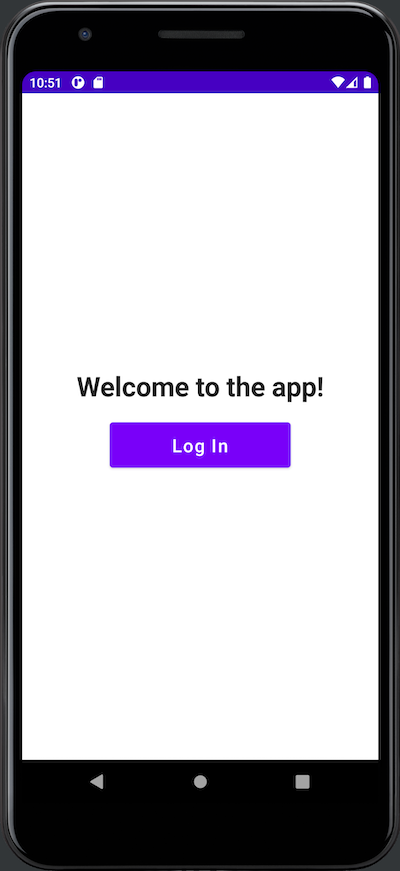
When you launch the completed app, you’ll see a greeting and a Log In button:
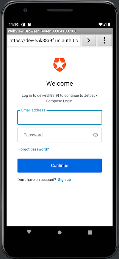
Pressing the Log In button takes the user to the Auth0 Universal Login screen. It appears in a web browser view embedded in your app. Here’s what it looks like in an emulator...
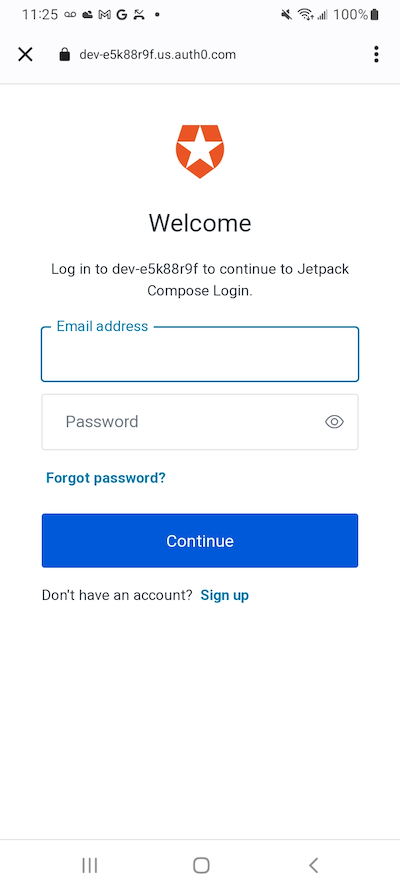
...and here’s what it looks like on a device:
When you use Auth0 to add login/logout capability to your apps, you delegate authentication to an Auth0-hosted login page. You've seen this in Google web applications such as Gmail and YouTube. These services redirect you to log in using accounts.google.com. After logging in, Google returns you to the web application as a logged-in user.
If you’re worried that using Auth0’s Universal Login means that your app’s login screen will be stuck with the default Auth0 “look and feel,” I have good news for you: you can customize it to match your app or organization’s brand identity.
The Universal Login page saves you from having to code an authentication system. It gives your applications a self-contained login box with several features to provide a great user experience.
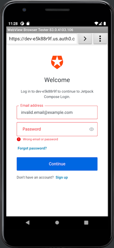
If the user enters an invalid email address/password combination, it displays an error message and gives them another chance to log in:
There are two ways to exit the Universal Login screen. There’s the “unhappy path,” where the user presses the Cancel button at the upper left corner of the screen, which dismisses the Universal Login screen and returns them to the opening screen.
The “happy path” out of the Universal Login appears when the user enters a valid email address/password combination. When this happens, Auth0 authenticates the user, the embedded web view and Universal Login will disappear, and control will return to the app, which will now look like this:
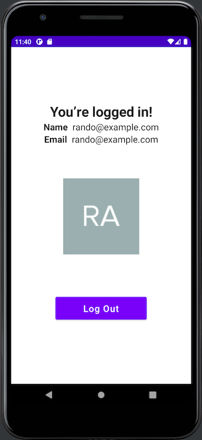
Here’s what changed after the user logged in:
- The title text at the top of the screen now says, “You’re logged in!”
- The name, email address, and photo associated with the user’s account appear onscreen.
- A Log Out button appears below the user’s photo.
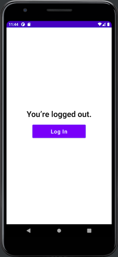
As you might expect, the user logs out by pressing the Log Out button, which returns them to a slightly different version of the initial screen:
What You’ll Need
You’ll need the following to build the app:
1. An Auth0 account
The app uses Auth0 to authenticate users, meaning you need an Auth0 account. You can sign up for a free account, which lets you add login/logout to 10 applications, with support for 7,000 users and unlimited logins — plenty for your prototyping, development, and testing needs.
2. An Android development setup
To develop applications for Android, make sure you have the following, in the order given below:
- Any computer running Linux, macOS, or Windows from 2013 or later with at least 8 GB RAM. When it comes to RAM, more is generally better.
- Java SE Developer Kit (JDK), version 11 or later. You can find out which version is on your computer by opening a command-line interface and entering
java --version. - Android Studio, version 2021.3.1 Patch 1 (also known as “Dolphin”) or later. Jetpack Compose is a recent development, so you should use the most recent stable version of Android Studio.
- At least one Android SDK (Software Development Kit) platform. You can confirm that you have one (and install one if you don’t) in Android Studio. Open Tools → SDK Manager. You’ll see a list of Android SDK platforms. Select the current SDK (Android 13.0 (Tiramisu) at the time of writing), click the Apply button, and click the OK button in the confirmation dialog that appears. Wait for the SDK platform to install and click the Finish button when installation is complete.
- An Android device, real or virtual:
- Using a physical device: Connect the device to your computer with a USB cable. Make sure that your device has Developer Options and USB debugging enabled.
- Using a virtual device: Using Android Studio, you can build a virtual device (emulator) that runs on your computer. Here’s my recipe for a virtual device that simulates a current-model inexpensive Android phone:
- Open Tools → AVD Manager (AVD is short for “Android Virtual Device”). The Your Virtual Devices window will appear. Click the Create Virtual Device... button.
- The Select Hardware window will appear. In the Phone category, select Pixel 3a and click the Next button.
- The System Image window will appear, and you’ll see a list of Android versions. Select S (API 31, also known as Android 12.0). If you see a Download link beside R, click it, wait for the OS to download, then click the Finish button. Then click the Next button.
- The Android Virtual Device (AVD) window will appear. The AVD Name field should contain Pixel 3a API 31, and the two rows below it should have the titles Pixel 3a (a reasonable “representative” phone, released three years ago at the time of writing) and S. In the Startup orientation section, select Portrait. Click the Finish button.
- You will return to the Your Virtual Devices window. The list will now contain Pixel 3a API 31, and that device will be available when you run the app.
3. A little familiarity with Android/Kotlin development.
If you’re new to Android development or the Kotlin programming language, you might find Android Basics in Kotlin to be a good introduction.
Create a New Jetpack Compose Project
🛠 Launch Android Studio and create a new project. You’ll see this window:
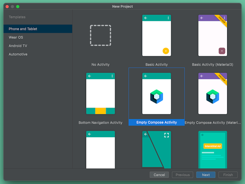
🛠 Do the following in this window:
- Select Phone and Tablet from the menu on the left side.
- Select Empty Compose Activity from the main list.
- Click Next.
You’ll go to this window:
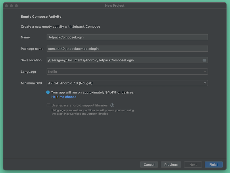
🛠 Do the following in this window:
- Enter
JetpackComposeLogininto the Name field. The Package Name field should automatically fill itself withcom.auth0.jetpackcomposelogin. Make a note of this package name — you’ll need it later when you register the app with Auth0. - Select a suitable location to save the project. In the screenshot above, you can see that I simply saved it to the default
AndroidStudioProjectsdirectory. - Set the Minimum SDK to API 24: Android 7.0 (Nougat) or later. This version of Android dates back to August 2016 and is above the minimum SDK level Jetpack Compose requires (API 21, also known as Android 5.0 or “Lollipop”). The project should run on most Android devices still in active use.
- Click Finish.
At the end of these steps, Android Studio will generate the project and present you with the app’s main activity file, MainActivity.kt.
Introducing Composable Functions
As with XML-based Android projects (which I’ll call “the old way”), the default MainActivity.kt file contains a MainActivity class that defines the default main activity’s appearance and behavior. The difference is in how it defines that appearance and behavior.
The MainActivity class
Let’s examine the MainActivity class. I’ve added some blank lines and comments to make the code a little easier to follow:
// 📄 MainActivity.kt

// (The package and import statements are here)

class MainActivity : ComponentActivity() {

    override fun onCreate(savedInstanceState: Bundle?) {
        super.onCreate(savedInstanceState)

        // Define which composable function defines the activity’s
        // overall appearance and behavior
        setContent {

                  // Define the activity’s colors
            JetpackComposeLoginTheme {

                // Define additional properties for the activity’s appearance
                Surface(
                    modifier = Modifier.fillMaxSize(),
                    color = MaterialTheme.colors.background
                ) {

                      // Define the activity’s layout and behavior
                    Greeting("Android")

                } // Surface()

            } // JetpackComposeLoginTheme()

        } // setContent()

    } // onCreate()

} // MainActivity

// (The rest of the file is here)
In XML-based Android projects, MainActivity’s onCreate() method calls setContentView() to “inflate” activity_main.xml. The XML file defines the activity’s layout, while the code in MainActivity defines the activity’s behavior.
In a Jetpack Compose project, onCreate() calls a similarly-named method, setContent(), to specify a composable function (or composable for short) that defines both the activity’s layout and behavior. In this case, that composable function is Greeting(), whose appearance is modified by the JetpackComposeLoginTheme() and Surface() functions containing it.
Before we continue, I’ll need to answer a question you’re probably asking right now.
What are composable functions?
Composable functions (or composables) are the building blocks of Jetpack Compose. While they’re not the same as views from “the old way” of building Android apps, they fill the same roles and behave similarly. They act as user interface elements or containers for user interface elements, just as views do in traditional Android projects. Think of them as functions that take in data and return UIs.
In mathematics, when you take the result of a function f() and feed it to another function g(), you are composing the two functions into a new function h(), whose value is g(f(x)). In Jetpack Compose, we do something similar — you can feed the UI component that one composable generates into another composable to create a more complex UI component. You do this by nesting composables inside other composables.
Let’s look at the first composable in MainActivity.kt. Android Studio creates it as part of the Empty Compose Activity app template. Its name is Greeting, and it’s located just after the MainActivity class:
@Composable
fun Greeting(name: String) {
    Text(text = "Hello $name!")
}
The first thing that you should notice is the @Composable annotation. This tells the Kotlin compiler that Greeting is a composable: function that receives data and generates a UI (or part of one) in response.
Annotating a function with @Composable adds a lot of behind-the-scenes behavior to it. Because of this, composables can only be used inside functions marked with the @Composable annotation. If you remove the @Composable annotation from Greeting, Android Studio will present you with the error message “@Composable invocations can only happen from the context of a @Composable function.”
You may have noticed these other things about Greeting:
- It’s a Kotlin function. Instead of XML, which can only define the structure of a user interface element or container, you’re looking at Turing-complete Kotlin code. This means that you can also use branching, looping, and all the other powers that code grants to define the behavior of user interface elements and containers. Later in this exercise, you’ll use these powers to show and hide UI elements based on whether the user is logged in or out.
- It has parameters. As a function, it has parameters (or, if you prefer, it takes arguments). This makes composables flexible and allows us to pass state to them. If you’re familiar with React, think of composable parameters as “props.”
- It’s a Unit function. In other words, it has no return value. Instead, it causes a user interface element or container to be drawn. Functional programming language purists would call this a side effect; we Jetpack Composers prefer to say that composables emit UI elements.
- Its name is a CapitalizedNoun. The convention is that composable function names are nouns capitalized in PascalCase. It helps distinguish composables from ordinary functions and methods, where the convention is to make their names verbs that use camelCase capitalization.
The second function in MainActivity.kt appears immediately after Greeting. It’s called DefaultPreview:
@Preview(showBackground = true)
@Composable
fun DefaultPreview() {
    LoginWithJetpackTheme {
        Greeting("Android")
    }
}
DefaultPreview has two annotations: @Composable and @Preview. The @Preview annotation tells the Kotlin compiler that this composable creates a UI element or container that doesn’t appear in the running app but as a preview in Android Studio. Preview composables let you preview the UI without requiring you to compile and run the app.
DefaultPreview renders the Greeting composable in Android Studio’s preview pane. You can open this pane by selecting Split near the upper right corner of the code pane:
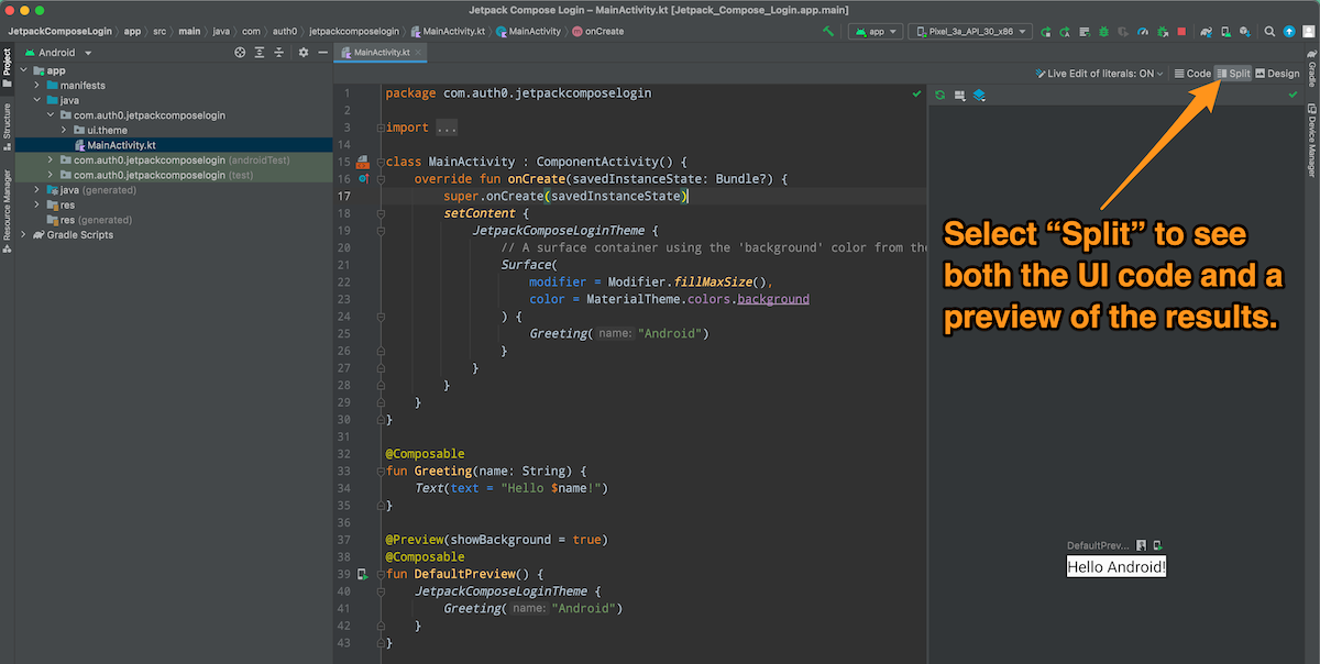
Since preview composables are visible only within Android Studio, they’re optional. We’ll ignore them in this tutorial for the sake of brevity.
Build the App’s User Interface
Let’s take our first step and build the app’s UI...
Define the app’s string resources
🛠 Open the project’s strings.xml file (in Android Studio’s Project pane, you’ll find it in the /app/res/values folder; in the filesystem, it’s in /app/src/main/res/values/). Replace its contents with this XML:
<!-- 📄 strings.xml -->

<resources>
    <string name="app_name">Jetpack Compose Login</string>
    <string name="initial_title">Welcome to the app!</string>
    <string name="logged_in_title">You’re logged in!</string>
    <string name="logged_out_title">You’re logged out.</string>
    <string name="log_in_button">Log In</string>
    <string name="log_out_button">Log Out</string>
    <string name="name_label">Name</string>
    <string name="email_label">Email</string>
    <string name="user_icon_url">https://images.ctfassets.net/23aumh6u8s0i/5hHkO5DxWMPxDjc2QZLXYf/403128092dedc8eb3395314b1d3545ad/icon-user.png</string>
</resources>
You’ll use these string resources in the app’s user interface. As a general rule, you shouldn’t use string literals in the user interface; instead, you should use string resources.
String resources are an underappreciated Android feature. They allow us to avoid the problems arising from hard-coded strings, prevent duplication of often-used string values, and simplify internationalization (you can create a string resource file for each language your app supports).
Add a new view and title to the main activity
🛠 Update the import statements to the beginning of MainActivity.kt to the following:
// 📄 MainActivity.kt

/// 👇🏽👇🏽👇🏽 Updated code
import android.os.Bundle
import androidx.activity.ComponentActivity
import androidx.activity.compose.setContent
import androidx.compose.foundation.layout.*
import androidx.compose.material.MaterialTheme
import androidx.compose.material.Surface
import androidx.compose.material.Text
import androidx.compose.runtime.Composable
import androidx.compose.ui.Modifier
import androidx.compose.ui.res.stringResource
import androidx.compose.ui.text.TextStyle
import androidx.compose.ui.text.font.FontFamily
import androidx.compose.ui.text.font.FontWeight
import androidx.compose.ui.tooling.preview.Preview
import androidx.compose.ui.unit.sp
import com.auth0.jetpackcomposelogin.ui.theme.JetpackComposeLoginTheme
/// 👆🏽👆🏽👆🏽
🛠 Update the MainActivity class by replacing the call to the Greeting composable with a call to a new composable called MainView:
// 📄 MainActivity.kt

class MainActivity : ComponentActivity() {
    override fun onCreate(savedInstanceState: Bundle?) {
        super.onCreate(savedInstanceState)
        setContent {
            JetpackComposeLoginTheme {
                // A surface container using the 'background' color from the theme
                Surface(
                    modifier = Modifier.fillMaxSize(),
                    color = MaterialTheme.colors.background
                ) {
                    /// 👇🏽👇🏽👇🏽 Updated code
                    MainView()
                    /// 👆🏽👆🏽👆🏽
                }
            }
        }
    }
}
🛠 Replace the Greeting and DefaultPreview composables with two new ones: MainView and Title:
// 📄 MainActivity.kt

/// 👇🏽👇🏽👇🏽 Updated code
// Remove Greeting and DefaultPreview
/// 👆🏽👆🏽👆🏽

/// 👇🏽👇🏽👇🏽 New code
@Composable
fun MainView() {
    Title(
        text = stringResource(R.string.initial_title)
    )
}

@Composable
fun Title(
    text: String,
)
{
    Text(
        text = text,
        style = TextStyle(
            fontFamily = FontFamily.Default,
            fontWeight = FontWeight.Bold,
            fontSize = 30.sp,
        )
    )
}
/// 👆🏽👆🏽👆🏽
The MainView composable emits the app’s main view, a container for the main view’s UI elements. It contains a call to the Title composable, passing it the ID value for the “Welcome to the app!” string resource.
Let’s take a closer look at the Title composable:
// 📄 MainActivity.kt

@Composable
fun Title(  // 1
    text: String,
)
{
    Text(  // 2
        text = text,
        style = TextStyle(
            fontFamily = FontFamily.Default,
            fontWeight = FontWeight.Bold,
            fontSize = 30.sp,  // 3
        )
    )
}
These notes correspond to the numbered comments in the code above:
- We’re defining a composable named
Title, which takes one argument:text, a string whose contents will be shown in a large title font. - It emits
Text, a built-in composable that displays text. We provide it with two arguments:text: A string containing the text thatTitlewill display.style: ATextStyleobject that changes the appearance of whatTextemits. The title will use the default font, in boldface, sized at 30 scale-independent pixels.
- Note how the font size is specified:
30.sp. ThefontSizeproperty expects aTextUnitvalue, andspis an extension property provided byTextUnitas syntactic sugar.30.spis much nicer to read thanTextUnit(30, TEXTUNIT_UNIT_SP).
For simplicity’s sake, I’m “hard-coding” the dimensions of UI components in this tutorial.
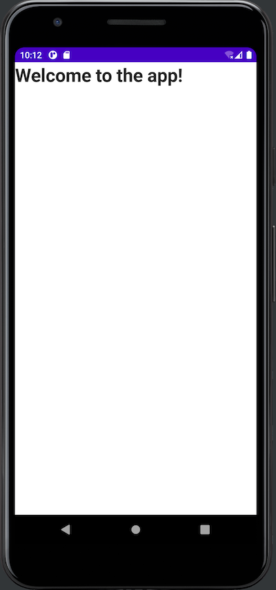
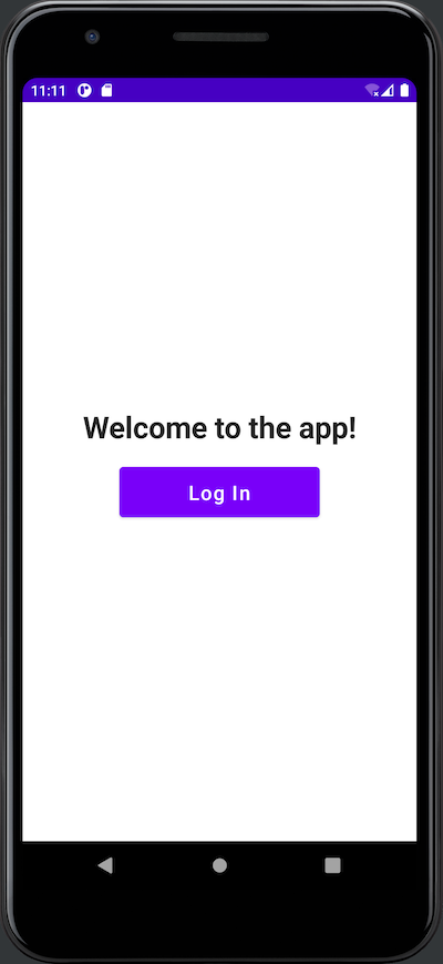
🛠 Run the app. It should look like this:
Add the Log In button
Let’s create a composable that will emit the Log In / Log Out button.
🛠 Add the following import statements to the ones near the start of MainActivity.kt:
// 📄 MainActivity.kt

import androidx.compose.ui.Alignment
import androidx.compose.material.Button
import androidx.compose.ui.unit.dp
🛠 Add the following code after the Title composable:
// 📄 MainActivity.kt

@Composable
fun LogButton(  // 1
    text: String,
    onClick: () -> Unit,
) {
    Column(  // 2
        modifier = Modifier
            .fillMaxWidth()
            .padding(20.dp),
        horizontalAlignment = Alignment.CenterHorizontally,
    ) {
        Button(  // 3
            onClick = { onClick() },
            modifier = Modifier
                .width(200.dp)
                .height(50.dp),
            ) {
            Text(  // 4
                text = text,
                fontSize = 20.sp,
            )
        }
    }
}
These notes correspond to the numbered comments in the code above:
- We’re defining a composable named
LogButton, which takes two arguments:text: A string containing the text that the button will display.onClick: A function that executes when the user presses the button.
Columnis a built-in layout composable, which acts as a container for other composables, laying them out vertically in the order in which they appear from the top to bottom. We’re providing it with three arguments:modifier: An instance of theModifierclass whose methods decorate or add behavior to a composable. We’re calling two methods —fillMaxWidth(), which makes theColumnas wide as its parent allows, andpadding()to specify 20 device-independent pixels’ worth of padding.- We’re setting its
horizontalAlignmentso that it’s centered horizontally. - A lambda function that specifies the composables inside the
Column.
Buttonis a built-in UI element composable that emits a standard button. We’re providing it with three arguments:onClick: The function that should execute when the user presses the button.modifier: We’re using this to specify the button’s dimensions — 200 device-independent pixels wide and 50 device-independent pixels high.- A lambda function that specifies the composables inside the
Button.
- This
Textcomposable defines the text within the button. It takes two arguments:text: A string containing the text to be displayed.fontSize: Sets the font size to 20 scale-independent pixels.
🛠 Add the button to the app’s main view by updating the MainView composable as shown below:
// 📄 MainActivity.kt

@Composable
fun MainView() {
    Title(
        text = stringResource(R.string.initial_title)
    )
    /// 👇🏽👇🏽👇🏽 New code
    LogButton(
        text = stringResource(R.string.log_in_button),
        onClick = { },
    )
    /// 👆🏽👆🏽👆🏽
}
🛠 Run the app. You’ll see this:
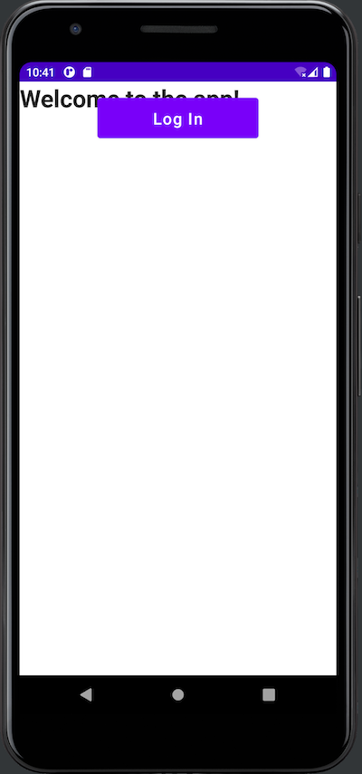
As you can see, LogButton overlaps Title. This happens when you place one UI element composable after another without placing them inside a layout composable. We can fix this by putting them inside a Column.
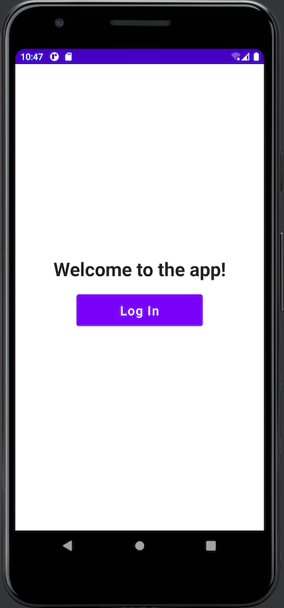
🛠 Update MainView as shown below, then rerun the app:
// 📄 MainActivity.kt

@Composable
fun MainView() {
    /// 👇🏽👇🏽👇🏽 New code
    Column(
        modifier = Modifier.padding(20.dp),
        horizontalAlignment = Alignment.CenterHorizontally,
        verticalArrangement = Arrangement.Center,
    ) {
    /// 👆🏽👆🏽👆🏽
        Title(
            text = stringResource(R.string.initial_title)
        )
        LogButton(
            text = stringResource(R.string.log_in_button),
            onClick = { },
        )
    /// 👇🏽👇🏽👇🏽 New code
    }
    /// 👆🏽👆🏽👆🏽
}
The column you just added has 20 device-independent pixels of padding, its contents are centered horizontally and vertically within MainView, and it lays out Title and LogButton in a vertical line. The result looks much better:
Add UI elements to display the user’s name and email address
The app needs UI elements to display the user’s name and email address. Let’s create a composable that takes two string arguments — a label and a corresponding value — and shows them side-by-side, with the label in bold text.
🛠 Add the following code to MainView.kt after Title and before LogButton:
// 📄 MainActivity.kt

@Composable
fun UserInfoRow(
    label: String,
    value: String,
) {
    Row {  // 1
        Text(
            text = label,
            style = TextStyle(
                fontFamily = FontFamily.Default,
                fontWeight = FontWeight.Bold,
                fontSize = 20.sp,
            )
        )
        Spacer( // 2
            modifier = Modifier.width(10.dp),
        )
        Text(
            text = value,
            style = TextStyle(
                fontFamily = FontFamily.Default,
                fontSize = 20.sp,
            )
        )
    }
}
This code introduces two new built-in composables, each highlighted by a numbered comment:
Row: The horizontal counterpart toColumn. It’s a layout composable that acts as a container for other composables, laying them out horizontally in the order in which they appear from left to right. We’re using it to put the label and value side by side.Spacer: A composable that provides space between other composables. We’re using it to make a little horizontal space between the label and the value.
🛠 Update MainView to incorporate two instances of UserInfoRow: one for the user’s name and one for the user’s email address:
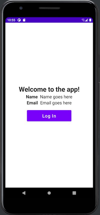
// 📄 MainActivity.kt

@Composable
fun MainView() {
    Column(
        modifier = Modifier.padding(20.dp),
        horizontalAlignment = Alignment.CenterHorizontally,
        verticalArrangement = Arrangement.Center,
    ) {
        Title(
            text = stringResource(R.string.initial_title)
        )
        /// 👇🏽👇🏽👇🏽 New code
        UserInfoRow(
            label = stringResource(R.string.name_label),
            value = "Name goes here",
        )
        UserInfoRow(
            label = stringResource(R.string.email_label),
            value = "Email goes here",
        )
        /// 👆🏽👆🏽👆🏽
        LogButton(
            text = stringResource(R.string.log_in_button),
            onClick = { },
        )
    }
}
The hard-coded value parameters in the two UserInfoRow instances are temporary. You’ll replace them with values provided by Auth0 later in this exercise.
🛠 Run the app. You should see this:
Add a UI element to display the user’s picture
There’s one more UI element to add: one that can take a URL for a picture and display it onscreen. To do this, we’ll use the Coil image loading library, which is “Kotlin-first,” fast, and easy to use. Let’s add Coil to the project.
🛠 Open the app’s build.gradle file (in Android Studio’s Project pane, it’s the build.gradle (Module: JetpackComposeLogin.app) file under Gradle Scripts; in the filesystem, it’s /app/build.gradle). Update the dependencies section to include the latest version of Coil, as shown below:
// 📄 /app/build.gradle

dependencies {

    implementation 'androidx.core:core-ktx:1.7.0'
    implementation "androidx.compose.ui:ui:$compose_version"
    implementation "androidx.compose.material:material:$compose_version"
    implementation "androidx.compose.ui:ui-tooling-preview:$compose_version"
    implementation 'androidx.lifecycle:lifecycle-runtime-ktx:2.3.1'
    implementation 'androidx.activity:activity-compose:1.3.1'
    testImplementation 'junit:junit:4.13.2'
    androidTestImplementation 'androidx.test.ext:junit:1.1.3'
    androidTestImplementation 'androidx.test.espresso:espresso-core:3.4.0'
    androidTestImplementation "androidx.compose.ui:ui-test-junit4:$compose_version"
    debugImplementation "androidx.compose.ui:ui-tooling:$compose_version"
    debugImplementation "androidx.compose.ui:ui-test-manifest:$compose_version"

    /// 👇🏽👇🏽👇🏽 New code
    // Coil image loading library
    // (see https://github.com/coil-kt/coil)
    implementation 'io.coil-kt:coil-compose:+'
    /// 👆🏽👆🏽👆🏽

}
The first set of dependencies listed above was automatically generated by Android Studio and has Android Studio’s choice of dependency versions. I prefer to leave those alone. However, we added the Coil dependency manually. With dependencies that I add myself, I prefer to request the latest version unless there’s a security-related reason to use a specific version.
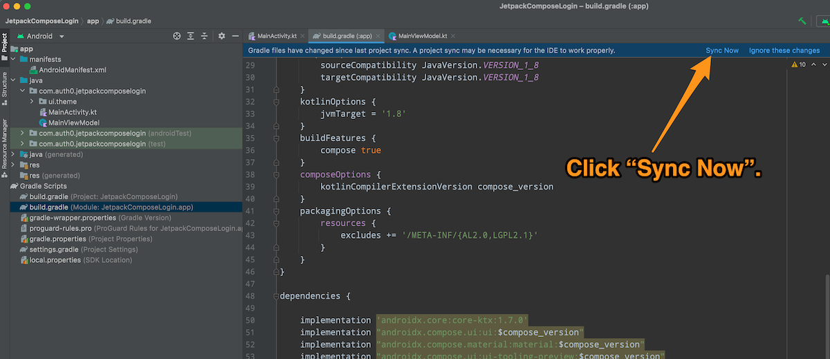
🛠 This change to the app’s build.gradle file will require re-syncing the project with the updated Gradle file. Click the Sync Now link near the top right corner of the code pane to do so:
Android Studio will display the message “Gradle project sync in progress...” for a few moments, and then the sync will complete.
The next step is to give the app permission to access the internet. The coil needs it to download images, and Auth0 will need it to contact its servers. You specify this permission in the app’s manifest file.
🛠 Open the app’s manifest file, AndroidManifest.xml (in Android Studio’s Project pane, it’s in the /app/manifests folder; in the filesystem, it’s in /app/src/main/. Add a <uses-permission> XML element for internet access as shown below:
<!-- 📄 app/manifests/AndroidManifest.xml -->

<?xml version="1.0" encoding="utf-8"?>
<manifest xmlns:android="http://schemas.android.com/apk/res/android"
    xmlns:tools="http://schemas.android.com/tools"
    package="com.auth0.androidlogin">

    <!-- New code 👇🏽 -->
    <uses-permission android:name="android.permission.INTERNET" />
    <!-- New code 👆🏽 -->

    <application
        android:allowBackup="true"
        android:dataExtractionRules="@xml/data_extraction_rules"
        android:fullBackupContent="@xml/backup_rules"
        android:icon="@mipmap/ic_launcher"
        android:label="@string/app_name"
        android:roundIcon="@mipmap/ic_launcher_round"
        android:supportsRtl="true"
        android:theme="@style/Theme.AndroidLogin"
        tools:targetApi="31">
        <activity
            android:name=".MainActivity"
            android:exported="true">
            <intent-filter>
                <action android:name="android.intent.action.MAIN" />

                <category android:name="android.intent.category.LAUNCHER" />
            </intent-filter>
        </activity>
    </application>

</manifest>
🛠 Add these import statements to the ones near the start of MainActivity.kt. The first one imports the Image composable, and the second imports Coil’s rememberAsyncImagePainter() function, which downloads and stores an image from a URL:
// 📄 MainActivity.kt

import androidx.compose.foundation.Image
import coil.compose.rememberAsyncImagePainter
🛠 With the prerequisites out of the way, it’s time to write the composable to display the user’s picture, which is stored online at a specified URL. Add the following code after UserInfoRow and before LogButton:
// 📄 MainActivity.kt

@Composable
fun UserPicture(  // 1
    url: String,
    description: String,
) {
    Column(  // 2
        modifier = Modifier
            .padding(10.dp),
        horizontalAlignment = Alignment.CenterHorizontally,
        verticalArrangement = Arrangement.Center,
    ) {
        Image(  // 3
            painter = rememberAsyncImagePainter(url),
            contentDescription = description,
            modifier = Modifier
                .fillMaxSize(0.5f),
        )
    }
}
These notes correspond to the numbered comments in the code above:
- We’re defining a composable named
UserPicture, which takes two arguments that will be passed to theImagecomposable contained within this composable.url: A string containing the URL for the image to be downloaded and displayed.description: A description of the image.
- This composable uses a
Columnto provide padding and horizontal/vertical center alignment. Imageis a built-in UI element composable that displays an image. We’re providing it with three arguments:painter: The image to be displayed by the composable. This should be an instance of a subclass ofPainter, an abstract class representing something that can be drawn, such as a bitmapped graphic, vector graphic, color, or gradient. In this case, we want to download an image from an URL and display it, so we set this value torememberAsyncImagePainter(url), a Coil method that downloads an image from a URL specified byUserPicture’surlparameter and returns anAsyncImagePainterinstance that the composable can display.contentDescription: A description of the image that accessibility devices or tools will use. Think of this as Android’s version of “alt text” in HTML.modifier: We’re using this to limit the image to half of its maximum possible size on the screen.
🛠 Update MainView to incorporate UserPicture, placing it below the UserInfoRow for the user’s email address and above the Log In button:
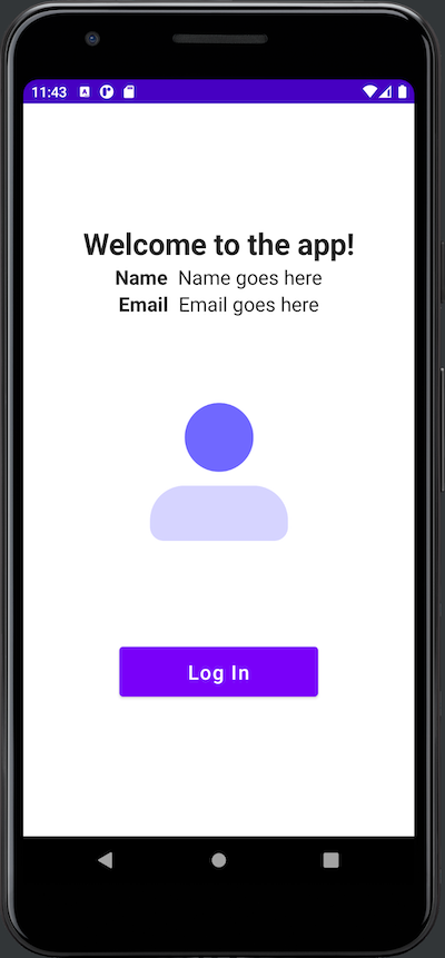
// 📄 MainActivity.kt

@Composable
fun MainView() {
    Column(
        modifier = Modifier.padding(20.dp),
        horizontalAlignment = Alignment.CenterHorizontally,
        verticalArrangement = Arrangement.Center,
    ) {
        Title(
            text = stringResource(R.string.initial_title)
        )
        UserInfoRow(
            label = stringResource(R.string.name_label),
            value = "Name goes here",
        )
        UserInfoRow(
            label = stringResource(R.string.email_label),
            value = "Email goes here",
        )
        /// 👇🏽👇🏽👇🏽 New code
        UserPicture(
            url = "https://images.ctfassets.net/23aumh6u8s0i/5hHkO5DxWMPxDjc2QZLXYf/403128092dedc8eb3395314b1d3545ad/icon-user.png",
            description = "Description goes here",
        )
        /// 👆🏽👆🏽👆🏽
        LogButton(
            text = stringResource(R.string.log_in_button),
            onClick = { },
        )
    }
}
We’re breaking Android’s “don’t use string literals in the user interface, use string resources” rule in setting the url property in the call to UserPicture. Once again, this temporary measure lets us display a placeholder graphic where the user’s picture will eventually go.
🛠 Run the app. You should see this:
With UserPicture, you’ve added all the UI elements to the app. It’s time to make the app respond to the user, which requires adding behavior and state.
Add Behavior and State to the App
In this part of the exercise, we’ll add behavior to the app by making it respond to the user’s button presses. When launched, the app should show this screen:
When the user presses the Log In button, the app should show the “logged in” screen. The user should see “Welcome to the app!” as the title, with placeholder values for the user’s name, email address, and picture. The button should say Log Out:

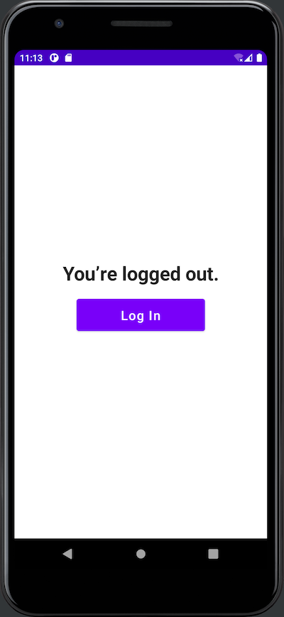
When the user presses the Log Out button, they return to the initial page. The title changes to “You’re logged out,” and the button’s text changes to “Log In.”
Preserve and observe (or: Keep track of the app’s state)
To add behavior to the app, it needs to be aware of its state. We’ll need two variables to store the state:
userIsAuthenticated: a boolean value that istrueif the user is logged in. This will determine which screen the user sees — the “logged out” screen or the “logged in” one. Its initial value isfalse.appJustLaunched: a boolean that istrueif the app has just been launched and the user has not logged in since launch. This will determine the title the user sees on the “logged out” screen: “Welcome to the app!” or “You’re logged out.” This variable’s initial value istrue.
In a Jetpack Compose-based application, the UI reacts to changes in the state, which means it reacts to changes in the variables. When userIsAuthenticated’s value changes to true, the app should present the “logged in” screen, complete with the user’s name, email address, and picture, along with the Log Out button. When userIsAuthenticated’s value changes to false, the app should display the “logged out” screen with only the greeting title and the Log In button.
This “reactive UI” approach presents two requirements for state variables:
- In a Jetpack Compose activity, the UI is defined by composable functions located outside the activity class. Any state variables inside those functions go out of scope as soon as the functions finish executing. There needs to be a way for a composable to remember the values of state variables when it’s called again.
- There also needs to be a way to specify which variables are part of the state so that Jetpack Compose can observe them for changes and call the necessary composables to update the UI (a process called recomposing or recomposition) when their values change.
Jetpack Compose provides two mechanisms that allow us to meet these challenges.
Preserving state with remember
The remember API allows composables to remember values between calls. It has this syntax...
remember { thing }
...where thing is an object — mutable or immutable — whose value should be stored in the composable between calls to it.
Observing state with mutableStateOf()
The mutableStateOf() function creates an instance of MutableState<T>, an object containing a value of type T that Jetpack Compose watches for changes. Here’s an example:
var userIsAuthenticated = mutableStateOf(false)
The code above declares a variable, userIsAuthenticated, as one that Jetpack Compose should watch for changes. It also sets the variable’s initial value to false, which causes Kotlin to infer that userIsAuthenticated’s type is MutableState<Boolean>. You access this boolean value via userIsAuthenticated’s value property. For example, this code changes userIsAuthenticated’s value to false:
userIsAuthenticated.value = false
We can use Kotlin’s by keyword and delegated properties when declaring a state variable to make it easier to get and set its value. If we declare userIsAuthenticated this way...
var userIsAuthenticated by mutableStateOf(false)
...then we can change the value contained within userIsAuthenticated using the simpler syntax:
userIsAuthenticated = false
Declaring preserved and observed state variables
A state variable needs to be both preserved and observed. We can combine both remember and mutableStateOf() to create such variables.
Here’s how we’d declare userIsAuthenticated and appJustLaunched as state variables:
var userIsAuthenticated by remember { mutableStateOf(false) }
var appJustLaunched by remember { mutableStateOf(true) }
Let’s put this to use.
Add state to MainView
🛠 Add these import statements to the ones near the start of MainActivity.kt. These will add support for the delegated properties of mutableStateOf(), remember, and mutableStateOf():
// 📄 MainActivity.kt

import androidx.compose.runtime.getValue
import androidx.compose.runtime.mutableStateOf
import androidx.compose.runtime.remember
import androidx.compose.runtime.setValue
🛠 Add the userIsAuthenticated and appJustLaunched state variables to MainView by declaring them at the start of the composable:
// 📄 MainActivity.kt

@Composable
fun MainView() {
    /// 👇🏽👇🏽👇🏽 New code
    var userIsAuthenticated by remember { mutableStateOf(false) }
    var appJustLaunched by remember { mutableStateOf(true) }
    /// 👆🏽👆🏽👆🏽

    // (The rest of the code goes here)
🛠 Update the rest of MainView so that userIsAuthenticated and appJustLaunched determine what the app shows onscreen. MainView should look like this:
// 📄 MainActivity.kt

@Composable
fun MainView() {
    var userIsAuthenticated by remember { mutableStateOf(false) }
    var appJustLaunched by remember { mutableStateOf(true) }

    Column(
        modifier = Modifier.padding(20.dp),
        horizontalAlignment = Alignment.CenterHorizontally,
        verticalArrangement = Arrangement.Center,
    ) {
        /// 👇🏽👇🏽👇🏽 1. Updated code
        // Title
        // -----
        val title = if (userIsAuthenticated) {
            stringResource(R.string.logged_in_title)
        } else {
            if (appJustLaunched) {
                stringResource(R.string.initial_title)
            } else {
                stringResource(R.string.logged_out_title)
            }
        }
        Title(
            text = title
        )
        /// 👆🏽👆🏽👆🏽
        /// 👇🏽👇🏽👇🏽 2. New code
        // User info
        // ---------
        if (userIsAuthenticated) {
        /// 👆🏽👆🏽👆🏽
            UserInfoRow(
                label = stringResource(R.string.name_label),
                value = "Name goes here",
            )
            UserInfoRow(
                label = stringResource(R.string.email_label),
                value = "Email goes here",
            )
            UserPicture(
                url = stringResource(R.string.user_icon_url),
                description = "Description goes here",
            )
        /// 👇🏽👇🏽👇🏽 3. New code
        }
        /// 👆🏽👆🏽👆🏽
        /// 👇🏽👇🏽👇🏽 4. New code
        // Button
        // ------
        val buttonText: String
        val onClickAction: () -> Unit
        if (userIsAuthenticated) {
            buttonText = stringResource(R.string.log_out_button)
            onClickAction = {
                userIsAuthenticated = false
                appJustLaunched = false
            }
        } else {
            buttonText = stringResource(R.string.log_in_button)
            onClickAction = {
                userIsAuthenticated = true
            }
        }
        /// 👆🏽👆🏽👆🏽
        LogButton(
            /// 👇🏽👇🏽👇🏽 5. Updated code
            text = buttonText,
            onClick = onClickAction,
            /// 👆🏽👆🏽👆🏽
        )
    }
}
These notes correspond to the numbered “New code” and “Updated code” comments above:
- This code determines the title shown onscreen:
- If the user is logged out and has never logged in during this session, the title is “Welcome to the app!”.
- If the user is logged in, the title is “You’re logged in!”
- If the user is logged out after having logged in, the title is “You’re logged out.”
- This
ifstatement ensures that the user’s name, email address, and picture are displayed only if the user is logged in. - This is the closing parenthesis for the
ifstatement above. - This sets up two values that determine the button's text (“Log In” or “Log Out”) and action based on whether the user is logged in.
- This uses the two values above to compose the button.
🛠 Run the app. You can now press the Log In button to go to the “logged in” screen and the Log Out button to go to the “logged out” screen. You’ve added behavior and state management to the app!
In Part Two of this tutorial, you’ll improve the architecture with a ViewModel and add Auth0 authentication to the app.
About the author

Joey deVilla
Senior Developer Advocate (Auth0 Alumni)