


Announcing Manage Dashboard’s Dark Theme!
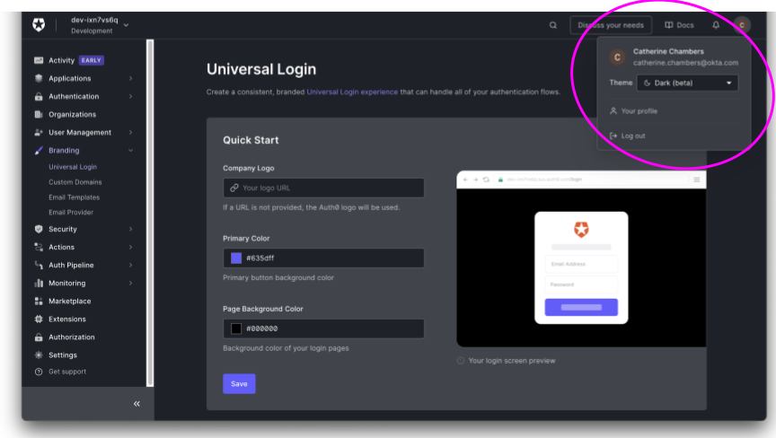
The feedback has been coming in for a while: up until now, opening the Auth0 management dashboard has been awfully jarring for people who prefer to work in the cooler, more subdued tones of a dark mode app. That’s why we’re thrilled to announce that the Auth0 Manage dashboard now has a dark theme option too! You can check out this early-access feature today by enabling it in your user profile.
This new theme is slick and elegant, and we think it’s going to fit in perfectly with how many of our users prefer to work. It is, however, a work in progress, and you may notice a few places in the app that can be improved. We’ll be monitoring our feedback channels closely!
Of course, building a dark theme involves more than just inverting colors. Behind the scenes, making this new dashboard experience possible is our internal design system called Quantum. And behind Quantum is a team of designers and developers who have been amongst the strongest advocates for our new dark theme.
Dark Theme from A Designers Perspective
Introducing dark mode has many UI benefits as it provides a great reading experience, reflects less light, and allows users to not have a jarring experience shifting between their system preferences to a forced light mode when visiting our site.
The design team took several steps to ensure that our experience remained seamless and intuitive within the dark mode. By first understanding a color palette that was compatible with a dark mode and understanding implications or changes that might need to be made with a switch in theme.
The dark mode also presents unique design challenges. For example, it can be difficult to differentiate between elements on a dark background, since some tend to blend together. To counteract this, the design team performed an audit to make sure we used high-contrast colors and considered how some components look when viewed in both light and dark modes.
The Quantum design system team is currently working on handling theming and tokens within Figma to ensure our design team has all the necessary resources to create designs in dark mode.
Creating this theming layer does not just create the opportunity to enable dark mode but also other visual modes that enable the dashboard to be more accessible. The dark mode was our first step, but we want to tackle other modes such as dark/light high contrast, tritanopia, deuteranopia, protanopia, reduced motion, and more.
Implementing Dark Theme
Implementing Dark Theme comes with challenges that do not exist in a single-theme environment. To help mitigate these challenges, we make heavy use of our system Quantum. Once Quantum fully supported dark mode, adding it to our application was relatively simple.
Quantum is built on top of Material UI (MUI) with a collection of theme overrides and custom components using the styling engine MUI provides. The dark mode is built into MUI components but requires some work from the consumer to make it work with their own overrides and components.
At the theme level, we took what MUI already provided and built it on top of it. With the introduction of theme modes, there is a greater importance on choosing colors based on their intention instead of their value. Using and providing semantic colors is key. MUI provides some out-of-the-box, and we added others to support our visual look and feel.
Once implemented at the theme level, we went component by component to validate how they look in dark mode and occasionally had to adjust components using the semantic tokens. During this work, we worked alongside design instead of trying to hand it off for review. This allowed for quick iteration and ultimately allowed us to ship faster.
Migrating the management dashboard to dark mode was as simple as updating to our new version of Quantum with dark theme support… until it wasn’t. While most of our application is built using Quantum components directly, we still have a few locations where we are overriding values or making completely custom components. To remedy this, we took the following actions:
- Remove any overrides that are unnecessary.
- Update any custom components to use the semantic token values
- Make a note of any components that might be good candidates to be added to Quantum.
- Provide documentation for how developers can safely implement custom components or override that will be dark mode compatible.
Implementing dark mode is only half of the battle, though. One large challenge we will face will be making sure we continue to support both themes with a high level of quality. We are approaching this from a few directions:
- Monitoring Quantum changes using a combination of Storybook and Chromatic. We are taking snapshots of both themes for all components and will be able to detect changes to either and quickly either fix or approve any updates.
- Using lint rules to avoid using any hardcoded colors or non-semantic tokens.
- Documentation of best practices and common scenarios.
Conclusion
To all of our users who sent us feedback on color themes or anything else, thank you! Keep it coming! We hope you enjoy our gift to you: a cool, new dark theme for your Manage dashboard.