Blame Netflix or Spotify.
In fact, take your pick of any of the digital brands that have made seamless and beautiful UX a staple part of daily life. From one-click checkouts on Amazon to Single Sign-On across all of Google’s services, consumers have never had it better for digital experiences….and they are now expecting it everywhere they go online.
“Login boxes are the first thing many people engage with on a website. Yet, the importance of them can sometimes be relegated to “as long as it works, it works.””
Tweet This
Login boxes are the first thing many people engage with on a website. Yet, the importance of them can sometimes be relegated to “as long as it works, it works.”
The challenge is consumers don’t just want things that work; they want things that work so well they never even notice it.
And so here are five ways in which your login box is turning your customers away from your brand.
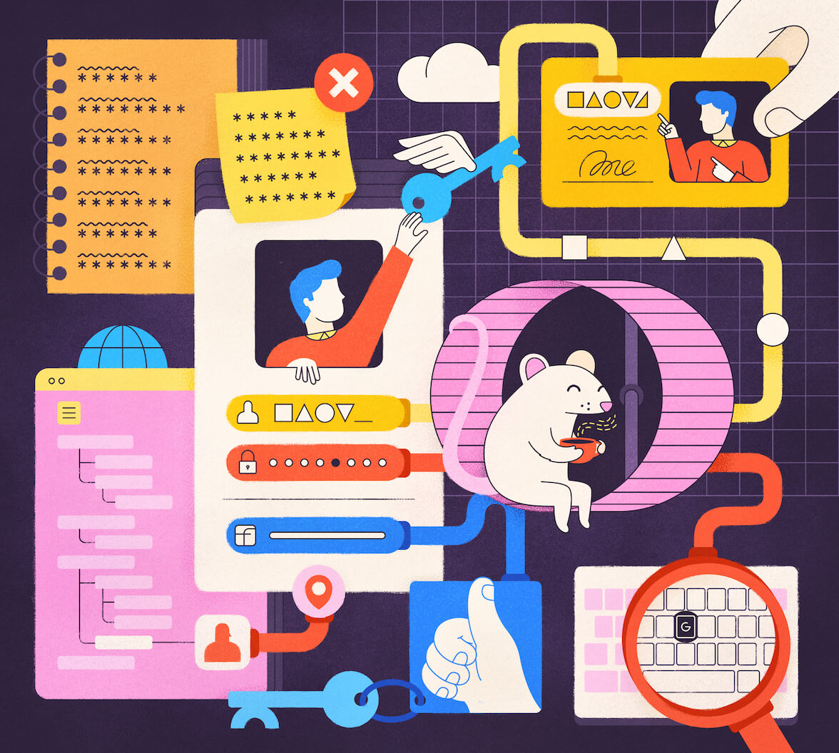
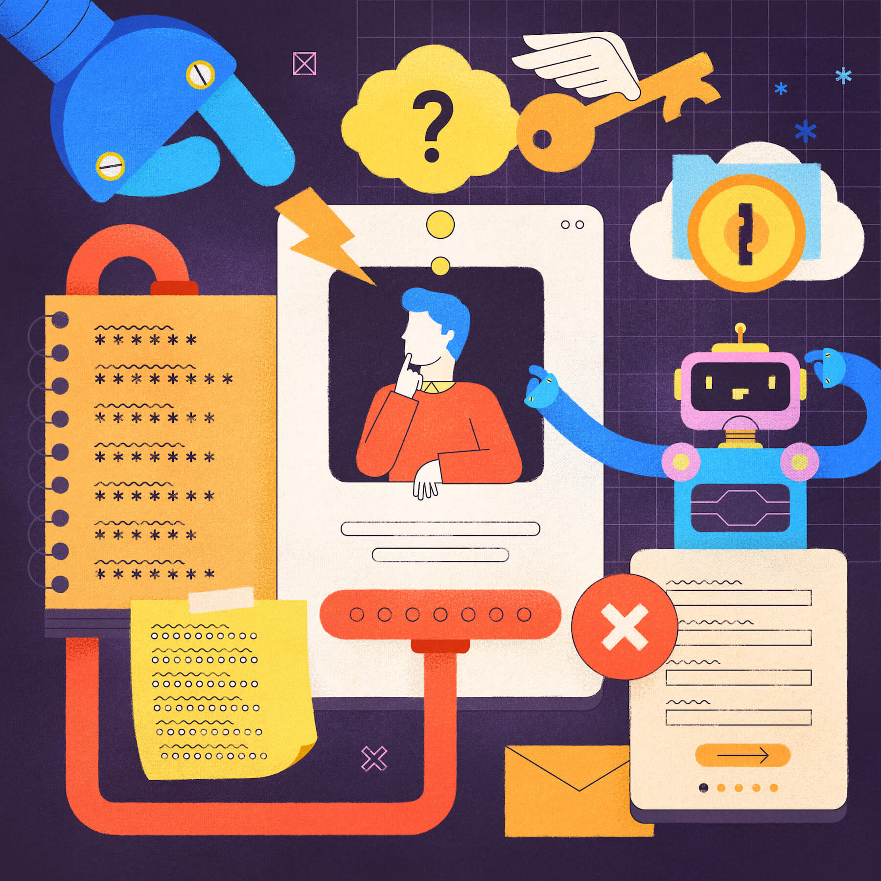
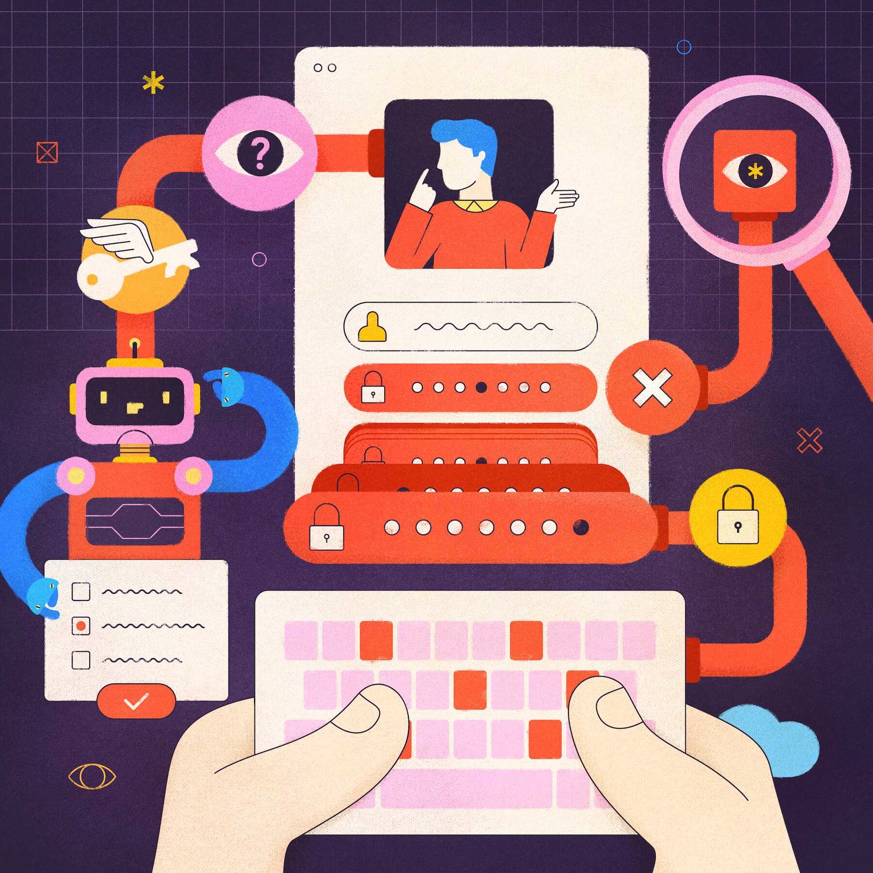
1. Punishing Customers for Forgetting Passwords
Look, we get annoyed by remembering passwords as well. In an ideal world, everyone would have a 1Password account. But we live in a world where people forget things. Making it difficult to reset a password doesn’t help anyone. It won’t make your customers think they should turn over a new leaf; it just makes them annoyed. So make it simple to get a reset and get them into your site.
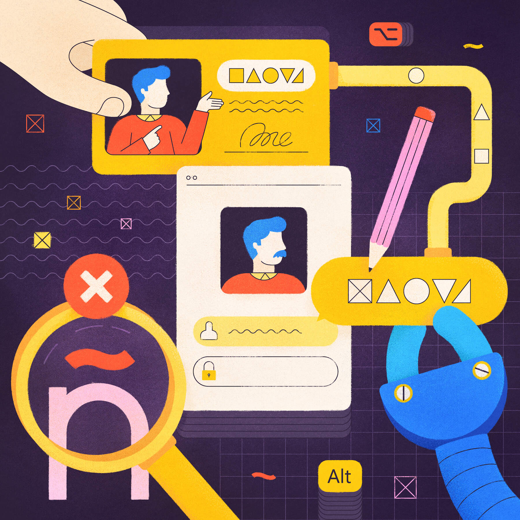
2. Not Offering Special Characters for Usernames
People often like to use their real names for usernames. That’s not an unreasonable thing, but some global apps don’t support usernames with special characters, like “ñ” for Spanish names. There’s no worse way to start off with a new customer than to deny them the chance to spell their name properly. Remedy this by building in a more diverse character set.
3. Not Giving the Option to See the Password
Phones are getting smaller + hands not = lots of mistyped passwords. We have all had that moment when after typing in the ten-digit password, we find out it’s invalid because the second letter was wrong. So build in a simple toggle that lets users choose whether to make their text input visible before they start typing.
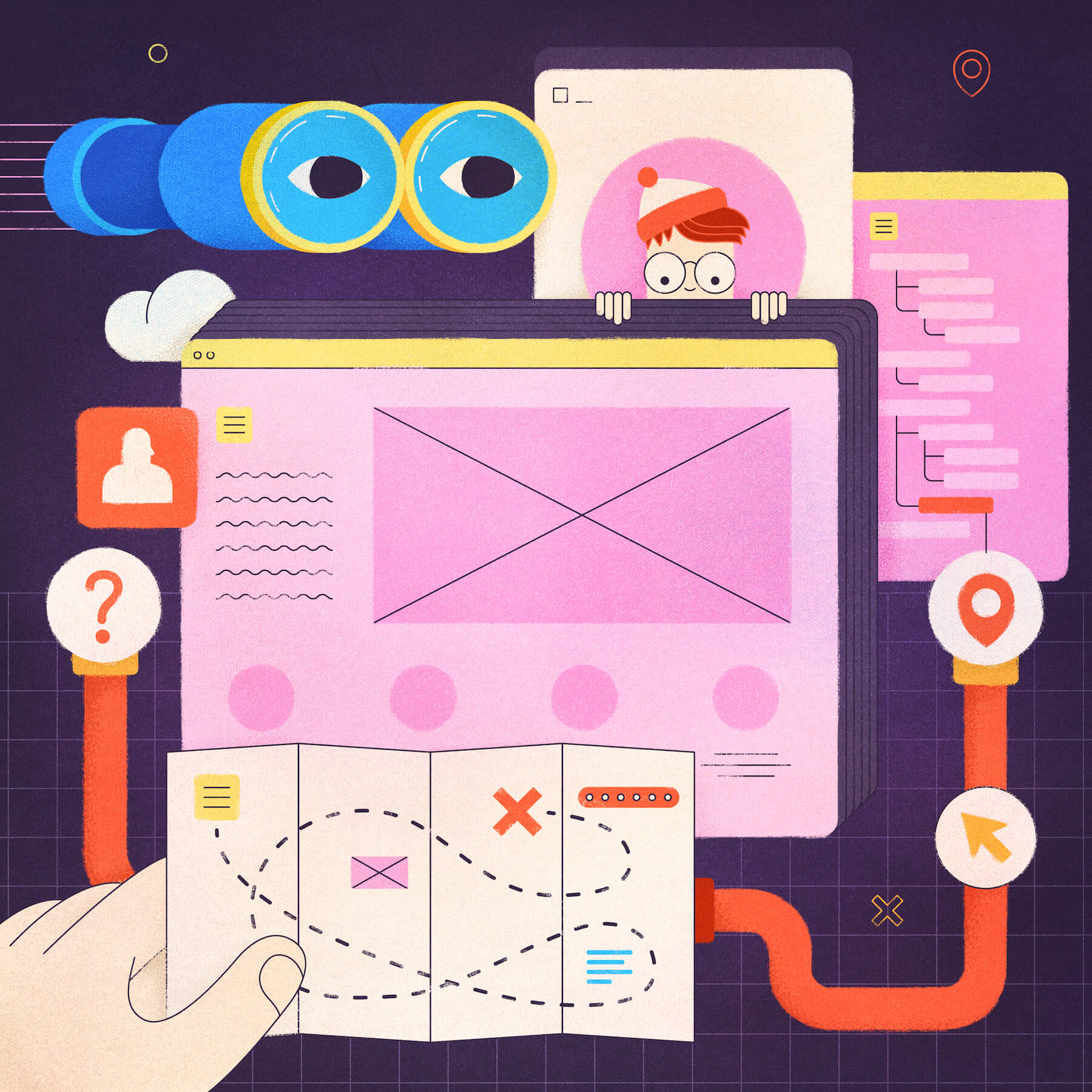
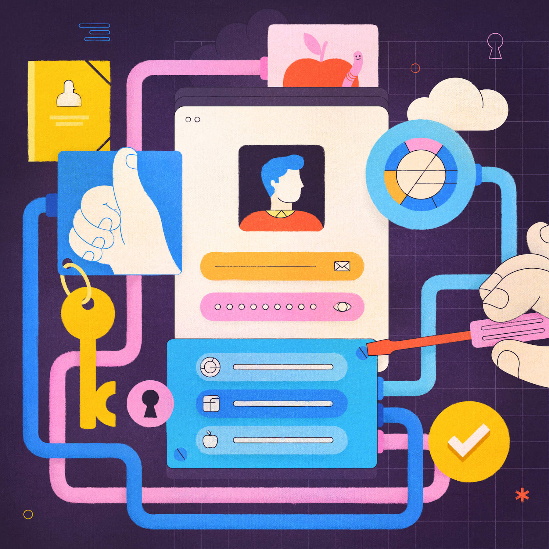
4. Hiding Your Login Box
Your customer might enjoy playing ‘Where’s Wally’ in their spare time. They probably don’t want to do it when they just want to visit your site. It’s such an obvious one, but making it difficult to find a login box on your site means less time your customer is doing what you want on your site. Put the login box or link clearly where your users can see it.
5. Not Offering Social Login
Sometimes people just want to jump straight into buying/streaming/browsing when they visit a site. They don’t want to fill in a registration form, so being able to just one click with their existing social accounts is ideal. This is becoming more and more popular, so when a login box doesn’t have this feature, it stands out. Make things easier by giving the option of using Facebook, Google, or Apple on your login page.
Taking a little bit of time to enact the above, and your login box — and customers — will thank you for it.
You can find out more about features such as MFA, magic links, SSO, and other ways you can make your login box awesome at auth0.com
About Auth0
Auth0 by Okta takes a modern approach to customer identity and enables organizations to provide secure access to any application, for any user. Auth0 is a highly customizable platform that is as simple as development teams want, and as flexible as they need. Safeguarding billions of login transactions each month, Auth0 delivers convenience, privacy, and security so customers can focus on innovation. For more information, visit https://auth0.com.
About the author

Kerry Ok
Chief Marketing Officer