Developers can use animations in meaningful and non-distracting ways to significantly improve their application's user experience (UX). This blog post discusses four effective techniques to animate your application's user interface, covering popular use cases. You'll learn how to transform bland experiences into memorable ones for your users.
Getting Started Quickly
I created a demo application to help you focus on adding animations to Angular. You'll add animations to a starter app as you progress through this tutorial. The starter application uses Tailwind to take care of its style and layout, but none of the animations discussed here are dependent on it.
Follow this tutorial without cloning any repo, right in the browser using Stackblitz or CodeSandbox.
If you prefer to work locally in your IDE, clone the demo app and check out its starter branch:
git clone -b starter git@github.com:auth0-blog/angular-animations-storefront.git
Once you clone the repo, make angular-animations-storefront your current directory:
cd angular-animations-storefront
Install the project's dependencies:
npm i
Run the project locally:
npm run start
Brief Overview of Angular Animations
Angular comes with a powerful animation module that lets you quickly add motion to your application: BrowserAnimationsModule. Under the hood, this module uses the Web Animations API (WAAPI) to create motion and interactivity. Whenever WAAPI isn't available, BrowserAnimationsModule falls back to using CSS keyframes. Angular animations give you the option to use their abstraction layer to animate any properties that the web considers animatable such as positions, sizes, colors, and many more.
Let's see how you can integrate Angular animations in your project.
First, we need to update our AppModule as defined in the src/app/app.module.ts file to include BrowserAnimationsModule in its imports array:
📁 src/app/app.module.ts:
import { NgModule } from '@angular/core';
import { CommonModule } from '@angular/common';
import { FormsModule } from '@angular/forms';
import { BrowserModule } from '@angular/platform-browser';
import { HttpClientModule } from '@angular/common/http';
import { AppRoutingModule } from './app-routing.module';
import { AppComponent } from './app.component';
import { SharedModule } from './shared';
import { BrowserAnimationsModule } from '@angular/platform-browser/animations';

@NgModule({
    declarations: [AppComponent],
    imports: [
        BrowserModule,
        CommonModule,
        FormsModule,
        HttpClientModule,
        AppRoutingModule,
        SharedModule,
        BrowserAnimationsModule,
    ],
    providers: [],
    bootstrap: [AppComponent],
})
export class AppModule {}
If you get an ngcc error, please restart your local development server after adding BrowserAnimationsModule to your AppModule.
Signal Interactivity
This type of animation gives prompts to the user that some elements are interactable: you can click or tap on them to trigger an action or event. It draws the user's attention to the component and serves as a logical "guide" in the app. Consistent use of this animation technique helps the user associate the animation with its actions, creating an intuitive pattern for the user to navigate within the application.
A basic and common pattern to show interactivity is changing your cursor to a pointer when hovering over an interactable element. We can add subtle animations along with the cursor change to draw more attention to the component.
There are numerous ways that you can add hover animations. You can do it through JavaScript by using a mouseover event listener or using the :hover pseudo-class through CSS. The :hover pseudo-class is perhaps the most straightforward and widely used method for this type of animation. CSS comes with a lot of flexibility for building animations and is also very performant in executing them.
To add this effect to your components, add a :hover pseudo-class to the target CSS selector. Within :hover define a transform and a transition property that defines which CSS properties you want to animate and how you want to animate them. The demo includes several instances of hover animations using CSS with varying complexity.
Let's add a simple hover animation in the navigation buttons of the starter application, dimming them as the user hovers over them. The dimming effect uses a :hover pseudo-class which transitions the elements opacity from 1 to 0.5 on hover.
Add the following CSS class to the src/styles.scss file:
// Other CSS selectors...

.hover-dim {
  opacity: 1;
  &:hover {
    opacity: 0.5;
    transition: opacity 0.2s ease-in-out;
  }
}
To apply the animation above to an element, we need to add the hover-dim class to the component. Let's add this to a button from the MenuComponent's template.
Open src/app/shared/components/menu/menu.component.html and update the file as follows:
<div class="p-5">
  <ul class="list-none">
    <ng-container *ngIf="{ value: animated$ | async } as animated">
      <ng-container *ngIf="selectedProductType$ | async as selectedProductType">
        <ng-container *ngFor="let item of productTypes$ | async">
          <li class="p-5">
            <!-- ✨ New! Adding the hover-dim to this button 👇 -->
            <button
              class="hover-dim text-xl text-gray-600 p-2 w-full rounded-full"
              [class.font-bold]="item.typeKey === selectedProductType"
              [class.text-gray-800]="item.typeKey === selectedProductType"
              (click)="selectMenuItem(item.typeKey)"
            >
              {{ item?.displayName }}
            </button>
          </li>
        </ng-container>
      </ng-container>
    </ng-container>
  </ul>
</div>
Exercise: Add more hover animations
I have added more hover animations that you can apply to the application by adding their class name. You can find these classes in thesrc/styles.scss file.
Copy them into your src/styles.scss file so that you can use them locally.
Adding these classes will give your component the following effects:
- hover-shadow adds a box shadow when hovered, creating an elevation illusion.
- hover-dim lowers the opacity when hovered.
- hover-bounce adds an infinite vertical bounce when hovered.
As an example, add the hover-bounce class to the classes of the <button> HTML element present in src/app/shared/components/cards/product-card/product-card.component.html. Doing so will make your cart icon bounce when you hover over it.
Confirm User's Action
This type of animation is critical in terms of usability. This animation informs the user that the application has registered their action. Actions can range from clicking a button to moving sliders to have an effect, such as placing an order successfully.
Interacting with a digital product is different compared to a physical product. Typing on your laptop, you get immediate feedback that the key you pressed is registered by hearing the keyboard's clicking sound followed by some UI change. Compare this to typing on a touch screen device. You don't get the same haptic or sound feedback. Often, the device adds some light vibrations and a small visual cue on every keystroke.
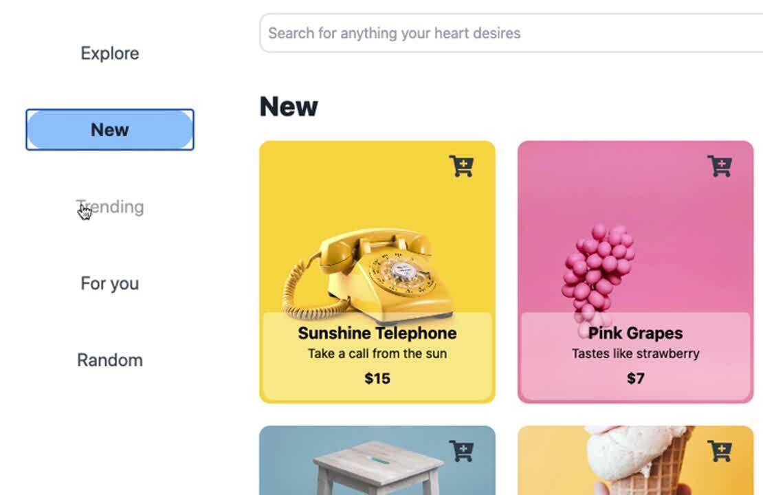
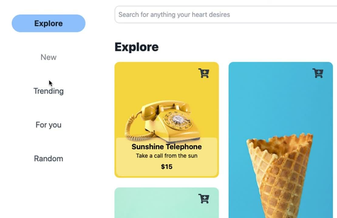
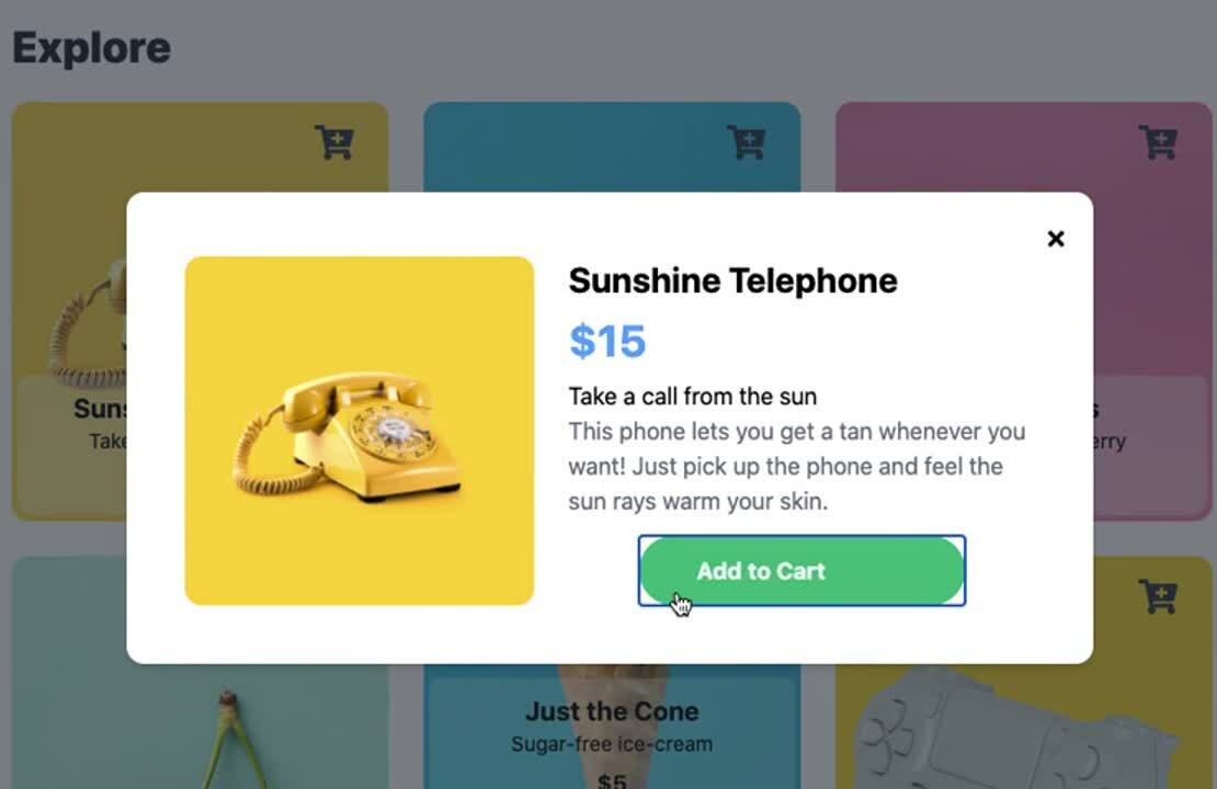
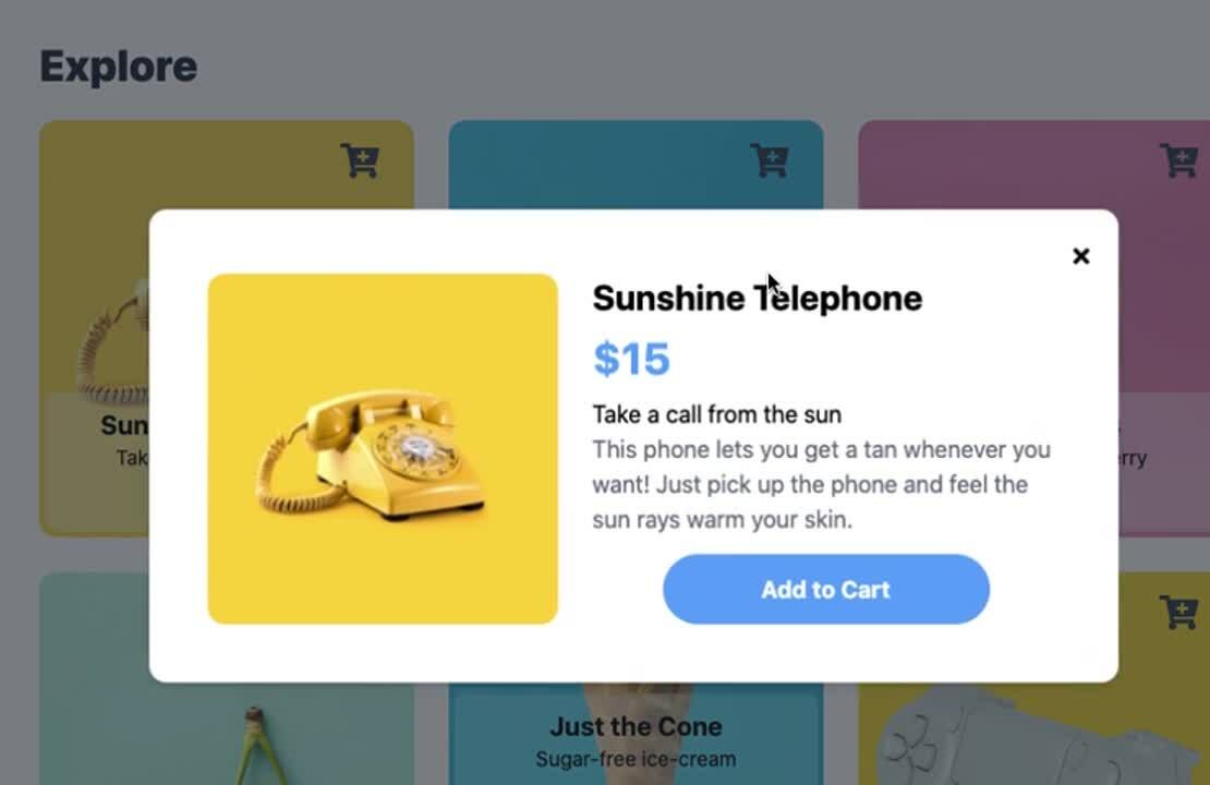
In web applications, we can add visual cues to indicate a registered event by changing the element's state. Let's take the navigation options as an example. It has an ACTIVE state and a DEFAULT state with a background color change as its visual indicator. Another example is the "Add to Cart" button on the demo. Clicking on it immediately switches the button state from its default state to its "added successfully" state. Visually, the button changes its text from "Add to Cart" to "Added" accompanied by a background color change from blue to green.
Element's state changes can seem abrupt without a transition. Angular Animations is compelling for this use case as it allows binding a state to a style with a preconfigured animation to transition between the states.
Let's see this concept in action. Let's use Angular animations to add a smooth transition between two states. Our demo's menu options have a DEFAULT state and an ACTIVE state, and a visual distinction between the two is their background color. The button has blue background when ACTIVE and transparent when DEFAULT.
Let's first write the animation code to handle the transition and styles associated with the state change.
Open the src/app/shared/components/menu/menu.component.ts file and update its content with the following:
import { Component } from '@angular/core';
import {
  BaseComponent,
  DataService,
  ProductType,
  UIService,
} from '../../../core';
import {
  animate,
  state,
  style,
  transition,
  trigger,
} from '@angular/animations';

@Component({
  selector: 'app-menu',
  templateUrl: './menu.component.html',
  // ✨ New! Defining the animation
  animations: [
    trigger('menuOptionsBackground', [
      state('DEFAULT', style({ backgroundColor: 'transparent' })),
      state('ACTIVE', style({ backgroundColor: '#93C5FE' })),
      transition('* => *', animate('0.3s ease-in-out')),
    ]),
  ],
})
export class MenuComponent extends BaseComponent {
  productTypes$ = this.dataService.getProductTypes$();
  selectedProductType$ = this.uiService.selectProductType$();
  animated$ = this.uiService.selectAnimated$();
  constructor(private dataService: DataService, private uiService: UIService) {
    super();
  }

  selectMenuItem(productType: ProductType): void {
    this.uiService.selectProductType(productType);
  }
}
menuOptionsBackground in the code above is called the animation trigger. The trigger is what tells Angular which set of style/animation to apply to the element. The values passed into the state function are the state's name (DEFAULT and ACTIVE), followed by the style associated with it. Lastly, the transition property specifies how Angular should transition between the states.
We can now add the animation to the button by adding the trigger (@menuOptionsBackground) and binding it to a variable that dictates its state.
Open the src/app/shared/components/menu/menu.component.html template file and update its content to this:
<div class="p-5">
  <ul class="list-none">
    <ng-container *ngIf="{ value: animated$ | async } as animated">
      <ng-container *ngIf="selectedProductType$ | async as selectedProductType">
        <ng-container *ngFor="let item of productTypes$ | async">
          <li class="p-5">
            <!-- ✨ New! Adding menuOptionsBackground to this button 👇 -->
            <button
              [@menuOptionsBackground]="
                item.typeKey === selectedProductType ? 'ACTIVE' : 'DEFAULT'
              "
              class="hover-dim text-xl text-gray-600 p-2 w-full rounded-full"
              [class.font-bold]="item.typeKey === selectedProductType"
              [class.text-gray-800]="item.typeKey === selectedProductType"
              (click)="selectMenuItem(item.typeKey)"
            >
              {{ item?.displayName }}
            </button>
          </li>
        </ng-container>
      </ng-container>
    </ng-container>
  </ul>
</div>
Enter and leave animations
Angular Animations also lets us set transitions for elements entering and leaving the DOM. We can use this if our state change involves adding and removing elements from our User Interface (UI), such as our demo's "Add to Cart" button. The button contains two <span> elements: one for its default state and another for its added state. These <span> elements are conditionally displayed depending on the current state of the button.
Since this transition is specific to our "Add to Cart" button, let's include the animation code directly in the @Component decorator of the CartButtonComponent component.
Angular Animations come with a transition called :enter and :leave, which, as the name suggests, are used to apply a transition to an element entering and leaving the DOM, respectively. You can add the animation code needed to slide in the text from the right as it enters and slide it out to the left as it leaves as follows.
Open the src/app/shared/components/layers/product-details/cart-button/cart-button.component.ts file and update its content with the following:
import { Component, Input } from '@angular/core';
import {
  animate,
  animation,
  style,
  transition,
  trigger,
} from '@angular/animations';
import {
  BaseComponent,
  CartService,
  IProduct,
  UIService,
} from '../../../../../core';

@Component({
  selector: 'app-cart-button',
  templateUrl: './cart-button.component.html',
  // ✨ New! Defining the animation
  animations: [
    trigger('addToCartText', [
      transition(
        ':enter',
        animation([
          style({
            transform: 'translate(200px,0)',
          }),
          animate(
            '0.3s cubic-bezier(0.59, 0.32, 0.38, 1.13)',
            style({
              transform: 'translate(0)',
            })
          ),
        ])
      ),
      transition(
        ':leave',
        animation([
          style({ transform: 'translate(0)' }),
          animate(
            '0.3s cubic-bezier(0.59, 0.32, 0.38, 1.13)',
            style({
              transform: 'translate(-200px,0)',
            })
          ),
        ])
      ),
    ]),
  ],
})
export class CartButtonComponent extends BaseComponent {
  @Input() product: IProduct;
  addState: 'DEFAULT' | 'ADDED' = 'DEFAULT';
  animated$ = this.uiService.selectAnimated$();

  constructor(private uiService: UIService, private cartService: CartService) {
    super();
  }

  addToCart(): void {
    if (this.addState === 'ADDED') {
      return;
    }
    this.addState = 'ADDED';
    this.cartService.addToCart(this.product);

    // reset to default state
    // some delay here to simulate some processing time
    // when user clicks on add to cart
    setTimeout(() => {
      this.addState = 'DEFAULT';
    }, 2000);
  }
}
The animations array in the component decorator (addToCartText) applies a horizontal transform to the element as it enters and leaves the DOM. When it enters, the element is first positioned 200px to the right of its target position, followed by an animation that animates it to the target position. When it leaves, the element is animated from its current position to 200px to its left. When this is applied to both the <span> elements in our button and triggered conditionally, it creates an illusion of the incoming <span> pushing the current <span> off the container as it enters.
We now need to add the animation trigger to an element of the CartButtonComponent template. Since we are defining the animations within the scope of our component, its template will have access to the animation trigger directly. We can add @addToCartText to the elements to be animated, which in our case are the two <span> elements inside the <button> element.
Open the src/app/shared/components/layers/product-details/cart-button/cart-button.component.html template file and update its content to this:
<button
  class="p-3 w-56 text-l font-bold rounded-full text-white overflow-hidden hover-softbounce-once"
  [class.bg-blue-400]="addState === 'DEFAULT'"
  [class.bg-green-500]="addState === 'ADDED'"
  (click)="addToCart()"
>
    <div class="grid grid-cols-1 grid-rows-1 overflow-hidden">
        <!-- ✨ New! Adding @addToCartText and @addToCartText to the spans of this button 👇 -->
        <span
          *ngIf="addState === 'DEFAULT'"
          class="col-start-1 col-span-1 row-start-1 row-span-1"
          @addToCartText
        >Add to Cart</span
        >
        <span
          *ngIf="addState === 'ADDED'"
          class="col-start-1 col-span-1 row-start-1 row-span-1"
          @addToCartText
        >Added</span
        >
    </div>
</button>
Web Animation APIs
Let's add another animation to confirm the user's actions. We can enhance the feedback users get when they add an item to the cart by creating an animation that makes the product card jump from the product grid into the shopping cart.
But, this is a challenge that we'll need to approach with WAAPI instead of CSS and Angular animations.
Let me tell why. Locate the product card that has the "Playstation Controller". Within this card, location the "Add to Cart" icon (a shopping with a + on its center). When we click on this icon, what we want the illusion that a card behind the product card jumps into the shopping cart icon, which is located at the upper-right corner of the page.
Here some images that show A -> B are different distance depending on viewport size or scroll position.
For instance, when the viewport is this size, this is the distance between these two points:
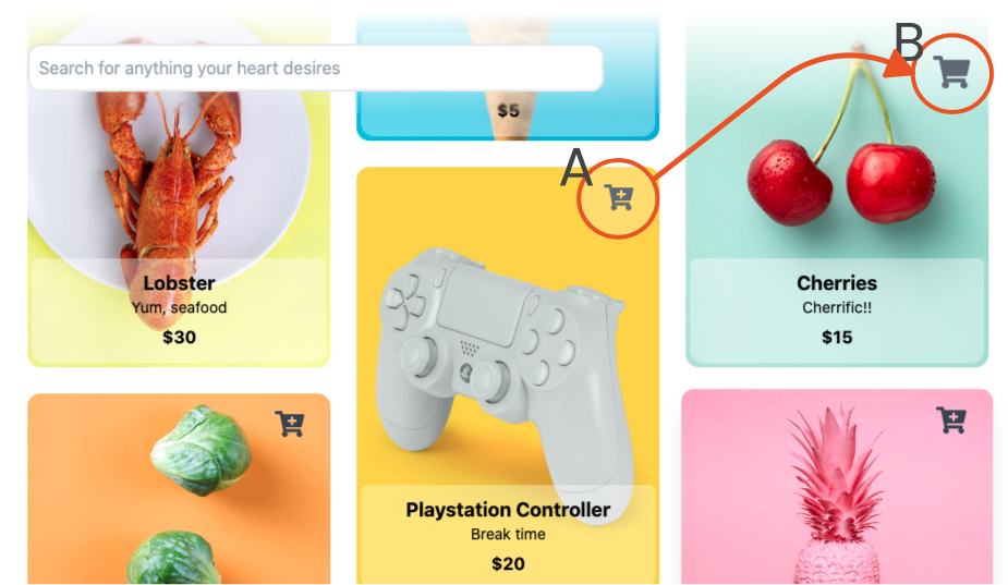
But, if you scroll down, the distance now changes:
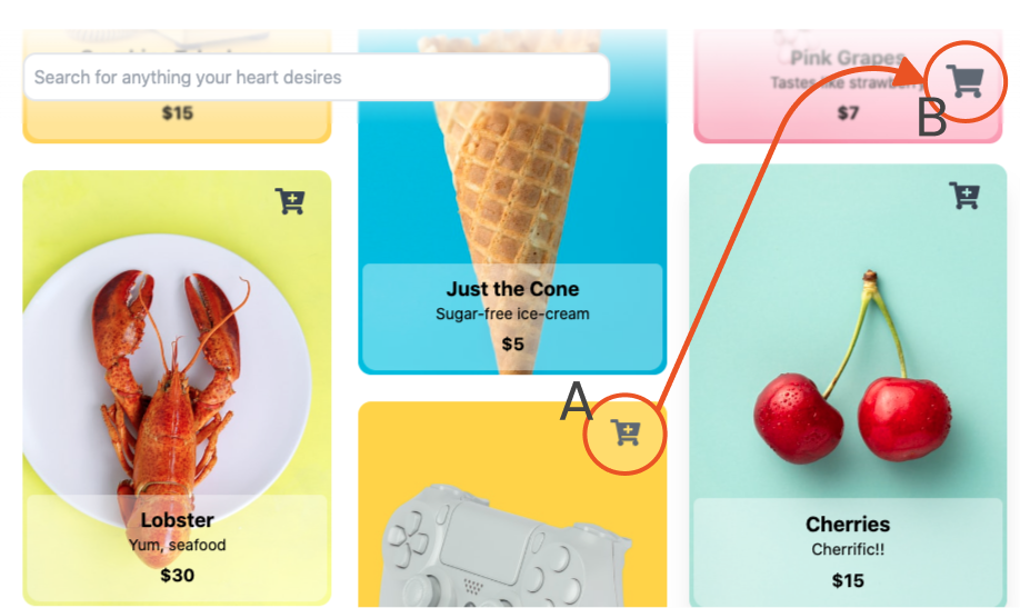
Now, if you resize the viewport, this is the distance between these two points:
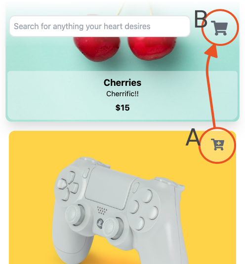
With regular CSS and Angular animations, we wouldn't be able to dynamically calculate the distance between these two points easily. However, with WAAPI we can. We can use the element's getBoundingClientRect to get it's current position and use it to calculate the distance and path the element has to travel for it's animations.
Let's start by adding another card that we will be animating to our product card template.
Open src/app/shared/components/cards/product-card/product-card.component.html and update its content to this.
<div class="grid grid-cols-1 grid-rows-1 h-full cursor-pointer">
  <!-- ✨ New! Adding #addToCartLayer as the layer to animate 👇 -->
  <div #addToCartLayer class="row-start-1 row-span-1 col-start-1 col-span-1 invisible">
      <ng-container *ngTemplateOutlet="productTemplate;context:{product:product}"></ng-container>
  </div>
  <div #displayCard class="row-start-1 row-span-1 col-start-1 col-span-1 z-10" (click)="viewProductDetails(product)">
      <ng-container *ngTemplateOutlet="productTemplate;context:{product:product}"></ng-container>
  </div>
</div>

<ng-template #productTemplate let-product="product">
  <div class="grid grid-rows-5 grid-cols-1 rounded-xl h-full">
    <div class="row-start-1 row-span-5 col-start-1 col-span-1 grid">
      <img class="h-full w-full rounded-xl" [src]="product?.imageUrl"/>
    </div>
    <div class="row-start-1 row-span-1 col-start-1 col-span-1 justify-self-end align-self-start">
      <button class="button py-3 px-6 hover-bounce" (click)="noop($event); addToCart(product)">
        <fa-icon class="text-2xl text-gray-700" [icon]="icons.cartPlus"></fa-icon>
      </button>
    </div>
    <div class="row-start-5 row-span-1 col-start-1 col-span-1 self-end m-1 px-5 py-3 rounded-b-xl rounded-t-md bg-white bg-opacity-40">
      <div class="grid grid-rows-3 grid-cols-1">
        <span class="row-start-1 row-span-1 col-start-1 col-span-1 font-bold text-lg text-center leading-tight">{{ product?.title }}</span>
        <span class="row-start-2 row-span-1 col-start-1 col-span-1 text-sm text-opacity-50 text-center leading-tight">{{ product?.description }}</span>
        <span class="row-start-3 row-span-1 col-start-1 col-span-1 font-bold text-center">${{ product?.price }}</span>
      </div>
    </div>
  </div>
</ng-template>
Let's now update the component file to get the addToCartLayer and add a function to animate it's position and size.
Open src/app/shared/components/cards/product-card/product-card.component.ts and add the following code.
export class ProductCardComponent extends BaseComponent {

  // other component functions ...

  // ✨ New! Add everything below this line

  @ViewChild('addToCartLayer') addToCartLayer: ElementRef;
  @ViewChild('displayCard') displayCard: ElementRef;
  private _isAdding = false;

  addToCart(selectedProduct: IProduct): void {
    // if in the middle of an animation, wait until its done prior
    // to allowing the user to add to cart again
    if (this._isAdding) {
      return;
    }
    this.cartService.addToCart(selectedProduct);
    if (this.uiService.animatedCurrentValue()) {
      this._isAdding = true;
      this._animateCard();
    }
  }

  private _animateCard(): void {
    this.addToCartLayer.nativeElement.style.visibility = 'visible';
    this.addToCartLayer.nativeElement.style.opacity = 1;
    const DOMrect = this.displayCard.nativeElement.getBoundingClientRect();
    const offsetX =
      (window.innerWidth ||
        document.documentElement.clientWidth ||
        document.body.clientWidth) -
      DOMrect.x -
      50;
    const offsetY = -DOMrect.y + 50;
    const offsetPath = `path("m 150 140 Q ${offsetX / 2} ${
      offsetY - 100
    } ${offsetX} ${offsetY}")`;
    this.addToCartLayer.nativeElement.style.offsetPath = offsetPath;
    const addToCartAnimation = this.addToCartLayer.nativeElement.animate(
      [
        {
          offsetDistance: 0,
          offsetRotate: '0deg',
        },
        {
          offsetDistance: '100%',
          transform: 'scale(0,0)',
          offsetRotate: '0deg',
          opacity: 0,
        },
      ],
      {
        duration: 800,
        easing: 'ease-in-out',
        fill: 'none',
      }
    );
    addToCartAnimation.onfinish = () => {
      this.addToCartLayer.nativeElement.style.visibility = 'hidden';
      this.addToCartLayer.nativeElement.style.offsetDistance = 0;
      this._isAdding = false;
    };
  }
}
The function _animateCard() above goes through a couple of key steps to create this animation:
Sets the
visibilityandopacityof theaddToCartelement to make it visible to the user before animating it.Gets the card's current position by using
getBoundingClientRectand calculating the offsets on each axis.We use an offset path here to get a slight curve on the path from the card's current position to the cart button. This creates a more natural motion compared to animating it in a straight line.
Run the animation, animating the offset distance, scale, and opacity.
Hide the card on animation completed and reset its position to get it ready for the next time we want to trigger the animation.
To add some continuity between the card's motion and the cart button. Let's also animate the cart button with a short bounce as the product card reaches the cart button.
Open src/app/shared/components/header/header.component.ts and add the following code:
export class HeaderComponent extends BaseComponent {
  @ViewChild('cartButton') cartButton: ElementRef;
  searchQuery = '';
  cartCount$ = this.cartService.selectTotalProductQuantity$().pipe(
    delay(600),
    withLatestFrom(this.uiService.selectAnimated$()),
    // ✨ New! Add the following animation code
    tap(([count, isAnimated]) => {
      if (isAnimated && count > 0 && this.cartButton?.nativeElement) {
        this.cartButton.nativeElement.animate(
          [
            // keyframes
            { transform: 'translate3d(0, -5px, 0) scaleY(1.1)' },
            { transform: 'translate3d(0, -10px, 0) scaleY(1.05)' },
            { transform: 'translate3d(0, 5px, 0) scaleY(0.95)' },
            { transform: 'translate3d(0, 0, 0) scaleY(1)' },
          ],
          {
            // timing options
            duration: 200,
          }
        );
      }
    }),
    map(([count, isAnimated]) => count)
  );

  // other functions
}
Grab User's Attention
Motion is scientifically proven to attract attention. Effective use of animation can help guide the user through your UI, shifting their focus from one place to another.
Movement in a person's peripheral vision triggers a stimulus-driven shift in visual attention Animation for Attention and Comprehension, Aurora Harley
On the other side, overdone motion can negatively impact your users and become more of a distraction. Flashy ad banners are an example of this. Ad banners usually have blinking images with bright colors to get noticed by the user. It grabs the user's attention but often quickly becomes a distraction.
A common trick is to use fast animations. Fast animations are more likely to attract attention than slower animations, making them more suitable for attention grabbers. A lot of applications use animations with a slight bounce at the end for attention-grabbing.
There are a few different ways you can achieve this in an Angular application. In terms of animation, we can either use the animation-curve property or keyframes to control the animations' curve and timing. Angular Animations and CSS animations are both great ways to create this type of animations.
Let's first go over the Angular Animations implementation. Our demo has a product details modal that has a bouncy transition as it enters and leaves. The demo uses a combination of a bounce animation curve and keyframes to control the animation.
Bounce enter/exit animations aren't usually contextual to a specific part of the application. Let's build this as a separate file with some configurable options such as timing and delay to make it reusable in other parts of the application.
Create bounce.animation.ts in src/app/shared/animations and add the following animation code:
import { animation, style, animate, keyframes } from '@angular/animations';

export const DEFAULT_TIMING = '0.5';

export const bounceIn = animation(
  animate(
    '{{ timing }}s {{ delay }}s cubic-bezier(0.17, 0.89, 0.24, 1.11)',
    keyframes([
      style({
        opacity: 0,
        transform: 'scale3d(0.1, 0.1, 0.1) translate3d(0, 1000px, 0)',
        offset: 0,
      }),
      style({
        opacity: 1,
        transform: 'scale3d(0.475, 0.475, 0.475) translate3d(0, -60px, 0)',
        offset: 0.6,
      }),
      style({
        opacity: 1,
        transform: 'scale3d(1, 1, 1) translate3d(0,0,0)',
        offset: 1,
      }),
    ])
  ),
  { params: { timing: DEFAULT_TIMING, delay: 0 } }
);

export const bounceOut = animation(
  animate(
    '{{ timing }}s {{ delay }}s cubic-bezier(0.6, 0.72, 0, 1)',
    keyframes([
      style({
        opacity: 1,
        transform: 'scale3d(0.475, 0.475, 0.475) translate3d(0, -60px, 0)',
        offset: 0.3,
      }),
      style({
        opacity: 0,
        transform: 'scale3d(0.1, 0.1, 0.1) translate3d(0, 500px, 0)',
        offset: 1,
      }),
    ])
  ),
  { params: { timing: DEFAULT_TIMING, delay: 0 } }
);
In the code above, the configurable parts are inside the params object. The custom values are then passed to the animation using the key names enclosed within double curly braces ({{ timing }} and {{ delay }}).
To use the animation in your component, we will need to import the animation and set up a trigger for the animation. Instead of writing out the full animation code here, we can use the useAnimation method and pass in the animation's name and any additional params the animation requires.
Open src/app/app.component.ts and update its contents to include the following code:
import { transition, trigger, useAnimation } from '@angular/animations';
import { bounceIn, bounceOut } from './shared';

@Component({
  selector: 'app-root',
  templateUrl: './app.component.html',
  styleUrls: ['./app.component.scss'],
  // ✨ New! Configuring the animation
  animations: [
    trigger('bounce', [
      transition(
        'void => *',
        useAnimation(bounceIn, {
          params: { timing: 0.7 },
        })
      ),
      transition(
        '* => void',
        useAnimation(bounceOut, {
          params: { timing: 0.6 },
        })
      ),
    ]),
  ],
})
Now that we have the trigger for the animations configured. We need to add the animation to our template by adding the trigger prefixed with @ to the element. Since this is an enter and leave animation, we won't need to bind the animation to any state. The *ngIf will take care of the show/hide logic, and the @bounce will apply the transitions automatically.
Open src/app/app.component.html and update the div containing app-product-details with the animation trigger:
 <!-- product details -->
<ng-container *ngIf="layers.productDetails !== undefined">
    <!-- fade -->
    <div
      *ngIf="!!layers.productDetails"
      @fade
      class="col-start-1 col-span-5 z-20 row-start-1 row-span-1 bg-gray-800 bg-opacity-60 h-full w-full"></div>
    <!-- product details -->
    <!-- ✨ New! Adding @bounce 👇 -->
    <div
      *ngIf="!!layers.productDetails"
      @bounce
      class="col-start-1 col-span-5 mx-10 row-start-1 row-span-1 relative z-40 grid content-center justify-center"
      (click)="closeAllLayers()">
      <app-product-details [product]="layers.productDetails"></app-product-details>
    </div>
</ng-container>
Another option is to use CSS animations. Angular lets you bind a CSS class name directly to a variable - conditionally adding and removing the class depending on the variable's value at that point.
We can write out our CSS animations ourselves or use a third-party CSS animation library such as animate.css to handle the animation for us. CSS animation libraries are usually controlled by adding or removing their predefined set of classes, making it a powerful tool when combined with Angular's class binding.
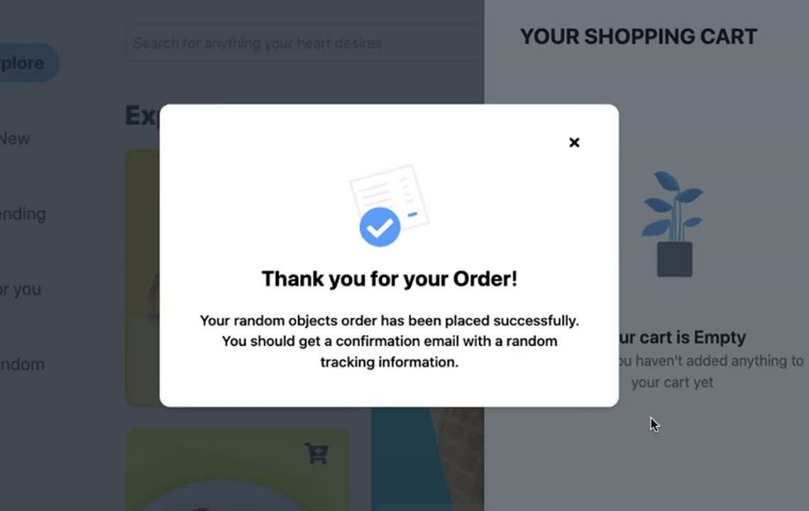
Our demo's order confirmation modal's transition uses animate.css's bounce animation. To use third-party animation libraries, you will first need to go through their installation process, which may differ from one library to another. For animate.css, I added a link to their CDN on my index.html.
Open src/index.html and add the the following CSS dependency:
<head>
  <!-- other html imports ...-->

  <link
    rel="stylesheet"
    href="https://cdnjs.cloudflare.com/ajax/libs/animate.css/4.0.0/animate.compat.css"
   />
</head>
Since most of these are pure CSS libraries, we don't need to add any specific configurations for Angular. To use it in our template, we need to add the animated class to the element to be animated (this is a requirement for animate.css). Triggering the animation is then done by adding either bounceInUp or bounceOutDown depending on whether we want the element to enter or exit the view.
Open src/app/app.component.html and update the div containing app-order-confirmation:
<ng-container *ngIf="layers.orderConfirmation !== undefined">
  <div
    *ngIf="layers.orderConfirmation === true"
    @fade
    class="col-start-1 col-span-5 z-30 row-start-1 row-span-1 bg-gray-800 bg-opacity-60 h-full w-full"></div>
  <!-- ✨ New! Adding classes - "animated fast" and [class.bounceInUp] and [class.bounceOutDown] 👇 -->
  <div
    class="col-start-1 col-span-5 mx-10 row-start-1 row-span-1 relative z-40 grid content-center justify-center animated fast"
    [class.bounceInUp]="layers.orderConfirmation === true"
    [class.bounceOutDown]="layers.orderConfirmation === false"
    (click)="closeAllLayers()">
    <app-order-confirmation></app-order-confirmation>
  </div>
</ng-container>
Help User Focus
This type of animation usually involves some sort of attention-grabbing animation along with a dimming animation to create a distinction between the new view and the current screen. Think of it as now that I have the user's attention, let's keep their attention here and not let anything else in the UI distract them.
The shopping cart panel and the modals in the demo are an example of this type of animation. The transitions contain an attention-grabber for the view entering the DOM and a layer that dims the current screen.
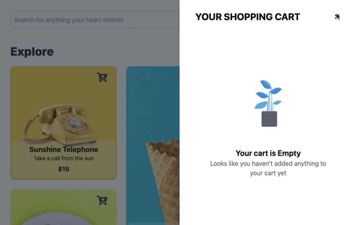
Let's go into more detail on how to add the shopping cart panel's transition. A flag signaling the cart to open adds two layers to the DOM. A fade layer with the dimming effect and the shopping cart panel, each with its own transitions.
Open src/app/app.component.html and add the following code:
<div class="grid grid-cols-5 grid-rows-1 h-screen font-body overflow-hidden">
  <!-- other elements ...-->

  <!-- ✨ New! add fade layer 👇 -->
  <div
    *ngIf="layers.cart"
    (click)="closeAllLayers()"
    class="col-start-1 col-span-5 z-20 row-start-1 row-span-1 bg-gray-800 bg-opacity-60 h-full w-full"></div>

  <!-- ✨ New! add cart layer 👇 -->
  <div
    *ngIf="layers.cart"
    class="col-start-1 col-span-5 sm:col-start-4 sm:col-span-2 row-start-1 row-span-1 relative z-30">
    <app-cart></app-cart>
  </div>
</div>
Let's build out the @fade and @slideRight animations.
Fade animations involve transitioning the element's opacity from 0 to 1 or vice versa, creating a smooth fading effect. Fades are usually component agnostic. Let's build this animation as a separate file that we can import and reuse in different parts of the application.
Create a new file fade.animation.ts in src/app/shared/animations/ and add the following code:
import {
  transition,
  style,
  animate,
  trigger,
  animation,
} from '@angular/animations';

export const Fade = trigger('fade', [
  transition(
    ':enter',
    animation([
      style({ opacity: 0 }),
      animate(
        '0.3s cubic-bezier(0.59, 0.32, 0.38, 1.13)',
        style({ opacity: 1 })
      ),
    ])
  ),
  transition(
    ':leave',
    animation([
      style({ opacity: 1 }),
      animate(
        '0.3s cubic-bezier(0.59, 0.32, 0.38, 1.13)',
        style({ opacity: 0 })
      ),
    ])
  ),
]);
Moving to the SlideRight transition for the shopping cart panel. A slide transition is also usually component agnostic. Let's also build this as a separate file but structure it a little differently. Instead of hardcoding the transforms, we'll use a parameter to modify the direction and amount of translate to apply to the element depending on the use case.
Create a new file slide.animation.ts in src/app/shared/animations and add the following code:
import {
  transition,
  style,
  animate,
  trigger,
  useAnimation,
  animation,
} from '@angular/animations';

export const SlideEnterAnimation = animation([
  style({ transform: 'translate({{ x }}, {{ y }})' }),
  animate(
    '{{ duration }} cubic-bezier(0.59, 0.32, 0.38, 1.13)',
    style({ transform: 'translate(0)' })
  ),
]);

export const SlideExitAnimation = animation([
  style({ transform: 'translate(0)' }),
  animate(
    '{{ duration }} cubic-bezier(0.59, 0.32, 0.38, 1.13)',
    style({ transform: 'translate({{ x }}, {{ y }})' })
  ),
]);

export const SlideRight = trigger('slideRight', [
  transition(
    ':enter',
    useAnimation(SlideEnterAnimation, {
      params: { x: `${window.innerWidth}px`, y: 0, duration: '0.5s' },
    })
  ),
  transition(
    ':leave',
    useAnimation(SlideExitAnimation, {
      params: { x: `${window.innerWidth}px`, y: 0, duration: '0.5s' },
    })
  ),
]);
To use both animations in our template, add the animations to the component's animation array.
Open src/app/app.component.ts and update its contents with this:
import { SlideRight, Fade } from './shared';

@Component({
  selector: 'app-root',
  templateUrl: './app.component.html',
  styleUrls: ['./app.component.scss'],
  // ✨ New! Add the animation
  animations: [
    SlideRight,
    Fade,
    // Other animations ...
  ]
})
Now that the component has access to the animations. We can add the animations' triggers to the elements in our template. Since we are using an *ngIf to control the element's state, we can add the animation triggers to the element without any bindings.
Open src/app/app.component.html and update the fade and cart divs with the animation triggers:
<!-- fade -->
<!-- ✨ New! Adding @fade 👇 -->
<div
  *ngIf="layers.cart"
  @fade
  (click)="closeAllLayers()"
  class="col-start-1 col-span-5 z-20 row-start-1 row-span-1 bg-gray-800 bg-opacity-60 h-full w-full"></div>

<!-- cart -->
<!-- ✨ New! Adding @slideRight 👇 -->
<div
  *ngIf="layers.cart"
  @slideRight
  class="col-start-1 col-span-5 sm:col-start-4 sm:col-span-2 row-start-1 row-span-1 relative z-30">
  <app-cart></app-cart>
</div>
Conclusion
Adding animations to your application can significantly improve the overall user experience for your users. However, applied in the wrong area or overdoing it can have a negative impact. With the various animation tools at our disposal, it can be tempting to animate everything in our UI. Add animations sparingly and only when they are meaningful to the application. Always keep the end-users in mind. Will the animation help the users achieve their goal and make it a more pleasant experience, or will it be distracting and annoying to them.
About Auth0
Auth0 by Okta takes a modern approach to customer identity and enables organizations to provide secure access to any application, for any user. Auth0 is a highly customizable platform that is as simple as development teams want, and as flexible as they need. Safeguarding billions of login transactions each month, Auth0 delivers convenience, privacy, and security so customers can focus on innovation. For more information, visit https://auth0.com.
About the author

William Juan
Frontend Developer