Things to know
- Viewing a tenant’s Activity page requires an account with an administrator role (such as Administrator or Owner).
- The Support Access role has read-only access to view metrics on the tenant’s Activity page but cannot modify settings.
- To ensure data is consistent, the current date cannot be selected in the date picker and data may take up to 24 hours to display.
Metrics
Here’s what you will see on your tenant’s Activity page.Totals
At the top of the page, you’ll see your tenant’s total number of users, applications, APIs, and connections.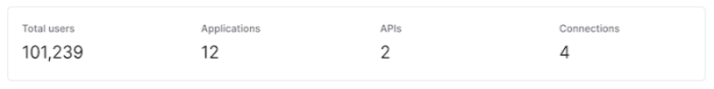
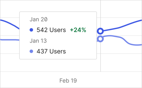
Daily active users
The number of daily unique users with successful authentication (successful login) or authorization activity (successful token exchange). This is calculated based on successful log events for each user. You can see the number of unique users for each day by hovering your mouse over a point in the graph.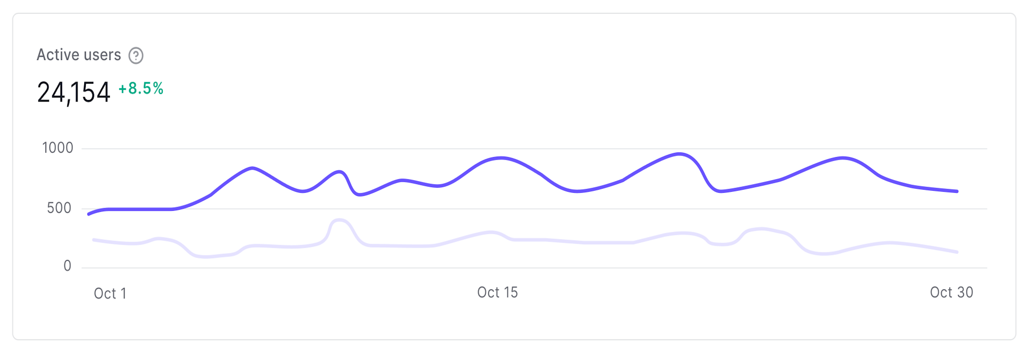
User retention
The percentage of users that were active during the given time frame, calculated from the number of active users out of the total number of users on the tenant.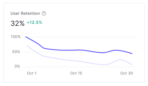
Signups
The number of successful user signups, which includes new user registrations through any configured connection (database, social, enterprise).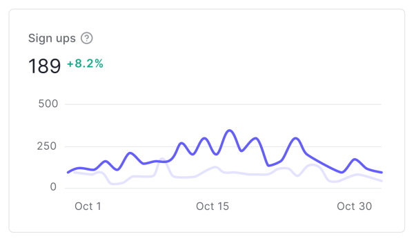
Failed logins
The number of failed user logins (thef log event type) over the given time period.
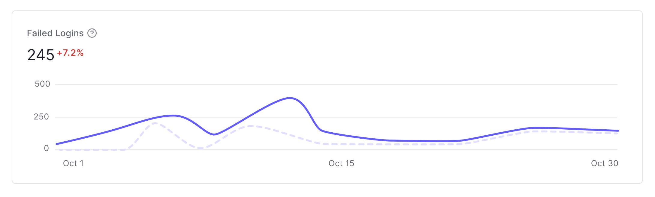
Compare to last period
When Compare to last period is enabled:- The percentage difference is included in the graph. Increases are colored green while decreases are colored red.
- Dotted lines are the last time period and solid lines are the current time period.
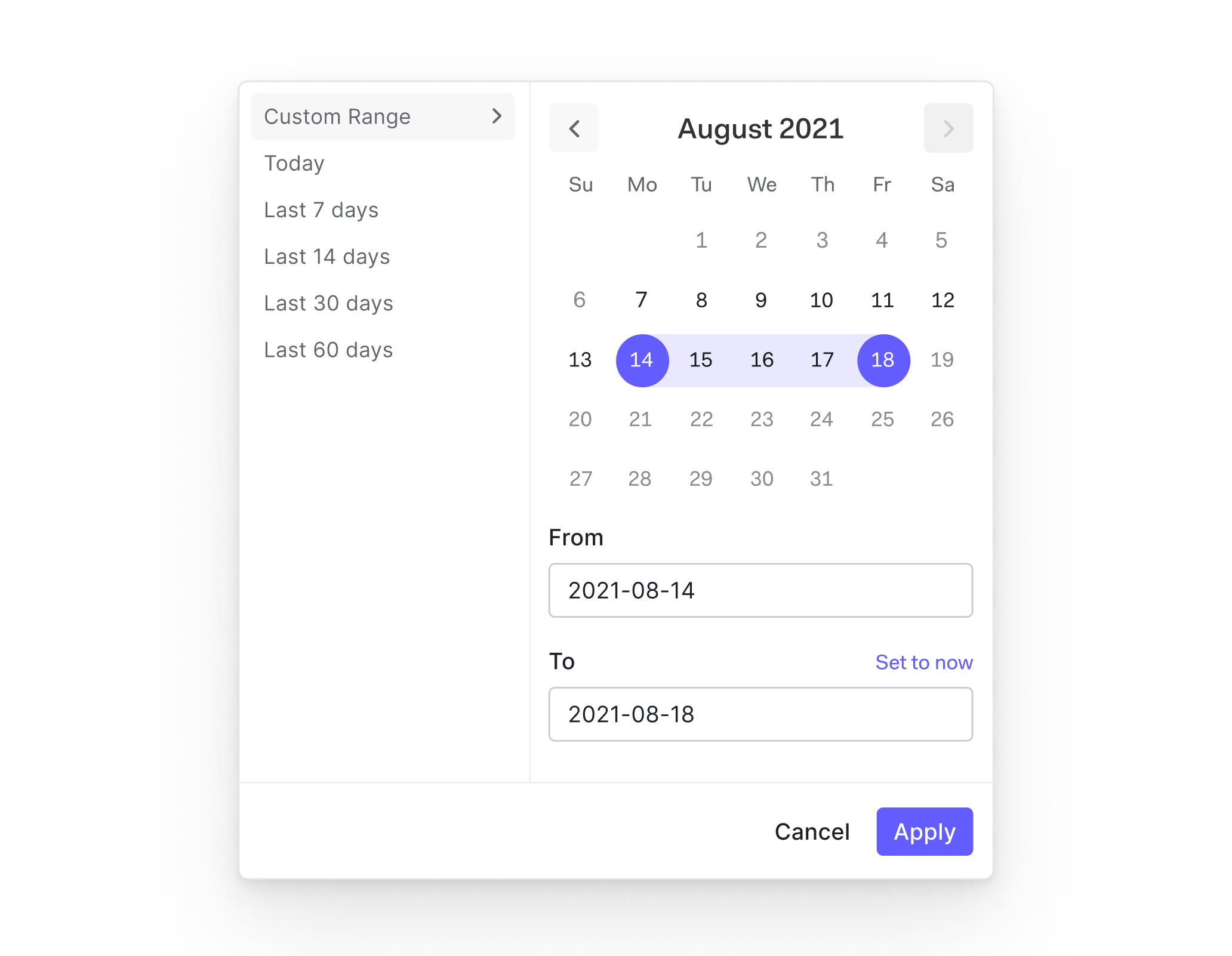
View data by time frame
You can view data for a given time frame by using the datepicker next to the Compare to last period checkbox. There are built-in date ranges for the last 7/14/30/60 days, or you can provide the From and To dates for a custom range.