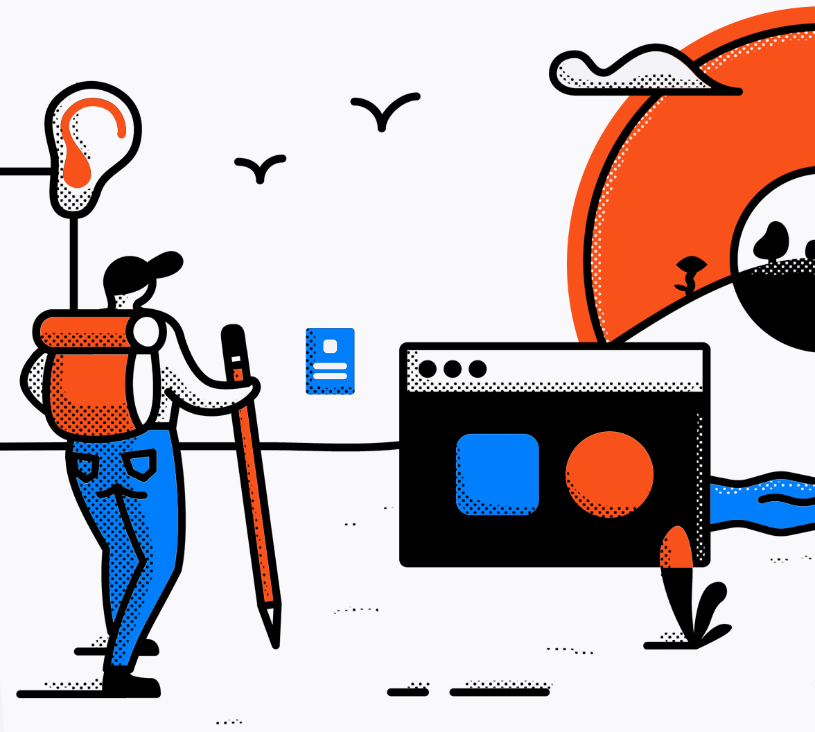
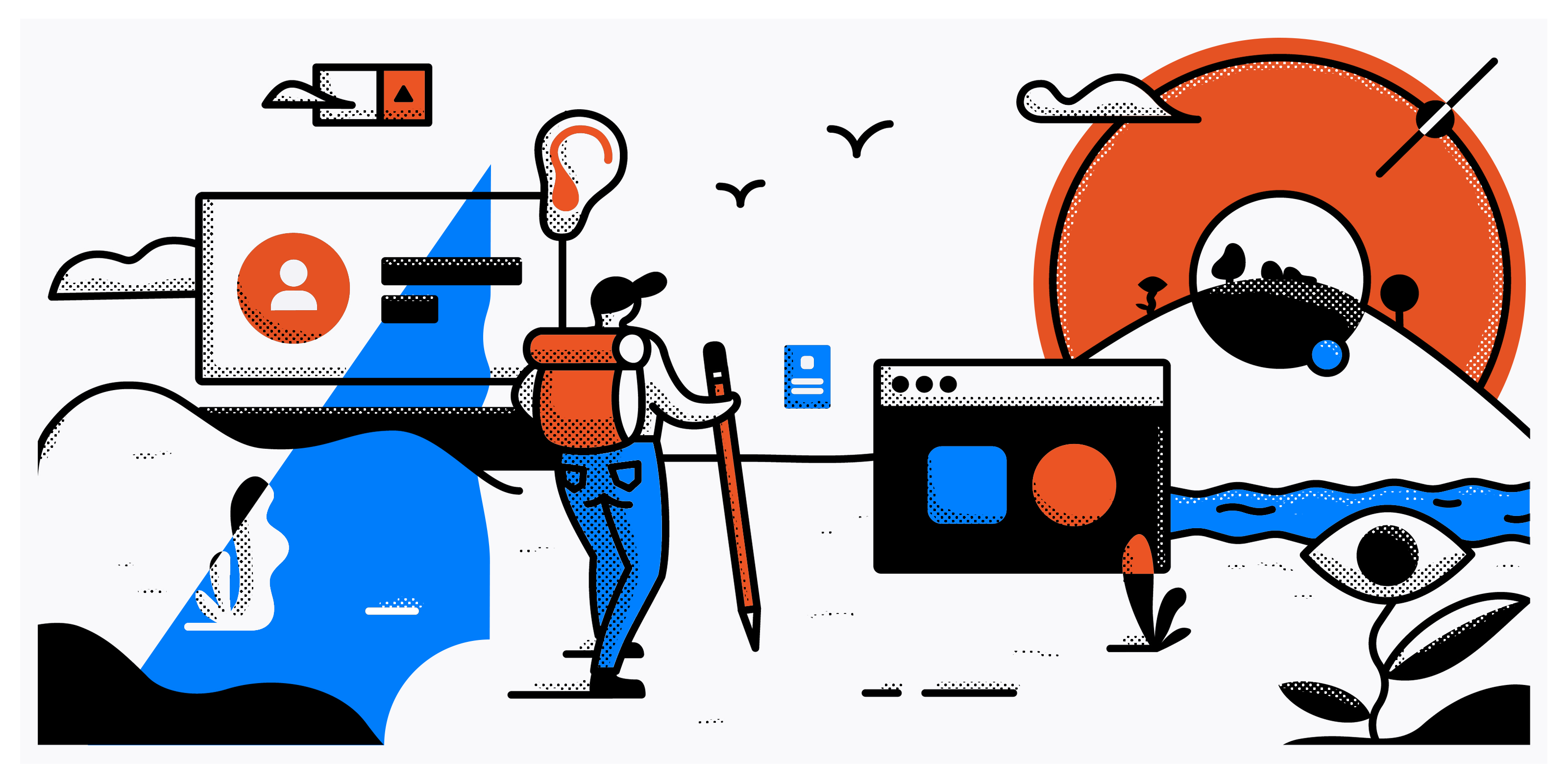
Here at Auth0, we provide our customers with the means of easily implementing that one thing we all do just about every day — Authentication. Ah yes, the good ol’ email address and password. Tired of typing in that password? Yeah, we’ve got passwordless login. Need an extra layer of security? Hell yeah, you can implement two-factor authentication. We provide these out-of-the-box solutions to your end users through a not-so-little product we call Universal Login.
Alright, you’re probably not here to read a pitch as to why you should be using Universal Login and I’m most definitely not the right person to be doing that. In fact, what it’s capable of isn’t even that important here either. What’s more important to understand are the end users who might use this very product: Everyone. That implies people with disabilities, lower tech devices, without access to high speed internet, and the likes. If the title didn’t give it away, we’re talking about how we’ve taken steps towards creating a customizable product while remaining accessible, and we’ve started with Universal Login.
Our Journey
You may have gathered this by now but if you haven’t, Universal Login is a white-label product meaning it’s meant to be re-styled to match a company’s brand. Although our journey started by using best practices towards creating an easily customizable experience for our users, we slowly started facing some of the challenges that designing both a white-label and accessible product creates and ultimately learned the importance of ensuring our product remained accessible. Sure, when building a product from scratch you can select colors that offer enough contrast, but what happens when you put that in the hands of your customers? How do we ensure that when UL is customized it remains just as accessible?
Understanding Our Customers
As with everything, you can’t build the right product without knowing your customers, and that same concept certainly remained true here. We couldn’t build a white-label product without understanding our customer’s problems and needs, so we took our questions to them. We wanted to know what they would need to be able to customize in order to make our out-of-the-box solution viable for them and their product. Knowing their specific needs would allow us to determine areas where accessibility might be a concern and how we can ensure the product remains accessible.
After talking with some of our customers, our findings were generally in line with our expectations: Besides the obvious logo, primary color and background color/image were the most important variables necessary to provide a simple yet customizable experience. Defining how these are used within the experience was the fun part, and I’ll dive deep into that soon.
Skipping ahead a bit, the one thing on everyone’s mind during the design process was simplicity. Not just simple flows, but a simple visual language to help foster a simply customizable experience. How did we achieve this?
Keeping It Simple
As designers, we love to be trendy and push design boundaries when possible. I know this because that’s something I find myself trying to do maybe a bit too often (which is not necessarily a bad thing). Either way, Universal Login was not the place for this, and that’s okay. We saved ourselves a few headaches by not going nuts trying to invent the next big design thing.
Here’s a perfect example: I’m sure you’ve seen those large yet subtle and soft drop shadows on buttons and cards all over Dribbble or even a few different company websites. While this is admittedly pretty, it might not match other company’s product branding, so why force it? These details are great for individual company branding, but doesn’t work for a white-label product.
We kept the fancy stuff to a minimum to ensure that we met branding requirements for ~95% of companies out there, not just the 5%.
One color to rule them all
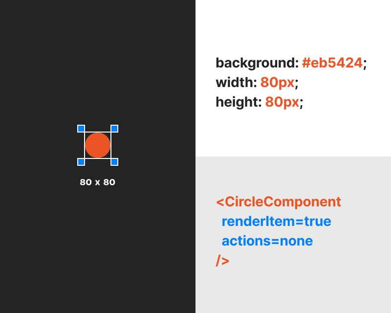
Besides a background color (or image), we knew that our customers wanted a customizable primary color. Could that one color be sufficient enough? That’s something that we’re still learning, but if we assumed that most companies tend to have one unique brand color, then we’re getting pretty damn close. This one color, when applied across the experience, would ensure that our out-of-the-box experience felt like yours. And to make things even more simple, we didn’t try applying this color across multiple components. Each prompt typically has one primary action button, and we found that by applying the customer’s primary color to this button, we could provide sufficient coverage of the brand color to the complete login experience.
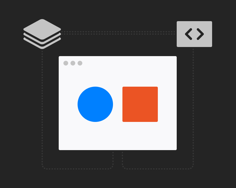
With the change of one color and a logo, we’re able to make the experience feel branded towards any company.
Thinking One Step Ahead
So what does all of this have to do with accessibility, you ask? We all know that if you give people the option to do something, they will do it, and for us that will result in a bright yellow button with white text over top. If we’re allowing our customer to change something as important as the button color, how could we help them ensure that the text over top had enough contrast to make it legible? It was at this point that accessibility, specifically color accessibility, became something we were actually starting to think about.
Our solution? Don’t let our customers make the decision on their own. Let’s do the heavy lifting and suggest the best possible contrasting text color.
Using some simple yet nifty code, we’re able to remain one step ahead and automatically select the best contrasting text color between black or white based on the provided primary color, all the while maintaining AA conformance for accessibility. This is quite the improvement over the previous Universal Login experience which defaulted to a white text color and would require some development knowledge to adjust the text color if necessary.
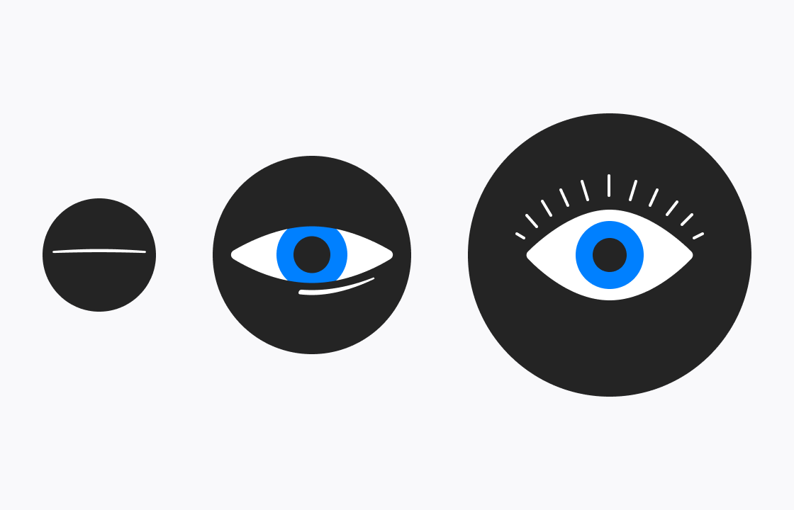
How the button text color changes based on the user provided primary color.
What Have We Done to Create More Accessible Components?
Accessibility is a topic that’s gaining traction within Auth0 and becoming something we value and incorporate into our every day process as designers. A year ago, you could have asked us “Hey Auth0, what do y’all do to be more accessible?” and our response would have been something along the lines of “not enough”. As designers, we have the power to influence the product’s direction and push for customer-centric design initiatives within our product teams, and that’s exactly what’s starting to happen. As a company, we’re now aware of the importance of providing an accessible product, and within the Login team, we’re working towards that goal every day.
Color Accessibility
We started by ensuring all of our colors met AA conformance. After running out first set of colors through the WebAIM contrast checker, we were somewhat surprised to see several colors that were not passing, leading us to make another attempt at making these more accessible. This resulted in a more robust set of gray values ranging from light to dark that could be used across UI components and different variants of text. At the same time, we also improved the remainder of the colors including the secondary color (used for links and component focus states) and the set of alert colors for informing the user of success or that an error has occurred.
Low Vision Accessibility
Improvements were made to the prompts to increase readability for users with low vision by increasing the default font size to 14px except for input fields, buttons, and other interactive components where the size was increased to 16px. While we were at it, we took a moment to also increase the line spacing to match ~1.5x the font size. While increased line spacing is typically beneficial when dealing with larger paragraphs, there are a couple of scenarios where the body text of a prompt reaches onwards of four lines. Increased line spacing ensured that the body text is scannable, accessible, and readable.
Other Forms of Accessibility
For users with motor disabilities, we increased the button and input component sizes alongside the increase in font size. Lastly, we ensured to create better focus states for all interactive components, including buttons, input fields, list items, and links, creating a tabbable experience that can then be completed solely by keyboard.
What Does the Future Hold?
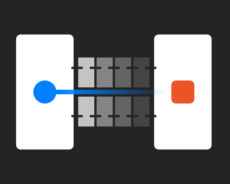
While many efforts were made over the past year, there are still areas where accessibility falls short within Universal Login, specifically for users who are blind. Our input fields remain inaccessible in this area due to the lack of labels. This forces us to rely on an icon to represent a field in the situation that the placeholder text is not descriptive enough or the field has been filled in. This is a major problem because not only is the field visually hard to understand, but this also means it’s not readable by a text reader for folks who are blind.
Input field exploration.
In terms of accessibility, screen reader compatibility is a top priority for us, including adjusting the input design to support labels. We’ve explored several input design options, outlined the pros and cons of each, and are currently in the process of selecting the best of the options so that we can move forward with implementation and ensure that each prompt can be read and successfully completed by using a screen reader.
Conclusion
When I look at accessibility, I see it like this: It’s not an optional side quest in a video game that you can just overlook. It’s actually part of the main quest and you must complete it to truly finish the game. And while I know that sounds a bit daunting, the truth is that it’s not all that difficult to make a big impact with minimal effort. As designers, we have a responsibility to make our designs accessible for all, and we’ve gotta start somewhere.
At the end of the day, whether you’re reading this as a designer or as someone seeking Auth0 as a potential identity solution, know that accessibility is just as important to us as it is to you.
Until next time!
P.S. If you are considering a job at Auth0, learn more about working remotely as a designer here and be sure to check out our jobs page here.
About the author

Dominick Renzetti
Product Designer at Auth0 (Auth0 Alumni)