
In this tutorial series, you'll be provided with a practical introduction to how Next.js can help you build web applications.
Created by Vercel, a cloud company for hosting frontends and serverless functions, Next.js is a React framework capable of creating applications that run both on the client and the server, otherwise known as Universal JavaScript applications. This framework helps you build universal apps faster by streamlining basic features like client-side routing and page layout while simplifying advance features like server-side rendering and code splitting.
In the first part of the series, you learned how to create pages and layouts. In this second, you'll learn how to apply styles to pages and create a theme using Next.js 9, the most recent framework version at the time of writing. Familiarity with the React library is recommended.
Setting Up the Project
If you are starting from this part, you can get the app that was built in the previous, first part by cloning the repo and checking out the part-1 branch:
git clone git@github.com:auth0-blog/whatabyte-next-intro.git whatabyte
cd whatabyte
git checkout part-1
If you haven't connected to GitHub using SSH, please clone the repo with the HTTPS URL:
git clone https://github.com/auth0-blog/whatabyte-next-intro.git whatabyte
cd whatabyte
git checkout part-1
The repository is cloned into the directory called whatabyte on your local machine. If the directory doesn't exist, it is created.
With the branch checked out, proceed to install the project dependencies:
npm install
Finally, execute the following command in your terminal to run the app:
npm run dev
To see the app in action and start following the tutorial, visit http://localhost:3000 on your browser.
Styling Components the Next.js Way
The application created in the first part of the series uses the style property of React components to specify component styling through JavaScript objects. That's handy but it won't let you create global CSS rules for your application. What you can do instead is to follow the CSS-in-JS component styling strategy that Next.js implements natively.
Next.js is preloaded with a CSS-in-JS framework called styled-jsx. This framework offers full, scoped, and component-friendly CSS support for JSX rendered on the client and/or the server-side. This lets you write scoped CSS rules within your JSX component templates. The style defined for a component only affects that component and nothing else — not even its children!
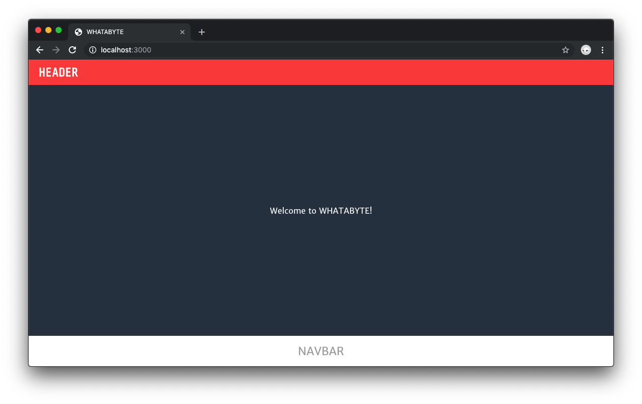
To see this in practice, first convert the Header component from using a style object to using styled-jsx. Open components/Header.js and update the component template as follows:
// components/Header.js

const Header = () => (
  <div className="Header">
    HEADER
    <style jsx>{`
      background-color: blue;
      color: white;
      width: 100%;
      height: 50px;
    `}</style>
  </div>
);

export default Header;
To use styled-jsx, you need to add the style jsx tag as a sibling or child of the JSX template element that you want to modify. The template of Header only has one element, thus, adding the style jsx tag as a sibling makes the most sense.
As an alternative, you can render an array of components or use React fragments.
CSS rules are written inside a template string that is placed within the style jsx tag. You write the rules the same way that you'd write them in a regular CSS file following any valid naming convention you prefer — as long as you are consistent — and terminating them with a semicolon.
The downside of using a template string to write CSS rules is that you lose IDE and code editor assistance to write them, for example. There's a candid debate about whether or not React developers should use CSS-in-JS.
The articles "What’s Wrong with CSS-in-JS?" by Brad Frost and "Bridging the Gap Between CSS and JavaScript: CSS-in-JS" by Matija Marohnić can help you form your own opinions about the topic.
The engineers that created Next.js suggest using CSS-in-JS to avoid practical issues that come with traditional CSS-file-based styling — especially in relation to the server-side rendering of React.
As an exercise, convert the NavBar and Layout components to using style jsx. When you are done, come back and compare your results:
// components/NavBar.js

const NavBar = () => (
  <div className="NavBar">
    NAVBAR
    <style jsx>{`
      background-color: red;
      color: white;
      width: 100%;
      height: 60px;
    `}</style>
  </div>
);

export default NavBar;
// components/Layout.js

import Head from "next/head";

import Header from "./Header";
import NavBar from "./NavBar";

const Layout = props => (
  <div className="Layout">
    <Head>
      <title>WHATABYTE</title>
      <meta name="viewport" content="width=device-width, initial-scale=1" />
      <meta charSet="utf-8" />
    </Head>
    <Header />
    <div className="Content">{props.children}</div>
    <NavBar />
    <style jsx>{`
      .Layout {
        display: flex;
        flex-direction: column;
        height: 100%;
        width: 100%;
      }

      .Content {
        flex: 1;
        display: flex;
        flex-direction: column;
      }
    `}</style>
  </div>
);

export default Layout;
How did you do? Notice that you can use the classes you specified for each template tag within the style jsx template string. This makes it easier and more natural to style a more complex component.
Forgetting to change a comma to a semicolon will break the whole styling.
The flexible layout defined within the Layout component has a problem though: The .Content container doesn't stretch out to fill the space left by the Header and NavBar components. For the .Content container to enforce its flex: 1 style property, it needs to have a frame of reference for sizing coming from the elements that enclose it, in this case the .Layout container.
The height of the .Layout container is specified to be 100%; however, this container is not filling out the full height of the viewport. In turn, this could only mean that its enclosing container doesn't have a height of 100%.
Inspecting the structure of the Index page using your browser developer tools will reveal that the top-level container for the app is a div element with the ID __next. That element has no height or width; therefore, its descendant elements have no height value to inherit and reference for dynamic sizing.
To fix this, you need to assign the #__next container a height and width of 100% with one caveat: Anything within the pages subdirectory represents a web page of your front-end application. Next.js wants you to think about these pages as complete and self-sufficient. This means that every page knows how to render its content correctly independently of any other page.
The solution to this layout problem is then to tell each page in your application how to render the html, body and #__next elements. The best place to do this is by defining global styles in the existing style jsx tag of your Layout component template.
Open and update Layout.js with the following code that defines the same global styles present in the index.css file of a standard create-react-app application:
// components/Layout.js

import Head from "next/head";

import Header from "./Header";
import NavBar from "./NavBar";

const Layout = props => (
  <div className="Layout">
    <Head>
      <title>WHATABYTE</title>
      <meta name="viewport" content="width=device-width, initial-scale=1" />
      <meta charSet="utf-8" />
    </Head>

    <Header />
    <div className="Content">{props.children}</div>
    <NavBar />
    <style jsx global>{`
      * {
        box-sizing: border-box;
      }

      html,
      body,
      #__next {
        height: 100%;
        width: 100%;
      }

      body {
        margin: 0;
        padding: 0;
        font-family: -apple-system, BlinkMacSystemFont, "Segoe UI", "Roboto",
          "Oxygen", "Ubuntu", "Cantarell", "Fira Sans", "Droid Sans",
          "Helvetica Neue", sans-serif;
        -webkit-font-smoothing: antialiased;
        -moz-osx-font-smoothing: grayscale;
      }

      .Layout {
        display: flex;
        flex-direction: column;
        height: 100%;
        width: 100%;
      }

      .Content {
        flex: 1;
        display: flex;
        flex-direction: column;
        font-family: Arial;
      }
    `}</style>
  </div>
);

export default Layout;
You added the global keyword after the style jsx tag name. As the word may infer, adding global to the tag lets you define CSS rules that affect the whole application.
Save your code and look at the browser. Now, the layout flows nicely and the content container adapts to the space left by the header and navigation bar.
I think that learning how to layout components effectively is one of the most important aspects of front-end development. For that reason, I felt it was important to go over styling and laying out DOM elements before going into topics like routing.
The Layout component is starting to look bloated and the CSS-in-JS is hard to write and even indent properly. To make styling and creating global style classes easier, you'll switch to using SCSS stylesheets in the application.
“Learn how to use styled-jsx with Next.js to style components.”
Tweet This
Styling Next.js Applications using SCSS Files
To use .scss files you need extra modules available through plugins. These modules configure sensible defaults for server rendered applications.
In the terminal, run the following to install the Next.js SASS plugin:
npm install --save @zeit/next-sass node-sass
SCSS stylesheets are compiled to .next/static/css. Next.js automatically adds the .css files to the HTML. In production, a chunk hash is added so that styles can be updated when a new version of the stylesheet is deployed.
Create a next.config.js under the whatabyte directory:
touch next.config.js
- Windows PowerShell:
ni next.config.js
Populate this file as follows:
// next.config.js

const withSass = require("@zeit/next-sass");
module.exports = withSass();
The next.config.js file is a regular Node.js module that lets you create custom Next.js configuration used by the server to build the application. To make the server aware of this new custom configuration you need to restart the server. Go to the terminal tab or window running the server, stop it, and execute npm run dev again.
Now, under the components directory, create an SCSS file named Header.scss:
touch components/Header.scss
- Windows PowerShell:
ni components/Header.scss
Fill the Header.scss file with this:
// components/Header.scss

.Header {
  display: flex;
  justify-content: flex-start;
  align-items: center;

  height: 50px;
  width: 100%;

  padding: 0 20px;

  font-family: Arial, sans-serif;
  font-size: 24px;
  font-weight: bold;
  color: white;
  text-transform: uppercase;

  background: crimson;

  cursor: pointer;
}
Open, Header.js, delete the style jsx tag and import the SCSS stylesheet as follows:
// components/Header.js

import "./Header.scss";

const Header = () => <div className="Header">HEADER</div>;

export default Header;
Save your changes and look at the browser. New CSS rules make the Header component look better. The Header.js file also looks lighter. It may be easier for you to reason about styling by using SCSS files; however, if you want, feel free to continue this tutorial using CSS-in-JS if you liked that strategy better.
To add SCSS stylesheets for NavBar and Layout, create the NavBar.scss and Layout.scss files respectively under the components directory:
touch components/NavBar.scss components/Layout.scss
- Windows PowerShell:
ni components/NavBar.scss, components/Layout.scss
Populate these files as follows:
// components/NavBar.scss

.NavBar {
  display: flex;
  justify-content: space-around;
  align-items: center;

  height: 60px;
  width: 100%;
  padding: 10px 0;

  background: crimson;

  font-family: Arial, sans-serif;
  font-size: 22px;
  color: white;

  box-shadow: 0px -2px 15px rgba(50, 50, 50, 0.45);

  a {
    color: inherit;
    text-decoration: none;
  }

  .active {
    color: navy;
  }
}
// components/Layout.scss

.Layout {
  flex: 1;
  display: flex;
  flex-direction: column;

  height: 100%;
  width: 100%;

  .Content {
    flex: 1;
    display: flex;
    flex-direction: column;
  }
}
Now, import each stylesheet into its respective component while deleting the CSS-in-JS logic:
// components/NavBar.js

import "./NavBar.scss";

const NavBar = () => <div className="NavBar">NAVBAR</div>;

export default NavBar;
// components/Layout.js
import Head from "next/head";

import Header from "./Header";
import NavBar from "./NavBar";

import "./Layout.scss";

const Layout = props => (
  <div className="Layout">
    <Head>
      <title>WHATABYTE</title>
      <meta name="viewport" content="width=device-width, initial-scale=1" />
      <meta charSet="utf-8" />
    </Head>

    <Header />
    <div className="Content">{props.children}</div>
    <NavBar />
  </div>
);

export default Layout;
However, the layout is broken again since you've lost the definition of CSS global rules. Not to worry, create an index.scss file under the pages subdirectory and populate it as follows:
touch pages/index.scss
- Windows PowerShell:
ni pages/index.scss
// pages/index.scss

* {
  box-sizing: border-box;
}

html, body, #__next {
  height: 100%;
  width: 100%;
}

body {
  margin: 0;
  padding: 0;
  font-family: -apple-system, BlinkMacSystemFont, "Segoe UI", "Roboto", "Oxygen",
  "Ubuntu", "Cantarell", "Fira Sans", "Droid Sans", "Helvetica Neue",
  sans-serif;
  -webkit-font-smoothing: antialiased;
  -moz-osx-font-smoothing: grayscale;
}

code {
  font-family: source-code-pro, Menlo, Monaco, Consolas, "Courier New",
  monospace;
}

#root {
  display: flex;
  flex-direction: column;
}
Import this index.scss into the Index component that lives in pages/index.js:
// pages/index.js

import Layout from "../components/Layout";

import "./index.scss";

const Index = () => <Layout>Welcome to WHATABYTE!</Layout>;

export default Index;
Refresh the page and observe how the interface layout is fixed again. However, is this the best approach to managing global application styling?
It was discussed earlier that an architecture principle of Next.js is to create pages that are complete and self-sufficient. JavaScript files inside the pages directory represent a page or view of the application. If you add other pages, you'd need to import that index.scss file into them for the layout to show correctly. Thus, a better solution is to move index.scss from pages to the components directory and have the Layout component import it.
First, you must delete the index.scss import from index.js to avoid page build errors.
Then, move the index.scss stylesheet to the components directory:
mv pages/index.scss components/index.scss
Finally, update components/Layout.js as follows:
// components/Layout.js

// Other imports

import "./Layout.scss";
import "./index.scss";

// Layout component definition

export default Layout;
Refresh the page and the layout should look correct.
You could copy the content of index.scss and paste it into Layout.scss; however, it's better to keep those global styles on their own file. If you ever need to use another component as the core layout, you then simply import that file into that component. The filename also helps you quickly locate it among the other files.
And with that, you are done learning how to style Next.js components! It was a long journey but it's well worth it to understand how CSS works in any application as it's the core engine to position and structure anything on a web page.
What would you like to do... Next? What about creating a theme to make the styling maintenance of your app easier?
Creating a Theme for a Next.js Application using SCSS
Centralizing the styling of an application through a theme helps with brand consistency and improves application maintenance. Things like colors and fonts should be placed within SCSS partials that can be imported in component stylesheets. That way, if you need to change the hex value of a color, you only need to make the change in one place and the whole application becomes aware of that change.
Under the whatabyte directory, create a theme subdirectory:
mkdir theme
Create the following SCSS files under the theme subdirectory and populate their content accordingly:
touch theme/_fonts.scss theme/_colors.scss theme/_theme.scss
- Windows PowerShell:
ni theme/_fonts.scss, theme/_colors.scss, theme/_theme.scss
_fonts.scss:
// theme/_fonts.scss

@import url('https://fonts.googleapis.com/css?family=Raleway:800|Merriweather+Sans|Share+Tech+Mono');

$logo-font: 'Share Tech Mono', monospace;
$header-font: 'Raleway', sans-serif;
$core-font: 'Merriweather Sans', sans-serif;
_colors.scss:
// theme/_colors.scss

$primary: #FFFFFF;
$primary-light: #ffffff;
$primary-dark: #cccccc;

$secondary: #2a3747;
$secondary-light: #546172;
$secondary-dark: #011120;

$on-primary: #000;
$on-primary-light: #A1A1A1;
$on-secondary: #fff;

$highlight: #FA4141;
_theme.scss:
// theme/_theme.scss

@import "./fonts";
@import "./colors";
SCSS files that start with an underscore, _, are named partials and can be imported into other SCSS files. What you'll do next is import the _theme.scss partial into other SCSS component files and use its values. Update the following files under the components directory:
Header.scss
// components/Header.scss

@import "../theme/theme";

.Header {
  display: flex;
  justify-content: flex-start;
  align-items: center;

  height: 50px;
  width: 100%;

  padding: 0 20px;

  font-family: $logo-font;
  font-size: 24px;
  font-weight: bold;
  color: $on-secondary;
  text-transform: uppercase;

  background: $highlight;

  cursor: pointer;
}
Layout.scss
// components/Layout.scss

@import "../theme/theme";

.Layout {
  flex: 1;
  display: flex;
  flex-direction: column;

  height: 100%;
  width: 100%;

  .Content {
    flex: 1;
    display: flex;
    justify-content: center;
    align-items: center;

    width: 100%;

    background: $secondary;
    color: $on-secondary;
    font-family: $core-font;

    a {
      color: inherit;
    }
  }
}
NavBar.scss:
// components/NavBar.scss

@import "../theme/theme";

.NavBar {
  display: flex;
  justify-content: space-around;
  align-items: center;

  height: 60px;
  width: 100%;
  padding: 5px 0;

  background: $primary;

  font-family: $core-font;
  font-size: 22px;
  color: $on-primary-light;

  box-shadow: 0px -2px 15px rgba(50, 50, 50, 0.45);

  a {
    color: inherit;
    text-decoration: none;
  }

  .active {
    color: $highlight;
  }
}
The application is starting to look more polished and professional.
“Learn how to create a theme for a Next.js app using SCSS”
Tweet This
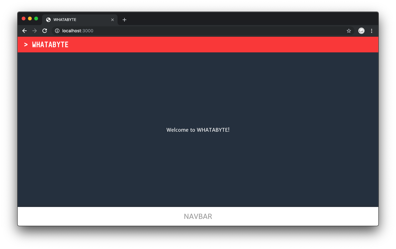
With the theme in place, you should replace the generic "HEADER" title of the app with "> WHATABYTE". Where do you think is the best place to pass that string as a prop?
As the Layout component is responsible for rendering the Header component, it should pass the title of the app as a prop to the Header component. Open components/Layout.js and update it as follows:
// components/Layout.js

import Head from "next/head";

import Header from "./Header";
import NavBar from "./NavBar";

import "./Layout.scss";
import "./index.scss";

const Layout = props => {
  const appTitle = `> WHATABYTE`;

  return (
    <div className="Layout">
      <Head>
        <title>WHATABYTE</title>
        <meta name="viewport" content="width=device-width, initial-scale=1" />
        <meta charSet="utf-8" />
      </Head>

      <Header appTitle={appTitle} />
      <div className="Content">{props.children}</div>
      <NavBar />
    </div>
  );
};

export default Layout;
The Layout function component now defines appTitle within its body and passes its value as the appTitle prop to the Header component. The header title should also link to the root page to create a better user experience. Naturally, update components/Header.js as follows:
// components/Header.js
import Link from "next/link";

import "./Header.scss";

const Header = props => (
  <Link href="/">
    <div className="Header">{props.appTitle}</div>
  </Link>
);

export default Header;
Take a look at the browser and notice the new cool header title. If you ever want to change it, you'll just need to change the value of appTitle within the Layout component function. Layout acts as the data hydration point for the application user interface.
“Learn how to polish Next.js apps using SCSS to create themes.”
Tweet This
Recap
In this tutorial, part 2 of our series, you have learned how to apply styles to pages using the styled-jsx CSS-in-JS framework that comes bundled with Next.js. You also learned how to integrate Next.js with SCSS to apply styles and create a theme to serve as the look-and-feel foundation of your web app.
Notice in components/NavBar.scss the .active class embedded within the .NavBar class. What gives? This class would be useful to give a distinctive color to the active navigation UI element if you were using React Router v4 with a create-react-app project.
To achieve that result, you need to learn how to implement navigation, routing, and use React high-order components with Next.js, which is the topic of the next part!
Again, you can reference Part 1 for creating pages and layouts, here.
Continue to Part 3: Next.js Navigation and Routing
About the author

Dan Arias
Software Engineer (Auth0 Alumni)