Storybook is a development environment for UI components. It let us browse a component library, view the different states of its components, and interactively develop and test them. Storybook runs outside of our application; therefore, we can develop UI components in isolation without worrying about any project dependencies and requirements.
For the scope of this introductory blog post, we are going to demonstrate how to start a new project using Storybook to get familiar with its platform and mechanics stemming from the "Storybook-Driven Development" practices that we have developed at Auth0 within the Customer Success Infrastructure team.
In a previous blog post, we created the foundation of our project by setting up a component library. If you have been following along you may continue to build upon where we left. Otherwise, feel free to clone the Marvel Bank app repo and checkout the A-Tale-of-Reusability-Part-1 branch which includes all the work that we've done in the first part.
git clone https://github.com/auth0-blog/marvel-bank-app.git
cd marvel-bank-app/
git checkout A-Tale-of-Reusability-Part-1
Let's start by learning how we can setup Storybook in a brand-new create-react-app project.
Thrilling news: the next chapter for @storybookjs with full-time maintenance and a bigger team. I'm over the moon!https://t.co/xWL3Gp5dzIpic.twitter.com/T1JJfzNGp6
— shilman (@mshilman) July 23, 2018
Setting Up Storybook
There are two options available to us for adding Storybook: we can install the platform globally or we can start the platform locally. Which installation path should we take?
Our colleague, Matt Machuga, an Engineering Lead in our R&D Team, suggests that "CLI tools that are not project specific are good candidates for global installation." In practice, Matt tries to "scope everything else into local. So the version being used is kept recorded and installed via npm install."
We have different options for installing Storybook: a global install, an install using npx, and a local manual install. I'll explore those options with you and let you decide which one is right for you. However, I do recommend that you walk with me through the local manual install as it let us learn a great deal about how Storybook works.
Install @storybook/react Globally
To install and run Storybook from your shell follow these quick steps:
In the shell, make sure that your project directory your current working directory,
marvel-app.Next, install
@storybook/cliglobally:
npm i -g @storybook/cli
Above, we used a few
npmargument shortcuts.istands forinstalland-gstands for the flag--global.
Restart your shell. You can do that by closing the existing window or tab and opening a new one.
Finally, with
marvel-appagain as your current working directory, run thegetstorybookcommand to have the Storybook CLI scaffold all the necessary files and folders to work with Storybook in your project. These include the.storybookfolder under the root project and thestoriesfolder under thesrcfolder.
Let's see how this can be done without a global install using npx.
Install @storybook/react Using npx
We can emulate the same behavior of the global installation of Storybook but without the actual global installation. If you have npm >= 5.2 installed in your system, you have npx available!
In the shell, make sure that your project directory your current working directory,
marvel-app.Run the
getstorybookcommand usingnpx:
npx @storybook/cli getstorybook
npx downloads and executes the binary on the fly. The Storybook CLI will run and create all the necessary files and folder in your project just as in the previous section. This method is the fastest way to get up and running!
“npx lets us run one-off invocations of CLI tools available in the npm registry without local installation.”
Tweet This
Now, let's explore what the Storybook creators call the "slow start", the local manual installation of Storybook. Through that process, we'll learn how the folders and files installed by the Storybook CLI work.
Install @storybook/react manually
In the shell, let's run the following command:
npm:
npm i -D @storybook/react
Another
npmargument shortcut.-Dstands for--save-dev.
Storybook NPM Script
After @storybook/react has finished its installation. We need to add the following script to package.json to run Storybook:
"storybook": "start-storybook -p 9001 -c .storybook"
{
  "name": "marvel-bank",
  "version": "0.1.0",
  "private": true,
  "dependencies": {
    "node-sass-chokidar": "^1.3.3",
    "npm-run-all": "^4.1.3",
    "react": "^16.4.1",
    "react-dom": "^16.4.1",
    "react-scripts": "1.1.4"
  },
  "scripts": {
    "build-css": "node-sass-chokidar src/ -o src/",
    "watch-css":
      "npm run build-css && node-sass-chokidar src/ -o src/ --watch --recursive",
    "storybook": "start-storybook -p 9001 -c .storybook",
    "start-react": "react-scripts start",
    "start": "npm-run-all -p watch-css start-react",
    "build-react": "react-scripts build",
    "build": "npm-run-all -s build-css build-react",
    "test": "react-scripts test --env=jsdom",
    "eject": "react-scripts eject"
  },
  "devDependencies": {
    "@storybook/react": "^3.4.8"
  }
}
Create A Storybook Configuration File
As explained in the Storybook docs, the platform is flexible and can be configured in different ways. We can control that configuration through a config directory. In our storybook npm script, we added a -c option followed by .storybook which tells Storybook to look for configuration options in the .storybook hidden folder.
Having our project root folder as the current working directory, let's go ahead and create that folder:
macOS/Linux/Windows:
mkdir .storybook
Next, we need to create a config.js file inside .storybook to hold the configuration. Let's start it with the following code:
// .storybook/config.js

import { configure } from "@storybook/react";

function loadStories() {
  require("../src/stories/index.js");
  // You can require as many stories as you need.
}

configure(loadStories, module);
Storybook works in a similar way to testing tools. The config.js loads the configure method, which takes as argument a function called loadStories and a module. loadStories will have stories defined on its body. A story describes the single state of a component. We want to write a story for each state a component will have.
Stories are similar to how
itmethods run tests in testing libraries like Jest.
We are going to write and load the stories from ../src/stories/index.js which will be under the root folder. Let's create such folder and file to write our first story. Under the src folder let's create a stories subfolder and then create an index.js file inside it.
.storybookis used solely for configuration files. Do not put yourstoriesfolder inside this hidden folder.
Writing a Story in Storybook
Open the recently created index.js under src/stories and populate it with the following code:
// src/stories/index.js

import React from "react";
import { storiesOf } from "@storybook/react";
So far, there's not much going on. We import React and a storiesOf method that will help us create stories for a component. We need that component. Let's import Button here:
// src/stories/index.js

import React from "react";
import { storiesOf } from "@storybook/react";
import Button from "../../src/features/common/Button";
Storybook has a declarative language. What we are going to do next is to tell it that we want stories of Button:
// src/stories/index.js

import React from "react";
import { storiesOf } from "@storybook/react";
import Button from "../../src/features/common/Button";

storiesOf("Button", module);
If we were thinking in terms of an actual book, this is the book's binding and cover. We need to fill it with pages full of stories. We do that declarative too using the add method:
// src/stories/index.js

import React from "react";
import { storiesOf } from "@storybook/react";
import Button from "../../src/features/common/Button";

storiesOf("Button", module).add("with text", () => (
  <Button label={`Continue`} />
));
add acts like adding a chapter to a book that has a story. We want to give each chapter a title. In this case, we are creating a story titled with text. add takes as argument the story title and a function that renders the component being staged.
We have the foundation of writing a story. It's time to see if everything is working by running Storybook.
“Similar to testing, Storybook uses declarative language to let us write stories that define the expected presentation and behavior of our components.”
Tweet This
Running Storybook
In the shell, run the following command:
npm:
npm run storybook
If everything runs successfully, we will see this message in the shell:
info Storybook started on => http://localhost:9001/
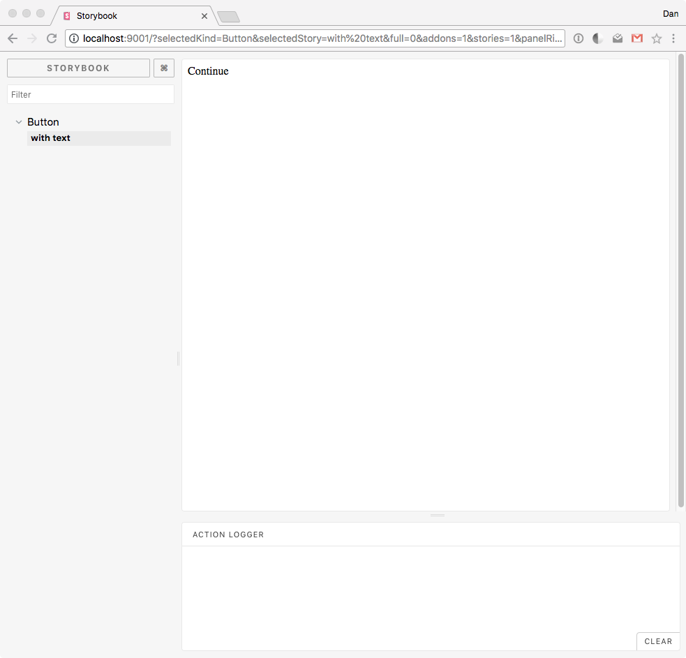
Let's open that URL, http://localhost:9001/ in the browser. Let it load... and there we have it in its full glory: our own Storybook!
Right now it's pretty basic but this is a great start!
This is a good time to make another commit to address the integration of Storybook:
git status
git add .
git commit -m "Integrate Storybook"
Integrating CSS with Storybook
To communicate the presentation and state of the Button component, we need to add styling to it. Under src/features/common, let's create Button.scss and populate it with the following code:
// src/features/common/Button.scss

@import "../../styles/theme";

.Button {
  display: flex;
  flex-direction: row;
  justify-content: center;
  align-items: center;

  height: 40px;
  width: 160px;
  border: 2px solid $blue;
  border-radius: 60px;

  font-family: $primary-font;
  font-size: 16px;
  color: $blue;
  letter-spacing: 1.27px;
  text-align: center;

  text-transform: uppercase;
}
Next, let's import that stylesheet into Button.js and add Button as a className for the Button component:
import React from "react";

import "./Button.css";

const Button = props => <div className="Button">{props.label}</div>;

export default Button;
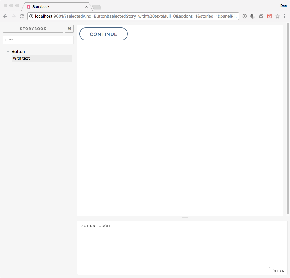
Let's save our work. We should see now how Storybook has refreshed the board and shows the updated component with styling applied:
Just like with create-react-app, we can make changes to the structure, content, or style of a component and they will be updated in Storybook. Let's change the background, font color and border of Button to see this in action:
// src/features/common/Button.scss

@import "../../styles/theme";

.Button {
  display: flex;
  flex-direction: row;
  justify-content: center;
  align-items: center;

  background: $green;

  height: 40px;
  width: 160px;

  border-radius: 60px;

  font-family: $primary-font;
  font-size: 16px;
  color: white;
  letter-spacing: 1.27px;
  text-align: center;

  text-transform: uppercase;
}
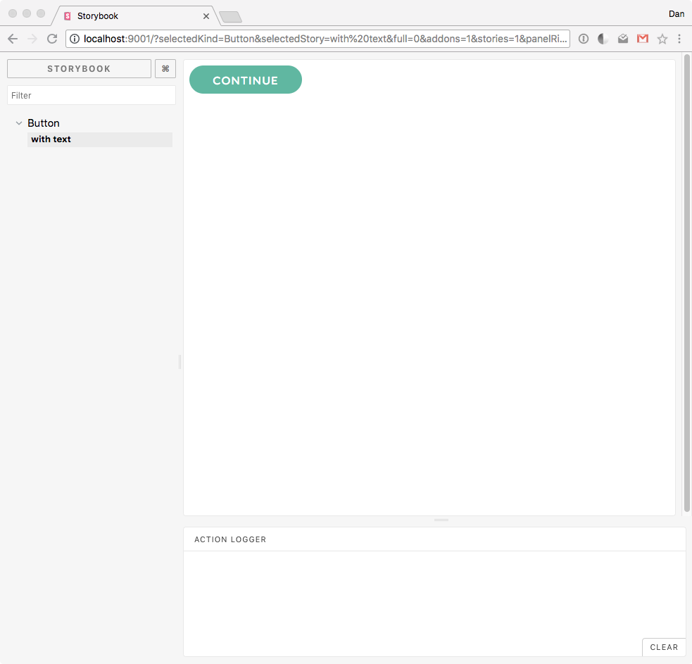
Let's save our work again and observe the changes:
Style changes are well integrated into our workflow. It's truly amazing that we can preview our components this way without having to run our application. We can develop our component in isolation and then use them in the app whenever we want.
“Just like with `create-react-app`, we can make changes to the structure, content, or style of a React component and it will be updated in Storybook! We can visualize our components without running our app.”
Tweet This
As discussed before, Button has three different presentations. The best way to organize that would be through CSS classes and props.
We want the Button component to know:
- Its active state:
active/disabled - Its style state:
fill/no-fill
Let's update Button.scss with classes that represent these states:
// src/features/common/Button.scss

@import "../../styles/theme";

.Button {
  display: flex;
  flex-direction: row;
  justify-content: center;
  align-items: center;

  height: 40px;
  width: 160px;

  border-radius: 60px;

  font-family: $primary-font;
  font-size: 16px;

  letter-spacing: 1.27px;
  text-align: center;

  text-transform: uppercase;
}

.active {
}

.disabled {
  border: 2px solid $color-text-lighter;

  color: $color-text-lighter;
  letter-spacing: 1.64px;
}

.fill {
  background: $green;
  box-shadow: 0 6px 8px 0 rgba(103, 194, 172, 0.5);

  color: $white;
  letter-spacing: 1.61px;
}

.no-fill {
  border: 2px solid $blue;

  color: $blue;
  letter-spacing: 1.27px;
}
Let's briefly review what we are doing here since it's important how this impacts component staging in Storybook:
.Buttonhas all the style properties shared by all instances ofButton..activeis not in use right now but it could be used to provide unique properties to an active button..disabledhas the style properties for any instance ofButtonthat becomes disabled.fillandno-fillapply distinct styling to an active button.
We need to integrate this style logic into our component logic as follows:
// src/features/common/Button.js

import React from "react";

import "./Button.css";

const Button = props => (
  <div
    className={`Button ${
      props.active
        ? props.fill
          ? `active fill`
          : `active no-fill`
        : `disabled`
    }`}
  >
    {props.label}
  </div>
);

export default Button;
Using a combination of ternary operators we process the state of the button. If props.active is true, we check if props.fill is true or not and apply the corresponding class to the component. If props.active is false, there are no extra decisions to make and we apply the default disabled class.
To see this in action, let's create new stories in our Storybook!
Creating Multiple Stories for a Component in Storybook
Let's head to src/stories/index.js and remove the current story that we have defined there, with text, as it isn't telling too much of a story:
// stories/index.js

import React from "react";
import { storiesOf } from "@storybook/react";
import Button from "../../src/features/common/Button";

storiesOf("Button", module);
Next, let's add three new stories that clearly define the three presentations that we want Button to have depending on different state flags:
// stories/index.js

import React from "react";
import { storiesOf } from "@storybook/react";
import Button from "../../src/features/common/Button";

storiesOf("Button", module)
  .add("active with fill", () => (
    <Button label={`continue`} fill={true} active={true} />
  ))
  .add("active with no fill", () => (
    <Button label={`sign up`} fill={false} active={true} />
  ))
  .add("disabled", () => <Button label={`continue`} active={false} />);
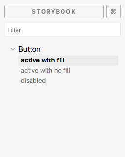
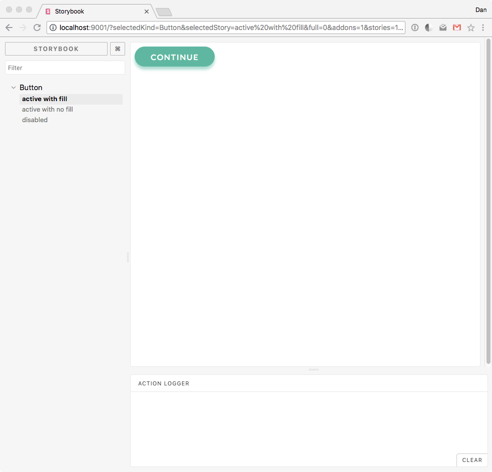
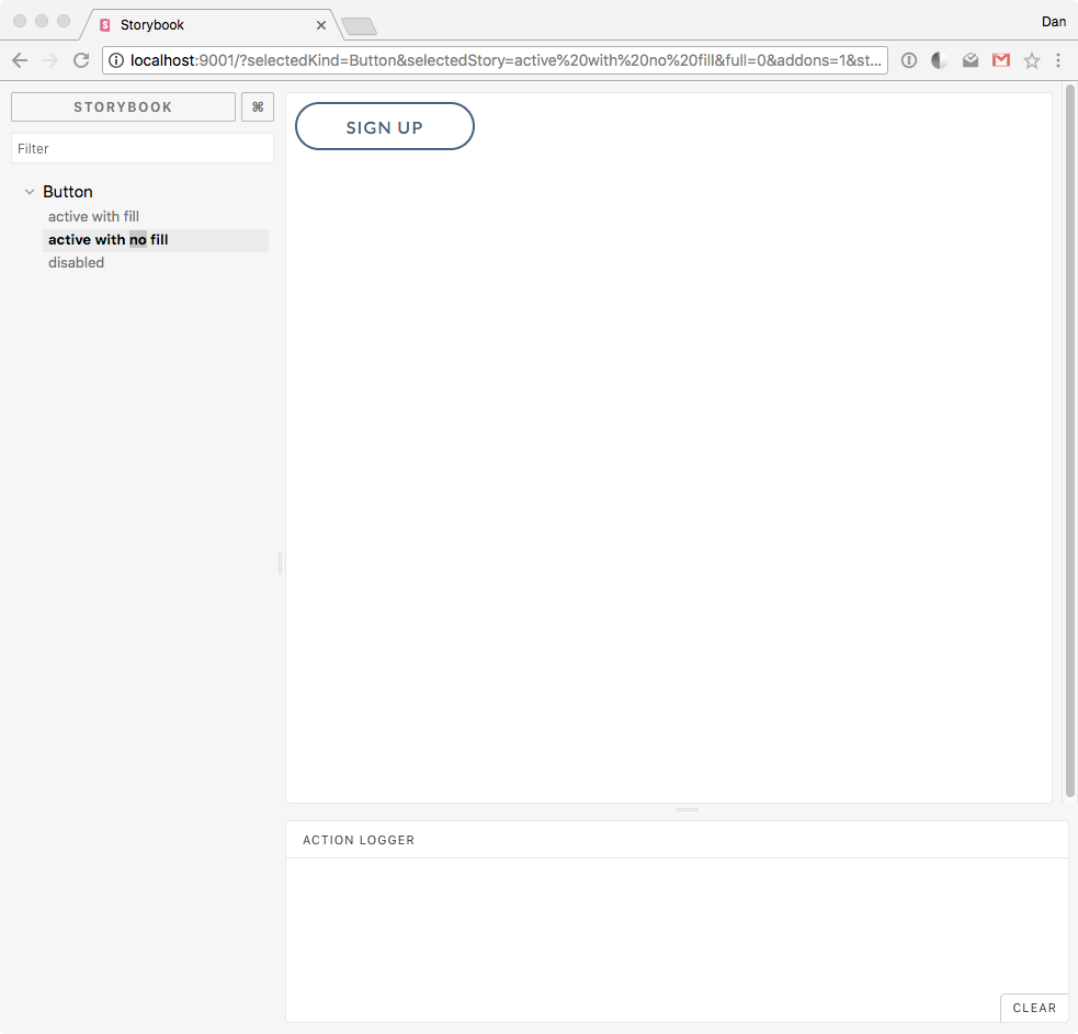
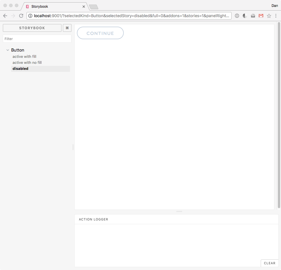
Let's save our work and we'll see Storybook update to show the three new stories under Button:
Each story renders an isolated instance of Button whose presentation depends on the props values that are passed to it. This is where we can see the value proposition of Storybook at play.
Without Storybook, we would need to add Button in our app somewhere and test its rendering by passing it different props. We would then need to remove the component. What if we need to change the structure or style of the component? We'd need to start that process all over again.
With Storybook, a component and all of its different states can be staged in a centralized location. What we see in Storybook will be seen in all the areas of the application that use the component, giving us confidence that we'll have presentational consistency throughout our application.
Let's click around the different stories and see how the component changes on each one. The UI Kit graphic definition of the user interface button is now alive in code.
"Button active with fill":
"Button active with no fill":
"Button disabled":
We have a solid Button component that communicates its state clearly through its presentation. Let's go ahead and commit these changes:
git status
git add .
git commit -m "Add three states to Button component"
Next Steps
We have just barely scratched the surface of what can be done with Storybook! There's a lot more we can do with this amazing tool to make the creation, testing, and documentation of React components much faster. Storybook is also a highly configurable tool that relies on add-ons to boost its offerings.
At Auth0, different teams are making extensive use of Storybook in their React development and design processes. We are converging designers and developers into a Design Systems team that is letting us iterate faster and develop better products for our cherished customers.
Feel free to grab the source code of the project we have created so far from the Marvel Bank App GitHub repo.
About Auth0
Auth0 by Okta takes a modern approach to customer identity and enables organizations to provide secure access to any application, for any user. Auth0 is a highly customizable platform that is as simple as development teams want, and as flexible as they need. Safeguarding billions of login transactions each month, Auth0 delivers convenience, privacy, and security so customers can focus on innovation. For more information, visit https://auth0.com.
About the author

Dan Arias
Software Engineer (Auth0 Alumni)
