About a year ago, we started to work on a new project along with the Marketing Team where we revisited more than 5 years of work on Auth0’s website, to see how we could improve it, having in mind the different personas that we work with (developers, C-level/business personas, and product managers — to name just a few) and the use cases that we solve on a daily basis (B2B, B2C, B2E).
This led us to perform several rounds of user testing, with some goals in mind. One in particular, was to understand if the website visitors had a true understanding of what Auth0’s value proposition was about.
After reviewing all the qualitative data gathered in these tests, we realized that 4 of 10 didn’t understand what Auth0 does after viewing the homepage — they knew it was something related to authentication, but thoughts varied whether it was just a wiz editable login box, how much code was needed, and what applications Auth0 is suitable for.
The problem was in the palm of our hands, and it was up to us to revisit the decisions that we made in the past and make our move.
First Things First: Cross-Team Collaboration
Working closely with the Marketing Team has a lot of benefits: one of them is that we have the Growth Team continuously experimenting to improve the experience across the different environments that Auth0 uses to connect with its users. Another one: working side by side with the Content Team to set up the tone and the voice of every campaign that we run.
Last — but not least — we also have an amazing team of UI Engineers that are always supporting us to put our designs live in the outer-internet space, so this was the ideal moment to reinforce our relationship and work closely with them.
In order to make this through, we created a cross-functional-team that included people from both teams (Growth and UI) in which I had the opportunity to collaborate with.
Little by Little
Although the primary goal of this project was to improve the homepage by changing its messaging and driving Auth0’s personas to the different points of interest in their journeys, we found out that some key objectives could be achieved by reorganizing and reducing the content, focusing on:
Auth0’s value proposition
Social proofs (customers logos + testimonials)
Pricing
Driving this goal into a more “marketing-oriented language”, we believed we could use this opportunity of refreshing the page design to also focus on moving the homepage’s traffic to high traffic pages (for example, Pricing), in addition to optimizing the homepage’s hero experience to capture high impact leads (also aligned with some of the experiments that our cross-team was running at the moment — for example, adding an input field to talk to an expert).
On the other hand, it was urgent to set some baseline metrics with the current design to see where and how much this new design could impact, so we crossed the information that we gathered not only in our own data warehouse but also the one provided by tools like Google Analytics and Hotjar. Some of the things that were (and still are) important to us:
- page views (which includes bounce rate, page visits, time on page),
- page scroll (how much of the content do the users really see before they leave the page?)
- and session length (how much time do the users spend on the page?).
Houston, We Have a Plan
Now the question was: how can we make it through this without losing our minds? Setting up a plan!
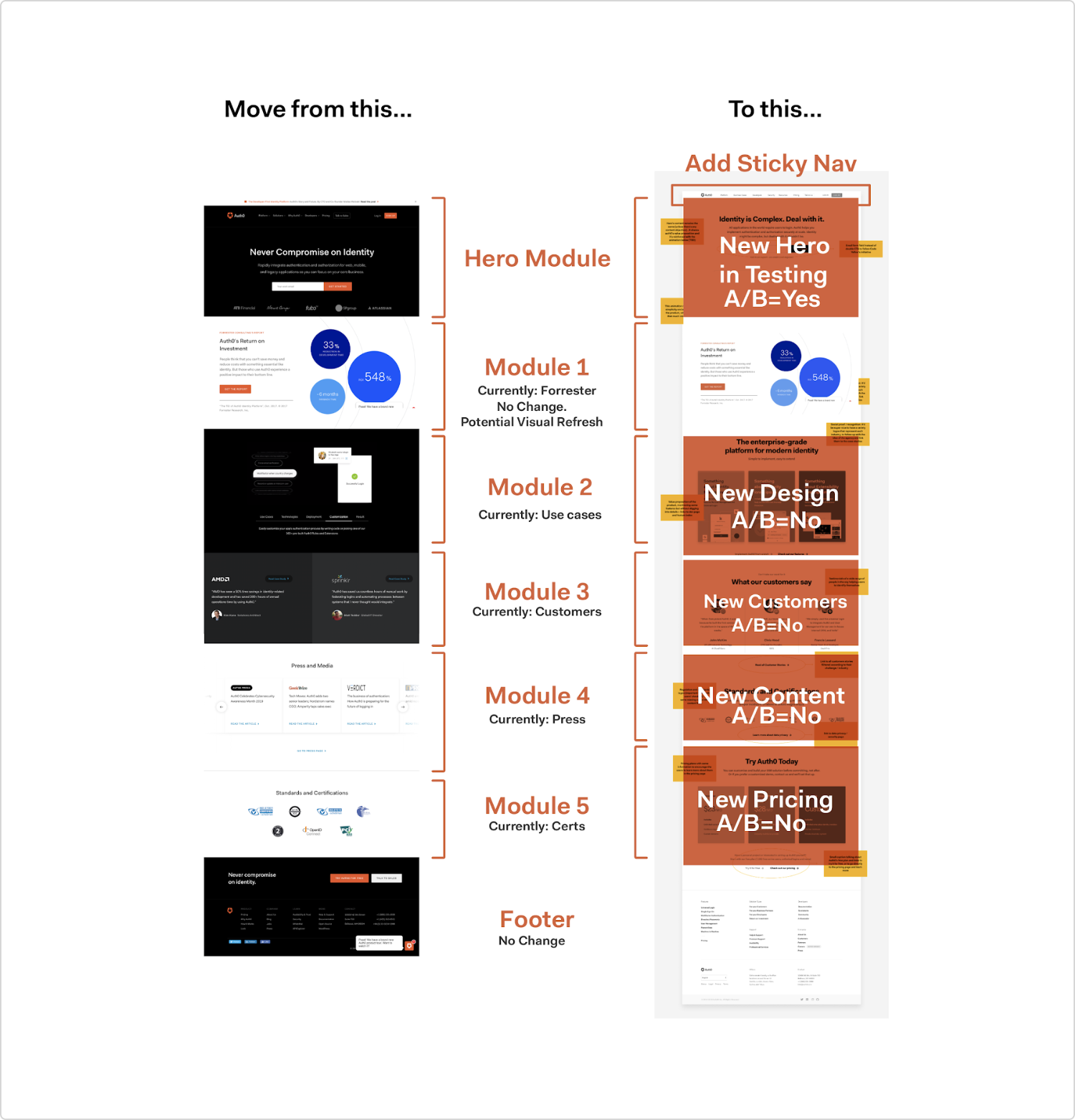
First of all, after reviewing all the information that we collected so far, we envisioned a design plan, which basically consisted of contrasting the current homepage design vs. the ideal, future design. We also figured out which scenarios were open to experimentation (for example, the hero unit and all the sections that contained useful information, like R.O.I. and Resources). In other words, we embraced using A/B testing as a quick and easy feedback cycle to validate decisions.
This was helpful not only for ourselves but for the rest of the people involved in the project, because we set up the priority and the level of effort behind each module of this new page, which meant that we could work on different tasks at the same time (for example: while Design was working on the hero unit exploration, Content was working on things like feature descriptions, looking for testimonials to show, etc.).
The Masterplan (A.K.A the Hero Unit Experience)
The main priority of the project was the hero unit experience. Why? Because that’s the first thing that users see when they arrive at a website’s homepage — and as a result, it has the most impact and risk on conversion metrics.
It seems easy, right? The truth is this was the most difficult piece of the whole project.
(Note: Before getting into the details, I want to shout out to Drew Sing, our Senior Growth Strategist, who put together the different test plans that made this critical part of the project smoother and easier to walk through. Also, a huge round of applause to the amazing Bel Cortes, UI Engineer, without whom this wouldn’t have seen the light of day).
After discussing the different approaches that we could do from a design perspective, we realized that it was possible to test out two different versions of this new hero unit design:
One of them could include a devices composition, to help users understand the different contexts where the Auth0 Platform can work (web, mobile, etc.)
Another one could include a diagram, to help users understand how Auth0 works in a few easy steps.
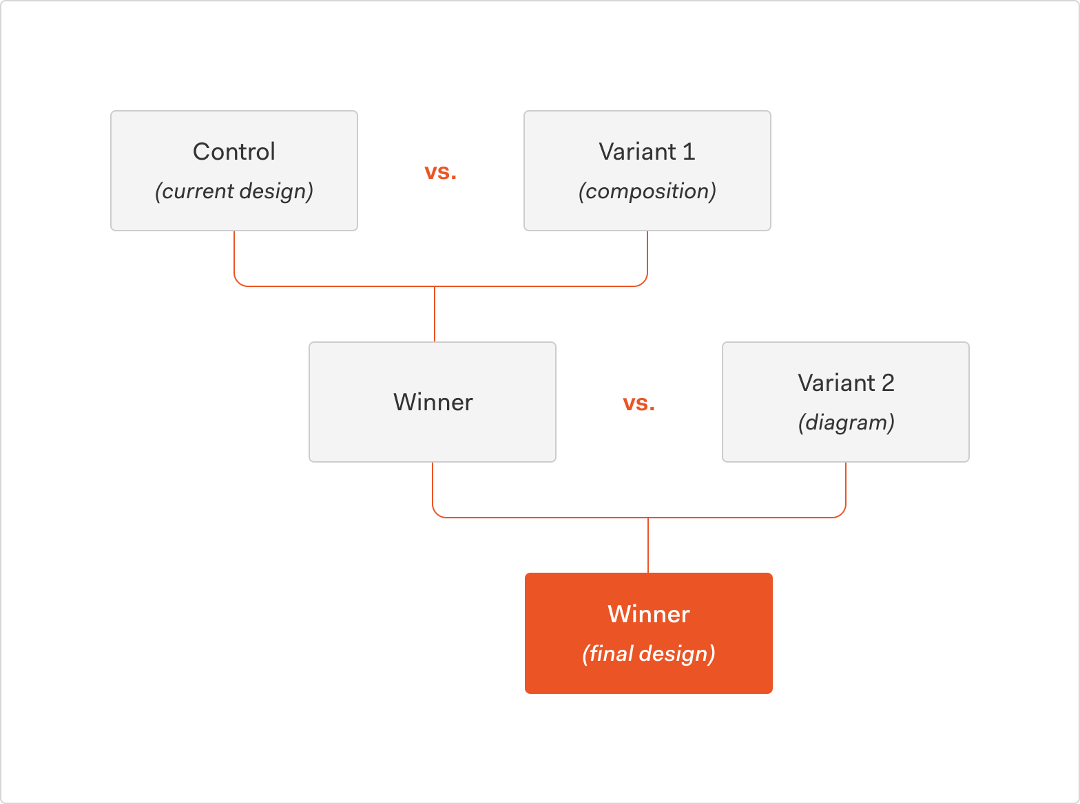
So yes: we had an existing design that needed to be contrasted with not one but two designs. How did we move forward? We planned to run two different A/B testings, following this scheme:
Something that we also included in all of the new designs was changes in the copy, and updating the existing CTAs (“Try Auth0 for Free” and “Talk to Sales”) to an email field with a “Get Started” CTA that directs users to a sales form-fill, to customize the experience of reaching out to Auth0.
Experiment #1: Control (Current Design) vs. Variant 1 (Composition)
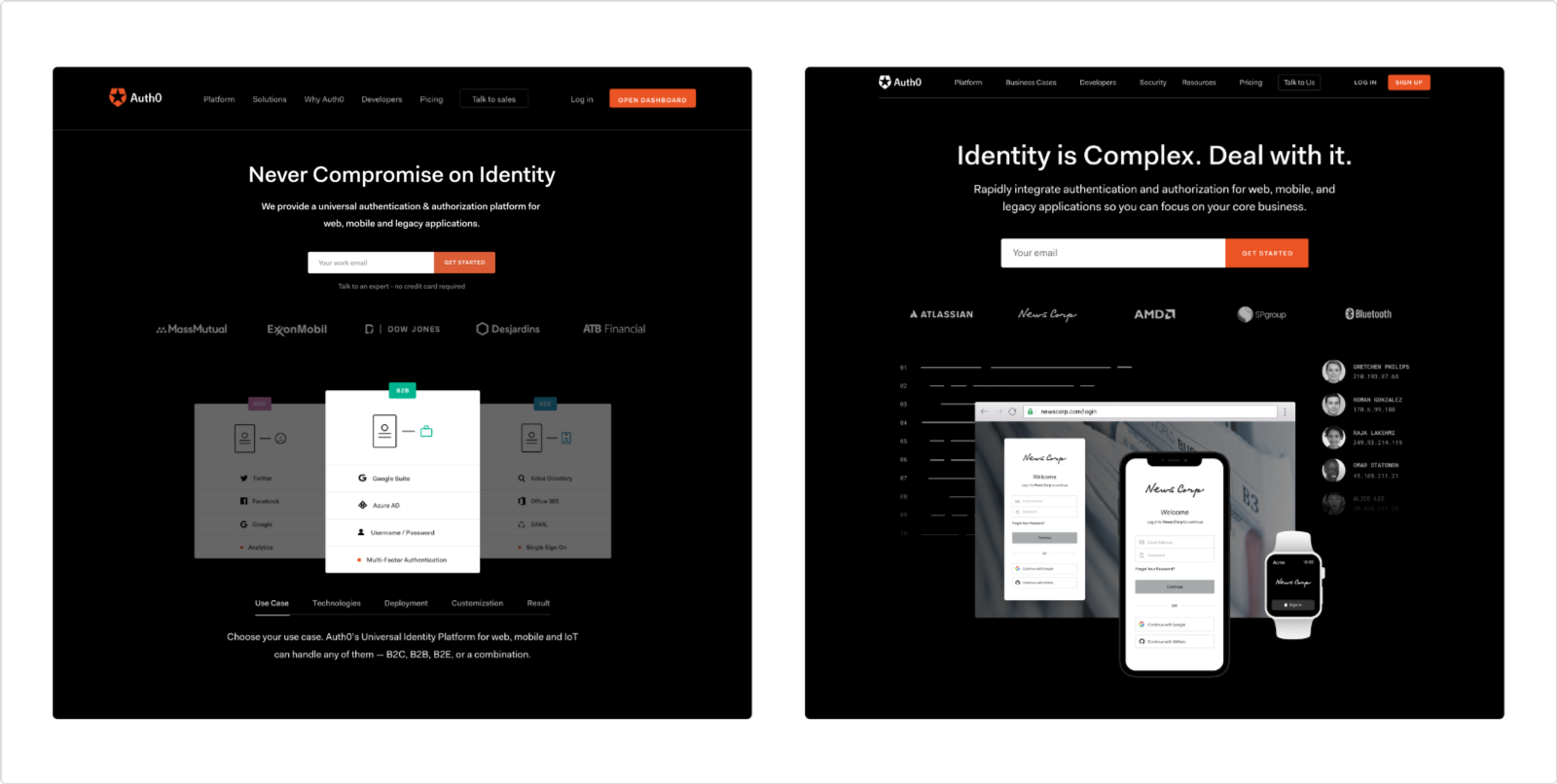
Left: control / Right: variant 1
Hypothesis: Because the auth0.com homepage receives a lot of traffic, we expected that updating the hero unit to have an email field with a “Get Started” CTA that directs to a sales form-fill would increase the number of form-fills.
Results: After running this test for a month, we discovered that users who saw the devices composition alongside the “Get Started” CTA converted 39% more form-fills than the control. Ergo, the variation proved itself a worthy winner in acquiring more form fills at no loss in form-fill quality.
Experiment #2: Control (Winner Design — Composition) vs. Variant 2 (Diagram)
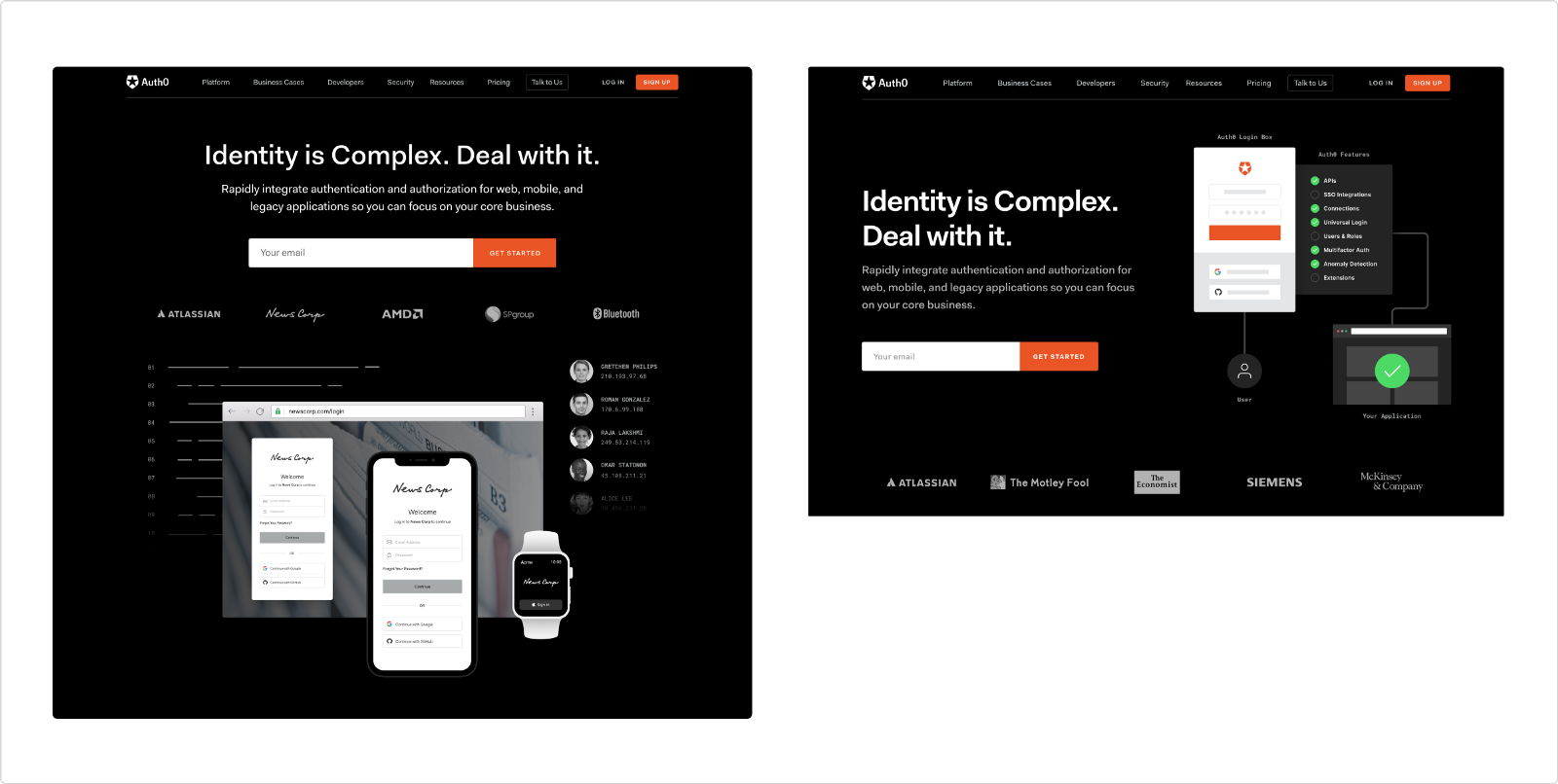
Left: winner / Right: variant 2
Hypothesis: Because the auth0.com homepage receives a lot of traffic, we expected that having an interactive diagram above the fold on the homepage would help increase engagement metrics, such as form-fill acquisition.
Results: After running this test for a month, we discovered that there was no statistically significant difference in form-fill conversions between the control and variation, but the variation did show a decrease in form-fills by 7.8%.
The Numbers Have Spoken?
After going through the different rounds of A/B testings, the winning design was the first variant (devices composition) and is the one that you can see at our brand new Homepage.
Although the numbers have spoken for sure, we understand that there are potential test outcome reasons (for example, you could argue that in Variant 2 the diagram could distract users away from CTAs, even though it has useful animated content), that we should definitely test in the future with different approaches to see what happens.
What Happened With the Rest of the Design?
Part of our discoveries in the primary stage of this project (thanks to Hotjar and the insights that we gathered with the heatmap feature) was that only 25% of the audience scrolled past the second fold of the page and -actually- only 5% of the audience scrolled down until the homepage’s footer. This led us to make the decision of not running any A/B testing with the rest of the design.
But, after considering that the design was changing radically, we decided that we’d run a “no harm test” to make sure that nothing that we designed and implemented was doing any damage to our conversion rate, and also get rid of our bias. As of today, this test is still running, so we expect to see results in the upcoming weeks (so yes, you can still see both, the old and the new design and contrast them).
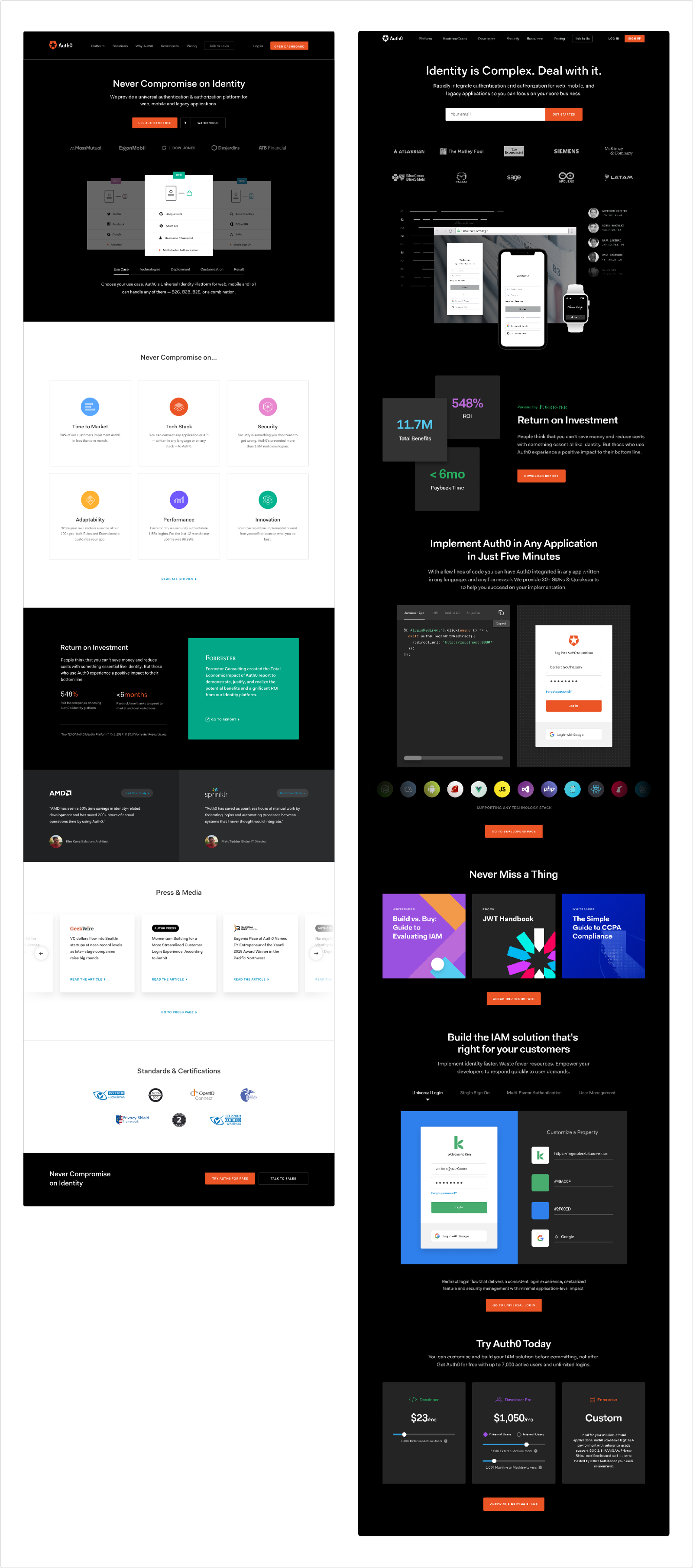
Left: old design / Right: new design
Final Thoughts / Conclusions
Working in this project has led us to different thoughts and conclusions, that we’re more than excited to share. Considering how this story has gone, I believe it’s important to divide them into two topics: cross-team collaboration and the benefits of working on our designs with metrics in mind.
About Cross-Team Collaboration — What Is It?
A cross-functional collaboration brings together people with different backgrounds, skill sets, and talent, in order to achieve specific goals. In the beginning, it can be quite challenging to find the right people to fit into this team, but once it’s done, it’s totally worth it. Some of the benefits of working in this kind of teams are:
You most probably will get the chance to work with super talented people, and learn from each other
Cross-team collaboration gives you a global perspective of your work, which means having insights from the different points of view (a problem might have different solutions depending on who’s trying to solve it -designers, developers, project managers, etc-)
It helps to innovate and think outside of the box, make smart decisions, and take better risks
You are helping to build a collaborative culture inside your org, embracing teamwork as a core value
And What About Design-Driven by Metrics?
My personal opinion is that, even if it doesn’t seem to, designers need analytics as much as any other contributor in the organization. Why? Because the hardest part of our job as designers is to educate others about the impact of our designs.
Without metrics, design reviews would mostly fall into confusion and vagueness; on the other hand, design-driven by metrics allows us to avoid comments about fonts and colors (or the infamous “make this bigger/smaller”), and focus on more strategic conversations (like “does this user flow improve the experience of our users while interacting with our product?”).
Apart from this, some of the benefits that I found about working with metrics are:
Failure isn’t failure anymore: it’s a new opportunity to improve our designs tactically (when you have metrics on your side you don’t have to “throw” a design away and start a new one; you are able to identify what the issue is and iterate)
It’s a less expensive alternative to user research (especially for superficial changes like the copy or color of a CTA).
About the author

Barbara Mercedes
Visual / Brand Designer (Auth0 Alumni)
