A lot can happen in eight years. Since Auth0’s inception in 2013, everything — from our product offering to our audience — has expanded. The company itself has grown from a fledgling startup to a global company servicing thousands of customers around the world. As a brand, we wanted to evolve as well.
But evolving a brand takes time and can encompass new design principles, typography, color palette, logo, and much more. For those who want a deeper look into our process, here’s where our Design Team started, how we approached challenges, and drumroll... where we landed with our exciting new brand!
Understanding Our Audience
Our team went through months of discovery and visual exploration to better understand our audience and drive the direction of our new brand. Our research was three-fold — we sent out a company-wide survey on how the brand was perceived within the company; conducted interviews with our Ambassadors to learn how the brand was perceived externally; and met with analysts to understand our brand within the market. This method helped us collect as many diverse perspectives as possible.
Throughout that process, we heard a lot of great feedback that influenced the designs and new brand. But there were three common themes that really shaped our decisions:
1. Our Brand Was Too Corporate
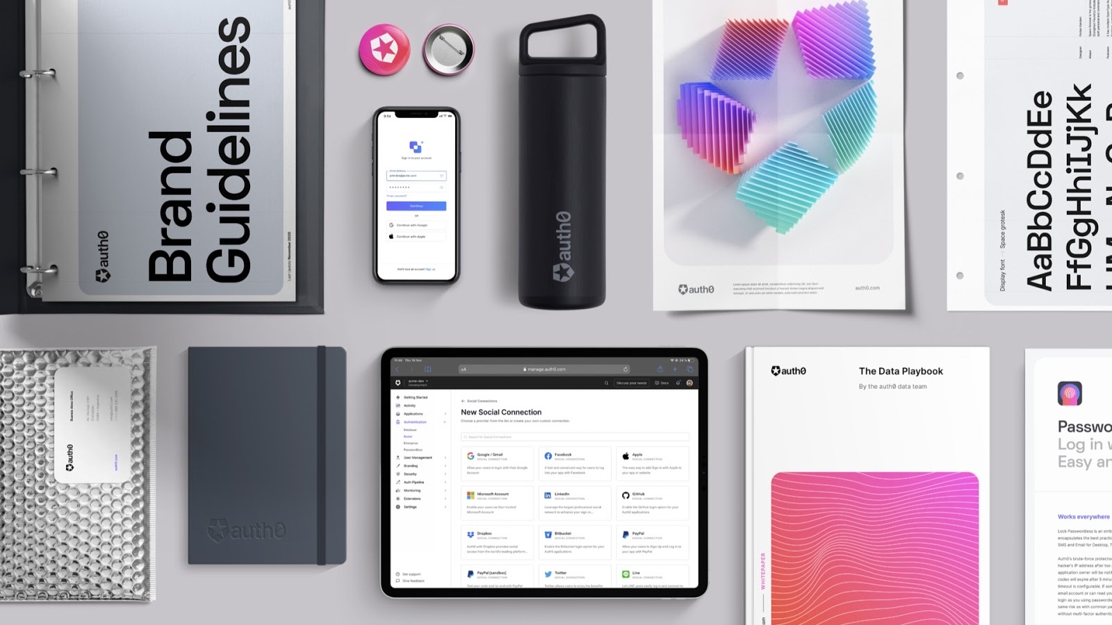
With the copy on our website and our color palette rigid and dark, we wanted to find ways to infuse more personality into our brand. We set out to create a new visual identity that was dynamic and approachable, including a more modern color palette and gradients, playful illustration style, and 3D elements.
2. Inclusivity is Important
The topic of inclusivity surfaced in many ways from many people and was clearly a recurring theme we wanted to address. Suggestions we heard included implementing dark mode within our product and improving the accessibility and localization on our website. Rooted in our mission of inclusivity and technology access, our team will continue to do better with every decision we make.
3. Auth-Oh or Auth-Zero?
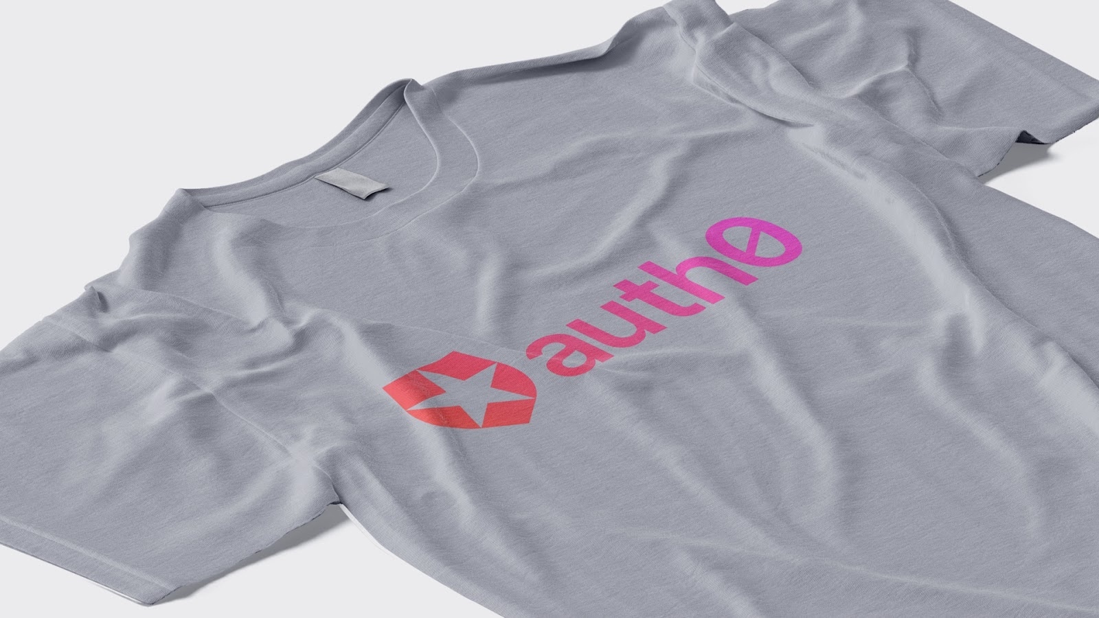
The most common recommendation we heard was addressing the confusion in our name. Is it an O or a zero? Hopefully, the introduction of the crossbar in the zero will end this debate once and for all. The intent of the new logo was to make this clear — saving us all time from pondering this question.
The Beginning of Something Great
All this to say, a lot of thought, time, and investment went behind the creation of our new brand. Its launch is a culmination of an effort to create an identity that not only represents where we are as a company today but also where we’re headed. This is only the beginning. Over the course of this year, we’ll be working hard to create a cohesive customer journey from beginning to end. Keep an eye out for more exciting things coming your way from our Design Team, and until then, check out more of our new brand experience.
About Auth0
Auth0 by Okta takes a modern approach to customer identity and enables organizations to provide secure access to any application, for any user. Auth0 is a highly customizable platform that is as simple as development teams want, and as flexible as they need. Safeguarding billions of login transactions each month, Auth0 delivers convenience, privacy, and security so customers can focus on innovation. For more information, visit https://auth0.com.
About the author

Emily Hsiao
Brand Design Manager (Auth0 Alumni)


