

For the past year, Auth0 has been growing at a fast pace and, naturally, so has the number of fronts that the Design Team has had to tackle.
In this post, we’ll explain what we've learned as we’ve implemented practices that help integrate design into our products, guarantee consistency, and optimize design choices.
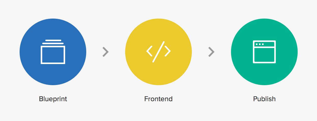
1. Blueprints
The first practice we introduced was design from blueprints. A blueprint is just a monochrome draft of the final product, with as little focus on styling as possible.
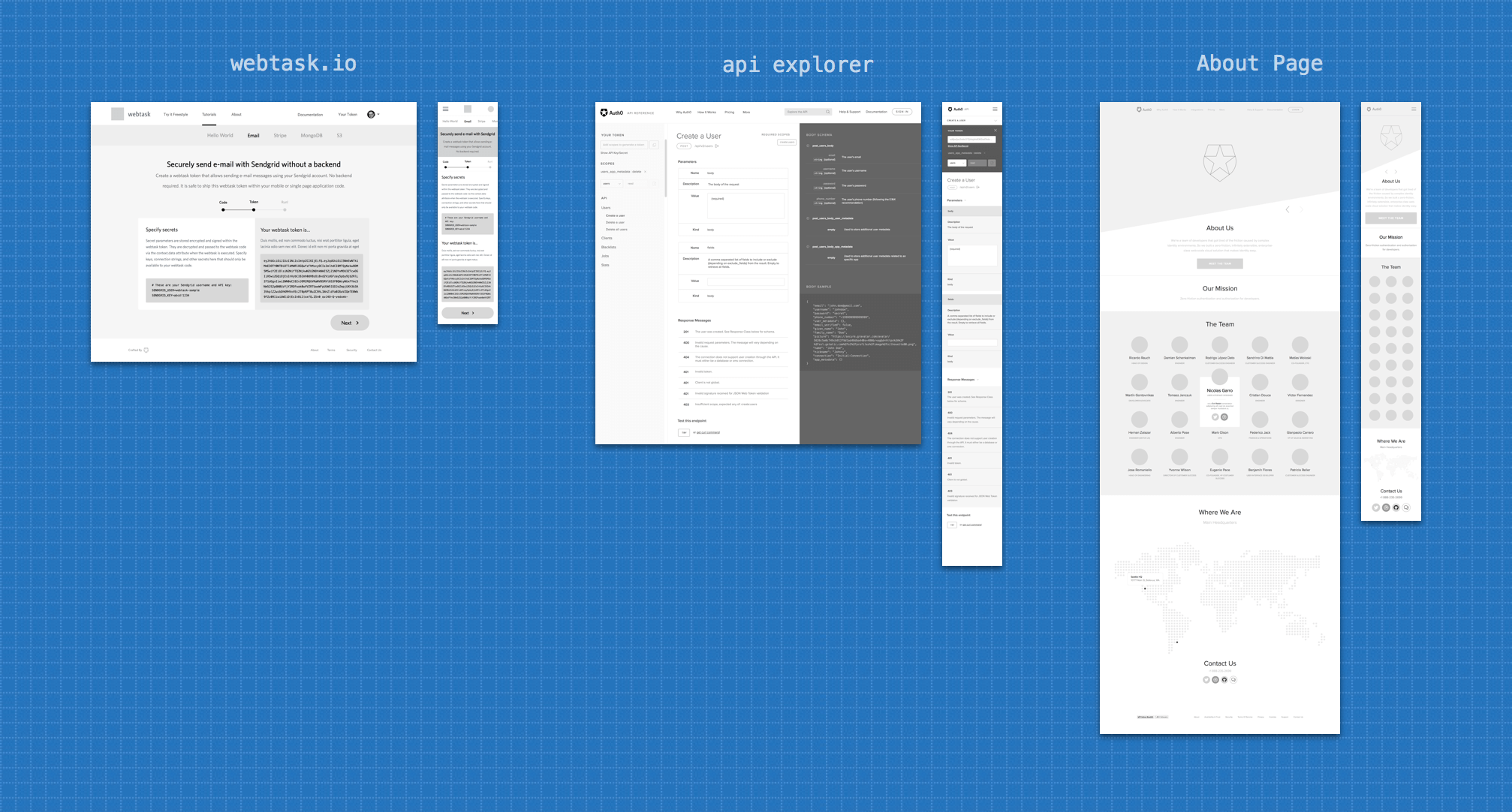
We go through a lot of feedback from different company stakeholders, including engineers, marketers, analytics, and our own clients. By taking subjective factors like color and embellishment out of the process, blueprints help us get better feedback and achieve simpler solutions in a shorter length of time.
2. Frontend
Asset production
We constantly review previous work when producing new assets to check for consistency and understand how they have evolved over time so we don’t repeat mistakes.
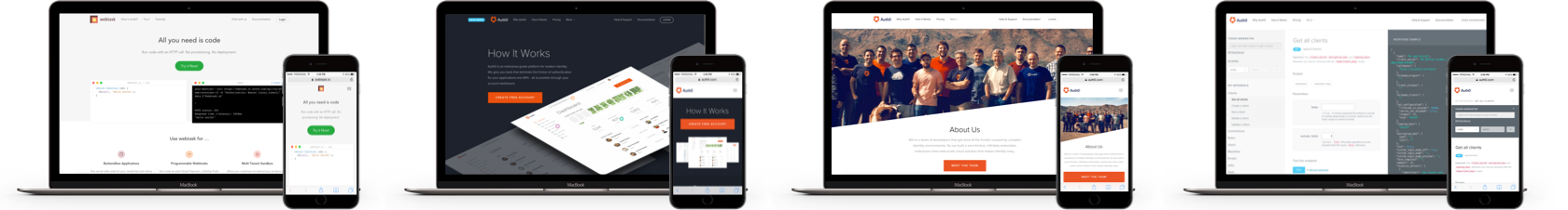
Our website is mapped out on a 1:1 scale with design files and is available to the whole team on Dropbox.
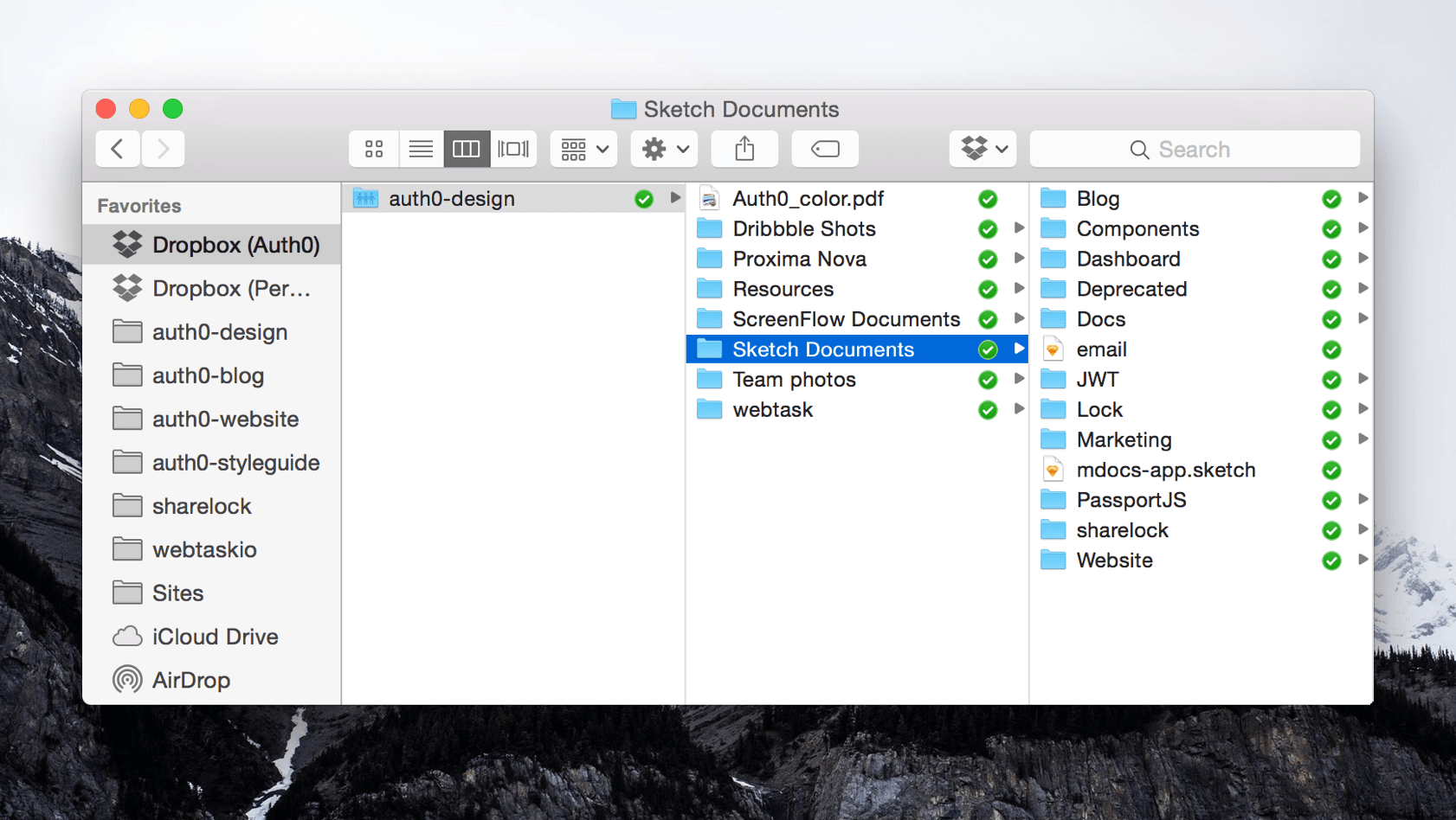
Using Sketch has dramatically improved the way we create and export assets. We think it’s the best tool for the job because it was designed with the Web in mind.
Mobile first
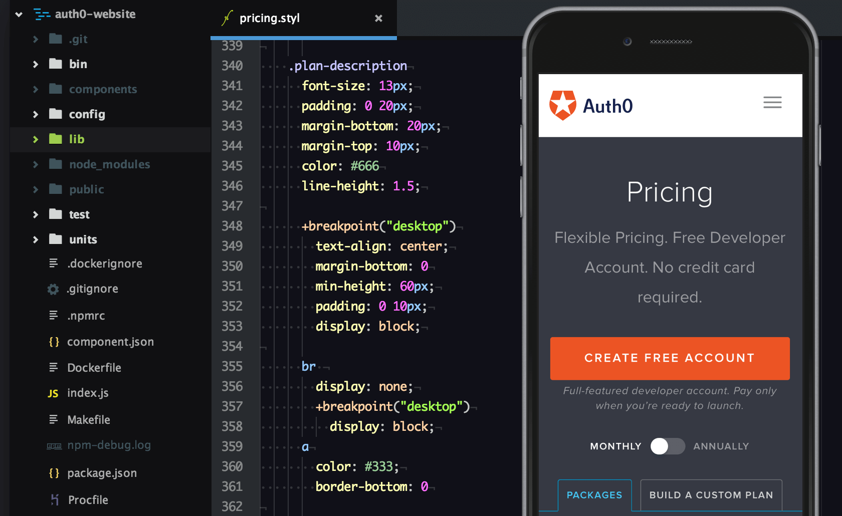
Most of the HTML and CSS at Auth0 it handled or refactored by a designer at some point. We’ve set clear guidelines for front-end code, and we’ve chosen Stylus and Jade to optimize our productivity. As a result, we write concise, clear code much faster.
Over the past year, we have started to migrate all of our pages as part of a mobile-first strategy.
The rationale behind this strategy starts with the design perspective: we set out to present only information that we can make available in a way that works on any device. This simplifies our approach to information architecture by getting rid of unnecessary elements and solving problems in the simplest way, which also reduces the potential for errors during development.
To maintain stability, we are making these changes progressively. Each page that gets a redesign gets a mobile-first refactor to go with it.
A key factor in preventing Responsive Design from getting messy was abstracting all of our media queries to a Stylus mixin and keeping them as close as possible to their relevant selectors, making them harder to overlook and easier to maintain.
.hero-cta
  color: blue;
  border-radius: 3px;
  padding: 10px 20px;
  max-width: 100%;

  +breakpoint("tablet")
    max-width: 620px;
    font-size: 18px;

  +breakpoint("desktop")
    max-width: 740px;
    font-size: 20px;
Styleguide for consistency
Styleguide is one of our most important projects. Its aim is to help maintain the same look and feel across all of our products and to make our front-end code reusable, no matter the specifics of any project's codebase.
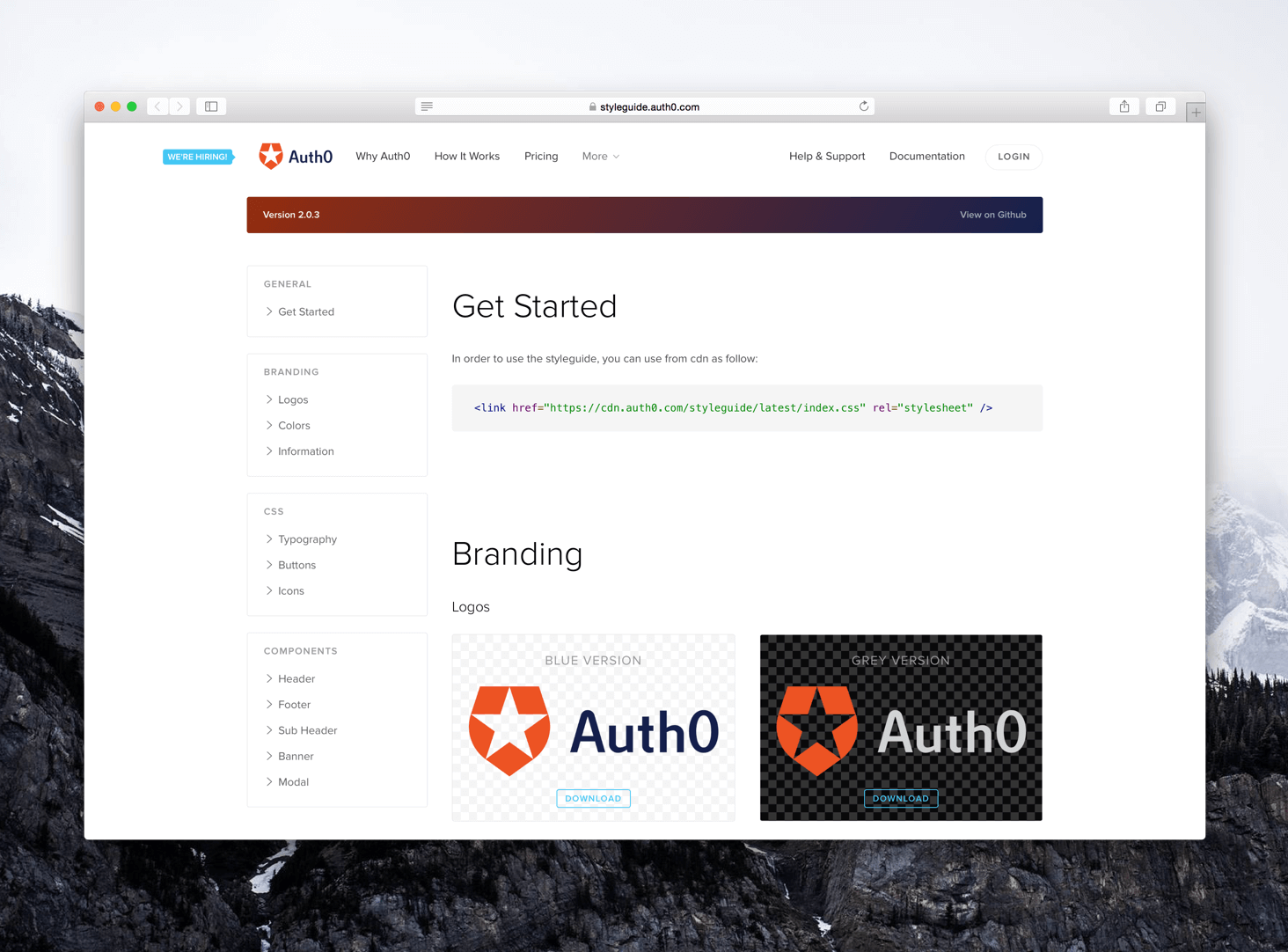
Styleguide holds values, patterns, and specific components that repeat across pages, enabling designers and engineers quickly to reuse them on any product without worrying about markup or CSS.
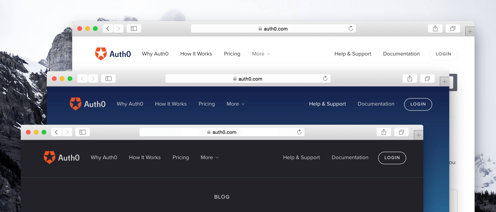
Elements like our header, footer, and other components are easily maintained on different projects by sourcing them directly from Styleguide.
By reducing complex html structures and patterns to Jade mixins available through Styleguide and passing only content as parameters, we optimize development time.
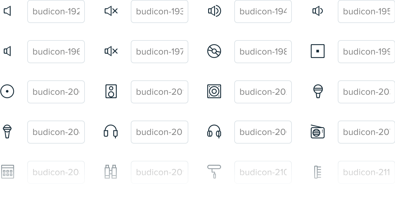
Company colors, typography, and icons are kept consistent by using the same set of variables and files for every project.
We use semantic versioning to enforce certain versions of Styleguide across projects. This helps maintain stability in our sites when we're doing heavy updates.
Today, we can include Styleguide using Bower or Component or by linking directly from the CDN.
If you are interested, check the live version or view the code on Github.
3. Publish
Deep testing
Once we reach the final step in producing a deliverable, we start a rough path of tests by using Heroku or Github pages as staging deployments. The whole point of this task is to have a last ride before publishing to the open when there is no take-back of the first impression statement.
Some of the things we review here:
Mobile rendering and response times on different real devices, browsers, and networks’ SEO optimizations (title on each page, description, sitemap…) and social sharing media elements like OpenGraph and Twitter Cards.
This method has always preceded the finest look and feel, in our experience.
And we’ll keep improving our test process to deliver no less than the best.
Design meetings
Though we’re still a small group, there are already different kinds of designers on the team, some more adept in usability or visual design and some more focused on prototyping and code.
We have established weekly design meetings as a simple “show and tell” exercise to feed off each other's work and be in the loop of what’s been going on during the week with other projects. This adds a big-picture perspective to all the work that's been done and complements daily feedback by showing the whole team the impact of design on our products.
We’re always looking for ways to improve and optimize our process. We hope that some of our practices can prove useful for anyone interested in collaborating on product design, and if you have suggestions or thoughts, we’d be glad to hear them.
Finally, processes are nothing without a great team. I am humbled to work every day with these amazing people: Victor Fernandez, Benjamin Flores, and Nicolás Garro
If this sparked some interest, we are hiring.