TL;DR: Inferno JS is a blazing-fast, lightweight, React-like JavaScript library. React developers will find it comfortably familiar. Inferno JS also supplies better performance, smaller size, and other improvements. Inferno is highly modular and unopinionated, encouraging developers to add only the pieces we require and write code to suit our personal preferences. In this tutorial, we'll introduce the Inferno JavaScript library, then build a simple Inferno app and authenticate it with Auth0. The final code can be found at the inferno-app GitHub repo.
Introduction to Inferno JS
Inferno is a fast, lightweight JavaScript library that resembles React. Minified and gzipped, Inferno weighs in at only 9kb (React gzipped is over 40kb). It's also extremely performant in benchmarks as well as real-world applications. Inferno can render on both the client and server and at the time of writing, it is the fastest JavaScript UI library that exists.
These features are very attractive, but many JavaScript developers are overwhelmed by the number of libraries and frameworks already out there. A few tools have emerged as mindshare and usage leaders, React among them. So what are the reasons behind Inferno's creation? Who should use Inferno and why?
Why Was Inferno JS Created?
Inferno's author, Dominic Gannaway, wanted to examine whether a UI library could improve experience for web apps on mobile devices. This included addressing issues that existing UI libraries had with battery drain, memory consumption, and performance. Inferno builds on the same API as React to greatly diminish the barrier to entry and take advantage of the best features of React. The result was a lightweight and incredibly performant UI library that React developers will find delightfully familiar but also improved.
Inferno JS Features
Inferno has many features, including but not limited to:
- Component driven, one-way data flow architecture
- Partial synthetic event system
- A
linkEventfeature, which removes the need for arrow functions or binding event callbacks - Isomorphic rendering on both client and server with
inferno-server - Lifecycle events on functional components
- Controlled components for input/select/textarea elements
You can read more about the features of Inferno and how Inferno works in the Inferno GitHub README and an indepth Inferno interview with Dominic Gannaway on the SurviveJS blog.
Note: I strongly recommend reading the interview article. It provides the technical details of Inferno, how it works, and how it compares to similar libraries like React and Preact.
Who Should Use Inferno?
Dominic Gannaway initially developed Inferno to improve performance on mobile. He says:
"Inferno is a great library for building UIs for mobile where performance has been poor in other libraries and people are looking around for alternatives." —Dominic Gannaway
Learning and Using the Inferno JS Library
Because Inferno is built on the same API as React, developers gain several adoption advantages when learning or switching to Inferno:
- React developers will find Inferno very familiar, resulting in a low barrier to entry; no extra time or money is needed to invest in learning a different library.
- Extensive availability of React resources online means that these tutorials and docs are helpful when learning Inferno as well.
- An
inferno-compatpackage allows developers to switch existing React projects to Inferno in just a few lines of code. - There is a growing set of Inferno packages available, such as
inferno-redux,inferno-mobx,inferno-router, and more.
The official Inferno website and documentation can be viewed here. Dominic Gannaway also recommends the React courses on egghead.io as well as React tutorials by Wes Bos. In addition, resources such as Auth0's React Quick Start and Secure Your React and Redux App with JWT Authentication can offer insight into managing authentication with Inferno.
Developers can get started easily with Inferno with the create-inferno-app project. This is a fork of create-react-app and sets up boilerplate for developing, testing, building, and serving an Inferno app.
Set Up an Inferno App
Now that we've learned a little bit about Inferno, let's build a simple app that calls an API to get a list of dinosaurs. We'll be able to click a dinosaur's name to display more information. Let's get started!
Dependencies
We'll need Node.js (with npm) installed globally. If you don't have Node already, download and install the LTS version from the Node.js website.
We're going to use create-inferno-app to generate the boilerplate for our application. Install create-inferno-app globally with the following command:
$ npm install -g create-inferno-app
Create a New Inferno App
Let's scaffold a new Inferno project with create-inferno-app. Navigate to a folder of your choosing and run the following commands to create a new app and start the local server:
$ create-inferno-app inferno-app
$ cd inferno-app
$ npm start
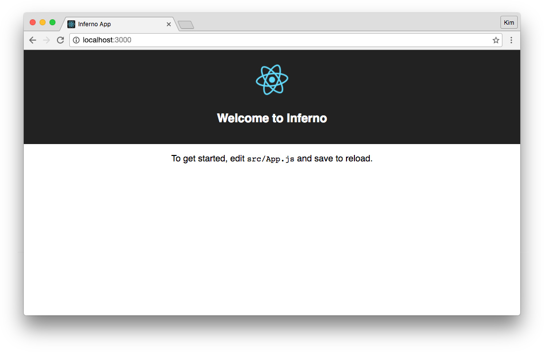
The app can now be accessed at http://localhost:3000 and should look like this in the browser:
Install Bootstrap CSS
To style our components quickly, let's use Bootstrap. Version 3 is the latest stable release at the time of writing. We'll use npm to install Bootstrap:
$ npm install bootstrap@3 --save
Import the Bootstrap CSS file in the src/index.js file to make it available in the application:
// src/index.js

...
import 'bootstrap/dist/css/bootstrap.css';
Install Node.js Dinosaurs API
Our app needs an API. Let's clone sample-nodeserver-dinos in the root of our Inferno app and then rename the repo folder to server. Then we'll execute npm install to install the necessary dependencies to run our API.
Note: The command to rename files or folders is
mvon Mac/Linux orrenon Windows.
$ git clone https://github.com/auth0-blog/sample-nodeserver-dinos.git
$ mv sample-nodeserver-dinos server
$ cd server
$ npm install
Our Inferno app runs on a local development server at localhost:3000 and the dinosaur API runs on localhost:3001.
Note: For brevity, we're going to run the app by launching the API server and app server in separate command windows. However, if you'd like to explore running multiple processes concurrently with one command, check out this article: Using create-react-app with a Server.
Call a Node API in an Inferno App
Let's start our API server. From the server folder, run:
$ node server.js
Create an API Service
To call our API, we can build a service to fetch data. App components can then use this service to make API requests. Let's create a new folder: src/utils. Inside this folder, make a new file and call it ApiService.js:
// src/utils/ApiService.js

const API = 'http://localhost:3001/api/';

// GET list of all dinosaurs from API
function getDinoList() {
  return fetch(`${API}dinosaurs`)
    .then(_verifyResponse, _handleError);
}

// GET a dinosaur's detail info from API by ID
function getDino(id) {
  return fetch(`${API}dinosaur/${id}`)
    .then(_verifyResponse, _handleError);
}

// Verify that the fetched response is JSON
function _verifyResponse(res) {
  let contentType = res.headers.get('content-type');

  if (contentType && contentType.indexOf('application/json') !== -1) {
    return res.json();
  } else {
    _handleError({ message: 'Response was not JSON'});
  }
}

// Handle fetch errors
function _handleError(error) {
  console.error('An error occurred:', error);
  throw error;
}

// Export ApiService
const ApiService = { getDinoList, getDino };
export default ApiService;
The fetch API makes HTTP requests and returns promises. We want to create methods to GET the full list of dinosaurs as well as GET an individual dinosaur's details by ID. We'll make sure the response is valid, handle errors, and then export the getDinoList() and getDino(id) methods for our components to use.
Get API Data and Display Dino List
Now we need to call the API from a component so we can display the list of dinosaurs in the UI. Open the src/App.js file. This has some boilerplate in it that we can delete and replace:
// src/App.js

import Inferno from 'inferno';
import Component from 'inferno-component';
import ApiService from './utils/ApiService';
import './App.css';

class App extends Component {
  componentDidMount() {
    // GET list of dinosaurs from API
    ApiService.getDinoList()
      .then(
        res => {
          // Set state with fetched dinos list
          this.setState({
            dinos: res
          });
        },
        error => {
          // An error occurred, set state with error
          this.setState({
            error: error
          });
        }
      );
  }

  render(props, state) {
    return(
      <div className="App">
        <header className="App-header bg-primary clearfix">
          <h1 className="text-center">Dinosaurs</h1>
        </header>
        <div className="App-content container-fluid">
          <div className="row">
            {
              state.dinos ? (
                <ul>
                  {
                    state.dinos.map((dino) => (
                      <li key={dino.id}>{dino.name}</li>
                    ))
                  }
                </ul>
              ) : (
                <p>Loading...</p>
              )
            }
          </div>
        </div>
      </div>
    );
  }
}

export default App;
If you have React experience, this should look familiar. If you're new to React and Inferno, please check out the React docs to learn about general syntax, state and lifecycle, JSX, and more.
In the componentDidMount lifecycle hook, we'll call our ApiService to get an array of all dinosaurs. We'll set state for our dinosaur array on success and error on failure. In the render(), we can pass props (there are none in this case) and state as parameters so we don't litter our render() function with this. For example, this way we can use state.dinos instead of this.state.dinos.
Now that we've replaced the boilerplate JS, let's delete everything in src/App.css and replace it with the following:
/* src/App.css */

.App-header {
  margin-bottom: 20px;
}
.App-header h1 {
  margin: 0;
  padding: 20px 0;
}
.App-content {
  margin: 0 auto;
  max-width: 1000px;
}
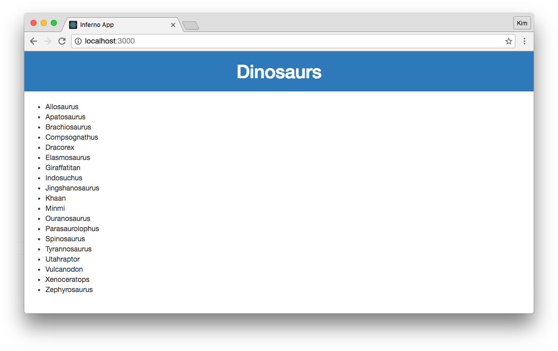
Our app now looks like this:
Create a Loading Component
In our App.js file, we're simply showing <p>Loading...</p> when there isn't any dinosaur data. However, this should be an error instead if the API isn't available. You may have noticed that we put error in the state but didn't use it in render() yet. Let's create a small component that conditionally shows a loading image or an error message.
Create a new folder: src/components. All components from now on will go into this folder. Next create a subfolder called Loading to contain our new component's files.
Let's add a loading image. You can grab the raptor-running.gif from GitHub here. Download the image into the src/components/Loading directory.
Create an empty file for the loading CSS: Loading.css.
Loading Component JS
Next, add a new JS file called Loading.js:
// src/components/Loading/Loading.js

import Inferno from 'inferno';
import Component from 'inferno-component';
import loading from './raptor-loading.gif';
import './Loading.css';

class Loading extends Component {
  render(props) {
    return(
      <div className="Loading">
        {
          !props.error ? (
            <img className="Loading-img" src={loading} alt="Loading..." />
          ) : (
            <p className="alert alert-danger"><strong>Error:</strong> Could not retrieve data.</p>
          )
        }
      </div>
    );
  }
}

export default Loading;
Let's import the loading image and CSS. Whenever we use our Loading component, we're going to pass the parent component's error state as a property. We can then pass props to our render() function to access properties without needing this. We'll render the loading image if there's no error, and show an alert if there is.
Loading Component CSS
Add the following CSS to Loading.css:
/* src/components/Loading/Loading.css */

.Loading-img {
  display: block;
  margin: 10px auto;
}
Let's verify that our src file structure looks like this:
public
server
src
  |-components
    |-Loading
      |-Loading.css
      |-Loading.js
      |-running-raptor.gif
  |-utils
    |-ApiService.js
  |-App.css
  |-App.js
  |-App.test.js
  |-index.css
  |-index.js
Add Loading Component to App
Now we can use this component in our App.js and replace the <p>Loading...</p> element we added earlier:
// src/App.js

...
import Loading from './components/Loading/Loading';

...
  render(props, state) {
    ...
            {
              state.dinos ? (
                ...
              ) : (
                <Loading error={state.error} />
              )
            }
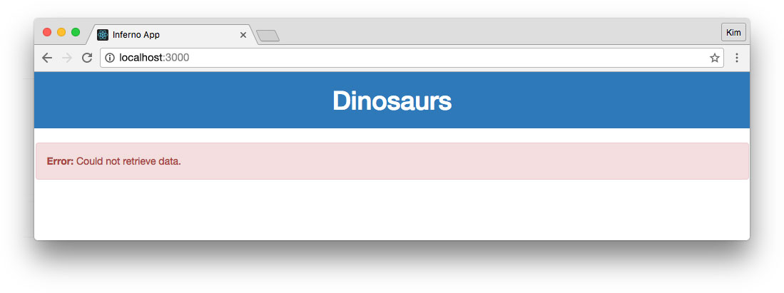
Now while data is being fetched from the API, the running dinosaur gif is shown. If we stop the API server and reload the app, we'll see our error message instead of an infinite loading state:
Create a List Component
Let's explore creating a component that displays the list of dinosaurs and lets users select one to show additional details. This will replace the simple unordered list that we put in the App.js file.
Create a new folder containing CSS and JS files for the DinoList component:
src
  |-components
    |-DinoList
      |-DinoList.css
      |-DinoList.js
List Component JS
Add the following code to DinoList.js:
// src/components/DinoList/DinoList.js

import Inferno, { linkEvent } from 'inferno';
import Component from 'inferno-component';
import ApiService from './../../utils/ApiService';
import Loading from './../Loading/Loading';
import './DinoList.css';

/*
  This function is pulled out of the class to
  demonstrate how we could easily use third-party APIs
*/
function getDinoById(obj) {
  const id = obj.id;
  const instance = obj.instance;

  // Set loading state to true while data is being fetched
  // Set active state to index of clicked item
  instance.setState({
    loading: true,
    active: id
  });

  // GET dino by ID
  // On resolve, set detail state and turn off loading
  ApiService.getDino(id)
    .then(
      res => {
        instance.setState({
          detail: res,
          loading: false,
          error: false
        });
      },
      error => {
        instance.setState({
          error: error,
          loading: false
        });
      }
    );
}

class DinoList extends Component {
  constructor() {
    super();

    // Set default loading state to false
    this.state = {
      loading: false
    };
  }

  render(props, state) {
    return(
      <div className="DinoList">
        <div className="col-sm-3">
          <ul className="DinoList-list">
            {
              props.dinos.map((dino) => (
                <li key={dino.id}>
                  <a
                    className={state.active === dino.id ? 'active' : ''}
                    onClick={linkEvent({id: dino.id, instance: this}, getDinoById)}>
                    {dino.name}
                  </a>
                </li>
              ))
            }
          </ul>
        </div>
        <div className="col-sm-9">
          {
            !state.loading && !state.error && state.detail ? (
              <p>{state.detail.name}</p>
            ) : (
              <Loading error={state.error} />
            )
          }
        </div>
      </div>
    );
  }
}

export default DinoList;
We'll import linkEvent from inferno. linkEvent() is an excellent helper function unique to Inferno. It allows attachment of data to events without needing bind(this), arrow functions, or closures.
The render() function will use the props and state parameters. We'll pass the dinosaurs array to our DinoList component from App.js as a property.
The getDinoById(obj) function at the top of the file is the event handler for when a user clicks a dinosaur's name to get dino details. This is not a method on the DinoList class. The function is pulled out to demonstrate how components can easily leverage methods from third-party APIs with linkEvent. The obj parameter comes from the linkEvent() in render() like so:
<a
  className={state.active === dino.id ? 'active' : ''}
  onClick={linkEvent({id: dino.id, instance: this}, getDinoById)}>
  {dino.name}
</a>
linkEvent can pass data (as well as the event) to a handler. We're using it here to pass the clicked dinosaur's id to call the API and apply a class to the active dinosaur in the list. We're also passing the instance (this) so we can use instance.setState() in our getDinoById() function without context errors or binding.
List Component CSS
Next, add the following to the DinoList.css file to style the list of dinosaurs:
/* src/components/DinoList/DinoList.css */

.DinoList a {
  cursor: pointer;
}
.DinoList a.active {
  font-weight: bold;
  text-decoration: underline;
}
Add List Component to App
In the App.js file, let's replace our unordered list with the new DinoList component:
// src/App.js

...
import Loading from './components/DinoList/DinoList';

...
  render(props, state) {
    ...
            {
              state.dinos ? (
                <DinoList dinos={state.dinos} />
              ) : (
                ...
              )
            }
At this point, when a dinosaur in this list is clicked, the only "detail" we're showing is the dinosaur's name. Also, because we don't make an API call automatically on load, the UI will show the loading image in the details area until the user clicks on a dinosaur in the list. Clearly this isn't ideal. We'll create a DinoDetail component next to display this in a much nicer way.
Create a Detail Component
Let's make a new folder for our DinoDetail component: src/components/DinoDetail. We'll only use Bootstrap to style this component, so a CSS file won't be necessary.
Detail Component JS
Let's build the DinoDetail.js:
// src/components/DinoDetail/DinoDetail.js

import Inferno from 'inferno';
import Component from 'inferno-component';

class DinoDetail extends Component {
  render(props) {
    let dino = props.dino;

    return(
      <div className="DinoList">
        {
          dino ? (
            <div className="list-group">
              <div className="list-group-item list-group-item-info">
                <h3 className="list-group-item-heading text-center">{dino.name}</h3>
              </div>
              <div className="list-group-item">
                <h4 className="list-group-item-heading">Pronunciation</h4>
                <p className="list-group-item-text">{dino.pronunciation}</p>
              </div>
              <div className="list-group-item">
                <h4 className="list-group-item-heading">Meaning of Name</h4>
                <p className="list-group-item-text">"{dino.meaningOfName}"</p>
              </div>
              <div className="list-group-item">
                <h4 className="list-group-item-heading">Period</h4>
                <p className="list-group-item-text">
                  {dino.period} ({dino.mya} million years ago)
                </p>
              </div>
              <div className="list-group-item">
                <h4 className="list-group-item-heading">Diet</h4>
                <p className="list-group-item-text">{dino.diet}</p>
              </div>
              <div className="list-group-item">
                <h4 className="list-group-item-heading">Length</h4>
                <p className="list-group-item-text">{dino.length}</p>
              </div>
              <div className="list-group-item">
                <p
                  className="list-group-item-text lead"
                  dangerouslySetInnerHTML={{__html: dino.info}}></p>
              </div>
            </div>
          ) : (
            <p className="lead">
              <em>Select a dinosaur to see details.</em>
            </p>
          )
        }
      </div>
    );
  }
}

export default DinoDetail;
Despite the large amount of JSX, this is a very simple component. All it does is take a dino property and display data. If there is no dino available, it shows a message that instructs the user to select a dinosaur.
Note: The API returns HTML in some dinosaurs'
infoproperties. We render this usingdangerouslySetInnerHTML. You can read more about this in the DOM Elements section of the React docs.
Add Detail Component to List Component
Now we'll replace the detail dinosaur name in the DinoList component with our new DinoDetail component:
// src/components/DinoList/DinoList.js

...
import DinoDetail from './../DinoDetail/DinoDetail';

...
  render(props, state) {
          ...
          {
            !state.loading && !state.error ? (
              <DinoDetail dino={state.detail} />
            ) : (
              ...
            )
          }
Note that we've also changed the expression to !state.loading && !state.error. We no longer want to check for state.detail here because we still want to display the DinoDetail component even if there is no detail information available yet. We only added this in the previous step to avoid errors.
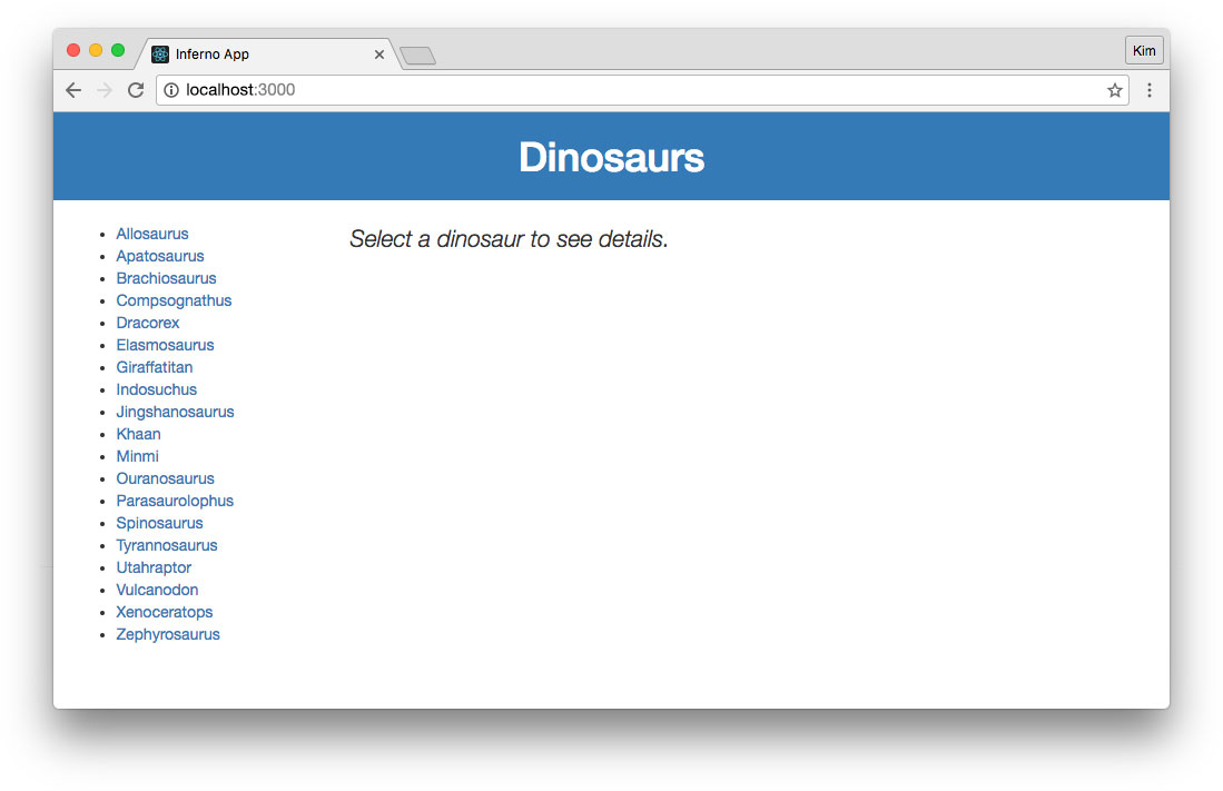
When no dinosaur is selected, our app now looks like this:
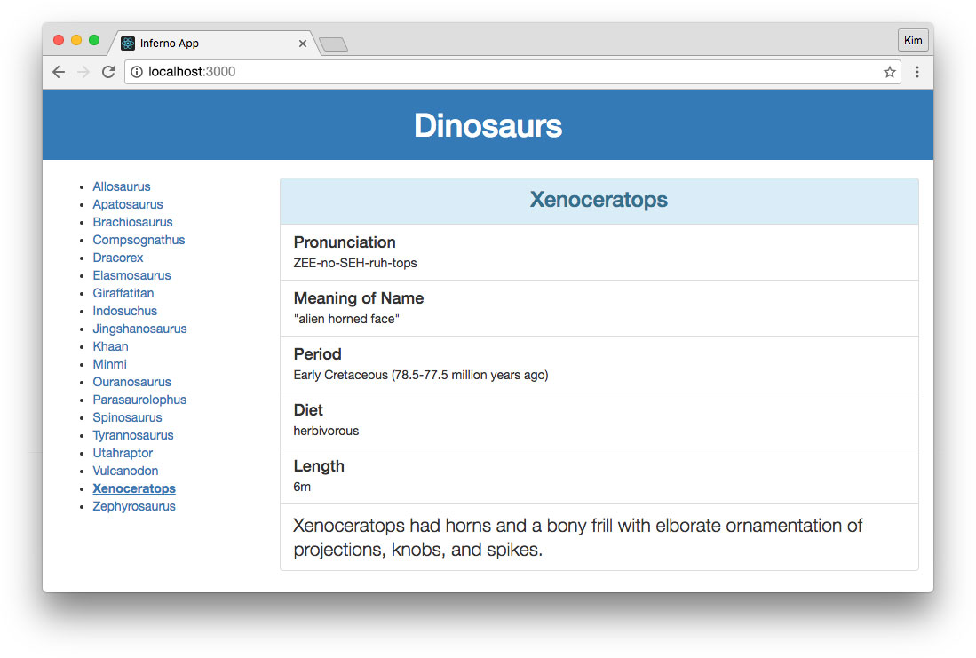
When a dinosaur is clicked, its details are fetched from the API and displayed. The selected dinosaur receives an .active class in the list, which we styled as bold and underlined in the DinoList CSS previously:
Authenticate an Inferno App with Auth0
The last thing we'll do is add Auth0 authentication to our Inferno app. At the moment, our sample dinosaur API doesn't have any secured endpoints—but if we need them in the future, Auth0's JSON Web Token authentication can help.
Configure Your Auth0 Client
The first thing you'll need is an Auth0 account. Follow these simple steps to get started:
Set Up a Client App
- Go to your Auth0 Dashboard and click the "create a new client" button.
- Name your new app and select "Single Page Web Applications".
- In the Settings for your new Auth0 client app, add
http://localhost:3000to the Allowed Callback URLs andhttp://localhost:3000to the Allowed Origins (CORS). - Scroll down to the bottom of the Settings section and click "Show Advanced Settings". Choose the OAuth tab and change the JsonWebToken Signature Algorithm to
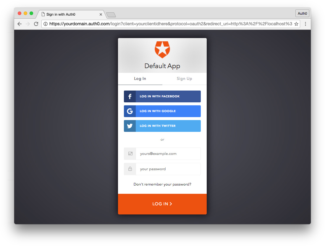
RS256. - If you'd like, you can set up some social connections. You can then enable them for your app in the Client options under the Connections tab. The example shown in the screenshot above utilizes username/password database, Facebook, Google, and Twitter.
Set Up an API
- Under your account name in the upper right corner of your Auth0 Dashboard, choose Account Settings from the dropdown, then select the Advanced tab. Scroll down to the Settings section and turn on the toggle for Enable APIs Section. Now you will have a link to manage APIs in your dashboard left sidebar navigation.
- Go to APIs in your dashboard and click on the "Create API" button. Enter a name for the API. Set the Identifier to your API endpoint URL. In this example, this is
http://localhost:3001/api/. The Signing Algorithm should beRS256.
Important API Security Note: The sample API that we cloned into this project does not have any authorized routes. However, you can easily set up protection for your Node API by consulting the Node.js example under the Quick Start tab in your new API's settings. You would then use the
fetchAPI in your Inferno app to add anAuthorizationheader withBearer [YOUR_ACCESS_TOKEN]to the protected HTTP requests.
Add Authentication Logic to Inferno App
Use npm to install auth0-js:
$ npm install auth0-js --save
Now that auth0-js is installed, we can use it in our App.js file to implement authentication logic. We'll also need to create two new components, Login and User. These components are referenced in App.js below.
// src/App.js

...
import auth0 from 'auth0-js';
import Login from './components/Login/Login';
import User from './components/User/User';

function logOut(instance) {
  // Remove token and profile from state
  // (using instance passed in by linkEvent to preserve "this" context)
  instance.setState({
    idToken: null,
    profile: null
  });

  // Remove tokens and profile from localStorage
  localStorage.removeItem('id_token');
  localStorage.removeItem('access_token');
  localStorage.removeItem('profile');
}

class App extends Component {
  constructor() {
    super();

    // Initial authentication state:
    // check for existing token and profile
    this.state = {
      idToken: localStorage.getItem('id_token'),
      profile: JSON.parse(localStorage.getItem('profile'))
    };
  }

  componentDidMount() {
    // Create Auth0 WebAuth instance
    this.auth0 = new auth0.WebAuth({
      clientID: '[YOUR_CLIENT_ID]',
      domain: '[YOUR_CLIENT_DOMAIN]'
    });

    // When Auth0 hash parsed, get profile
    this.auth0.parseHash((err, authResult) => {
      if (authResult && authResult.idToken && authResult.accessToken) {
        // Use access token to retrieve user's profile and set session
        // If you wanted to protect API requests, you'd use the access token to do so!
        // For more information, please see: https://auth0.com/docs/api-auth/grant/implicit
        this.auth0.client.userInfo(authResult.accessToken, (err, profile) => {
          window.location.hash = '';

          // Save tokens and profile to state
          this.setState({
            idToken: authResult.idToken,
            profile: profile
          });

          // Save tokens and profile to localStorage
          localStorage.setItem('id_token', this.state.idToken);
          // access_token should be used to protect API requests using an Authorization header
          localStorage.setItem('access_token', this.state.accessToken);
          localStorage.setItem('profile', JSON.stringify(profile));
        });
      }
    });

    // GET list of dinosaurs from API
    ...
  }

  render(props, state) {
    return(
      <div className="App">
        <header className="App-header bg-primary clearfix">
          <div className="App-auth pull-right">
            {
              !state.idToken ? (
                <Login auth0={this.auth0} />
              ) : (
                <div className="App-auth-loggedIn">
                  <User profile={state.profile} />
                  <a
                    className="App-auth-loggedIn-logout"
                    onClick={linkEvent(this, logOut)}>Log Out</a>
                </div>
              )
            }
            </div>
          <h1 className="text-center">Dinosaurs</h1>
        </header>
        <div className="App-content container-fluid">
          ...
        </div>
      </div>
    );
  }
}

export default App;
Import auth0-js as well as the new components we'll create, Login and User. Login will use an auth0.js authorize() method to log in and retrieve tokens and the user's profile, redirecting back to our app when successful. User will display after login and show the authenticated user's name and picture.
In the constructor(), we'll check for an existing token and profile from a previous login and set them if available. In componentDidMount(), we'll create our Auth0 instance. Replace [YOUR_CLIENT_ID] and [YOUR_DOMAIN] with your Auth0 client information. On successful redirection from Auth0's hosted login, we'll do the following:
- Use the access token to fetch user profile with
auth0.client.userInfo(). - Save the ID token and profile to
state. - Save the ID token, access token, and profile to
localStorageto persist the session.
Note: The access token would be needed for making authenticated API requests. We aren't doing so in this app, so we'll save it to local storage for the future, but there's no need to save it to state at this time.
In the render() function, we'll add the Login and User components to the <header> element as well as a logout link. These will show conditionally based on the presence or absence of an access token. We'll pass properties to these components:
<Login auth0={this.auth0} />
and:
<User profile={state.profile} />
The logOut() function (pulled out near the top of the App.js file) clears the user's token and profile from state and removes this data from local storage.
Update App CSS
We'll add a few more styles to our App.css to support our new markup:
/* src/App.css */

...
.App-auth {
  font-size: 12px;
  padding: 20px 10px;
}
.App-auth a {
  color: #fff;
  cursor: pointer;
  display: inline-block;
}
.App-auth a:hover {
  color: #fff;
}
.App-auth-loggedIn-logout {
  border-left: 1px solid rgba(255,255,255,.6);
  margin-left: 4px;
  padding-left: 4px;
}
Create Login Component
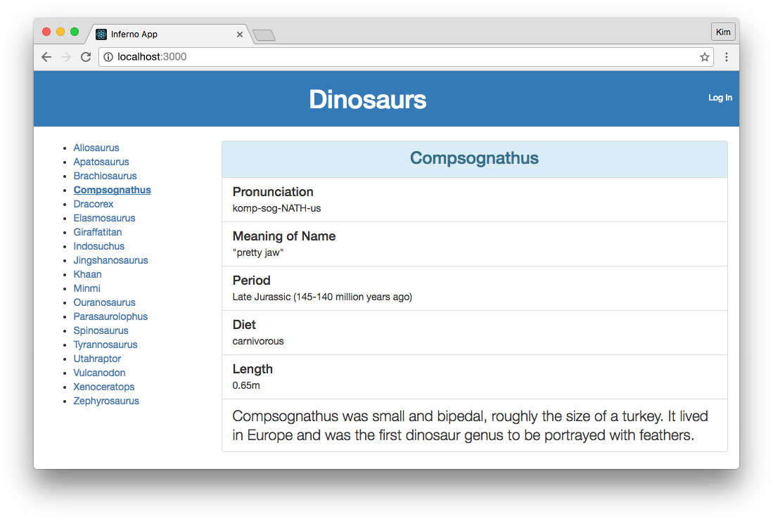
Next we'll create the Login component. When the user is logged out, the app will have a "Log In" link in the header like so:
Add the necessary folder and files for our Login component:
src
  |-components
    |-Login
      |-Login.css
      |-Login.js
Our Login.js should look like this:
// src/components/Login/Login.js

import Inferno, { linkEvent } from 'inferno';
import Component from 'inferno-component';
import './Login.css';

// Use the "auth0" prop passed in App.js to
// call authorize method to show hosted Auth0
// Lock widget so users can log in
function login(instance) {
  instance.props.auth0.authorize({
    responseType: 'token id_token',
    redirectUri: 'http://localhost:3000/',
    audience: 'http://localhost:3001/api/',
    scope: 'openid profile'
  });
}

class Login extends Component {
  render() {
    return(
      <div className="Login">
        <a onClick={linkEvent(this, login)}>Log In</a>
      </div>
    );
  }
}

export default Login;
We passed our App.js's Auth0 instance to Login so we could access its authorize() method. The Login component has a link that calls this method with the necessary options when clicked.
We'll add just a little bit of CSS to support this component:
/* src/components/Login/Login.css */

.Login {
  padding: 10px 0;
}
Create User Component
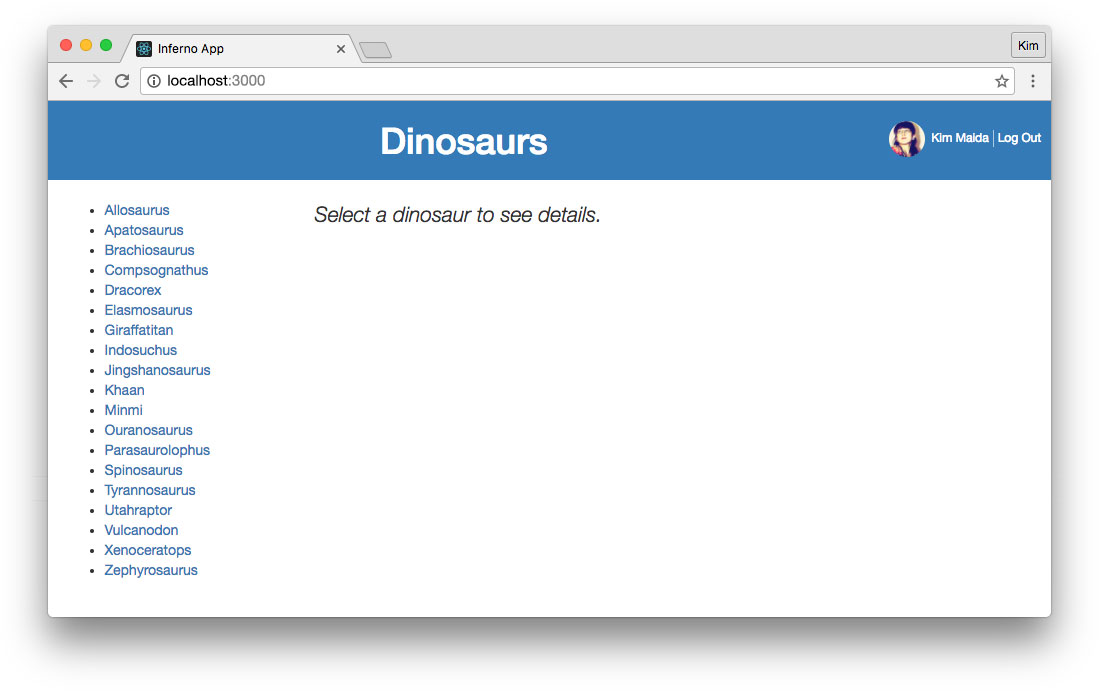
Finally, we'll build the User component. This will show the user's profile picture and name when authenticated:
Add the necessary folder and files for our User component:
src
  |-components
    |-User
      |-User.css
      |-User.js
The User.js file should look like this:
// src/components/User/User.js

import Inferno from 'inferno';
import Component from 'inferno-component';
import './User.css';

class User extends Component {
  render(props) {
    let profile = props.profile;
    let idp = profile.sub.split('|')[0];

    return(
      <div className="User" title={idp}>
        <img src={profile.picture} alt={profile.name} />
        <span>{profile.name}</span>
      </div>
    );
  }
}

export default User;
We'll display the user's picture and name. As a bonus, we can add a title attribute that shows the identity provider that the user signed in with (ie.: twitter, facebook, etc.).
Add a few styles to User.css for alignment and a circular profile image:
/* src/components/User/User.css */

.User {
  display: inline-block;
}
.User img {
  border-radius: 100px;
  display: inline-block;
  height: 36px;
  margin-right: 6px;
  width: 36px;
}
We now have working authentication in our Inferno app. In the future, we can use identity management to secure routes, make authenticated API calls, conditionally render UI, control user access, and more. Check out these additional resources to learn about packages and tutorials that will be helpful for authentication with Inferno / React-like apps:
- Inferno Redux
- Inferno Router
- Why You Should Use Access Tokens to Secure an API
- Call APIs with Implicit Grant
Conclusion
We've learned how to create a basic real-world application with Inferno. We've also explored some of the features Inferno has that its predecessors lack, such as linkEvent. We've demonstrated how simple it can be to utilize Inferno with external methods. Inferno author Dominic Gannaway's favorite feature is lifecycle hooks for functional components, something we didn't explore in this tutorial but should certainly be utilized by developers who prefer a functional component approach.
To learn more about the Inferno JS library, you can peruse the docs at infernojs.org or get in touch with the community and development team by checking out the Inferno GitHub and Inferno Slack.
If you're a JavaScript developer trying to improve performance and reduce filesize in your web apps, check out Inferno. Even if you don't have React experience, Inferno is easy to learn thanks to the abundance of React resources and tutorials available. Hopefully you're now ready to get started with Inferno in your projects!
About the author

Kim Maida
Group Manager, Developer Content

