
Storybook is a development environment for UI components. It let us browse a component library, view the different states of its components, and interactively develop and test them. Storybook runs outside of our application; therefore, we can develop UI components in isolation without worrying about any project dependencies and requirements.
We've shared about our experience using React and Storybook to better manage components. In this post, we are going to explore how to organize a basic project, how to implement a style guide to help us achieve consistent branding, and how to build the foundation of a component library to make our components reusable and easy to maintain.
React is such a good idea that we will spend the rest of the decade continuing to explore its implications and applications.
— Guillermo Rauch (@rauchg) November 22, 2016
Let's start.
Setting Up a React Project
We are going to use create-react-app to scaffold easily a new React application.
We can run create-react-app using npx which comes bundled with npm 5.2+ and higher:
npx create-react-app marvel-bank
cd marvel-bank
If you use npm 5.1 or earlier, you can't use npx. Instead, install create-react-app globally:
npm install -g create-react-app
And then run:
create-react-app marvel-bank
cd marvel-bank
Notice that we are not running
npm start. As mentioned earlier, we don't need to have a running React application to use Storybook.
Open the newly created marvel-app folder on your preferred code editor or IDE.
Within marvel-bank, the src folder contains the core business logic of our React application. Let's do some housekeeping and remove files and code that we don't need.
Open src/App.js and trim it like so:
// src/App.js

import React, { Component } from "react";
import "./App.css";

class App extends Component {
  render() {
    return <div className="App" />;
  }
}

export default App;
Next, let's delete the following files:
App.test.jslogo.svg
Spoiler: Storybook is an essential part of our testing stack as it makes testing a painless experience.
Using a Style Guide for Consistent Branding
Using a style guide can lead to better application design and development. As explained by the Marvel Design team, "during the design phase style guides encourage consistency in the visual identity and help keep the interface system as logical as possible, which makes for a better UX."
What is a style guide anyway? Marvel has a solid answer: "A style guide clearly demonstrates how all interface elements and components are to be visually represented. It’s essentially a master reference for the user interface (UI)."
In this sense, a component library is part of a style guide as it presents our components visually and it is the single source of truth for each component (the master reference). To create a comprehensive style guide, the component library can be accompanied by design documents that define font styles and sizes as well as primary and secondary user interface colors. A Design Team usually creates a "UI Kit" that is handed to developers for implementation. Shopify explains that a UI kit is an assortment of graphic files that include UI components (buttons, checkboxes, progress bars, etc.) for the purpose of defining and designing the user interface.
“A component library helps you achieve consistent branding as it becomes the single source of truth for every component not only in the application but for all projects in the organization”
Tweet This
For the online banking app that we are going to start creating in this blog post, we are going to use a free Banking UI Kit that Marvel created for Sketch. To honor their effort, we named the app marvel-bank. The UI Kit looks as follows:
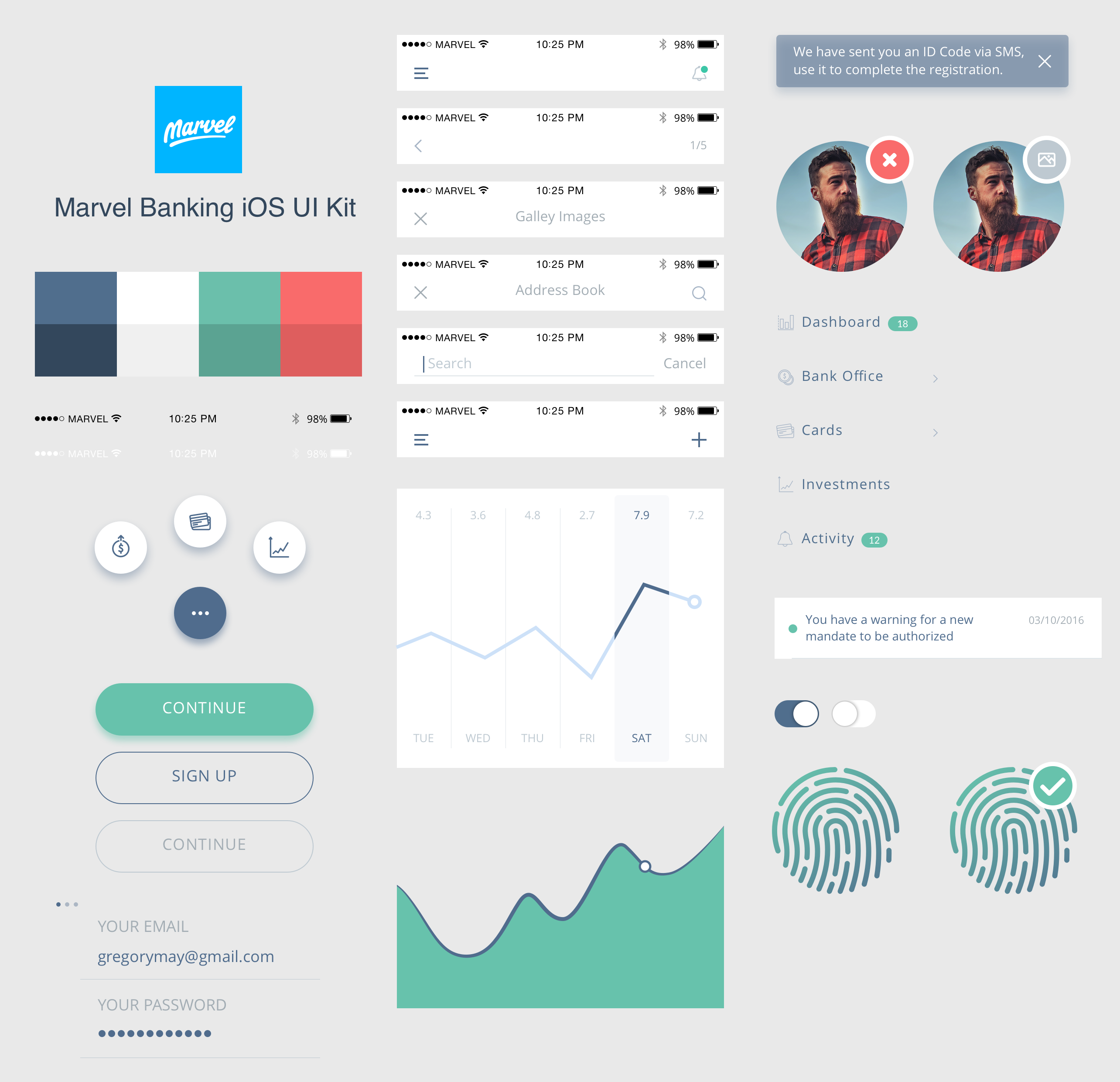
The UI Kit is designed for iOS, but we are going to adapt it for usage in a responsive web application. To make it easier for developers to understand the UI Kit, I created a design document where we can get the font names, the sizing, the color hex codes, etc: Marvel Bank Style Guide.
In the following excerpt, notice how is much easier to understand the guidelines that a developer would need to follow when creating the components presented in the UI Kit:
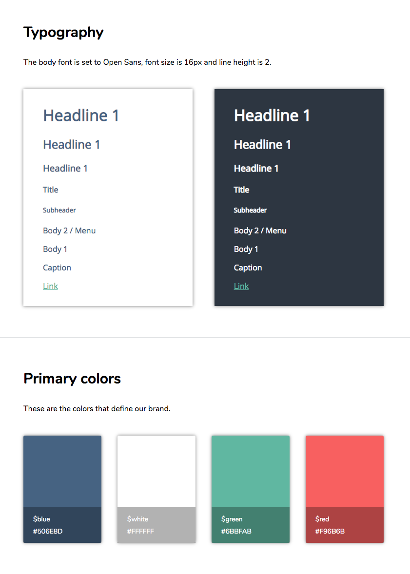
If we need to implement a green button, we can consult the design document and copy the hex code of $green; however, it would be much easier if we could code the elements of the design document into our application in a modular way and reusable way. We have plenty of options to do that:
- We could use CSS variables, also known as custom properties.
- We could use SCSS, LESS, or Stylus to create style partials and variables.
- We could also opt for using CSS-in-JS through a library like
styled-components.
Our Team currently has been using a combination of Stylus and CSS Modules to manage the styling of the projects. React has unified the three layers of front-end development (HTML, CSS, and JavaScript) under one layer powered by JavaScript, JSX, and CSS-in-JS. For this post, however, we are going to rely on SCSS to create the modular components to minimize the development overhead.
Feedback: Would you like to learn how we are using
styled-componentsto create a modern component library? Let us know in the comments below and we could create a blog post about it.
Oh man and a @storybookjs shoutout as well! Storybook has been indispensable for our component library.
— Maja Wichrowska (@majapw) May 17, 2018
Adding SCSS to create-react-app
We can add SCSS support to create-react-app without having to eject to a custom setup. We need to install a few packages to help us achieve that goal:
NPM:
npm install --save node-sass-chokidar npm-run-all
node-sass-chokidar is a thin wrapper around the node-sass executable to use chokidar instead of Gaze when watching files.
npm-run-all is a CLI tool to run multiple npm-scripts in parallel or sequentially.
Next, we need to modify our package.json "scripts" property to watch and process .scss files into .css ones:
{
  "name": "marvel-bank",
  "version": "0.1.0",
  "private": true,
  "dependencies": {
    "node-sass-chokidar": "^1.3.3",
    "npm-run-all": "^4.1.3",
    "react": "^16.4.1",
    "react-dom": "^16.4.1",
    "react-scripts": "1.1.4"
  },
  "scripts": {
    "build-css": "node-sass-chokidar src/ -o src/",
    "watch-css":
      "npm run build-css && node-sass-chokidar src/ -o src/ --watch --recursive",
    "start-react": "react-scripts start",
    "start": "npm-run-all -p watch-css start-react",
    "build-react": "react-scripts build",
    "build": "npm-run-all -s build-css build-react",
    "test": "react-scripts test --env=jsdom",
    "eject": "react-scripts eject"
  }
}
These scripts allow us to compile .scss files into .css and to keep watching the src folder for changes to the content of existing .scss files or the addition of new ones. To complete this task, we need to change the file extension of App.css and index.css to .scss. Depending on our development environment, this can be done in different ways such as renaming the files or refactoring their name or file type.
Storybook will only understand changes made or applied in .css files. If we were to make a change in a .scss file, we would need to compile it into .css for Storybook to be notified of the styling changes.
Normally, such compilation is a build step in our development workflow triggered by running npm start. However, I made the promise that we wouldn't have to run our React app in order to use Storybook in this blog post. I am keeping that promise and npm start is off-limits. What can we use instead? watch-css.
As stated earlier, watch-css compiles our SCSS into CSS files using the build-css script and it keeps monitoring all the SCSS files present under the src directory to detect any changes. Anytime an SCSS file is changed, that file is compiled and Storybook is able to see and apply the styling changes into the component preview (as we'll see soon!).
With this in mind, on the shell run the following command:
npm run watch-css
This is a good point to make our first git commit.
Using git Version Control
Our project is in a good place for its first git commit. But before we do so, let's ensure that we have everything we need to ignore specified in the .gitignore file. If you are using an IDE like WebStorm, for example, there are extra files that the IDE creates that is better to keep out of the git repo.
I personally like to use gitignore.io to generate the content of my .gitignore file automatically. The categories that I choose to create the file are WebStorm, IntelliJ, OSX, Windows, and Visual Studio Code, since they are the tools and platforms that are most commonly used. You may head to that site, enter those categories, and copy/paste the output at the end of the .gitignore file present in our project.
Since our .css files are built automatically under our project configuration, we do not need to include them in version control. In the .gitignore file add the following rule at the end:
// .gitignore

// ...

src/**/*.css
This rule ensures that none of the .css files under the src folder are tracked by git.
With a comprehensive .gitignore file in place, let's initialize a git repository (make sure that marvel-app directory is the current working directory):
git init
Let's run a quick git status check to see what files are being untracked:
git status
Let's go ahead and add these files shown to git in order to include them in our commit:
git add .
We used a shortcut here to add all the files that were being untracked using the . after the add command.
If you want a
gitrefresher, I highly recommend this amazing Git & Version Control tutorial by the folks at Git Tower.
Running git status again would show us the new files that have been added that include changes to be committed. Let's create our first commit then:
git commit -m "Initial commit"
We'll get a reply by git showing all the files that were changed and the insertions that were made. Having a well-thought commit history in place will let us go back in time if we ever need to use an older version of our code. CTRL/CMD + Z can only go so far back!
This all looks good to me (LGTM™), but before we include any styling or components in our project, we need to create a sound file structure.
Project Structure
An internal pattern that we use is to have specialized folders to hold the different elements of our React application. In one of our projects, we have the following structure:
- src
    |-- api/
    |-- features/
    |-- assets/
    |-- redux/
    |-- styles/
    |-- utils/
    |-- App.js
    |-- index.js
    |-- routes.js
For the initial phase of this project, we only need the features and the styles folder. The features folder holds our components in a categorized manner. We define features of our applications, such as search or reports in its subfolders, and create components that power and build that feature. What Storybook will help us solve is the event where features share components. Instead of duplicating the code across features, the feature will implement the component from a central source: our component library. As the name suggests, these common components go into a common feature folder.
This is the project structure we want for the src folder in this phase of the project:
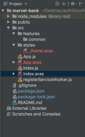
- src
    |-- features/
    |---- common/
    |-- styles/
    |---- _theme.scss
    |-- App.js
    |-- App.scss
    |-- index.js
    |-- index.scss
    |-- registerServiceWorker.js
“Instead of duplicating the component code across features in your project, implement the component from a central source, like a component library.”
Tweet This
Let's go ahead and create these folders and files:
We'll be using _theme.scss in a moment. This is a good checkpoint. Let's go ahead and commit:
git status
git add .
git commit -m "Create project structure that integrates with SCSS"
Noticed something different this time? Since the
featuresfolder and itscommonsubfolder are currently empty, they were not included as part of the commit bundle by git. We could place anindex.jsfile insidecommonthat exports all of the components within that folder using what is known as a barrel export. For this blog post, we are not going to use that just yet.
Creating the Application Theme
_theme.scss is an SCSS partial that will be imported by any other component stylesheet that needs to apply the defined theme based on the Marvel Banking Style Guide. You can copy and paste the following definitions to your local _theme.scss file:
// src/styles/_theme.scss

// Fonts
$primary-font: "Lato", sans-serif;
$secondary-font: "Open Sans", sans-serif;

// Font Colors
$color-text: #4f6c8d;
$color-text-light: #a3adb4;
$color-text-lighter: #ccd6e1;

$color-text-contrast: #ffffff;
$color-text-contrast-light: #a7b5c6;
$color-text-contrast-lighter: #5f5f63;

// Background Colors
$gray: #bec9d1;

// Primary Colors
$blue: #506e8d;
$white: #ffffff;
$green: #6bbfab;
$red: #f96b6b;

// Dark Primary Colors
$dark-blue: #33475c;
$dark-white: #f0f0f0;
$dark-green: #5ba392;
$dark-red: #de5e5e;

// Auxiliary Colors
$bright-blue: #5db8eb;
$opaque-blue: #4770d6;
$opaque-yellow: #f3c416;
$opaque-red: #dd765f;
Since this is a significant checkpoint, let's commit again:
git status
git add .
git commit -m "Create app theme variables"
It's time to start creating components!
Creating A Reusable Button Using React
To see the benefits and value that Storybook provides us, we need to have components to visualize. Right now, we have none.
Recall that the Marvel UI Kit offers us the definition of a button that has three presentations:
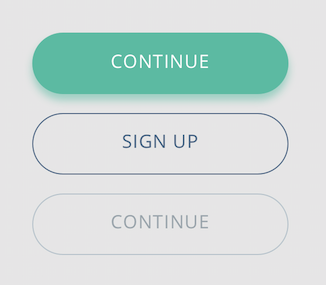
These presentations can be summarized as follows:
- Active State (Fill): The button is green, pops up, and has white text.
- Active State (No-Fill): The button shares the background of the parent container, and it has a blue color for its text and border.
- Disabled State: The button looks suppressed and has a light blue color for its text and border.
The button itself has two status: active or disabled. The relationship between presentation and state is something that we can express easily with Storybook. First, we need to plan the component. How are we going to approach its engineering?
Let's start with creating the basic structure of the component: a rounded rectangle that contains a label. Create a file named Button.js under the common folder and populate it with this:
// src/features/common/Button.js

import React from "react";

const Button = props => <div>{props.label}</div>;

export default Button;
Let's quickly commit the creation of the Button component:
git status
git add .
git commit -m "Create Button component"
Now that we have a component, we go back to one of the questions that we have been asking ourselves in our team when creating components:
- How should a prototype of the component be presented? Should a blank page with mock data be used?
Traditionally, we would compose the component into a visible element of the UI to preview it. This time, we are going to use Storybook.
Next Steps
We have built a foundation to help us create our online banking web app with consistent branding by implementing a style guide. At Auth0, different teams are making extensive use of Storybook as a development and design tool. We are converging designers and developers into a Design Systems team that is letting us iterate faster and develop better products for our cherished customers.
Feel free to grab the source code of the project we have created so far from the Marvel Bank App GitHub repo. The repo is being built gradually and contains commits that cover the work we have done in this blog post and on future posts. To start from scratch, be sure to create a branch from the first commit: Initial commit.
For more content like this, follow @auth0 on Twitter or subscribe to our newsletter.
About Auth0
Auth0 by Okta takes a modern approach to customer identity and enables organizations to provide secure access to any application, for any user. Auth0 is a highly customizable platform that is as simple as development teams want, and as flexible as they need. Safeguarding billions of login transactions each month, Auth0 delivers convenience, privacy, and security so customers can focus on innovation. For more information, visit https://auth0.com.
About the author

Dan Arias
Software Engineer (Auth0 Alumni)