So, you've built an outstanding application. Your landing page is meticulously designed, compelling, and has a high conversion rate. You've carefully crafted every detail of the user experience, but what about the entry points to your app – the signup and login pages?
Often overlooked in the design process, these critical touchpoints serve as the users’ gateways into your application. They should be as compelling, user-friendly, and beautiful as the rest of your application. Just as the landing page captures the user's attention, the login and signup pages are where you can truly start to engage users, encouraging them to join your application.
In this article, we'll explore how Auth0 makes it easy to build login and signup experiences that not only align seamlessly with your branding but also provide a superior user experience. A poorly designed login page can lead to user frustration and higher abandonment rates, whereas a well-designed one establishes trust and encourages engagement. Because every aspect of your application, even the seemingly mundane, should be nothing short of beautiful.
Let's dive into how Auth0 can elevate your login experience, covering the importance of UI and UX, and offering practical tips to create extraordinary login flows.
The Importance of the Login Page Design
The login page is often the first impression a user has of your application. It sets the tone for the entire user experience and can make or break a user's decision to continue using your app.
The design of a login page encompasses both UI and UX. It should not only be pretty but also easy to use while conveying a sense of security and trustworthiness to the user.
If you need inspiration or to learn some tips on what makes good login pages extraordinary, check out these ten tips.
Getting Started
Auth0 offers a variety of customization options to match your application's branding and design. With Auth0, you can rest assured that your login and signup pages will be not only beautiful and match your brand but also secure and reliable.
In many scenarios, those out-of-the-box settings are all you need to make your login and signup pages match your brand and style. But in case you want a completely customized page, Auth0 offers the possibility to create your own styles and designs using HTML, CSS, and JavaScript templates.
Custom templates require enabling custom domains, which is a paid feature.
In this article, we’ll focus on creating our own template to have full control over the login experience. However, if you would like to know how to set up your branding settings instead, you can refer to this article on Customize Auth0 Universal Login with Auth0 CLI.
You can work with templates either through the Auth0 Dashboard with an integrated code editor and preview mode, or you can use the Auth0 CLI with your editor of choice and Storybook to preview your designs.
Throughout the article, we'll use the Auth0 CLI to customize the templates as it provides a rich developer experience.
Setting up the Auth0 CLI
The Auth0 CLI is a powerful tool that allows you to manage your entire Auth0 tenant from the command line. The Auth0 CLI helps you simplify your workflows and set up automation on your Auth0 account.
Install the Auth0 CLI
The Auth0 CLI is available for macOS, Linux, and Windows. To install it on your preferred OS, please follow these installation instructions.
After your installation completes, you can verify the installation by running the following command:
auth0 -v
Connect the CLI to your Auth0 Account
To connect the CLI to your Auth0 account, you'll need to log in. Run the following command in your terminal and follow the instructions to authenticate:
auth0 login
First, the CLI will prompt for one of two authentication methods, As a user or As a machine. For now, we’ll select As a user since it is the recommended option for a personal computer. However, for automation scenarios, it is recommended to select the latter.
Next, we need to authenticate in the browser using device authorization flow. The Auth0 CLI will show a code on the screen and will open a browser session, where the code should match, and after verification, you’ll have to authorize the CLI on all the requested scopes.
Activate a Custom Domain
As mentioned before, a requirement for editing custom templates is to activate custom domains, which is a good practice for production. Since custom domains come in different configurations and multiple steps, I won’t be covering them in this article. Instead, I can refer you to the custom domains documentation, where you can find all the information you’ll need with step-by-step instructions.
Once you have a custom domain set up on your account, you can continue with the rest of the article.
Customizing the Universal Login UI
To start customizing the Universal Login UI, run the following command on your terminal:
auth0 universal-login customize
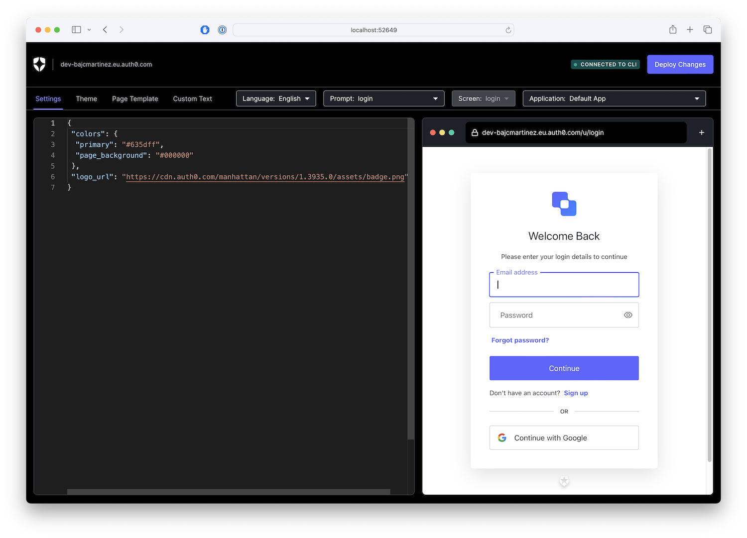
This will open the Auth0 customization editor on your browser which will allow you to change any visual settings in Universal Login, from colors, logo, texts, and you can design your own templates with live preview in this app.
Any changes that you make locally can then be deployed to your Auth0 tenant from the same UI.
Exploring the UI
The UI customization tool is divided into three sections:
- Navigation bar: It allows you to work on different areas of customization, from settings, theme, page template and custom texts. It also allows you to navigate through the different prompts like login, signup, etc.
- Editor: On the left side, it's the editor. It will display information about the current state of your page in either JSON for settings or HTML code for the page template editor.
- Preview window: The preview window gives you a live preview of your changes and how your UL page will look like when deployed to your tenant.
Building a Beautiful Template
If you jump into the Page Template section, the editor will load the current template available for your tenant. If you have never customized your template, it will display the default template which looks like this:
<!DOCTYPE html>
<html>
  <head>
    {%- auth0:head -%}
  </head>
  <body>
    {%- auth0:widget -%}
  </body>
</html>
There's some custom code in that template, let's explore what each of those sections do:
{%- auth0:head -%}: This will set all the head elements that are required for universal login to work, like importing scripts, basic styles, etc.{%- auth0:widget -%}: This will place the login widget on the screen.
Templates use Liquid syntax, with variables you can use to further customize your experience. You can read about all variables available here.
One of the benefits of using Auth0's rich templating system is the ability to customize logic depending on the current prompt. For example, you could have some parts of the UI shown on the signup screen but not on the login or other prompts. The term prompt is used to refer to a specific step in the login flow. Each prompt can have one or more screens. For example, the reset-password prompt would have multiple screens for resetting password requests, checking your email, entering a new password, and confirming your change. You can find the complete list of prompts and screens on the official template variables documentation.
You can do that by implementing conditionals over the variable prompt.name. Here's an example that renders additional content when the user is signing up.
{% if prompt.name == "signup" %}
Show this only if the user is signing up
{% end %}
As part of templating, you can also set custom brand parameters, such as the brand's primary color, background, and logo, which you can use throughout the template by accessing the branding variable.
For example, if you need a button that aligns with the branding's primary color, you could implement it as follows:
<button style="background-color: {{branding.colors.primary}}" ...>My Button</button>
Now that we know what we can do with the templating system, it's time to build your own.
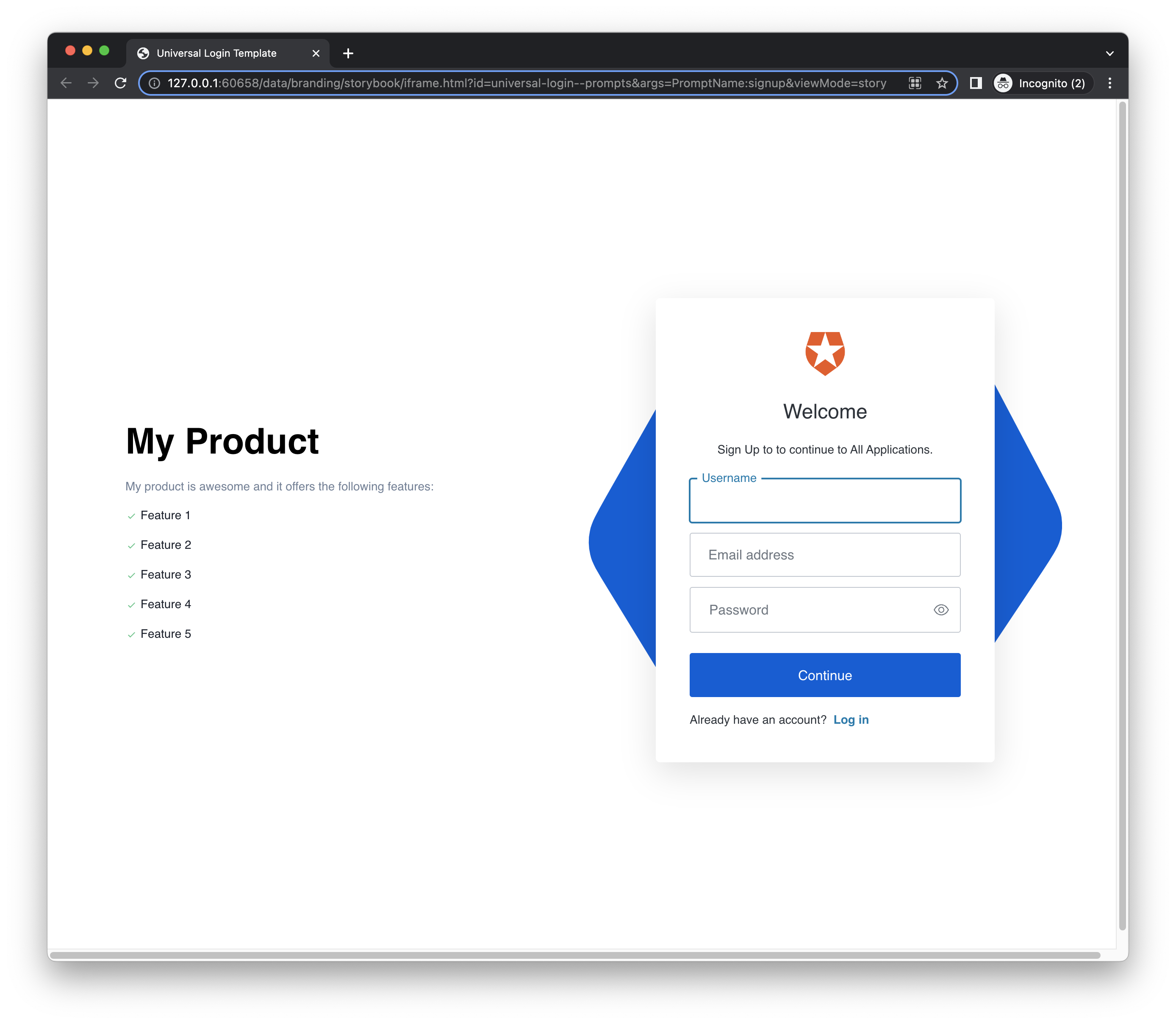
Here's what I'll build. Feel free to copy and paste this template and customize it to your application or use it as a baseline for your own.
- Signup screen:
- Login screen:

What’s interesting about this design is that the signup page looks different from the rest as it provides additional information about the product, so users know what they are signing up for. I also make use of variables to set the branding color on custom elements and I added some responsive elements for tablets and mobile devices.
Here is my template for your reference:
<!DOCTYPE html>
<html>
  <head>
    {%- auth0:head -%}

    <style>
        body {
            background-color: #fff;
        }

        .wrapper {
            max-width: 80rem;
            margin: 0 auto;
        }

        {% if prompt.name == "signup" %}
        .container {
            width: 100%;
            height: 100vh;
            display: grid;
            grid-template-columns: 1fr 1fr;
            align-items: center;
        }

        @media screen and (max-width: 720px) {
            .container {
                display: flex;
                flex-direction: column;
            }
        }

        .container > .info {
            max-width: 28rem;
            padding: 1rem;
        }
        {% else %}
        .container {
            width: 100%;
            height: 100vh;
            display: flex;
            align-items: center;
            justify-content: center;
        }

        .container > .info {
            display: none;
        }
        {% endif %}

        .container > .info h2.title {
            font-size: 3rem;
            line-height: 1.2;
            margin-bottom: 1.5rem;
            font-weight: bold;
        }

        .container > .info p.subtitle {
            color: #718096;
        }

        .container > .info ul {
            list-style-type: none;
            margin: 0;
            padding: 0;
        }

        .container > .info li {
            color: #1A202C;
        }

        .container > .info li svg {
            color: #5CC98D;
            vertical-align: text-bottom;
            margin-top: 1.5rem;
        }

        .container > .login-box {
            position: relative;
            display: flex;
            align-items: center;
            justify-content: center;
            padding: 0 4rem;
        }

        .container > .login-box svg {
            position: absolute;
            width: 100%;
        }
    </style>
  </head>
  <body>
    <div class="wrapper">
        <div class="container">
            <div class="info">
                <h2 class="title">My Product</h2>
                <p class="subtitle">My product is awesome and it offers the following features:</p>
                <ul role="list">
                    <li>
                        <svg stroke="currentColor" fill="currentColor" stroke-width="0" viewBox="0 0 24 24" focusable="false" role="presentation" height="1em" width="1em" xmlns="http://www.w3.org/2000/svg"><path d="m10 15.586-3.293-3.293-1.414 1.414L10 18.414l9.707-9.707-1.414-1.414z"></path></svg>
                        Feature 1
                    </li>
                    <li>
                        <svg stroke="currentColor" fill="currentColor" stroke-width="0" viewBox="0 0 24 24" focusable="false" role="presentation" height="1em" width="1em" xmlns="http://www.w3.org/2000/svg"><path d="m10 15.586-3.293-3.293-1.414 1.414L10 18.414l9.707-9.707-1.414-1.414z"></path></svg>
                        Feature 2
                    </li>
                    <li>
                        <svg stroke="currentColor" fill="currentColor" stroke-width="0" viewBox="0 0 24 24" focusable="false" role="presentation" height="1em" width="1em" xmlns="http://www.w3.org/2000/svg"><path d="m10 15.586-3.293-3.293-1.414 1.414L10 18.414l9.707-9.707-1.414-1.414z"></path></svg>
                        Feature 3
                    </li>
                    <li>
                        <svg stroke="currentColor" fill="currentColor" stroke-width="0" viewBox="0 0 24 24" focusable="false" role="presentation" height="1em" width="1em" xmlns="http://www.w3.org/2000/svg"><path d="m10 15.586-3.293-3.293-1.414 1.414L10 18.414l9.707-9.707-1.414-1.414z"></path></svg>
                        Feature 4
                    </li>
                    <li>
                        <svg stroke="currentColor" fill="currentColor" stroke-width="0" viewBox="0 0 24 24" focusable="false" role="presentation" height="1em" width="1em" xmlns="http://www.w3.org/2000/svg"><path d="m10 15.586-3.293-3.293-1.414 1.414L10 18.414l9.707-9.707-1.414-1.414z"></path></svg>
                        Feature 5
                    </li>
                </ul>
            </div>
            <div class="login-box">
                <svg width="1013" height="890" viewBox="0 0 1013 890" fill="none" xmlns="http://www.w3.org/2000/svg">
                    <path d="M180.462 795.681L40.8315 567.776C19.5801 533.09 8.95466 515.747 4.64446 497.091C0.831363 480.586 0.608543 463.413 3.99145 446.712C7.81567 427.835 17.9843 409.924 38.3214 374.102L184.235 117.101C203.682 82.8483 213.405 65.722 227.028 52.9648C239.084 41.6743 253.303 32.9153 268.81 27.225C286.332 20.7958 306.003 19.8141 345.345 17.8502L644.507 2.91668C685.874 0.851143 706.557 -0.18069 725.22 4.94606C741.731 9.48141 757.023 17.479 770.074 28.4042C784.827 40.7544 795.51 58.1913 816.877 93.066L955.838 319.878C977.009 354.434 987.595 371.712 991.91 390.3C995.728 406.747 995.98 423.86 992.649 440.515C988.883 459.337 978.815 477.215 958.678 512.969L811.011 775.156C791.315 810.127 781.466 827.612 767.593 840.563C755.316 852.023 740.811 860.86 724.997 866.515C707.127 872.905 687.074 873.638 646.968 875.103L350.229 885.943L350.228 885.944C309.449 887.433 289.06 888.178 270.689 882.944C254.434 878.313 239.396 870.318 226.557 859.48C212.045 847.23 201.517 830.047 180.462 795.681Z" fill="{{branding.colors.primary}}"/>
                    <path d="M179.711 769.196L58.7659 539.848C40.3585 504.942 31.155 487.489 28.2839 469.088C25.744 452.808 26.7984 436.065 31.3778 419.97C36.5543 401.778 47.9229 384.859 70.66 351.022L233.792 108.259C255.534 75.9041 266.405 59.7266 280.801 48.0099C293.543 37.6402 308.23 29.8499 323.963 25.1169C341.74 19.7693 361.233 19.8416 400.221 19.9857L696.692 21.0815C737.687 21.2325 758.184 21.3089 776.23 27.2798C792.194 32.562 806.699 41.1538 818.774 52.4806C832.423 65.2849 841.676 82.8321 860.183 117.928L980.548 346.176C998.887 380.95 1008.06 398.337 1010.94 416.674C1013.49 432.897 1012.46 449.584 1007.94 465.636C1002.82 483.778 991.558 500.669 969.023 534.451L803.775 782.175C781.734 815.216 770.713 831.737 756.054 843.629C743.084 854.153 728.106 862.004 712.074 866.687C693.957 871.978 674.104 871.643 634.398 870.973L340.624 866.016L340.623 866.016C300.251 865.335 280.065 864.994 262.316 858.934C246.611 853.572 232.358 844.996 220.486 833.765C207.067 821.072 197.948 803.779 179.711 769.196Z" fill="{{branding.colors.primary}}"/>
                </svg>
                {%- auth0:widget -%}
            </div>
        </div>
    </div>
  </body>
</html>
Explore Your Own Designs
By the end of this article, you can now design and customize signup and login experiences with Auth0 that are as beautiful and user-friendly as the rest of your application. With the power of custom templates, you can integrate your brand's color palette, unique fonts, and more. I'd love to see the unique and effective login experiences you create! Please share screenshots or links in the comments below.
Thanks for reading!
About the author

Juan Cruz Martinez
Staff Developer Advocate