
TL;DR: In this article, you will learn how to use Angular Material to create beautiful and modern Angular applications. You will start from scratch, installing Node.js and Angular CLI (if you don't have them yet), you will install and configure the dependencies needed to develop with Angular Material. You can find the final code developed throughout this article in this GitHub repository.
So, What Exactly is Angular Material?
Angular Material is a User Interface (UI) component library that developers can use in their Angular projects to speed up the development of elegant and consistent user interfaces. Angular Material offers you reusable and beautiful UI components like Cards, Inputs, Data Tables, Datepickers, and much more.
Each component is ready to go with default styling that follows the Material Design Specification. Nonetheless, you can easily customize the look and feel of Angular Material components. The list of available Angular Material components continues to grow with each iteration of the library.
Angular Material Tutorial
This article aims to teach you how to use Angular Material through a hands-on exercise. First, you will check the dependencies you need on your computer to develop with Angular Material. Then you will learn how to configure and use different components.
Setup the Environment for Angular
To work with Angular, you will need Node.js and Angular CLI (Command Line Interface) installed in your development environment. Node.js will provide the packages needed by the CLI to work and the development server so you can check your progress in real-time.
Angular CLI is the tool that helps you create a new Angular project and configure Angular components, services, and so on. You will need it because an Angular project is more than just HTML and script files. That is, An angular project uses TypeScript, which needs to be transpiled and optimized to run browsers. Without Angular CLI, you would need to set up and wire a lot of tools to work together, which would consume too much time.
If you don't have Node.js installed in your computer, proceed to the download page and follow the instructions there (or use a tool like N, a Node.js version manager to have multiple versions installed with ease). After installing Node.js, use NPM (which comes along with Node.js) to install Angular CLI:
npm install -g @angular/cli
Note: Depending on your computer's setup, you might need to use
sudoto use the-g(global) flag.
Create an Angular Project
Having both Node.js and Angular CLI correctly installed on your computer, you can use the following command to set up a new Angular project:
# create a new Angular project under angular-material-tutorial
ng new angular-material-tutorial

# move into the new project
cd angular-material-tutorial
The first command will generate a directory/file (under a new directory called angular-material-tutorial) structure with many files that are needed so you can create your Angular applications. To learn the details of this structure, please, check the Angular CLI documentation. The second command will move your terminal into the project root directory.
Install Angular Material
To install Angular Material as a dependency of your project, run the following command:
npm install @angular/material @angular/cdk
For now, you won't make any changes to your project's source code. First, you will install a few more cool dependencies.
Angular Material Theme
After installing Angular Material, you will configure a theme that defines what colors will be used in your Angular Material components. To configure the basic theme, open the src/styles.css file, and paste the following code:
@import "~@angular/material/prebuilt-themes/indigo-pink.css";
By the way, if you don't know what IDE (Integrated Development Environment) to use while developing with Angular, Visual Studio Code is a great (and free) alternative.
Angular Material Gesture
Some components like Slide Toggle, Slider, and Tooltip rely on a library called HammerJS to capture touch gestures. So, you will need to install HammerJS and load it into our application.
To do so, from the project root directory, run:
# from angular-material-tutorial
npm install hammerjs
After installing it, add the following line at the top of the src/main.ts file:
import 'hammerjs';
Material Icons
Another cool thing to add to your project is the Material Icons library. To have access to this huge library of icons, update the src/index.html file as follows:
<!doctype html>
<html lang="en">
<head>
  <!-- ... other tags ... -->
  <link href="https://fonts.googleapis.com/icon?family=Material+Icons" rel="stylesheet">
</head>
<!-- ... body and app root ... -->
</html>
What Will You Build with Angular Material
After setting up the Angular project structure and some dependencies, you will start developing apps. In this article, to learn Angular Material through practical exercises, you will develop a dashboard for a blog engine where users can insert new posts and delete existing ones. This won't be a full-fledged application with a backend persistence nor enhanced features. The idea here is to show how cool and easy it is to use Angular Material.
“I'm learning Angular Material through practical exercises!”
Tweet This
Importing Material Components
The first thing you will do is to create a new file called material.module.ts in the ./src/app directory. Inside this file, you will add the following code:
import {NgModule} from '@angular/core';

@NgModule({
  imports: [],
  exports: []
})
export class MaterialModule {}
The idea of creating a new Angular module (@NgModule) is to centralize what you will import from Angular Material in a single file. Before adding Angular Material components in this file, you will need to import and configure it in your main module (i.e., in the ./src/app/app.module.ts file) as follows:
// ... other import statements ...
import {BrowserAnimationsModule} from '@angular/platform-browser/animations';
import {MaterialModule} from './material.module';

@NgModule({
  // ... declarations property ...
  imports: [
    BrowserModule,
    BrowserAnimationsModule,
    MaterialModule,
  ],
  // ... providers and bootstrap properties ...
})
export class AppModule {}
Note: You are also adding
BrowserAnimationsModuleso your app can count on some cool animation features (like the shadow on the click of the buttons).
Angular Material Sidenav
After defining a centralized place to import Angular Material components, you can focus on adding a navigation bar to your app. For this, you will update the ./src/app/material.module.ts to look like this:
import {NgModule} from '@angular/core';

import {
  MatSidenavModule,
  MatToolbarModule,
  MatIconModule,
  MatListModule,
} from '@angular/material';

@NgModule({
  imports: [
    MatSidenavModule,
    MatToolbarModule,
    MatIconModule,
    MatListModule,
  ],
  exports: [
    MatSidenavModule,
    MatToolbarModule,
    MatIconModule,
    MatListModule,
  ]
})
export class MaterialModule {}
This change will make MatSidenavModule available in your application. So, now, you can update the app template (./src/app/app.component.html) to use this component:
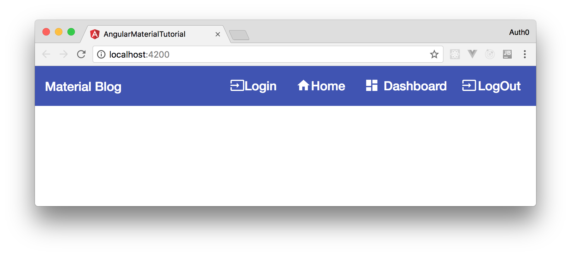
<mat-sidenav-container>
  <mat-sidenav  #sidenav role="navigation">
   <mat-nav-list>
    <a mat-list-item>
      <mat-icon class="icon">input</mat-icon>
      <span class="label">Login</span>
    </a>
    <a mat-list-item>
      <mat-icon class="icon">home</mat-icon>
        <span class="label">Home</span>
    </a>
    <a mat-list-item>
      <mat-icon class="icon">dashboard</mat-icon>
      <span class="label">Dashboard</span>
    </a>
    <a  mat-list-item type="button">
      <mat-icon class="icon">input</mat-icon>
      <span class="label">LogOut</span>
    </a>
    </mat-nav-list>
  </mat-sidenav>
  <mat-sidenav-content>
    <mat-toolbar color="primary">
     <div fxHide.gt-xs>
       <button mat-icon-button>
        <mat-icon>menu</mat-icon>
      </button>
    </div>
     <div>
       <a>
          Material Blog
       </a>
     </div>
     <div fxFlex fxLayout fxLayoutAlign="flex-end"  fxHide.xs>
        <ul fxLayout fxLayoutGap="20px" class="navigation-items">
            <li>
                <a>
                  <mat-icon class="icon">input</mat-icon>
                  <span  class="label">Login</span>
                 </a>
            </li>
            <li>
              <a >
                  <mat-icon class="icon">home</mat-icon>
                  <span class="label">Home</span>
              </a>
            </li>
            <li>
                <a>
                    <mat-icon class="icon">dashboard</mat-icon>
                    <span class="label">Dashboard</span>
                </a>
              </li>
            <li>
                <a>
                  <mat-icon class="icon">input</mat-icon>
                  <span class="label">LogOut</span>
                 </a>
            </li>
        </ul>
     </div>
    </mat-toolbar>
    <main>
    </main>
  </mat-sidenav-content>
</mat-sidenav-container>
For now, you won't have anything nice to see in a browser yet, but you will get there soon.
Angular Material and Flexbox
To make your life easier when defining your Angular application's layout, you will take advantage of the Flex layout schema introduced recently on CSS. More specifically, you will use an Angular directive called fxFlex to handle the Flex layout.
To use it, install the Flex layout package with the following command:
npm install @angular/flex-layout@v5.0.0-beta.14 rxjs-compat
Note: You are explicitly installing
v5.0.0-beta.14of the@angular/flex-layoutlibrary because the newer version available is not working properly with Angular 6.
Note that after the major upgrade to Angular 6, you will need to install
rxjs-compatalongside@angular/flex-layout. The command above already includes this library. So, it is just a matter of copying and pasting the command in your terminal (while being in the project root, of course).
Then, import and configure it into src/app.module.ts as shown here:
// ... other import statements ...
import {FlexLayoutModule} from '@angular/flex-layout';

@NgModule({
  // ... declarations property ...
  imports: [
    // ... other modules ...
    FlexLayoutModule,
  ],
  // ... providers and bootstrap properties ...
})
export class AppModule {}
If you take a close look, you will see that you are already using this package's features in the navigation bar defined before. For example, you have added directives like fxLayout, fxLayoutAlign, and other fxFlex directives.
Before running your app for the first time, add the following CSS rules to app.component.css, so your navigation looks better:
mat-sidenav-container, mat-sidenav-content, mat-sidenav {
  height: 100%;
}

mat-sidenav {
  width: 250px;
}

a {
  text-decoration: none;
  color: white;
}

a:hover,
a:active {
  color: lightgray;
}

.navigation-items {
  list-style: none;
  padding: 0;
  margin: 0;
  cursor: pointer;
}

.icon {
  display: inline-block;
  height: 30px;
  margin: 0 auto;
  padding-right: 5px;
  text-align: center;
  vertical-align: middle;
  width: 15%;
}

.label {
  display: inline-block;
  line-height: 30px;
  margin: 0;
  width: 85%;
}
Also, add the following rule to ./src/styles.css so you don't have any white margins on your app:
@import "~@angular/material/prebuilt-themes/indigo-pink.css";

body {
  margin: 0;
}
With these rules in place, you can issue ng serve from your project root to check your application for the first time.
More Angular Material Components
Now that you have your application up and running with your first Angular Material component, it's time to add more features. So, the first thing you will do is to define two new components (views) to your application, the WelcomeComponent and the DashboardComponent. To create these two new components, you can use the Angular CLI tool as follows:
ng g c welcome --module app.module
ng g c dashboard --module app.module
It's important to define --module app.module because you have another module called material.module, making Angular CLI unable to identify the targeted module automatically.
After running these two commands, open the welcome.component.html and replace the code with this:
<div style="text-align:center">
  <h1>Angular Content Management System</h1>
  <p>
    This is a platform for technical writers to manage their blog post contents related to angular.
    <br> Click on Login to get Started!!!
  </p>
</div>
Don't worry about the DashboardComponent for now. You will work on it soon.
Creating Routes
Now that you have multiple components, you will need to define some routes so your users can access them. To do so, you can create a file called app.routes.ts in the ./src/app directory and add the following code to it:
import {NgModule} from '@angular/core';
import {RouterModule, Routes} from '@angular/router';
import {WelcomeComponent} from './welcome/welcome.component';
import {DashboardComponent} from './dashboard/dashboard.component';

const routes: Routes = [
  {path: '', component: WelcomeComponent},
  {path: 'dashboard', component: DashboardComponent}
];

@NgModule({
  imports: [RouterModule.forRoot(routes)],
  exports: [RouterModule]
})
export class AppRouters {}
In this file, you define two routes: one for the WelcomeComponent and one for the DashboardComponent. As such, when you head to http://localhost:4200, you will see the WelcomeComponent and when you head to http://localhost:4200/dashboard, you will see the DashboardComponent.
Besides defining this module, you will need to update the app.component.html file to add links to these new routes:
<mat-sidenav-container>
  <mat-sidenav  #sidenav role="navigation">
   <mat-nav-list>
    <a mat-list-item>
      <mat-icon class="icon">input</mat-icon>
      <span class="label">Login</span>
    </a>
    <a mat-list-item
        routerLink="/">
      <mat-icon class="icon">home</mat-icon>
        <span class="label">Home</span>
    </a>
    <a mat-list-item
      routerLink="/dashboard">
      <mat-icon class="icon">dashboard</mat-icon>
      <span class="label">Dashboard</span>
    </a>
    <a  mat-list-item
        type="button">
      <mat-icon class="icon">input</mat-icon>
      <span class="label">LogOut</span>
    </a>
    </mat-nav-list>
  </mat-sidenav>
  <mat-sidenav-content>
    <mat-toolbar color="primary">
     <div fxHide.gt-xs>
       <button mat-icon-button (click)="sidenav.toggle()">
        <mat-icon>menu</mat-icon>
      </button>
    </div>
     <div>
       <a routerLink="/">
          Material Blog
       </a>
     </div>
     <div fxFlex fxLayout fxLayoutAlign="flex-end"  fxHide.xs>
        <ul fxLayout fxLayoutGap="20px" class="navigation-items">
            <li>
                <a>
                  <mat-icon class="icon">input</mat-icon>
                  <span  class="label">Login</span>
                 </a>
            </li>
            <li>
              <a
                routerLink="/">
                  <mat-icon class="icon">home</mat-icon>
                  <span class="label">Home</span>
              </a>
            </li>
            <li>
                <a
                  routerLink="/dashboard">
                    <mat-icon class="icon">dashboard</mat-icon>
                    <span class="label">Dashboard</span>
                </a>
              </li>
            <li>
                <a>
                  <mat-icon class="icon">input</mat-icon>
                  <span class="label">LogOut</span>
                 </a>
            </li>
        </ul>
     </div>
    </mat-toolbar>
    <main>
      <router-outlet></router-outlet>
    </main>
  </mat-sidenav-content>
</mat-sidenav-container>
Lastly, you will need to update the app.module.ts file to use the new module:
// ... other import statements ...
import {AppRouters} from './app.routes';

@NgModule({
  // ... declarations property ...
  imports: [
    // ... other imports ...
    AppRouters,
  ],
  // ... providers and bootstrap properties ...
})
export class AppModule {}
If you check your application now (through ng serve), you will see the contents defined in the HTML file of WelcomeComponent. If you click on the Dashboard link, you will see that it loads the "dashboard works!" message.
Managing Data - Part 1
As your dashboard component has nothing more than a simple message, it's time to focus on enhancing it. The idea of this dashboard is to let users add and remove blog posts. The first thing you will do is define an interface to represent instances of blog posts.
To do so, create a new file called Post.ts inside the ./src/app directory and add the following code to it:
export interface Post {
  title: string;
  category: string;
  date_posted: Date;
  position: number;
  body: string;
}
Now, you can use this interface to build a data service to simulate a real application. To create this service, you can run the following command:
ng g s data/data --module app.module
Once finished, you can open the data.service.ts file created and replace its code with:
import {Injectable} from '@angular/core';
import {Post} from '../Post';
import {Observable, of} from 'rxjs';

@Injectable()
export class DataService {

  ELEMENT_DATA: Post[] = [
    {position: 0, title: 'Post One', category: 'Web Development', date_posted: new Date(), body: 'Body 1'},
    {position: 1, title: 'Post Two', category: 'Android Development', date_posted: new Date(), body: 'Body 2'},
    {position: 2, title: 'Post Three', category: 'IOS Development', date_posted: new Date(), body: 'Body 3'},
    {position: 3, title: 'Post Four', category: 'Android Development', date_posted: new Date(), body: 'Body 4'},
    {position: 4, title: 'Post Five', category: 'IOS Development', date_posted: new Date(), body: 'Body 5'},
    {position: 5, title: 'Post Six', category: 'Web Development', date_posted: new Date(), body: 'Body 6'},
  ];
  categories = [
    {value: 'Web-Development', viewValue: 'Web Development'},
    {value: 'Android-Development', viewValue: 'Android Development'},
    {value: 'IOS-Development', viewValue: 'IOS Development'}
  ];

  constructor() {
  }

  getData(): Observable<Post[]> {
    return of<Post[]>(this.ELEMENT_DATA);
  }

  getCategories() {
    return this.categories;
  }

  addPost(data) {
    this.ELEMENT_DATA.push(data);
  }

  deletePost(index) {
    this.ELEMENT_DATA = [...this.ELEMENT_DATA.slice(0, index), ...this.ELEMENT_DATA.slice(index + 1)];
  }

  dataLength() {
    return this.ELEMENT_DATA.length;
  }
}
In your data service, you have two different arrays: one for storing categories of posts and the other one for storing blog posts.
You will also have to guarantee that the app.module.ts file includes your new DataService class in its providers property:
// ... other imports ...
import {DataService} from './data/data.service';

@NgModule({
  // ... declarations and imports ...
  providers: [DataService],
  // ... bootstrap ...
})
export class AppModule { }
Now, you can update your dashboard to make use of the data service to render some data. So, open the dashboard.component.ts file and replace its code with this:
import {Component} from '@angular/core';
import {DataService} from '../data/data.service';
import {Post} from '../Post';
import {DataSource} from '@angular/cdk/table';
import {Observable} from 'rxjs/Observable';

@Component({
  selector: 'app-dashboard',
  templateUrl: './dashboard.component.html',
  styleUrls: ['./dashboard.component.css']
})
export class DashboardComponent {
  constructor(private dataService: DataService) {
  }

  displayedColumns = ['date_posted', 'title', 'category', 'delete'];
  dataSource = new PostDataSource(this.dataService);
}

export class PostDataSource extends DataSource<any> {
  constructor(private dataService: DataService) {
    super();
  }

  connect(): Observable<Post[]> {
    return this.dataService.getData();
  }

  disconnect() {
  }
}
Then, open the dashboard.component.html file and replace everything with:
<div>
  <br>
    <div class="container">
        <div class="container">
          <div fxLayout="column" fxLayoutGap="20px" fxLayout.gt-md="row"  fxLayoutAlign="space-around center" class="content">
              <div class="blocks">
                  <button button="submit" mat-raised-button color="primary">
                      <mat-icon>add</mat-icon> Add Post
                  </button>
              </div>
        </div>
    </div>
    <br>
    <div class="container">
      <div fxLayout="row" fxLayoutAlign="center center" class="content">
        <mat-card class="card" >
          <mat-card-title fxLayout.gt-xs="row" fxLayout.xs="column">
            <h3>Recent Posts</h3>
          </mat-card-title>
          <mat-card-content>
              <div class="example-container mat-elevation-z8">
                  <mat-table #table [dataSource]="dataSource">
                  <ng-container matColumnDef="date_posted">
                    <mat-header-cell *matHeaderCellDef> Date Posted </mat-header-cell>
                    <mat-cell *matCellDef="let element"> {{element.date_posted  | date: 'd/M/y'}} </mat-cell>
                  </ng-container>
                    <ng-container matColumnDef="title">
                      <mat-header-cell *matHeaderCellDef> Title </mat-header-cell>
                      <mat-cell *matCellDef="let element"> {{element.title}} </mat-cell>
                    </ng-container>
                    <ng-container matColumnDef="category">
                      <mat-header-cell *matHeaderCellDef> Category </mat-header-cell>
                      <mat-cell *matCellDef="let element"> {{element.category}} </mat-cell>
                    </ng-container>
                    <ng-container matColumnDef="delete">
                      <mat-header-cell *matHeaderCellDef></mat-header-cell>
                      <mat-cell *matCellDef="let element">
                        <a
                            type="button">
                          <mat-icon class="icon">delete</mat-icon>
                        </a>
                      </mat-cell>
                    </ng-container>
                    <mat-header-row *matHeaderRowDef="displayedColumns"></mat-header-row>
                    <mat-row *matRowDef="let row; columns: displayedColumns;"></mat-row>
                  </mat-table>
                </div>
          </mat-card-content>
        </mat-card>
      </div>
    </div>
  </div>
</div>
Here, you are using some Angular Material Components like mat-card, mat-button, and mat-table to render the list of existing blog posts. Before proceeding, you will have to import these components into the material.module.ts file. So, open it and update as follows:
import {NgModule} from '@angular/core';

import {
  // ... other modules ...
  MatCardModule,
  MatButtonModule,
  MatTableModule,
} from '@angular/material';

@NgModule({
  imports: [
    // ... other modules ...
    MatCardModule,
    MatButtonModule,
    MatTableModule,
  ],
  exports: [
    // ... other modules ...
    MatCardModule,
    MatButtonModule,
    MatTableModule,
  ]
})
export class MaterialModule {}
Before checking your application running with these new components, open the dashboard.component.css file and add the following content:
.card {
  min-width: 80%;
}

.example-container {
  display: flex;
  flex-direction: column;
  max-height: 500px;
  min-width: 100%;
}

.mat-table {
  overflow: auto;
  max-height: 500px;
}

a {
  cursor: pointer;
}
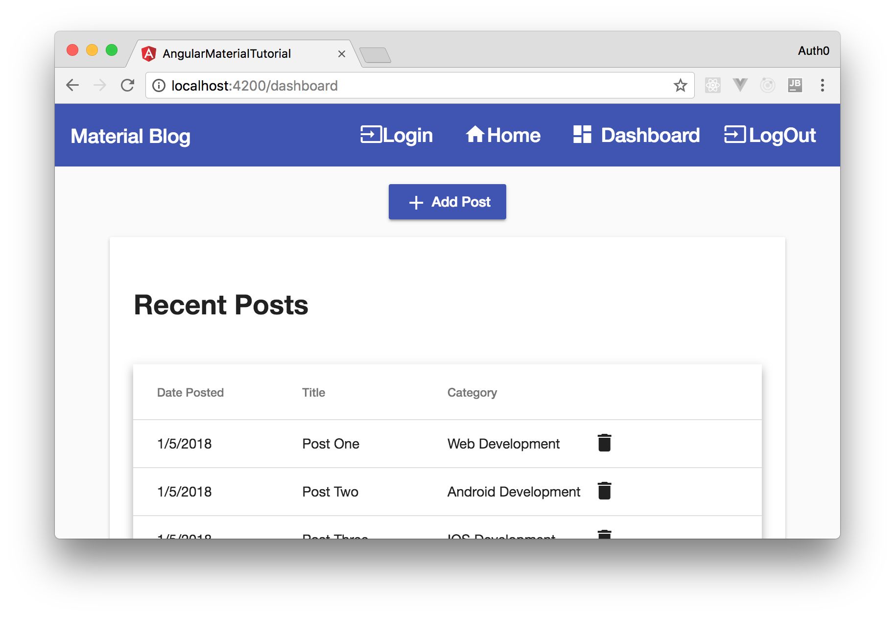
Now, running your app (ng serve) and heading to http://localhost:4200/dashboard, you will see the following screen:
Securing Angular Material with Auth0
As you don't want unauthenticated users to create blog posts or remove existing ones, you will take advantage of Auth0 to easily secure your app.
So, before integrating Auth0 into your app, you will need to sign up for a free Auth0 account. After following the instructions there to create your account, you will need to create an Auth0 Application to represent your Angular app.
To do so, click on the New Application button on your dashboard page. Then, fill the form shown as follows:
- Application Name: Angular Material Tutorial
- Application Type: Single Page Web Apps
Once finished, Auth0 will show you a screen where you can see tabs like Quick Start, Settings, and Addons. Choose the Settings tab and add http://localhost:4200/ as an Allowed Callback URL. This is the URL that Auth0 is allowed to call after finishing the authentication process (this configuration exists to make the process more secure).
Now, create a new file called auth.service.ts in the ./src/app directory and add the following code to it:
import {Injectable} from '@angular/core';
import {Router} from '@angular/router';
import * as auth0 from 'auth0-js';

// why do you need defining window as any?
// check this: https://github.com/aws/aws-amplify/issues/678#issuecomment-389106098
(window as any).global = window;

@Injectable()
export class AuthService {

  auth0 = new auth0.WebAuth({
    clientID: '<APPLICATION_CLIENT_ID>',
    domain: '<YOUR_AUTH0_DOMAIN>',
    responseType: 'token',
    redirectUri: 'http://localhost:4200/',
    scope: 'openid'
  });

  accessToken: String;
  expiresAt: Number;

  constructor(public router: Router) {}

  public login(): void {
    this.auth0.authorize();
  }

  public handleAuthentication(): void {
    this.auth0.parseHash((err, authResult) => {
      if (authResult && authResult.accessToken) {
        window.location.hash = '';
        this.accessToken = authResult.accessToken;
        this.expiresAt = (authResult.expiresIn * 1000) + new Date().getTime();
        this.router.navigate(['/dashboard']);
      } else if (err) {
        this.router.navigate(['/']);
        console.log(err);
      }
    });
  }

  public logout(): void {
    // Remove tokens and expiry time from localStorage
    this.accessToken = null;
    this.expiresAt = null;
    // Go back to the home route
    this.router.navigate(['/']);
  }

  public isAuthenticated(): boolean {
    // Check whether the current time is past the
    // Access Token's expiry time
    return new Date().getTime() < this.expiresAt;
  }
}
The code in this service, although lengthy, is quite simple. You are just defining an instance of auth0.WebAuth to interact with Auth0, and then you define a method called handleAuthentication that will fetch the tokens returned by Auth0. Also, there are other handy methods in this service like isAuthenticated, login, and logout. You will use all of them soon.
Important! You will need to replace
<APPLICATION_CLIENT_ID>and<YOUR_AUTH0_DOMAIN>in the code with your Auth0 application's values. For example, the client id will look likelU4PgkBaogkZP13Mv1gSkHK6VIH6xIkq, and the domain will look likebk-tmp.auth0.com.
Also, before proceeding, you will have to install the auth0-js library and its types definition (@types/auth0-js):
npm install auth0-js
npm i -D @types/auth0-js
Now, you can update the app.component.html to integrate it with your new service:
<mat-sidenav-container>
  <mat-sidenav  #sidenav role="navigation">
   <mat-nav-list>
    <a mat-list-item
        *ngIf="!auth.isAuthenticated()"
        (click)="auth.login()">
      <mat-icon class="icon">input</mat-icon>
      <span class="label">Login</span>
    </a>
    <a mat-list-item
        *ngIf="auth.isAuthenticated()"
        routerLink="/">
      <mat-icon class="icon">home</mat-icon>
        <span class="label">Home</span>
    </a>
    <a mat-list-item
      routerLink="/dashboard">
      <mat-icon class="icon">dashboard</mat-icon>
      <span class="label">Dashboard</span>
    </a>
    <a  mat-list-item
      *ngIf="auth.isAuthenticated()"
      (click)="auth.logout()" type="button">
      <mat-icon class="icon">input</mat-icon>
      <span class="label">LogOut</span>
    </a>
    </mat-nav-list>
  </mat-sidenav>
  <mat-sidenav-content>
    <mat-toolbar color="primary">
     <div fxHide.gt-xs>
       <button mat-icon-button (click)="sidenav.toggle()">
        <mat-icon>menu</mat-icon>
      </button>
    </div>
     <div>
       <a routerLink="/">
          Material Blog
       </a>
     </div>
     <div fxFlex fxLayout fxLayoutAlign="flex-end"  fxHide.xs>
        <ul fxLayout fxLayoutGap="20px" class="navigation-items">
            <li>
                <a
                  *ngIf="!auth.isAuthenticated()"
                  (click)="auth.login()">
                  <mat-icon class="icon">input</mat-icon>
                  <span  class="label">Login</span>
                 </a>
            </li>
            <li>
              <a
                *ngIf="auth.isAuthenticated()"
                routerLink="/">
                  <mat-icon class="icon">home</mat-icon>
                  <span class="label">Home</span>
              </a>
            </li>
            <li>
                <a
                  routerLink="/dashboard">
                    <mat-icon class="icon">dashboard</mat-icon>
                    <span class="label">Dashboard</span>
                </a>
              </li>
            <li>
                <a
                *ngIf="auth.isAuthenticated()"
                (click)="auth.logout()" type="button"
                >
                  <mat-icon class="icon">input</mat-icon>
                  <span class="label">LogOut</span>
                 </a>
            </li>
        </ul>
     </div>
    </mat-toolbar>
    <main>
      <router-outlet></router-outlet>
    </main>
  </mat-sidenav-content>
</mat-sidenav-container>
In the new version of this file, you use the methods defined in the service created before to show or hide the login and logout buttons.
You will need to import AuthService in the AppComponent class and make it fetch the token returned by Auth0. So, open the app.component.ts file and replace its contents with this:
import { Component } from '@angular/core';
import { AuthService } from './auth.service';

@Component({
  selector: 'app-root',
  templateUrl: './app.component.html',
  styleUrls: ['./app.component.css']
})
export class AppComponent {
  constructor(public auth: AuthService) {
    auth.handleAuthentication();
  }
}
Lastly, you will need to update the app.module.ts file as follows:
// ... other import statements ...
import {AuthService} from './auth.service';

@NgModule({
  // ... declarations and imports properties ...
  providers: [DataService, AuthService],
  // ... bootstrap property ...
})
export class AppModule {}
Running your application now, you will be able to log in through Auth0. After logging in, you will see that you are redirected to the dashboard and that the Logout button is shown.
Enabling Data Deletion
Now that your app is secured with Auth0, you will want to allow authenticated users to delete blog posts.
To do so, you will inject AuthService in your DashboardComponent class and define a new method called deletePost as follows:
// ... import statements ...
import {AuthService} from '../auth.service';

// ... @Component ...
export class DashboardComponent {
  constructor(private dataService: DataService, public auth: AuthService) {
  }

  // ... displayedColumns and dataSource ...

  deletePost(id) {
    if (this.auth.isAuthenticated()) {
      this.dataService.deletePost(id);
      this.dataSource = new PostDataSource(this.dataService);
    } else {
      alert('Login in Before');
    }
  }
}

// ... PostDataSource ...
Now, you just have to update the dashboard.component.html file to bind the click event of the delete button to the deletePost method:
<a (click)="deletePost(element.position)" type="button">
  <mat-icon class="icon">delete</mat-icon>
</a>
Enabling Data Input
In the last feature of your app, you will use the dialog component of the Angular Material library to allow users to insert new blog posts. As you want only authenticated users to access this feature and you want to let unauthenticated users that they must log in before adding blog posts, you add the *ngIf="auth.isAuthenticated()" directive to wrap the Add Post button. So, open the dashboard.component.html file and add this directive to the div class="blocks" element that wraps this button:
<div class="blocks" *ngIf="auth.isAuthenticated()">
  <button button="submit" mat-raised-button color="primary">
    <mat-icon>add</mat-icon> Add Post
  </button>
</div>
Now, right after this block, add the following one:
<div class="blocks">
  <a button mat-raised-button color="primary" (click)="auth.login()" *ngIf="!auth.isAuthenticated()">
    <mat-icon>input</mat-icon>Login to Add Post
  </a>
</div>
This will be enough to tell unauthenticated users to log in.
To enable users to create new blog posts, you will create a new component called PostDialogComponent. To do so, issue:
ng g c post-dialog --module app.module
Then, open the post-dialog.component.html file and put the following HTML code inside it:
<h1 mat-dialog-title>{{data}}</h1>
<div mat-dialog-content>
  <form class="example-form" (ngSubmit)="onSubmit()">
    <mat-form-field>
      <input matInput placeholder="Post Title" type="text" required [(ngModel)]="blogPost.title" name="name">
    </mat-form-field>
    <mat-form-field>
      <textarea matInput placeholder="Post Body" required [(ngModel)]="blogPost.body" name="body"></textarea>
    </mat-form-field>
    <mat-form-field>
      <mat-select matInput placeholder="Post Category" required [(ngModel)]="blogPost.category" name="category">
        <mat-option *ngFor="let cat of categories" [value]="cat.value">
          {{ cat.viewValue }}
        </mat-option>
      </mat-select>
    </mat-form-field>
    <button mat-raised-button type="submit" color="primary">Save</button>
  </form>
</div>
<div mat-dialog-actions>
  <button mat-raised-button class="close" (click)="onNoClick()" color="warn">Cancel</button>
</div>
You can see you are using mat-dialog, mat-input, and mat-select from the Angular Material library in the HTML file. So, as you can imagine, you will need to import them into your material.module.ts file:
import {NgModule} from '@angular/core';

import {
  // ... other modules ...
  MatDialogModule,
  MatInputModule,
  MatSelectModule,
} from '@angular/material';

@NgModule({
  imports: [
    // ... other modules ...
    MatDialogModule,
    MatInputModule,
    MatSelectModule,
  ],
  exports: [
    // ... other modules ...
    MatDialogModule,
    MatInputModule,
    MatSelectModule,
  ]
})
export class MaterialModule {}
Besides updating this module, you will need to import and configure the FormsModule from @angular/forms in the main module. So, open the app.module.ts file and update it as follows:
// ... other imports ...
import {FormsModule} from '@angular/forms';

@NgModule({
  // ... declarations property ...
  imports: [
    // ... other modules ...
    FormsModule,
  ],
  // ... providers and bootstrap ...
})
export class AppModule {}
Also, to make your dialog look nice, you can insert the following rules in the post-dialog.component.css file:
.example-form {
    display: flex;
    flex-direction: column;
}

.example-form > * {
    width: 100%;
}

.close{
    width: 100%;
}
Then, you can open the post-dialog.component.ts file and replace its code with the following;
import {Component, EventEmitter, Inject} from '@angular/core';
import {MAT_DIALOG_DATA, MatDialogRef} from '@angular/material';
import {DataService} from '../data/data.service';

@Component({
  selector: 'app-post-dialog',
  templateUrl: './post-dialog.component.html',
  styleUrls: ['./post-dialog.component.css']
})
export class PostDialogComponent {
  blogPost = {
    title: '',
    body: '',
    category: '',
    position: 0,
    date_posted: new Date()
  };
  public event: EventEmitter<any> = new EventEmitter();

  constructor(
    public dialogRef: MatDialogRef<PostDialogComponent>,
    @Inject(MAT_DIALOG_DATA) public data: any,
    public dataService: DataService
  ) {
  }

  onNoClick(): void {
    this.dialogRef.close();
  }

  onSubmit(): void {
    this.blogPost.position = this.dataService.dataLength();
    this.event.emit({data: this.blogPost});
    this.dialogRef.close();
  }

  categories = this.dataService.getCategories();
}
To make a button open up this dialog box, you need to tell it to do so by binding a click event to the button. So, open the dashboard.component.html and modify the button you created before to look like this:
<div class="blocks" *ngIf="auth.isAuthenticated()">
  <button button="submit" mat-raised-button color="primary" (click)="openDialog()">
    <mat-icon>add</mat-icon> Add Post
  </button>
</div>
Then, in the TypeScript file of the dashboard.component.ts, you will have update the code as:
// ... other import statements ...
import {PostDialogComponent} from '../post-dialog/post-dialog.component';
import {MatDialog} from '@angular/material';

// ... @Component ...
export class DashboardComponent {
  constructor(public auth: AuthService, public dialog: MatDialog, private dataService: DataService) {
  }
  // ... displayedColumns, dataSource, and deletePost ...

  openDialog(): void {
    let dialogRef = this.dialog.open(PostDialogComponent, {
      width: '600px',
      data: 'Add Post'
    });
    dialogRef.componentInstance.event.subscribe((result) => {
      this.dataService.addPost(result.data);
      this.dataSource = new PostDataSource(this.dataService);
    });
  }
}

// ... PostDataSource ...
Lastly, open the ./src/app/app.module.ts file and add the following property to @NgModule:
entryComponents: [
  PostDialogComponent
],
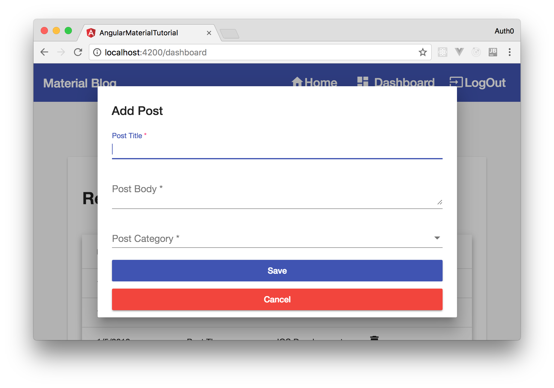
Now, to see the dialog in action, run ng serve, log in, and head to http://localhost:4200/dashboard. From there, hit the Add Post button, and you will see the following screen:
That's it! You have just created your first app with Angular Material. Easy right?!
“Angular Material makes it easy to develop modern apps with great UI!”
Tweet This
Conclusion
In this article, you had the chance to use Angular Material components to create a beautiful application without investing too much time thinking about styles. What is great is that besides being easy to use, Angular Material components leverage best practices and a common UI that most users already use. Awesome, right?
About the author

Oliver Mensah
Software Developer at Agro Innova