
TL;DR: This article will show you how to create Web Components with Stencil, a tool that allows you to use a high-level syntax to define components, and that generates them based on vanilla JavaScript. Throughout the article, you will build a simple rating component and then you will integrate it with React and Angular. You can find the final code of this component in this GitHub repository.
What are Web Components
Have you ever struggled with integrating UI components implemented for different JavaScript frameworks or libraries, say, for example, Angular or React or Vue or whatever? Are you tired of reimplementing the same UI component for each new framework or library? Do you know that a solution to this problem has already existed for some years? It is called Web Components.
Web Components are a set of standard specifications that allow you to create custom and reusable components by simply using HTML, CSS, and JavaScript. In other words, Web Components allow you to define new custom HTML tags and behaviors by using standard technologies. These custom components should be natively supported by any Web browser, regardless of the framework you are using to build your Web pages or your Web application. This should be the end of any JavaScript library interoperability nightmare, but... but there are still a few problems: mainly the browser support for all the features and the low level of Web Components APIs.
How Stencil Fits in the Web Components World
In past years a few libraries tried to remedy these Web Component problems providing a higher level of abstraction and filling the browser's lack of support regarding some basic features. Among others, Polymer and X-Tag helped many developers to adopt Web Components in their projects.
In August 2017, the Ionic team announced Stencil.js, a performant compiler that generates Web Components by combining the best concepts of the most popular UI JavaScript frameworks and libraries. Unlike Polymer and X-Tag, Stencil is not another library that allows you to use Web Components in your project. It is a building tool that allows you to use a high-level abstraction to define your UI components and to generate pure JavaScript code implementing standard-based Web Components. The compiled code runs in all major browsers since Stencil uses a small polyfill only on browsers that lack some needed features.
“The @stenciljs library is a building tool that facilitates the creation of web components that you can use with @reactjs and @angular.”
Tweet This
So, let's give Stencil a try and see how to build and use a Web Component.
Setup of the Stencil Environment
To become familiar with Stencil, you are going to build a rating Web Component, that is a UI component allowing the user to provide their feedback about a product, an article or whatever by assigning a number of stars like in the following picture:

As a first step towards this goal, you need to set up the Stencil development environment. So, be sure to get Node.js installed on your machine and then type the following command in a terminal window:
npm init stencil component rating-stencil-component
This command creates a new Stencil component project by using the component starter. It creates the project into the rating-stencil-component folder.
You can use other starters to create different types of projects, like Stencil applications (
app) and Progressive Web Apps based on the Ionic UI (ionic-pwa). See thecreate-stencildocumentation for more details.
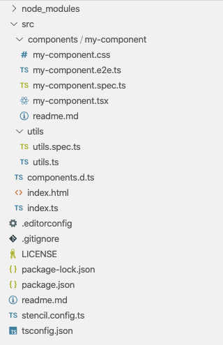
The component starter project provides a standard Node.js development environment. In particular, you can see a few configuration files in the root folder and the src folder containing a folder structure, as shown in the following picture:
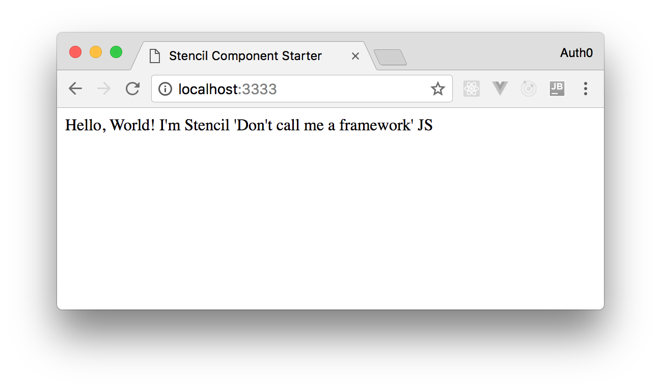
The component starter project contains a very basic and working component that you can see in action by typing npm start. After a few seconds a browser window like the following will be open:
You are going to build your component by exploiting the infrastructure of this basic project.
Creating a Basic Stencil Component
In order to implement our rating component, let's create a my-rating-component folder inside the /src/components folder. In this newly created folder, put one file named my-rating-component.tsx and one named my-rating-component.css. The .css file will contain the following code:
/* src/components/my-rating-component/my-rating-component.css */

.rating {
  color: orange;
}
The .tsx file will contain the following TypeScript code:
// src/components/my-rating-component/my-rating-component.tsx import { Component, h } from '@stencil/core'; @Component({ tag: 'my-rating', styleUrl: 'my-rating-component.css', shadow: true }) export class MyRatingComponent { render() { return ( <div> <span class="rating">★</span> <span class="rating">★</span> <span class="rating">★</span> <span class="rating">☆</span> <span class="rating">☆</span> <span class="rating">☆</span> </div> ); } }
The .tsx extension indicates that the file contains TypeScript and JSX code. Actually, these are the languages used by Stencil to define the component. A Stencil component is a TypeScript class, MyRatingComponent in the example, that implements a render() method. This class is decorated by the @Component decorator, previously imported from the stencil/core module. This decorator allows you to define some meta-data about the component itself. In particular, you defined the tag name that will be associated with the component. This means that you will use the <my-rating></my-rating> element to put this component inside an HTML page. You also defined the CSS file containing styling settings for the component via the styleUrl property. The last property, shadow, isolates the internal component DOM and styles so that it is shielded by name conflicts and accidental collisions. This feature should be granted by the Web Component's Shadow DOM. All recent browsers support this feature. Anyway, if any older browser doesn't support it, a polyfill will be used.
The render() method describes the component's appearance by using JSX expressions. In our example, the component's markup consists of a sequence of six-span HTML elements: three of them contain the HTML entity for the full star (★), and the other three contain the code for the empty star (☆).
You may notice that the h() function has been imported from the stencil/core module. This function is needed to allow Stencil to turn the JSX into Virtual DOM elements. In fact, Stencil uses a tiny Virtual DOM layer similar to the one used by React.
Manually Testing a Stencil Component
Now that you have defined your first component, you can remove the default component included in the starter component project. So, remove the /src/my-component folder. Then open the index.html file in the src folder and replace its content with the following markup:
<!-- src/index.html -->
<!DOCTYPE html>
<html dir="ltr" lang="en">
<head>
  <meta charset="utf-8">
  <meta name="viewport" content="width=device-width, initial-scale=1.0, minimum-scale=1.0, maximum-scale=5.0">
  <title>Stencil Component Starter</title>
  <script type="module" src="/build/rating-stencil-component.esm.js"></script>
  <script nomodule src="/build/rating-stencil-component.js"></script>
</head>
<body>
  <my-rating></my-rating>
</body>
</html>
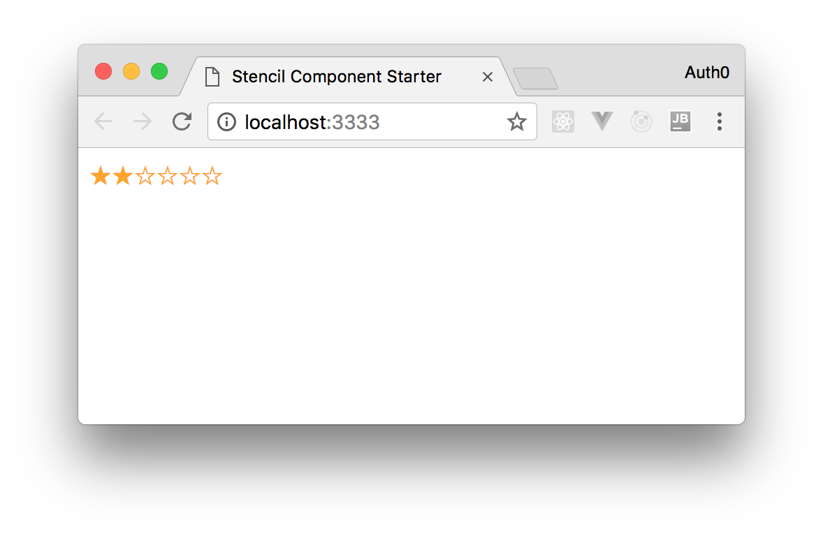
As you can see, the body of the HTML page contains the newly defined <my-rating> tag that identifies our component. After saving the index.html file, type npm start in a console window, and you will see your component in a browser as in the following picture:

Note: The Stencil development environment provides support for hot reloading, so if your environment is running after an
npm start, any changes to the project's files will cause its automatic rebuilding and running. This means that you don't need to type againnpm start.
Adding Properties to Stencil Components
The component you have created so far is not so interesting, after all. It is quite static since it simply shows a fixed number of full and empty stars, and the user cannot interact with it. It would be a bit more useful if at least the user could assign the total number of stars to show and the number of full stars indicating the current rating value. Adding these features is pretty simple. Let's change the component definition as follows:
// src/components/my-rating-component/my-rating-component.tsx import { Component, Prop, h } from '@stencil/core'; @Component({ tag: 'my-rating', styleUrl: 'my-rating-component.css', shadow: true }) export class MyRatingComponent { @Prop() maxValue: number = 5; @Prop() value: number = 0; createStarList() { let starList = []; for (let i = 1; i <= this.maxValue; i++) { if (i <= this.value) { starList.push(<span class="rating">★</span>); } else { starList.push(<span class="rating" >☆</span>); } } return starList; } render() { return ( <div> {this.createStarList()} </div> ); } }
As the first difference with respect to the previous version, you imported the @Prop() decorator. This decorator allows you to map the properties of the component class to attributes in the markup side of the component. You added the maxValue property, which represents the maximum number of stars to show, and the value property, which indicates the current rating value and so the number of full stars to be shown. As you can see, each property has a default value. These properties decorated with @Prop() allows you to use the component's markup as follows:
<my-rating max-value="6" value="2"></my-rating>
By using this markup, you are mapping the value of max-value attribute to the maxValue property and the value of value attribute to the value property. Notice how the kebab case naming style of the attribute names is mapped to the camel case naming style of the class properties.
Finally, the createStarList() method dynamically creates the sequence of the stars to display based on maxValue and value properties' value.
By applying these changes, you will get the following result:
The Reactive Nature of Properties on Stencil
The component's properties are not only a way to set customized initial values through HTML attributes. The mapping between the attributes and the properties is reactive. This means that any change to the attribute fires the render() method so that the component's UI is updated. You can verify this behavior by changing the content of the index.html file as follows:
<!-- src/index.html -->
<!DOCTYPE html>
<html dir="ltr" lang="en">
<head>
  <meta charset="utf-8">
  <meta name="viewport" content="width=device-width, initial-scale=1.0, minimum-scale=1.0, maximum-scale=5.0">
  <title>Stencil Component Starter</title>
  <script type="module" src="/build/rating-stencil-component.esm.js"></script>
  <script nomodule src="/build/rating-stencil-component.js"></script>
  <script>
    setTimeout(function() {
      let myRatingComponent = document.getElementById("myRatingComponent");
      myRatingComponent.value = 4;
    }, 5000)
    </script>
  </head>
  <body>
    <my-rating id="myRatingComponent" max-value="6" value="2"></my-rating>
  </body>
  </html>
You assigned an id attribute to the component's markup and added a script block calling the setTimeout() JavaScript function that schedules the execution of a function after 5 seconds. The scheduled function changes the value property of the component. So you will see your rating component with an initial number of two full stars, and after five seconds, you will see it with four full stars.
Managing State of Stencil Components
Now you want to add more interactivity to your rating component. You want the number of full stars of the component to follow the mouse movement when it is over it. It should return to its original number when the mouse is out of its area, like in the following animation:

In addition, you want to set a new value when the user clicks on one of the component's stars.
In order to manage this dynamic change of stars, you can assign an internal state to your component. The state of a component is a set of data internally managed by the component itself. This data cannot be directly changed by the user, but the component can modify it according to its internal logic. Any change to the state causes the execution of the render() method.
Stencil allows you to define the component state through the @State() decorator, so you can add a new property to internally track the stars to display in a given moment. The following is the first change to your code toward the dynamic behavior of the rating component:
// src/components/my-rating-component/my-rating-component.tsx import { Component, Prop, State, h } from '@stencil/core'; @Component({ tag: 'my-rating', styleUrl: 'my-rating-component.css', shadow: true }) export class MyRatingComponent { @Prop() maxValue: number = 5; @Prop() value: number = 0; @State() starList: Array<object> = []; createStarList() { let starList = []; for (let i = 1; i <= this.maxValue; i++) { if (i <= this.value) { starList.push(<span class="rating">★</span>); } else { starList.push(<span class="rating" >☆</span>); } } this.starList = starList; } render() { return ( <div> {this.starList} </div> ); } }
With respect to the previous version, this code imports the @State() decorator and apply it to the newly introduced starList property. This property is an array of objects and represents the component state that will contain the JSX description of the stars to display. Consequently, the createStarList() method has been modified so that the resulting array is assigned to the state property. Finally, the starList property is used inside the JSX expression returned by the render() method.
Note: Stencil watches state and props for changes in order to run the
render()method. However, it actually compares references for changes, so a change in data inside an array or to an object's property doesn't cause a re-rendering of the component. You need to assign a new array or object to the state.
Handling Events with Stencil
Once you added support for state management, let's make the user interact with our component. For this purpose, you need to capture mouse events in order to create the visual effect described above and to allow the user to assign a new rating value. You can handle the needed mouse event by adding some new code to the component, as shown in the following:
// src/components/my-rating-component/my-rating-component.tsx import { Component, Prop, State, h } from '@stencil/core'; @Component({ tag: 'my-rating', styleUrl: 'my-rating-component.css', shadow: true }) export class MyRatingComponent { @Prop() maxValue: number = 5; @Prop() value: number = 0; @State() starList: Array<object> = []; setValue(newValue) { this.value = newValue; this.createStarList(this.value); } createStarList(numberOfStars: number) { let starList = []; for (let i = 1; i <= this.maxValue; i++) { if (i <= numberOfStars) { starList.push(<span class="rating" onMouseOver={() => this.createStarList(i)} onMouseOut={() => this.createStarList(this.value)} onClick={() => this.setValue(i)}>★</span>); } else { starList.push(<span class="rating" onMouseOver={() => this.createStarList(i)} onMouseOut={() => this.createStarList(this.value)} onClick={() => this.setValue(i)}>☆</span>); } } this.starList = starList; } render() { return ( <div> {this.starList} </div> ); } }
You added a few attributes to the JSX definition of the single star: onMouseOver, to capture the presence of the mouse over the component, onMouseOut, to capture the mouse exit from the component area, and onClick, to capture the click event on a star of the component. As per JSX semantics, these attributes are mapped to the corresponding HTML attributes onmouseover, onmouseout, and onclick. Each attribute has an arrow function assigned that invokes the component's methods createStarList() and setValue().
The first one is a slightly changed version of the previous createStarList() method. Now it accepts an argument that defines the number of stars to display, and this parameter is used instead of the fixed value property.
The setValue() method takes the new value, assigns it to the value property and calls the createStarList() method to generate the new list of stars.
Now let's restore the previous version of the index.html file by removing the setTimeout() code. It will look as follows:
<!-- src/index.html -->
<!DOCTYPE html>
<html dir="ltr" lang="en">
<head>
  <meta charset="utf-8">
  <meta name="viewport" content="width=device-width, initial-scale=1.0, minimum-scale=1.0, maximum-scale=5.0">
  <title>Stencil Component Starter</title>
  <script type="module" src="/build/rating-stencil-component.esm.js"></script>
  <script nomodule src="/build/rating-stencil-component.js"></script>
  </head>
  <body>
    <my-rating id="myRatingComponent" max-value="6" value="2"></my-rating>
  </body>
  </html>
Now let's run the project and look at the browser.
Managing Stencil Components' Lifecycle
Unfortunately, running the code written until now results in a blank page. What happens?
Reviewing the code, you can see that the render() method includes the starList property in its JSX expression. This property is assigned inside the createStarList() method, but who does invoke this method in the initial step of the component creation?
You need to invoke the createStarList() method to correctly initialize your component. You may think to invoke it in the component's constructor, but it will have a strange behavior: its initial visualization will take into account the default values of value and maxValue properties since the list of stars will be built before the component receives the correct values from the DOM.
The right moment to initialize the component should be when it has been loaded into the DOM.
Fortunately, Stencil provides you with a few hooks to handle the various events of the component lifecycle:
componentWillLoad: the component is ready to be loaded into the DOM, but it is not rendered yet.componentDidLoad: the component has been loaded and rendered.componentWillUpdate: the component is about to be updated.componentWillRender: the component is about to be rendered.componentDidRender: the component has been rendered.componentDidUpdate: the component has been updated.componentDidUnload: the component has been removed from the DOM.
To use these hooks, you simply need to implement a method with the same name in your component.
So, in our case, you can implement the componentWillLoad() method and initialize the component, as shown below:
// src/components/my-rating-component/my-rating-component.tsx import { Component, Prop, State, h } from '@stencil/core'; @Component({ tag: 'my-rating', styleUrl: 'my-rating-component.css', shadow: true }) export class MyRatingComponent { @Prop() maxValue: number = 5; @Prop() value: number = 0; @State() starList: Array<object> = []; componentWillLoad() { this.createStarList(this.value); } setValue(newValue) { this.value = newValue; this.createStarList(this.value); } createStarList(numberOfStars: number) { let starList = []; for (let i = 1; i <= this.maxValue; i++) { if (i <= numberOfStars) { starList.push(<span class="rating" onMouseOver={() => this.createStarList(i)} onMouseOut={() => this.createStarList(this.value)} onClick={() => this.setValue(i)}>★</span>); } else { starList.push(<span class="rating" onMouseOver={() => this.createStarList(i)} onMouseOut={() => this.createStarList(this.value)} onClick={() => this.setValue(i)}>☆</span>); } } this.starList = starList; } render() { return ( <div> {this.starList} </div> ); } }
This small change solves our issue, but another problem still remains: when a user clicks a star, the number of full stars doesn't change. Why does the setValue() method not work?
Managing Mutable Properties on Stencil
As said above, a component property decorated with @Prop() acquires a reactive nature. This means that if a change to the property occurs from the external of the component, this immediately fires the re-rendering of the component itself. However, the property change can only occur through an external action. Props are immutable from inside the component. This means that an internal attempt to change the value of a prop doesn't work. This is the reason why the setValue() method doesn't work as expected.
There are a couple of solutions to this issue.
The first solution requires to define a new state property, say internalValue, and to refer to this property instead of the value property to generate the list of full stars. If you choose this way, your component's code will look as follows:
// src/components/my-rating-component/my-rating-component.tsx import { Component, Prop, State, h } from '@stencil/core'; @Component({ tag: 'my-rating', styleUrl: 'my-rating-component.css', shadow: true }) export class MyRatingComponent { @Prop() maxValue: number = 5; @Prop() value: number = 0; @State() starList: Array<object> = []; @State() internalValue: number; componentWillLoad() { this.createStarList(this.value); } setValue(newValue) { this.internalValue = newValue; this.createStarList(this.internalValue); } createStarList(numberOfStars: number) { let starList = []; for (let i = 1; i <= this.maxValue; i++) { if (i <= numberOfStars) { starList.push(<span class="rating" onMouseOver={() => this.createStarList(i)} onMouseOut={() => this.createStarList(this.internalValue)} onClick={() => this.setValue(i)}>★</span>); } else { starList.push(<span class="rating" onMouseOver={() => this.createStarList(i)} onMouseOut={() => this.createStarList(this.internalValue)} onClick={() => this.setValue(i)}>☆</span>); } } this.starList = starList; } render() { return ( <div> {this.starList} </div> ); } }
This code solves the problem but adds duplicate information inside the component.
The second solution is easier to implement and is based on declaring a prop as mutable. You can accomplish this by simply passing the {mutable: true} object to the @Prop() decorator. In this case, your code will look as follows:
// src/components/my-rating-component/my-rating-component.tsx import { Component, Prop, State, h } from '@stencil/core'; @Component({ tag: 'my-rating', styleUrl: 'my-rating-component.css', shadow: true }) export class MyRatingComponent { @Prop() maxValue: number = 5; @Prop({mutable: true}) value: number = 0; @State() starList: Array<object> = []; componentWillLoad() { this.createStarList(this.value); } setValue(newValue) { this.value = newValue; this.createStarList(this.value); } createStarList(numberOfStars: number) { let starList = []; for (let i = 1; i <= this.maxValue; i++) { if (i <= numberOfStars) { starList.push(<span class="rating" onMouseOver={() => this.createStarList(i)} onMouseOut={() => this.createStarList(this.value)} onClick={() => this.setValue(i)}>★</span>); } else { starList.push(<span class="rating" onMouseOver={() => this.createStarList(i)} onMouseOut={() => this.createStarList(this.value)} onClick={() => this.setValue(i)}>☆</span>); } } this.starList = starList; } render() { return ( <div> {this.starList} </div> ); } }
By declaring a prop as mutable, you allow it to be changed from inside the component, and then the setValue() method will work.
Emitting Events from Stencil Components
Stencil also allows you to emit events so that users of your component can be informed when something happens. For example, you could emit an event when the current value of your rating component changes. Let's make a few changes to the code of the component:
// src/components/my-rating-component/my-rating-component.tsx import { Component, Prop, State, EventEmitter, Event, h } from '@stencil/core'; @Component({ tag: 'my-rating', styleUrl: 'my-rating-component.css', shadow: true }) export class MyRatingComponent { @Prop() maxValue: number = 5; @Prop({ mutable: true }) value: number = 0; @State() starList: Array<object> = []; @Event() ratingUpdated: EventEmitter; componentWillLoad() { this.createStarList(this.value); } setValue(newValue) { this.value = newValue; this.createStarList(this.value); this.ratingUpdated.emit({ value: this.value }); } createStarList(numberOfStars: number) { let starList = []; for (let i = 1; i <= this.maxValue; i++) { if (i <= numberOfStars) { starList.push(<span class="rating" onMouseOver={() => this.createStarList(i)} onMouseOut={() => this.createStarList(this.value)} onClick={() => this.setValue(i)}>★</span>); } else { starList.push(<span class="rating" onMouseOver={() => this.createStarList(i)} onMouseOut={() => this.createStarList(this.value)} onClick={() => this.setValue(i)}>☆</span>); } } this.starList = starList; } render() { return ( <div> {this.starList} </div> ); } }
The first thing you notice is the import of the EventEmitter class and of the @Event() decorator. Both are used to define the ratingUpdated property. This property is an instance of the EventEmitter class and provides a way to generate an event with the same name. In fact, you added a call to its method emit() inside the setValue() method. You also passed an object representing the current value to the emit() method.
You can handle the onRatingUpdate event as shown by the following code:
<!-- src/index.html -->
<!DOCTYPE html>
<html dir="ltr" lang="en">
<head>
  <meta charset="utf-8">
  <meta name="viewport" content="width=device-width, initial-scale=1.0, minimum-scale=1.0, maximum-scale=5.0">
  <title>Stencil Component Starter</title>
  <script type="module" src="/build/rating-stencil-component.esm.js"></script>
  <script nomodule src="/build/rating-stencil-component.js"></script>
  <script>
    window.onload = function () {
      let rating = document.getElementById("myRatingComponent");
      rating.addEventListener("ratingUpdated", function (event) {
        alert(event.detail.value);
      })
    };
  </script>
  </head>
  <body>
    <my-rating id="myRatingComponent" max-value="6" value="2"></my-rating>
  </body>
  </html>
You simply added an event listener that will show an alert with the new value assigned to the rating component when the user clicks a star.
Preparing Stencil Components for Production
Now that you have a working component and are satisfied with its features, you can prepare it for production building. If you move to the root of the project and open the stencil.config.ts file in a text editor, you will find the following content:
// stencil.config.ts

import { Config } from '@stencil/core';

export const config: Config = {
  namespace: 'rating-stencil-component',
  taskQueue: 'async',
  outputTargets: [
    {
      type: 'dist',
      esmLoaderPath: '../loader'
    },
    {
      type: 'docs-readme'
    },
    {
      type: 'www',
      serviceWorker: null // disable service workers
    }
  ]
};
This file contains Stencil specific configuration options. In particular, it defines three output targets for your project:
- dist: this output target generates a library that can be distributed via npm. It also requires that the
package.jsonfile is correctly configured, as you will see in a moment. TheesmLoaderPathoption defines the folder where the compiler will put the code to load the library in different development environments, as you will see shortly. - docs-readme: this target generates readme files formatted in markdown from comments in your code. In the current project, it will not create any output.
- www: this target is intended for web apps and websites. This is the default output target, that is, if you don't specify any target, the
wwwtarget will be generated. Even if a project is meant to build a library, thewwwtarget is useful to test the components during the development.
You can find more details and other possible output targets in the official Stencil documentation.
Now, if you take a look at the package.json config file, you will see something like the following:
{
  "name": "rating-stencil-component",
  "version": "0.0.1",
  "description": "Stencil Component Starter",
  "main": "dist/index.js",
  "module": "dist/index.mjs",
  "es2015": "dist/esm/index.mjs",
  "es2017": "dist/esm/index.mjs",
  "types": "dist/types/index.d.ts",
  "collection": "dist/collection/collection-manifest.json",
  "collection:main": "dist/collection/index.js",
  "unpkg": "dist/rating-stencil-component/rating-stencil-component.js",
  "files": [
    "dist/",
    "loader/"
  ],
  ...
}
The file is already prepared to generate code to support the so-called differential bundling. This means that Stencil will create code for modern and legacy browsers, like, for example, IE11. In addition, it will generate code to be consumed in different ways, like npm or CDN. Finally, it will produce code to be used in different development environments. For example, it will generate types to allow developers to use the components in TypeScript projects.
In the package.json file above, you may want to customize the version and description of your package as follows:
{
  "name": "rating-stencil-component",
  "version": "1.0.0",
  "description": "A rating Web component compiled with Stencil",
  "main": "dist/index.js",
  ...
}
Once you have prepared your build configuration, type the command npm run build to start the building task.
After a few seconds, you will find a dist and a loader folders in the root of the project folder with everything you need to use your brand new Web Component. The several subfolders you find in the dist folder match the different production scenarios discussed above. In particular, the rating-stencil-component folder is all you need to use the component locally in your HTML page, as you'll see in the next section.
The best practices to distribute your component require to publish the package to the npm registry as the first step. Then, you can use the library in your project using one of the following approaches:
- via script tag: add a script tag similar to the following to the head section of your HTML page:
<script src='https://unpkg.com/rating-stencil-component@1.0.0/dist/rating-stencil-component.js'></script>
via Node modules: run the following command in the root of your Node project:
npm install rating-stencil-component
In both cases, you can simply use the <my-rating> tag wherever you can use HTML markup.
Using Stencil Component with React and Angular
After building your component, you are ready to use it in your Web application. As said at the beginning of this post, Web Components are meant to be natively supported by standard browsers as long as they support the features required by the standard. However, as Stencil produces code to polyfill the missing features, you can actually use your Web Component in not so recent browsers (e.g. Internet Explorer 11).
To use your rating component in a plain HTML page you should simply copy the rating-stencil-component folder from the dist folder and insert two script tags in the head section, as shown in the following example:
<!DOCTYPE html>
<html dir="ltr" lang="en">
<head>
  <meta charset="utf-8">
  <title>My Application</title>
  <script type="module" src="rating-stencil-component/rating-stencil-component.esm.js"></script>
  <script nomodule src="rating-stencil-component/rating-stencil-component.js"></script>
  <script>
    window.onload = function () {
      let rating = document.getElementById("myRatingComponent");
      rating.addEventListener("ratingUpdated", function (event) {
        alert(event.detail.value);
      })
    };
  </script>
  </head>
  <body>
    <my-rating id="myRatingComponent" max-value="6" value="2"></my-rating>
  </body>
  </html>
Here you created an HTML page with the same logic you used in the development environment. The first script tag (<script type="module">) refers to the version of the bundle containing the most recent JavaScript features. The second script tag (<script nomodule>) loads the bundle compiled into ES5 and includes the polyfills. The browser will load the right bundle based on its capabilities.
If you have an application built with React, you can still use your rating component. Assuming you have built your React app with create-react-app, you need to install the library or link it via the script tag as discussed before. Now you can use the <my-rating> tag inside any JSX expression in your application. For example, the following is the standard App component created by create-react-app with the rating component used in the JSX:
import React from 'react';
import logo from './logo.svg';
import './App.css';

function App() {
  return (
    <div className="App">
      <header className="App-header">
        <img src={logo} className="App-logo" alt="logo" />
        <p>
          Edit <code>src/App.js</code> and save to reload.
        </p>
        <a
          className="App-link"
          href="https://reactjs.org"
          target="_blank"
          rel="noopener noreferrer"
        >
          Learn React
        </a>
        <my-rating id="myRatingComponent" max-value="6" value="2"></my-rating>
      </header>
    </div>
  );
}

export default App;
Similarly, you can integrate the rating component in your Angular application. In this case, assume that your application has been created with Angular CLI. After you installed or added the script tag for the library, you need to change the app.module.ts file as in the following example:
import { BrowserModule } from '@angular/platform-browser';
import { NgModule, CUSTOM_ELEMENTS_SCHEMA } from '@angular/core';

import { AppComponent } from './app.component';

@NgModule({
  declarations: [AppComponent],
  imports: [BrowserModule],
  providers: [],
  bootstrap: [AppComponent],
  schemas: [CUSTOM_ELEMENTS_SCHEMA]
})
export class AppModule { }
The CUSTOM_ELEMENTS_SCHEMA allows Angular to ignore unknown tags since they are Web Components. This prevents the compiler raises errors because of the presence of <my-rating> tag in the application's markup. In fact, now you can use this tag in any HTML template.
You can use your Web Components created with Stencil also with other UI libraries like Vue and Ember. Check out the official documentation to find additional information about integrating Stencil components with UI frameworks.
“Using @stenciljs web components with @reactjs and @angular is easy.”
Tweet This
Aside: Auth0 Authentication with JavaScript
At Auth0, we make heavy use of full-stack JavaScript to help our customers to manage user identities, including password resets, creating, provisioning, blocking, and deleting users. Therefore, it must come as no surprise that using our identity management platform on JavaScript web apps is a piece of cake.
Auth0 offers a free tier to get started with modern authentication. Check it out, or sign up for a free Auth0 account here!
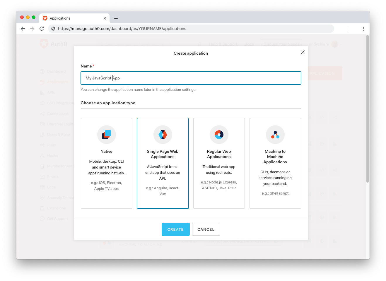
Then, go to the Applications section of the Auth0 Dashboard and click on "Create Application". On the dialog shown, set the name of your application and select Single Page Web Applications as the application type:
After the application has been created, click on "Settings" and take note of the domain and client id assigned to your application. In addition, set the Allowed Callback URLs and Allowed Logout URLs fields to the URL of the page that will handle login and logout responses from Auth0. In the current example, the URL of the page that will contain the code you are going to write (e.g. http://localhost:8080).
Now, in your JavaScript project, install the auth0-spa-js library like so:
npm install @auth0/auth0-spa-js
Then, implement the following in your JavaScript app:
import createAuth0Client from '@auth0/auth0-spa-js';

let auth0Client;

async function createClient() {
  return await createAuth0Client({
    domain: 'YOUR_DOMAIN',
    client_id: 'YOUR_CLIENT_ID',
  });
}

async function login() {
  await auth0Client.loginWithRedirect();
}

function logout() {
  auth0Client.logout();
}

async function handleRedirectCallback() {
  const isAuthenticated = await auth0Client.isAuthenticated();

  if (!isAuthenticated) {
    const query = window.location.search;
    if (query.includes('code=') && query.includes('state=')) {
      await auth0Client.handleRedirectCallback();
      window.history.replaceState({}, document.title, '/');
    }
  }

  await updateUI();
}

async function updateUI() {
  const isAuthenticated = await auth0Client.isAuthenticated();

  const btnLogin = document.getElementById('btn-login');
  const btnLogout = document.getElementById('btn-logout');

  btnLogin.addEventListener('click', login);
  btnLogout.addEventListener('click', logout);

  btnLogin.style.display = isAuthenticated ? 'none' : 'block';
  btnLogout.style.display = isAuthenticated ? 'block' : 'none';

  if (isAuthenticated) {
    const username = document.getElementById('username');
    const user = await auth0Client.getUser();

    username.innerText = user.name;
  }
}

window.addEventListener('load', async () => {
  auth0Client = await createClient();

  await handleRedirectCallback();
});
Replace the
YOUR_DOMAINandYOUR_CLIENT_IDplaceholders with the actual values for the domain and client id you found in your Auth0 Dashboard.
Then, create your UI with the following markup:
<p>Welcome <span id="username"></span></p>
<button type="submit" id="btn-login">Sign In</button>
<button type="submit" id="btn-logout" style="display:none;">Sign Out</button>
Your application is ready to authenticate with Auth0!
Check out the Auth0 SPA SDK documentation to learn more about authentication and authorization with JavaScript and Auth0.
Summary
In this post, you explored how Stencil allows you to create Web Components without too much effort. You used Stencil's syntax to incrementally define a rating component: from the definition of its appearance to the management of interactivity. In the end, you compiled the component for using in production and analyzed a few scenarios of integration.
The final code of the project developed throughout the post can be downloaded from this GitHub repository.
About the author

Andrea Chiarelli
Principal Developer Advocate
I have over 20 years of experience as a software engineer and technical author. Throughout my career, I've used several programming languages and technologies for the projects I was involved in, ranging from C# to JavaScript, ASP.NET to Node.js, Angular to React, SOAP to REST APIs, etc.
In the last few years, I've been focusing on simplifying the developer experience with Identity and related topics, especially in the .NET ecosystem.