
TL;DR: Bootstrap is the de-facto design frontend component library for designing web and mobile sites. In this article, I'll cover the new features in Bootstrap 4.0 and several other changes and deprecations.
We never stopped believing, and hope you didn’t either! Bootstrap 4.0.0 has finally landed! https://t.co/zFAOxpyhvD
— Bootstrap (@getbootstrap) January 18, 2018
Bootstrap is built and maintained by @mdo, @fat and a core team of developers. It is an open source toolkit that provides a responsive grid system, Sass variables and mixins, prebuilt components for developing with HTML, CSS, and JS.
Bootstrap 4.0 final release was announced to the world on January 19, 2018, after the alpha version was released three years ago. Bootstrap 4 is a major rewrite of the entire project. It is such a huge milestone for the Bootstrap team to tag the 4.0.0 release after many years of hard work squashing bugs, improving the framework and polishing the documentation. Let's go through the major changes in Bootstrap from the v4.0.0-beta to version 4.0.0.
Nearly three years of personal open source work and energy has gone into this thing. Words cannot express how happy I am that it’s out. Now, on to v4.1! https://t.co/XgpZzzDNoY
— Mark Otto (@mdo) January 18, 2018
1. Normalize Dropped, Reboot Here to Stay
Before version 4-beta, Normalize.css was a dependency in Bootstrap used for rendering the consistent appearance of all the HTML elements across the board. The team decided to drop the dependency, fork some of it and remixed it with Bootstrap's Reboot for a better and stable normalization approach.
2. Major Browser Support Change
Bootstrap v4.0 now supports Internet Explorer 10+ and iOS 7+. Furthermore, it added official support for Android v5.0 Lollipop's Browser and WebView.
Unfortunately, it dropped support for IE8, IE9 and iOS 6. If you are building applications that need support for these browser versions, use Bootstrap v3.
3. Giant Move to Flexbox
With Bootstrap v4, Flexbox is enabled out of the box. Flexbox ships with a lot of awesome features, thus making Bootstrap v4 very rich with benefits such as a Flexbox based grid, responsive sizing and floats, auto margins, vertical centering, auto-layout grid and even new spacing utilities. Flexbox also powers the new card components.
“ With Bootstrap v4, Flexbox is enabled out of the box.”
Tweet This
4. Improved Grid System
With Bootstrap version 4, an improvement has been made to make it a 5 grid tier system, xs, sm, md, lg, and xl. The new grid tier, xl, extends the media query range all the way down to 544px.
The improved grid system also offers the following:
- Support for flexbox in the grid mixins and predefined classes.
- Support for vertical and horizontal alignment classes.
Changes in media queries to avoid repeating query declarations.
  @include media-breakpoint-up(sm) {

  }
  @include media-breakpoint-down(sm) {

  }
  @include media-breakpoint-only(sm) {

  }
Changed grid mixins to merge
make-col-spanintomake-colfor a singular mixin.
Check out this awesome Bootstrap 4 Grid Demo on Codepen.
5. Media Queries on Steriods
The @screen format no longer exists in Bootstrap v4.0. Now, you can just use media queries easily like the example below:
```css
// Extra small devices (portrait phones, less than 576px)
// No media query since this is the default in Bootstrap

// Small devices (landscape phones, 576px and up)
@media (min-width: 576px) { ... }

// Medium devices (tablets, 768px and up)
@media (min-width: 768px) { ... }

// Large devices (desktops, 992px and up)
@media (min-width: 992px) { ... }

// Extra large devices (large desktops, 1200px and up)
@media (min-width: 1200px) { ... }
```
The new media-breakpoint-up(), media-breakpoint-down(), media-breakpoint-between, or media-breakpoint-only() can be used like so:
@media (min-width: 576px) and (max-width: 767.98px) { ... }can be used as@include media-breakpoint-only(sm) { ... }.@media (min-width: 768px) and (max-width: 991.98px) { ... }can be used as@include media-breakpoint-only(md) { ... }.@media (min-width: 992px) and (max-width: 1199.98px) { ... }can be used as@include media-breakpoint-only(lg) { ... }.@media (min-width: 1200px) { ... }can be used as@include media-breakpoint-only(xl) { ... }.@media (max-width: 575.98px) { ... }can be used as@include media-breakpoint-down(xs) { ... }.@media (max-width: 767.98px) { ... }can be used as@include media-breakpoint-down(sm) { ... }.@media (min-width: 576px) { ... }can be used as@include media-breakpoint-up(xs) { ... }.@media (min-width: 768px) { ... }can be used as@include media-breakpoint-up(sm) { ... }.
An example of media queries spanning multiple breakpoint widths such as @media (min-width: 768px) and (max-width: 1199.98px) { ... } can be used as @include media-breakpoint-between(md, xl) { ... } in a sass mixin.
6. Improved Form Support in Bootstrap 4
In Bootstrap 4, the default checkboxes and radios have been rewritten to have the same layout styles.
Form classes we were very familiar with in version 3 have been modified like so:
.control-labelis now.col-form-label..input-lgand.input-smis now.form-control-lgand.form-control-sm, respectively..form-group-*classes are now.form-control-*classes..help-blockis now.form-textfor block-level help text. Utility classes like.text-mutedcan be used for inline help text.- No more
.radio-inlineand.checkbox-inline. - The
.checkboxand.radioclasses have metamorphosed into.form-checkand the various.form-check-*classes. .has-error,.has-warning, and.has-successclasses have been replaced with HTML5 form validation via CSS’s:invalidand:validpseudo-classes..col-form-legendno longer exists.
Check out more information on forms.
7. Sass By Default, Less Eliminated
Bootstrap v3 uses Less for source CSS files. With Bootstrap v4, Sass is now used for source CSS files. From project experiments across the world, frontend developers tend to favour Sass over Less. Sass is very flexible and also compiles faster!
8. Elevated Card Components
Bootstrap v4 dropped support for panels, thumbnails, and wells in favor of the new card component built with Flexbox. The card component provides a flexible and extensible content container with multiple variants and options. It includes options for headers, footers, contextual background colours and powerful display options.
Functionality for panels, thumbnails and wells are available as modifier classes for cards.
<div class="card">
  <img class="card-img-top" src="https://images.ctfassets.net/23aumh6u8s0i/5HBmRYlHnhUb0J3dxKTdep/cf9acc7499491eec554b041136a2b270/Screen_Shot_2018-01-08_at_2" alt="Card image cap"/>
  <div class="card-body">
    <h5 class="card-title">Profile Picture</h5>
    <p class="card-text">Prosper Otemuyiwa, Developer Advocate</p>
    <a href="#" class="btn btn-primary">Visit Profile</a>
  </div>
</div>
You can have:
class="card-body"which is the building block.class="card-header"which gives you a header within a card.class="card-footer"which gives you a footer within a card.class="card-info"class="card-inverse"class="card-warning"class="card-danger"class="card-success"
All these classes are available as styling for header elements such as .card-warning to a <h2>,<h3> element.
Cards have no specific width so they'll be 100% wide by default. Custom CSS, grid classes and mixins can adjust it to whatever you want.
9. Spacing Utilities
Bootstrap includes a plethora of shorthand responsive margin and padding utility classes to modify an element’s appearance. This simply works by assigning responsive-friendly margin or padding values to an element with shorthand classes.
Here's a psuedocode of its representation, {margin or padding}-{sides}-{size}. An example is:
.mt-2 {
  margin-top: 2 !important;
}

.ml-3 {
  margin-left: ($spacer * .25) !important;
}
Check out more information on spacing utilities.
10. Improved Tooltip auto-placement Support
Bootstrap v4 ships with improves support for auto-placement of tooltips, popovers and dropdowns. Bootstrap 4 dropped support for Tether.js in favour of Popper.js which does a great job and is actively maintained.
    $(function () {
      $('[data-toggle="tooltip"]').tooltip()
    })
  <button type="button" class="btn btn-secondary" data-toggle="tooltip" data-placement="top" title="Tooltip on top">
    Tooltip on top
  </button>
  <button type="button" class="btn btn-secondary" data-toggle="tooltip" data-placement="right" title="Tooltip on right">
    Tooltip on right
  </button>
  <button type="button" class="btn btn-secondary" data-toggle="tooltip" data-placement="bottom" title="Tooltip on bottom">
    Tooltip on bottom
  </button>
  <button type="button" class="btn btn-secondary" data-toggle="tooltip" data-placement="left" title="Tooltip on left">
    Tooltip on left
  </button>
// Enable Popovers everywhere
    $(function () {
      $('[data-toggle="popover"]').popover()
    })
Deprecations and Other Updates
- The global font-size has been increased from
14pxto16px. - The primary CSS unit is now
remrather thanpx. However, pixels are widely used for media queries. - Bootstrap 4 dropped the Glyphicons icon font. Suggested options are fontAwesome and Octicons.
- Bootstrap 4 also dropped the Affix JQuery library. Suggested option is to use the
position:stickypolyfill. - Bootstrap 4 dropped support for non-responsive usage of Bootstrap.
- Bootstrap 4 uses a user's system fonts, with a fallback to Helvetica Neue, Arial, and sans-serif.
Check out other Angular 5 updates here.
Upgrading to Bootstrap 4
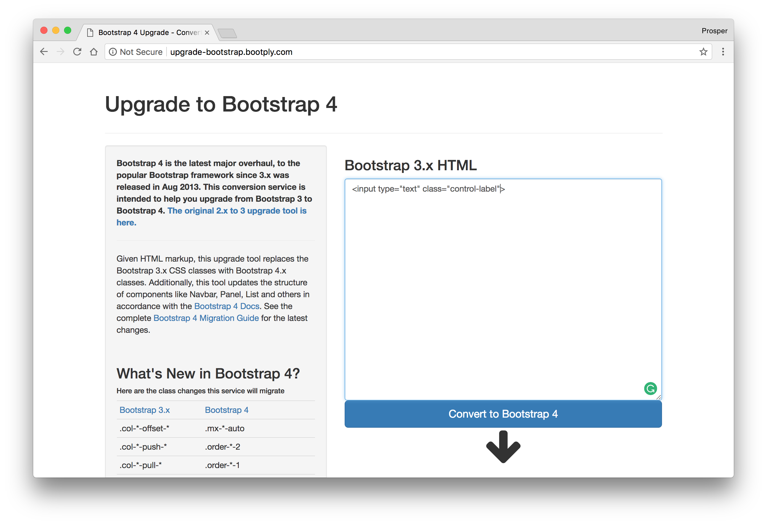
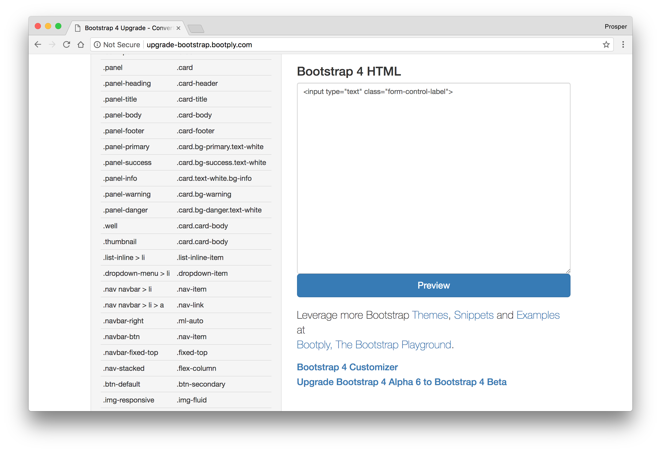
The Bootstrap team has a comprehensive guide for migrating to Bootstrap v4. However, there is a very nifty tool from the community that allows you to drop in a piece of code and convert it to the Bootstrap v4 equivalent.
Aside: Styling Auth0 Login Page
Auth0, a global leader in Identity-as-a-Service (IDaaS), provides thousands of customers in every market sector with the only identity solution they need for their web, mobile, IoT, and internal applications. Its extensible platform seamlessly authenticates and secures more than 50M logins per day, making it loved by developers and trusted by global enterprises.
Auth0 offers a free tier to get started with modern authentication. Check it out, or sign up for a free Auth0 account here!
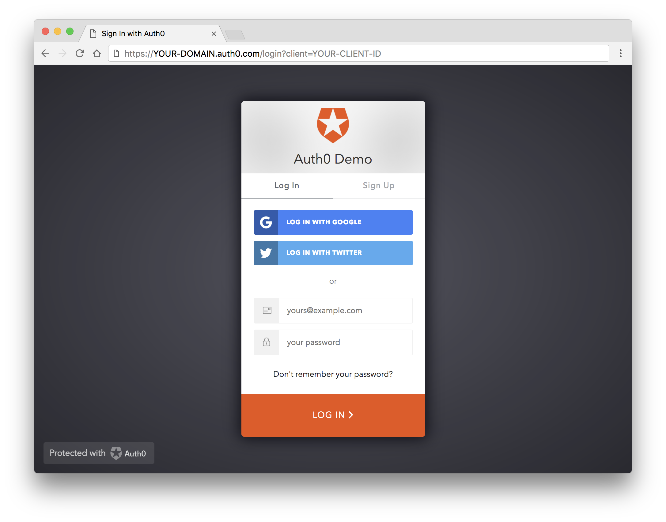
You can customize the look and feel of the Auth0 Login Page to suit your web application's appearance or theme from the Auth0 dashboard. Click on the Hosted Pages option from the sidebar, then go ahead to enable the Customize Login Page button.
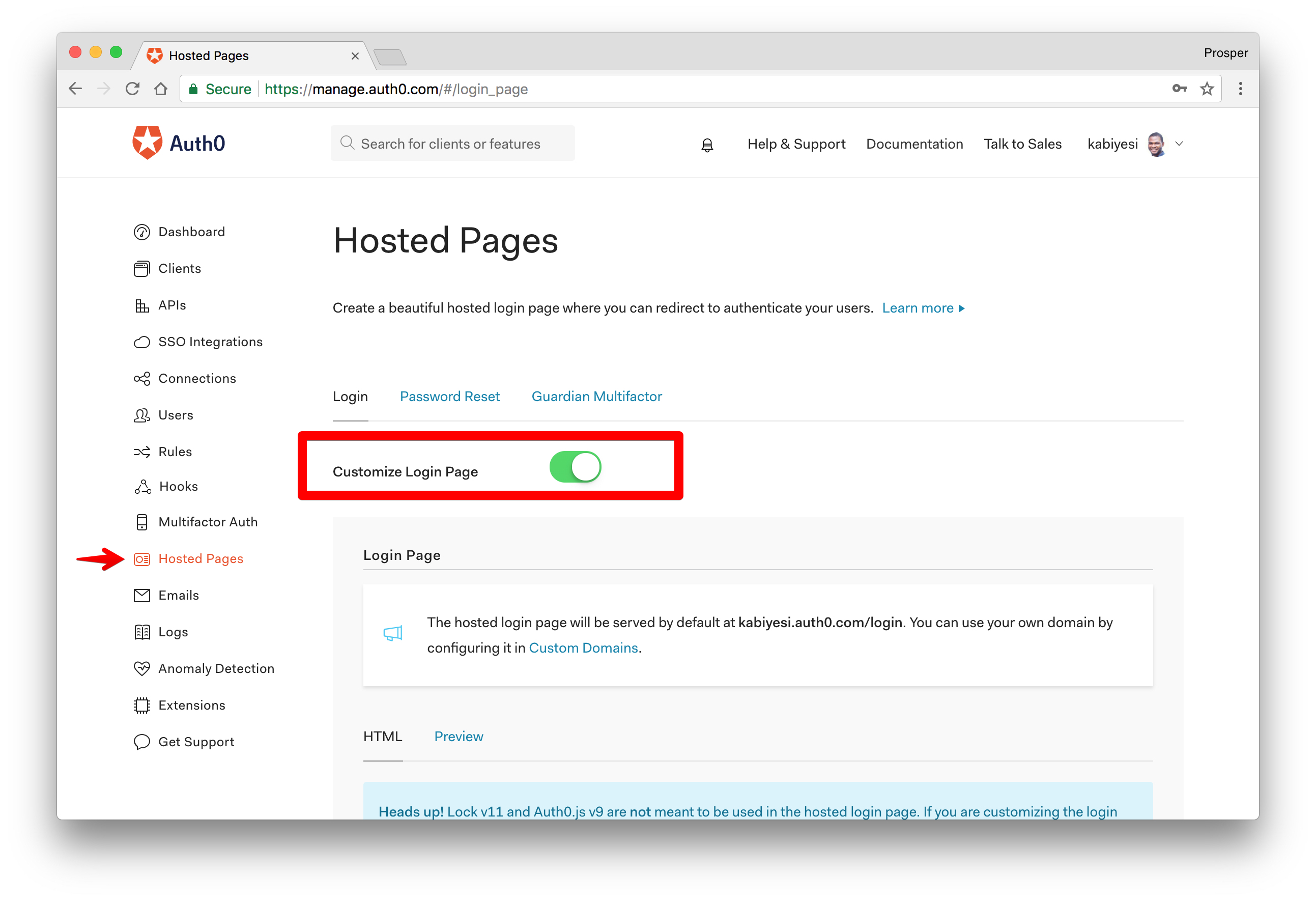
You'll be presented with various templates. Choose whatever template suits you.
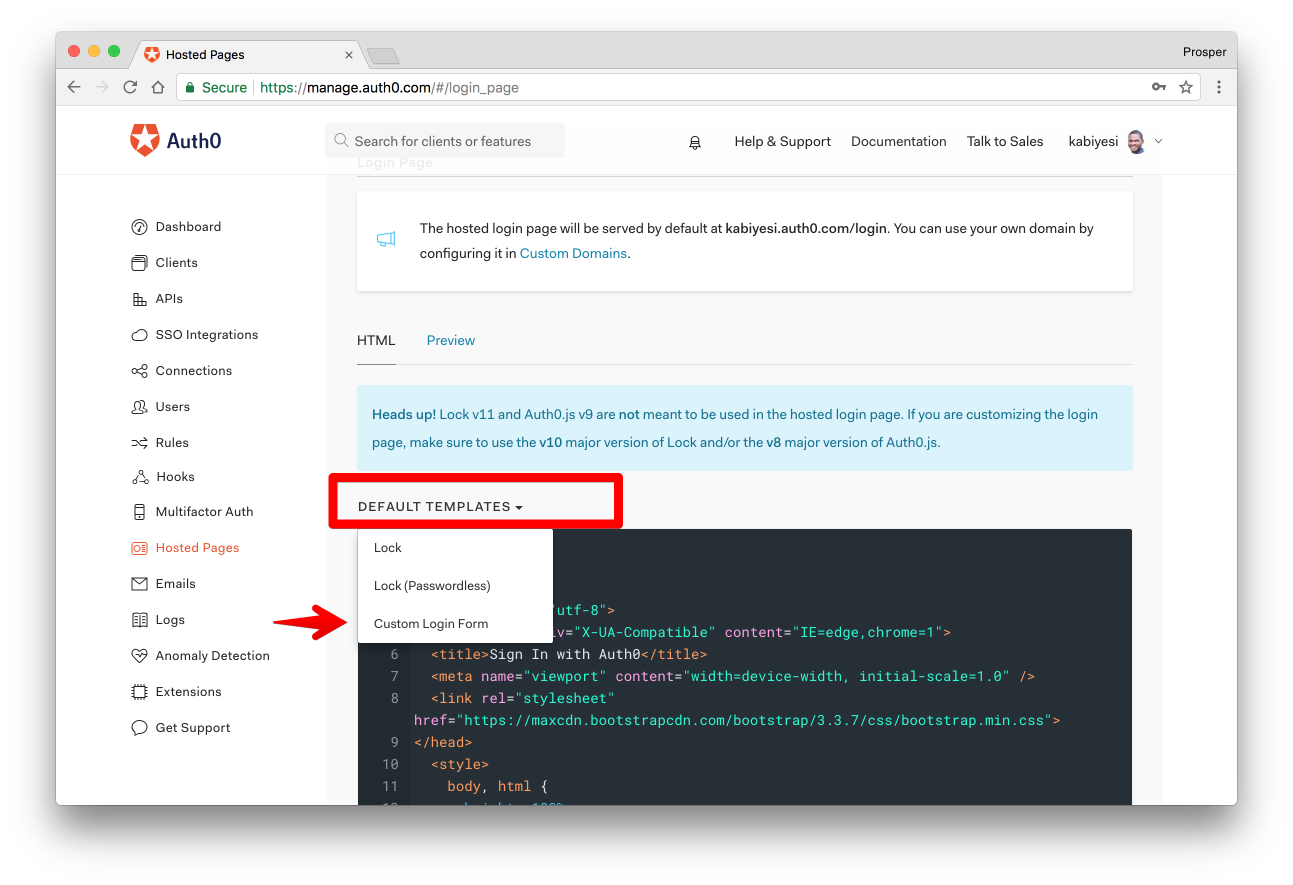
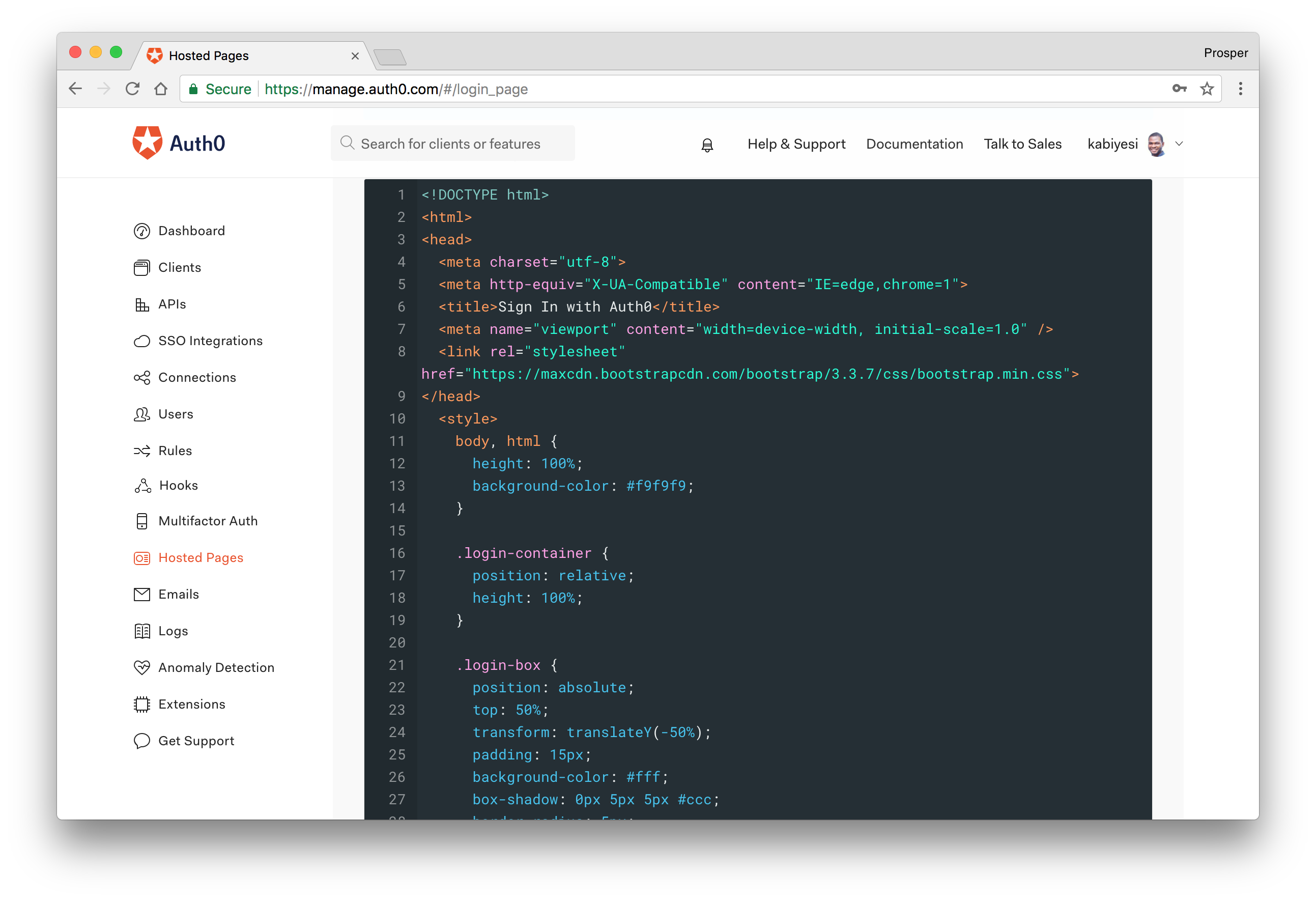
For every template selected, the editor will be populated with HTML, CSS and JS code that you can modify to change the look and feel.
Conclusion
Bootstrap 4 came loaded with new features and significant improvements. It is better, more customizable and slick. I am proud of what the Bootstrap team and the community achieved with this release.
“Bootstrap 4 is a major rewrite of the entire project.”
Tweet This
Have you switched to Bootstrap v4.0 yet? What are your thoughts? Let me know in the comments section! 😊
About the author

Prosper Otemuyiwa
Former Auth0 Employee (Auth0 Alumni)