フォームノード
フォームノードには開始、ステップ、フロー、経路、終了画面の5種類があります。これらのノードは、フォームの構造に対して非常に明確な目的があります。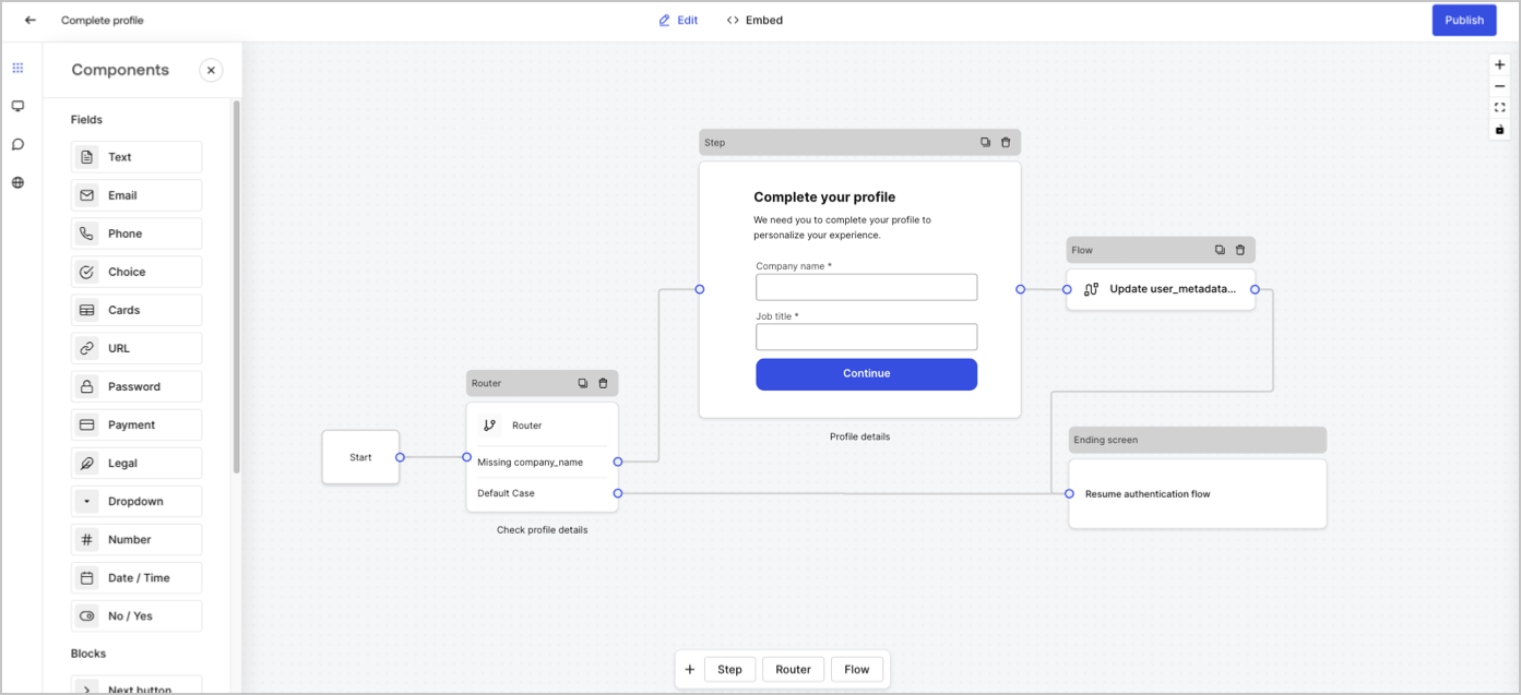
ステップノード
ステップノードではフォームを視覚的に確認できます。ユーザーがデータを入力できるフィールド、ブロック、およびウィジェットなど、複数のコンポーネントを含むことができます。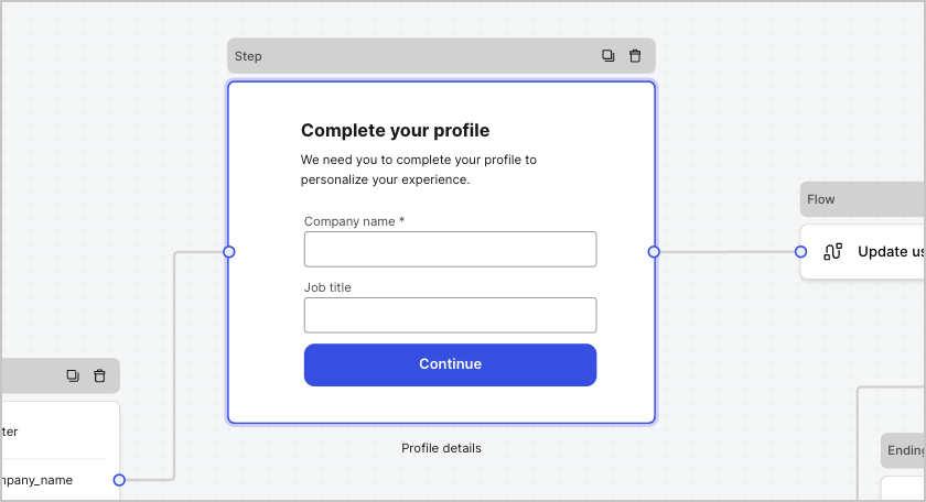
フィールドコンポーネント
フィールドは、ユーザーがフォームに情報を入力するUIコンポーネントです。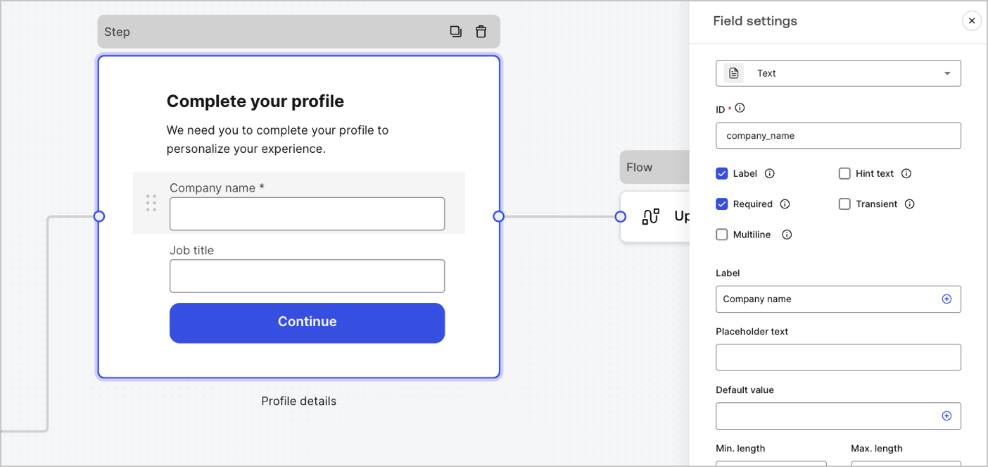
フィールド設定
フィールドには、要件を満たすために構成できるデフォルト設定がいくつかあります。 デフォルトのフィールド設定は次のとおりです。| 設定 | 説明 |
|---|---|
| ID | 一意のID |
| Label(ラベル) | ラベルを表示または非表示にします |
| Required(必須) | 入力値が必須です |
| Hint text(ヒントテキスト) | ヒントテキストを表示します |
| Placeholder text(プレースホルダーテキスト) | ユーザーに表示されるテキスト |
| Default value(デフォルト値) | ユーザーに表示されるデフォルト値 |
| Transient(一時的) | データマスクを有効または無効にします |
フィールド検証ルール
| 設定 | 説明 |
|---|---|
| Min. length / Max. length(最小長/最大長) | 入力値の長さを指定する。 |
| Min. value / Max. value(最小値/最大値) | 数値の長さを指定する。 |
フォームで使用可能なフィールド
特定の設定とデータ出力タイプを持つ使用可能なフィールドは次のとおりです。テキストフィールド
テキストフィールド
任意の文字列値を入力できる標準入力。
テキストフィールドの設定
テキストフィールドは以下のように設定されています。| 設定 | 説明 |
|---|---|
| Multiline(複数行) | 複数行のテキスト入力を有効にする。 |
テキストフィールドの出力値
テキストフィールドの出力値のデータ型はstringです。メールフィールド
メールフィールド
メール文字列値を入力できる標準入力。
メールフィールドの出力値
メールフィールドの出力値のデータ型はstringです。電話フィールド
電話フィールド
電話番号の値を入力できる標準入力。
電話フィールドの設定
電話フィールドは以下のように設定されています。| 設定 | 説明 |
|---|---|
| Country picker(国ピッカー) | 国ピッカーを有効または無効にします。デフォルトでは、ユーザーのIPの場所が表示されます。 |
| Filter placeholder text(フィルタープレースホルダーテキスト) | 国の検索ウィンドウでユーザーに表示されるテキスト。 |
電話フィールドの出力値
電話フィールドの出力値のデータ型はstringか、国ピッカーが有効な場合はobjectです。stringの電話フィールド出力のデータ型の値:objectの電話フィールド出力のデータ型の値:選択フィールド
選択フィールド
単一または複数選択する値を選択できる標準入力。
選択フィールドの設定
選択フィールドは以下のように設定されています。| 設定 | 説明 |
|---|---|
| Multiple choice(複数選択) | 複数の選択肢を有効にします。 |
| Other option(その他のオプション) | ユーザーが自分のオプションを入力できるようにします。 |
| Advanced(高度な設定)> Internal values(内部値) | 各選択肢に内部値を割り当てます。 |
| Advanced(高度な設定)> Bulk edit(一括編集) | ラベルと内部選択肢の値を一括編集します。 |
選択フィールドの出力値
選択フィールドの出力値のデータ型はstringか、複数選択が有効な場合はarray of stringsです。stringの選択フィールドの出力データ型の値:array of stringsの選択フィールドの出力データ型の値:カードフィールド
カードフィールド
単一または複数選択する画像値を選択できる標準入力。
カードフィールドの設定
カードフィールドは以下のように設定されています。| 設定 | 説明 |
|---|---|
| Multiple choice(複数選択) | 複数の選択肢を有効にする。 |
| Hide labels(ラベルを非表示) | カードラベルを非表示にする。 |
| Advanced(詳細設定) > Internal values(内部値) | 各選択肢に内部値を割り当てる。 |
カードフィールドの出力値
カードフィールドの出力値のデータ型はstringか、複数選択が有効な場合はarray of stringsです。stringのカードフィールドの出力データ型の値:array of stringsのカードフィールドの出力データ型の値:URLフィールド
URLフィールド
URL値を入力できる標準入力。
URLフィールドの出力値
URLフィールド出力値のデータ型は文字列です:パスワードフィールド
パスワードフィールド
パスワードまたはシークレット値を入力できる標準入力。
パスワードフィールドの設定
パスワードフィールドは以下のように設定されています。| 設定 | 説明 |
|---|---|
| 複雑なパスワードが必要 | パスワードには大文字・小文字、記号、数字を含める必要があります。 |
| NISTガイドラインの強制 | パスワードは8文字以上で指定し、以前に侵害されたパスワードや辞書に記載されている単語、繰り返しや連続した文字、コンテンツ固有の単語を使用することはできません。 |
| 強度メーターの追加 | 入力したパスワードの強度を示すために、パスワードフィールドの下に赤色、黄色、緑色のスケールで示されたメーターが表示されます。 |
| ハッシュ | 入力値をブラウザーに直接ハッシュするためのアルゴリズムを選択します。 |
パスワードフィールドの出力値
パスワードフィールドの出力値のデータ型はマスクされたstringです。支払いフィールド
支払いフィールド
決済プロバイダーを使用して支払い情報を入力できる標準入力。支払いは終了ノードの前に処理されます。
支払いフィールドの設定
支払いフィールドは以下のように設定されています。| 設定 | 説明 |
|---|---|
| Payment type(支払いタイプ) | 1回限り(チャージ)または継続払い(サブスクリプション)のいずれかを選択します。 |
| Amount(金額) | 1回限り(チャージ)の支払い額を指定します。 |
| Currency(通貨) | 1回限り(チャージ)の支払い通貨を指定します。 |
| Subscription action(サブスクリプションの操作) | 新規作成するか既存のサブスクリプションを更新するかを選択します。 |
| Customer action(顧客の操作) | 新規作成するか既存の顧客を更新するかを選択します。 |
| Display options(表示オプション) | カード番号、有効期限、セキュリティコードラベル、およびトラストマークを表示・編集します。 |
支払いフィールドの出力値
支払いフィールドの出力値のデータ型は、サブミッションフロー後は文字列かオブジェクトです。stringの支払いフィールド出力値のデータ型:objectの支払いフィールド出力値のサブスクリプションのデータ型:objectの支払いフィールド出力値の請求のデータ型:法律フィールド
法律フィールド
法律テキストとチェック入力を追加する標準入力。
法律フィールドの出力値
法律フィールド出力値のデータ型はbooleanです。ドロップダウンフィールド
ドロップダウンフィールド
単一または複数のドロップダウン選択値を選択できる標準入力。
ドロップダウンフィールドの設定
ドロップダウンフィールドは以下のように設定されています。| 設定 | 説明 |
|---|---|
| Multiple selector(複数セレクター) | 複数の選択肢を有効にします。 |
| Advanced(高度な設定) > Internal values(内部の値) | 各オプションに内部の値を割り当てます。 |
| Advanced(高度な設定) > Bulk edit(一括編集) | ラベルと内部の値を一括編集します。 |
ドロップダウンフィールドの出力値
ドロップダウンフィールドの出力値のデータ型はstringか、複数選択が有効な場合はarray of stringsです。stringのドロップダウンフィールド出力のデータ型の値:array of stringsのドロップダウンフィールド出力のデータ型の値:数字フィールド
数字フィールド
数値を入力できる標準入力。
数字フィールドの出力値
数字フィールドの出力値のデータ型はnumberです。日付/時刻フィールド
日付/時刻フィールド
日付または時刻の値を入力できる標準入力。
日付/時刻フィールド出力の時刻のデータ型の値は
日付/時刻フィールドの設定
日付/時刻フィールドの設定:| キー | 説明 |
|---|---|
| Format(形式) | 日付または時間の形式を選択する。 |
日付/時刻フィールドの出力値
日付/時刻フィールド出力の日付のデータ型の値はstringです:stringです:ブール値フィールド
ブール値フィールド
trueまたはfalseの値を入力できる標準入力。
ブール値フィールドの出力値
ブール値フィールドの出力値データ型はブール値です。カスタムフィールド
カスタムフィールド
カスタマイズして独自のフィールドを作成できる標準フィールド。
詳細については、フォームのカスタムフィールドのコンポーネントをお読みください。
カスタムフィールドの設定
カスタムフィールドの設定は次のとおりです。| 設定 | 説明 |
|---|---|
| パラメーター | カスタムフィールドのソースコードで参照するキーと値のペアを追加します。 |
| ソースコード | カスタムフィールドにJavascriptコードを追加します。 |
| JSONスキーマ | デフォルトでは、カスタムフィールドはあらゆる値のフォーマットを受け入れます。ただし、JSONスキーマを使用して値を検証することができます。 |
ブロックコンポーネント
ブロックは、ユーザー情報を収集せずにフォームに機能を追加するUIコンポーネントです。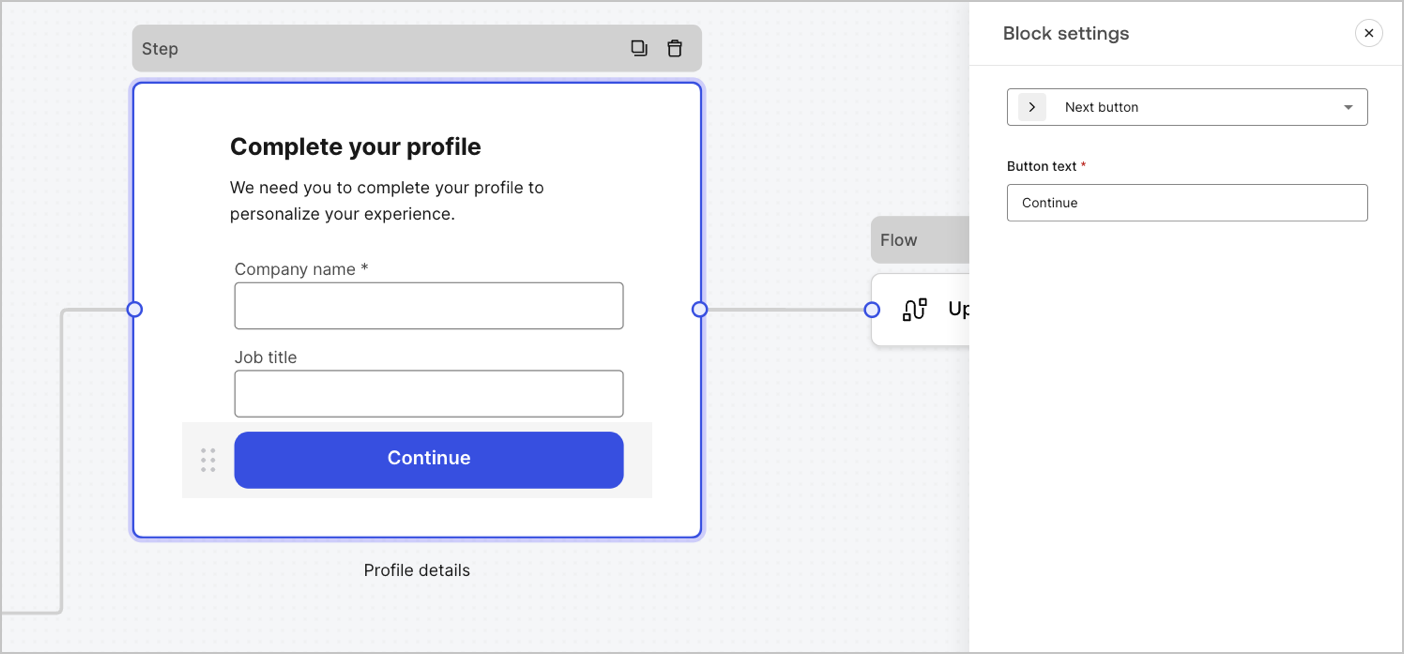
フォームで使用可能なブロック
使用可能なブロックは次のとおりです。次へボタンブロック
次へボタンブロック
次のフォームノードに進めるボタン。
- 続行する前に、フィールド検証ルールが適用され、クライアント側とサーバー側で検証されます。フィールド検証ルールが失敗した場合は、ユーザーが確認できるように、エラーメッセージが表示されます。
- 次のノードがフローノードである場合は、フローが完了するまでスピナーが表示されます。フローが失敗した場合やカスタムエラーメッセージが返された場合には、エラーメッセージが表示されます。
戻るボタンブロック
戻るボタンブロック
前のステップノードに移動できるボタン。
ユーザーが戻るボタンを選択すると、入力データに変更がない場合でも、続行する前にフィールド検証ルールが再実行されます。
ジャンプボタンブロック
ジャンプボタンブロック
現在のステップをスキップして、宛先ノードに直接ジャンプできるボタン。
現在のステップをスキップすると、検証が行われず、現在のステップで入力された情報が収集されません。
リッチテキストブロック
リッチテキストブロック
追加情報を使用してステップノードをパーソナライズするリッチテキストブロック。
仕切りブロック
仕切りブロック
ステップノードの異なるセクションを仕切る線。小さなテキストを含めることができます。
HTMLブロック
HTMLブロック
カスタムUIを作成するためのHTMLブロック。
画像ブロック
画像ブロック
画像を追加するステップをパーソナライズするための画像ブロック。
ウィジェットのコンポーネント
ウィジェットは、サードパーティ統合が含まれた事前構築されたコンポーネントで、クライアント側とサーバー側のロジックをフォームに追加します。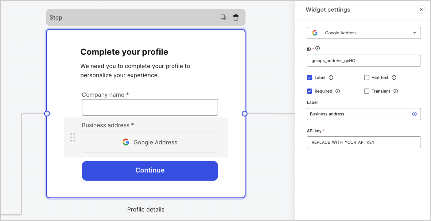
フォームで使用可能なウィジェット
使用可能なウィジェットは次のとおりです。Google Addressウィジェット
Google Addressウィジェット
住所を入力して検証できるウィジェット。
Google Addressウィジェットの設定
Google Addressウィジェットは以下のように設定されています。| 設定 | 説明 |
|---|---|
| API key(APIキー) | 要求の認証にGoogle MapsのAPIキーを要求する。 |
Google Addressウィジェットの出力値
Google Addressウィジェットの出力値のデータ型はobjectです。Google reCAPTCHA
Google reCAPTCHA
A widget that helps protect your website from spam and abuse by verifying that a user is a human and not a bot.The widget supports:
Example of
- Score-based (v3)
-
Challenge (v2)
- Invisible reCAPTCHA badge
v2 and v3:v2requires user interaction with visible challenges, such as clicking a checkbox or solving puzzles.v3runs in the background and provides a score based on user behavior, without requiring user interaction. When using this version, make sure to implement additional business logic to handle the score and determine if further action is needed.
Google reCAPTCHA widget settings
The Google reCAPTCHA widget settings include:| Settings | Description |
|---|---|
| Site key | The public site key used to initialize the reCAPTCHA on your website. You can create it in Google reCAPTCHA console or your Google Cloud Platform project. |
| Secret key | The secret key used to communicate securely with the reCAPTCHA service server-side. You can create it in Google reCAPTCHA console or your Google Cloud Platform project. |
Google reCAPTCHA output value
The Google reCAPTCHA widget output value data type is anobject.Example of v2 response:v3 response:Verifiable Credentials
Verifiable Credentials
A widget that lets a user verify their identity using verifiable credentials stored in their digital wallet.
Verifiable Credentials widget settings
The Verifiable Credentials widget settings include:| Settings | Description |
|---|---|
| URL | The URL value used to generate the QR code. This value is returned in the engagement property of the verification request. |
| Link text | Alternative text that will be displayed for users who cannot scan the QR code and prefer to open the link directly on their device. |
| Size | The size of the QR code. |
| Public token | The access token required to consume the polling endpoint. Please ensure the token is generated with only the read:verification_request scope to avoid exposing access to other resources. |
| Verification ID | The verification ID generated when you start the verification request. |
| Maximum waiting time | The maximum amount of time to wait for the verification process to complete. Once the set time is reached, polling will stop and an error will be thrown, regardless of the verification status. |
Verifiable Credentials output value
The Verifiable Credentials widget output value data type is anobject.経路ノード
経路ノードを使用すると、ノード間で条件付きロジックジャンプを作成するためのルールを追加できます。 デフォルトで、経路ノードには Default Case(デフォルトケース) という名前の単一パススルールールがあり、他のノードに接続します。変数が他のノードに接続するために満たさなければならない一連の条件に基づいて、追加のルールを追加することができます。詳細については、「経路」をお読みください。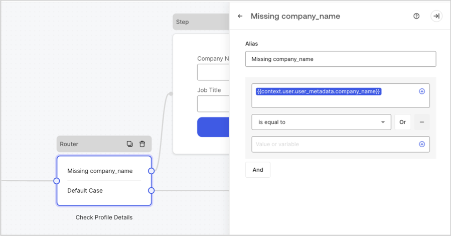
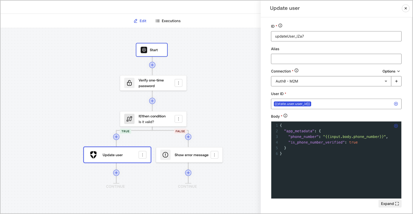
フローノード
フローノードを使用すると、フォームにカスタムロジックと統合フローを追加および作成することができます。詳細については、「フロー」をお読みください。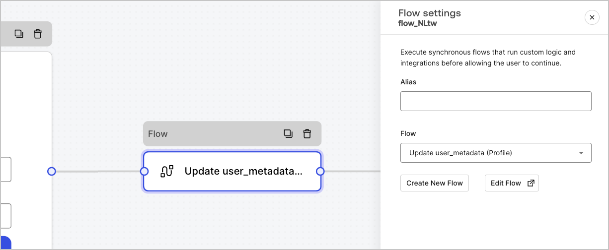
開始ノード
開始ノードはユーザーには表示されません。ここには、アクションを持つフォームを表示する際のユーザー属性など、隠しフィールド変数を構成することができます。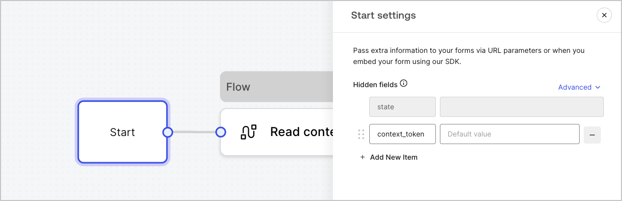
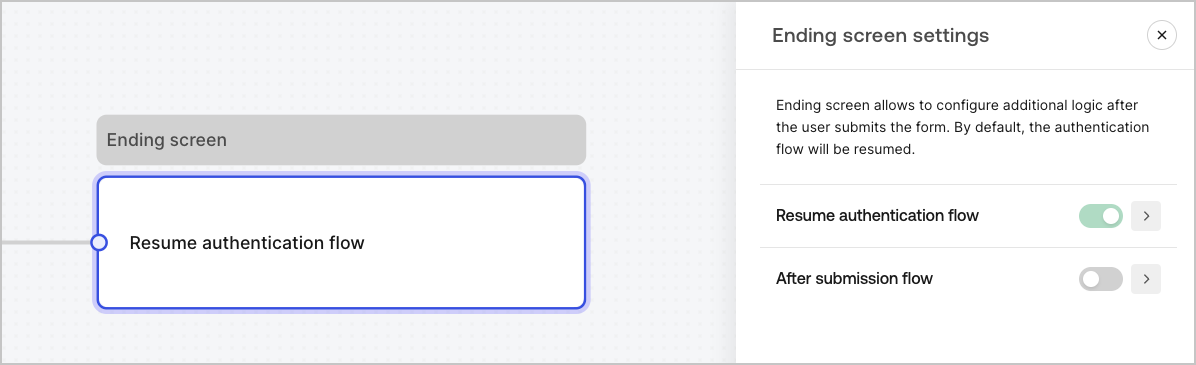
終了スクリーンノード
すべてのフォームに終了スクリーンノードがあります。デフォルトでは、このノードは認証フローを再開し、ここで送信後のフローを構成することができます。